Continuing the profiling of my art postcards…here are some recent examples of on various themes. These cards are hand-printed, created from a combination of drawing and printmaking in low print run editions. Once I finished a session it meant the end of that particular batch. I would not repeat the design or reprint it. Cards in an edition are all original prints…similar in design but classified as mono prints as there are no exact duplicates. They fall within the standard postcard size dimensions of 10cm x 15cm or a near approximate. More information about this project can be found on the four previous POSTCARD posts…see the links below at the bottom of this post.
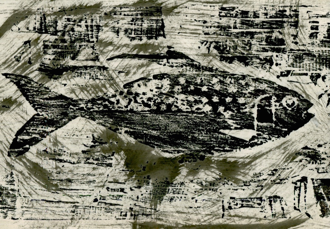
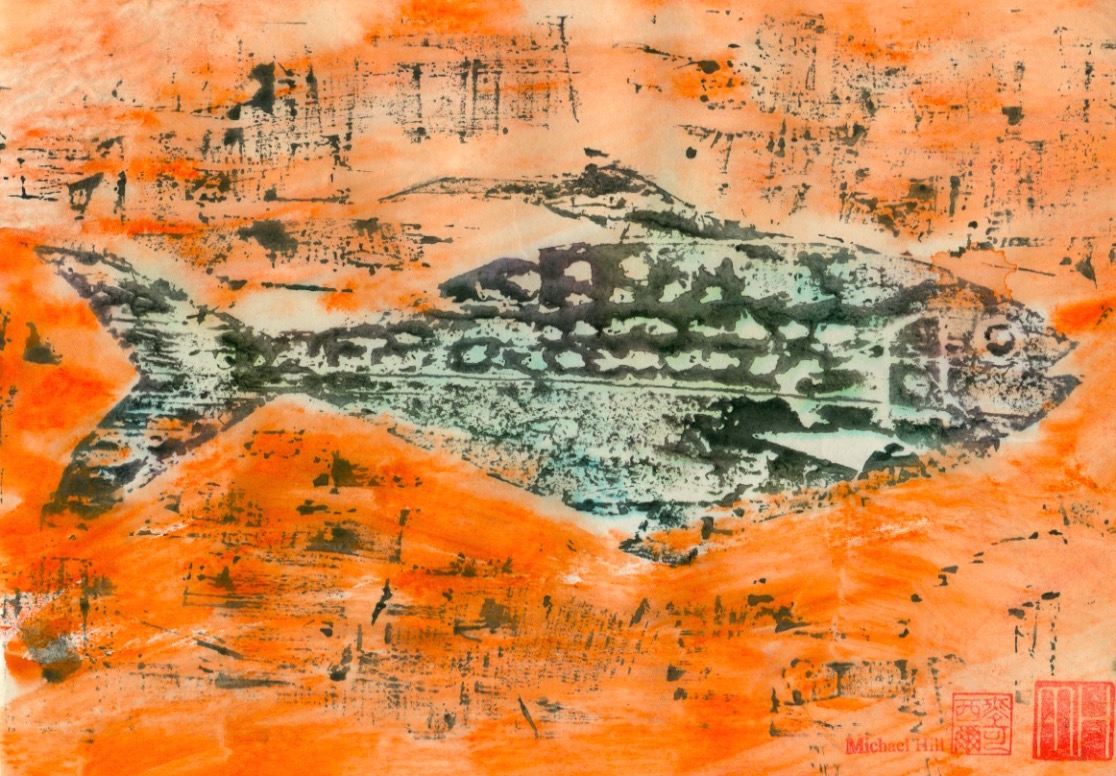
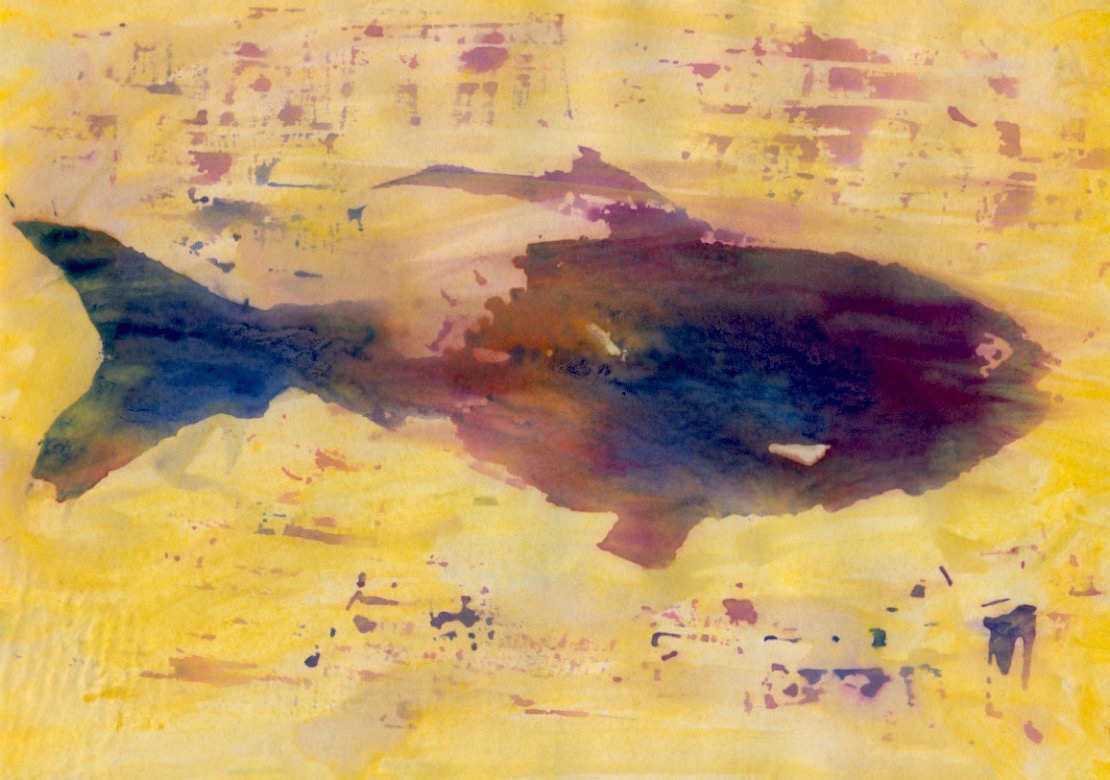
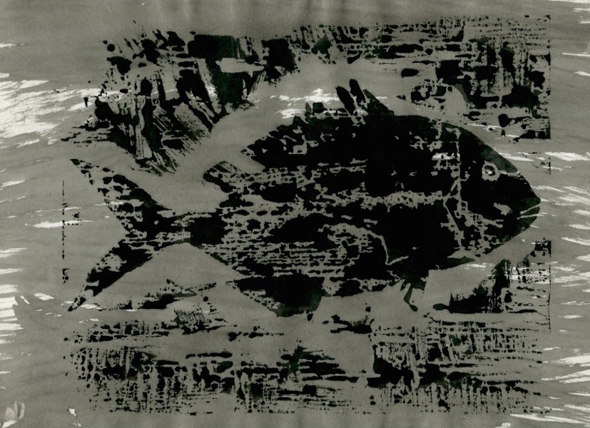
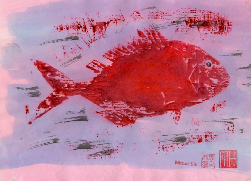
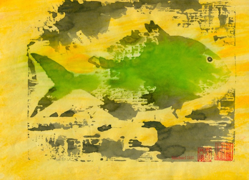
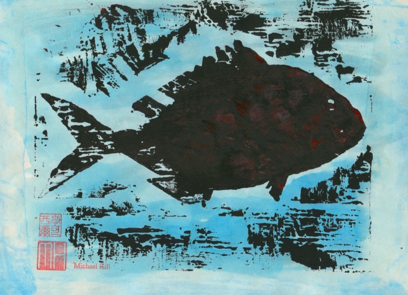
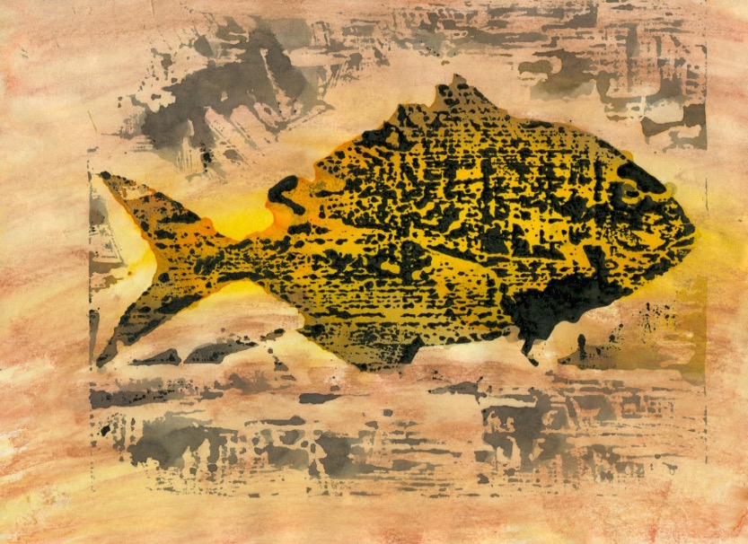
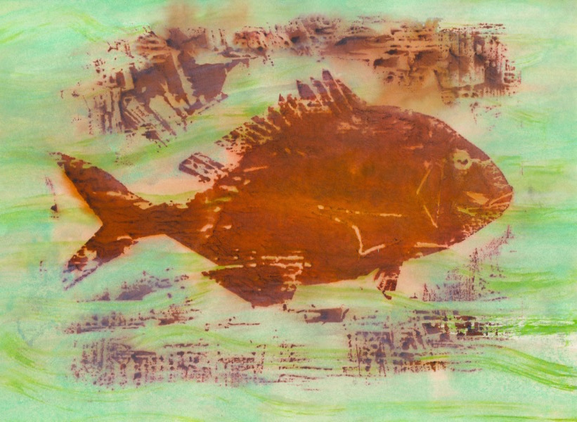
This is the third post based on the fish prints I made using woodblock printmaking techniques…for the experimental animated film Toxic Fish. The fish in this sequence is the Kohada or Gizzard Shad. Its static shape on the woodblock contrasts with the flooding of coloured toxins around it.
Making overlay textural effect inking of a sequence of prints on the floor of the studio…for inclusion as frames in the animation. (Photo by Louise Graber).
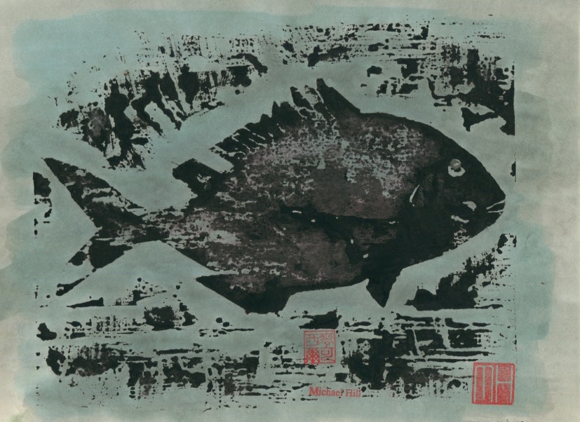
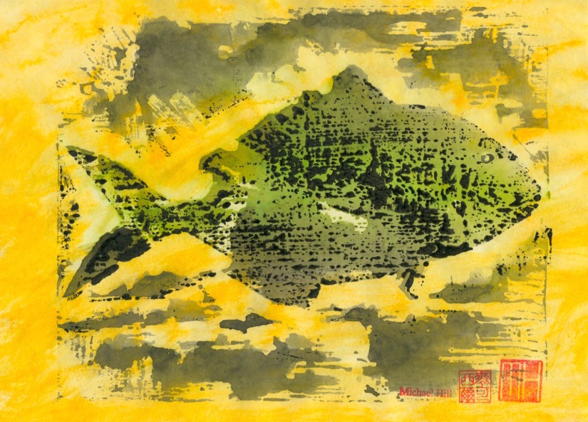
This series of posts will profile a collection of creative prints that I have made, beginning with a series of fish. I used the woodblock printmaking method with variations in inking to make monoprints so that the prints produced could also be used in animation sequences. Six species of fish were featured, the first of which is the Japanese Tai or sea bream. I was very attracted to the idea of working in both animation and printmaking at the time but found it difficult to sustain both in the available time and ultimately had to choose between the two. I found the solution in combining both mediums. Animation’s enormous need for artwork could be more speedily met by using the printmaking medium. I was doubly happy but have since settled on making comics which falls in the space located somewhere in-between and requires a lot less artwork.
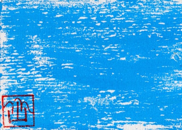
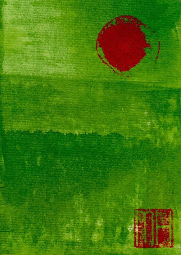
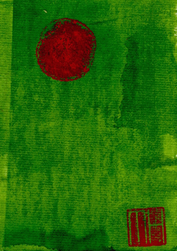
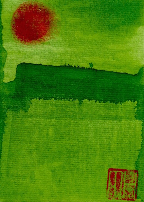
This post profiles another artistic medium that I have been printmaking in recent years. This is the design of limited edition art postcards. These are some of my earliest designs. More will be added in future posts. I hand-printed these postcards that were created from a combination of drawing and printmaking. I would make random, numbered editions of say 8, 19 or 33. A print run greater than 50 was rare. The total would be determined by the amount of blank cards, ink and time available for finishing. Once I completed a session it meant the end of that particular batch as I would not repeat the design. Cards in an edition are all original prints. These are called monoprints, so-called by being similar in design but with no exact duplicates in the batch.
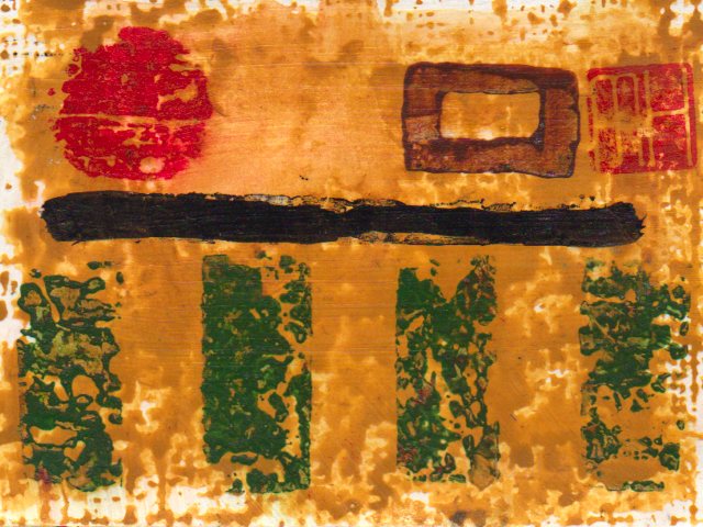
The following three postcards show variations produced in the same edition. (1) the overlaid pink patch is in a different position on each card…and its shape and strength of colour vary. (2) the dragon stamp(the small curvy line) is not in the exact same position. It is on two cards but not the third. Its legs seem absent in two of the impressions. (3) the large black and yellow mass varies in colour and texture from card to card. (4) the Post Office franking machine marking is at the top, bottom or missing(only visible on reverse side of card). (5) my MH signature seal, whilst generally in the same position, is actually upside down on two of the cards…an bloody unbelievable, creative oversight! I’m sorry!
The drinking of beer, usually a bottle of stout, marked the end of an edition and celebration of completion. This was often late in the afternoon as I never seemed to print in the mornings or evenings. After a couple of years I supplemented this hand-made approach with digital printing, making copies from the scanned original. But then, lacking satisfaction…and missing the additional ink staining on my jeans, I abandoned that and returned to the hand-made printmaking process. Consequently, both my level of satisfaction and the print marks on my jeans improved, Michael.
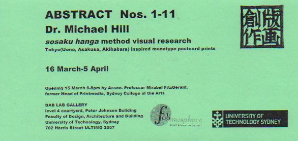
UPDATE OCTOBER 12, 2015: A selection of these art postcards have been displayed in exhibitions. The first in 2007 titled Abstract Nos. 1-11 at the DAB LAB Gallery, Faculty of Design, Architecture and Building of the University of Technology, Sydney.
Pop-Up Postcard Exhibition by Dr. Michael Hill: Abstract Nos.1-11, DAB LAB Gallery, UTS, 2007.
Detail: Pop-Up Postcard Exhibition by Dr. Michael Hill: Abstract Nos.1-11, DAB LAB Gallery, UTS, 2007.
Exhibition flyer designed by Dr. Michael Hill a.k.a. Doctor Comics.
Reverse of ABSTRACT exhibition flyer designed by Dr. Michael Hill a.k.a. Doctor Comics.
UPDATE NOVEMBER 6, 2015: At Hondarake Full of Books in 2012…the launch of my comic Blotting Paper was accompanied by a mini exhibition of my art postcards…33 in all from 32 different designs.
An exhibition of handmade art postcards…accompanying the launch of my artist book/comic Blotting Paper at Hondarake Bookshop, February 2012 (Photo by Louise Graber).
Fukushima Kids 2013 Auction, Japan: 10 of my art postcards…each print a monoprint and thus unique…were contributed to this cause and event. The reverse side was signed and dated with my artist’s stamp. These postcards were made on machine made cardboard following the Japanese sosaku hanga method of printmaking.
I decided to participate in this event in which participants do a drawing each day during the month of October. I took the option, however, of only doing it every other day. So I planned to produce an inked image on the odd numbered dates-1st, 3rd, 5th, 7th etc. That amounts to a potential 16 drawings over the period. These were progressively posted here on my blog and dated. I also added an image of the drawing implement(s) employed. I saw this exercise as an opportunity to ‘warm up’ for issue 4 of my Blotting Paper artist book/comic…another experimental image-making outlet.
A new drawing made on every odd numbered date of the month.
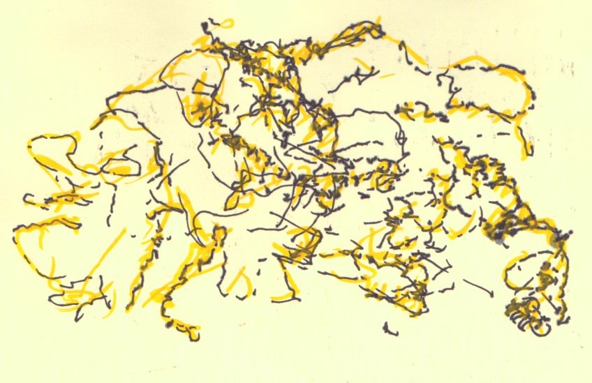
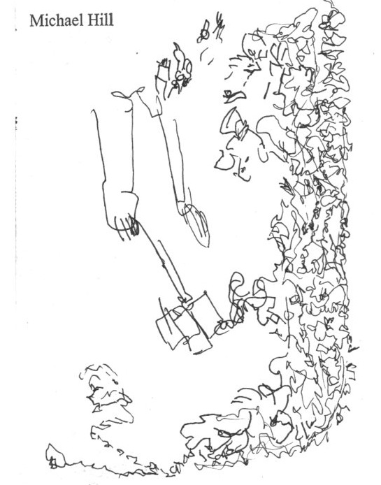
Midway through the month…I managed to maintain my planned participation of posting an ink image every other day. Next stage…I am move in the direction of making blind contour drawings of moving subjects.
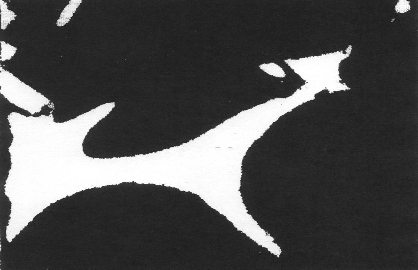
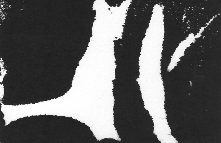
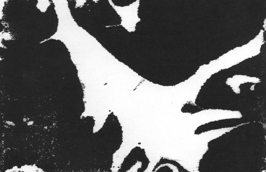
A return to abstraction for the final four images! I am switching to printmaking, exchanging the pen for a brush and using sumi ink to make monoprints.
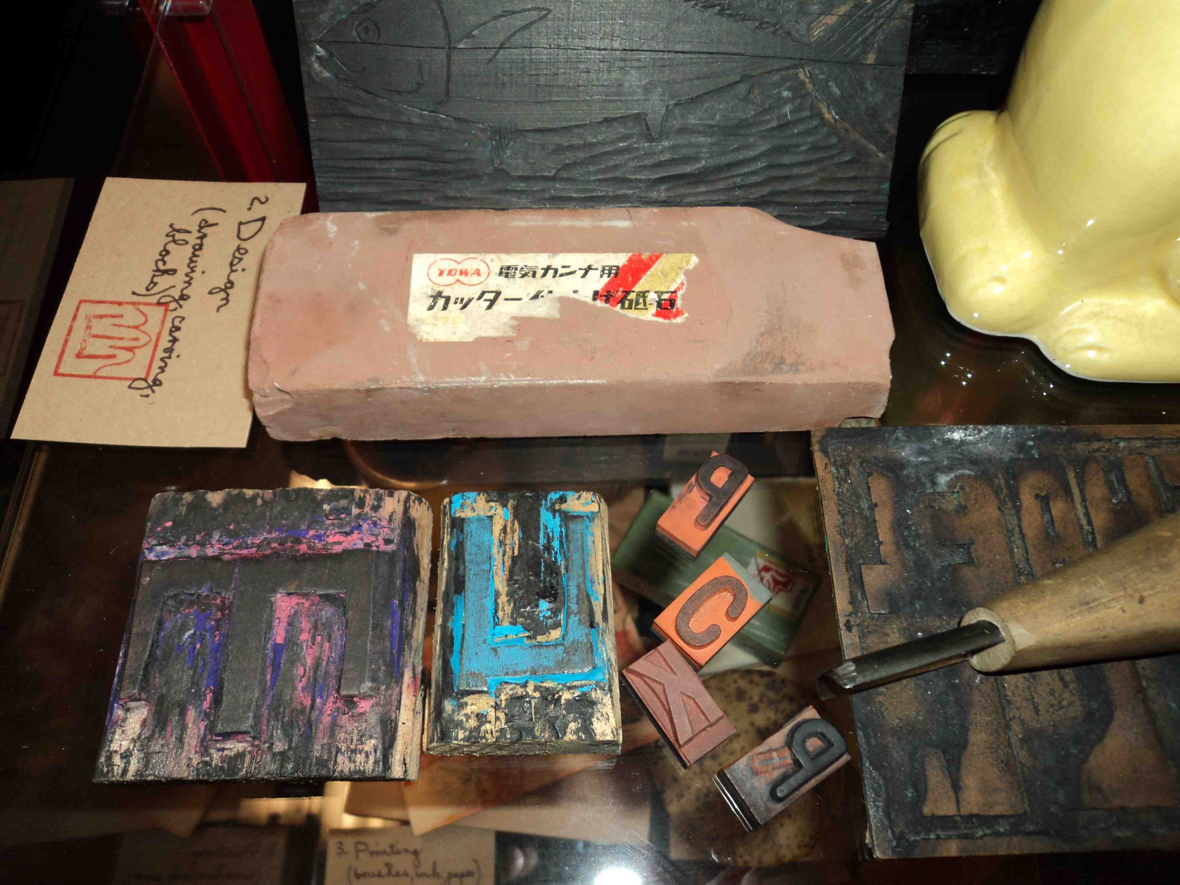
Design and production of Issue #1 of my artist book/comic…Blotting Paper: The Recollected Graphical Impressions Of Doctor Comics…involved a range of graphic techniques. These included drawing, handwriting, collage, photography, typography and printmaking. Selected production items were displayed at the launch with a description of my working method.
The first stage of the process is getting an idea. This may come from reading and research, travel, visits to galleries to look at art and objects and make sketches. One sketch book in the photo below shows a collaged image of a fictitious Japanese monster Shitake Man. Some sake also proved useful at this preliminary stage.
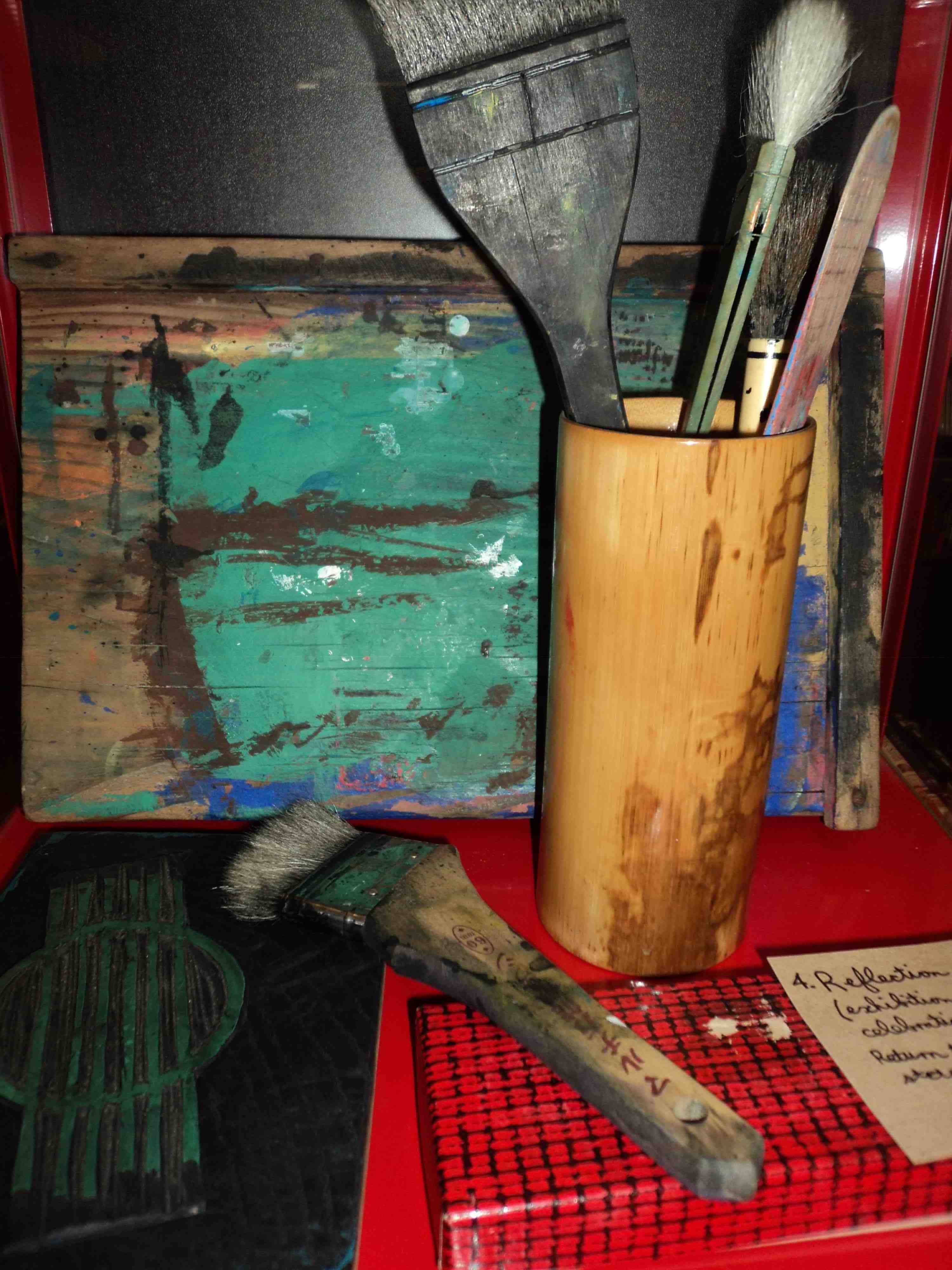
Where printmaking is involved the third stage brings out brushes, ink and paper for the printing part of the project. A baren is piece of dried bamboo that has been stretched over a board. It is used to ensure that the paper makes good contact with the inked block. The pressure applied can be varied to produce the degree of intensity of the ink. The autumn postcard print in the photo above has been constructed from 5 layers of print.
Copies of my artist book/comic…Blotting Paper: The Recollected Graphical Impressions Of Doctor Comics …are available exclusively from the launch venue Hondarake: Full Of Books till 31 May 2012. The store is located at Level 1, 465 Kent Street Sydney phone: 02 9261 5225 online shop: http://fullofbooks.com.au