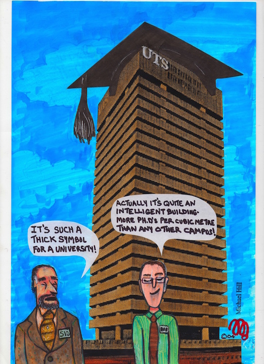
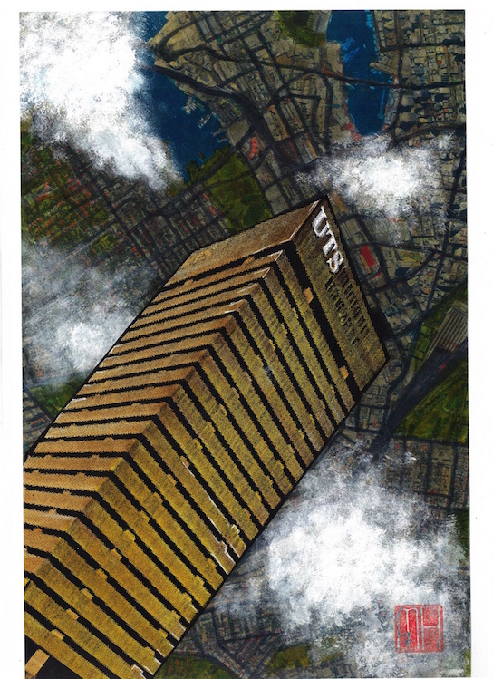
This post features the second instalment of cartoons I created during my academic tenure at the University of Technology, Sydney…and that were published in its magazine U:. These examples focus on the University’s Tower Building on Broadway near Railway Square. Labelled an example of “brutal modernism” despite its designer’s denial of it being that style…it is a monolithic stack of 27 storeys in concrete and glass… somewhat softened by the arrival of the newly constructed vertical garden clad Central Park building opposite. It was fun playing around with it as a satirical subject in these cartoons.

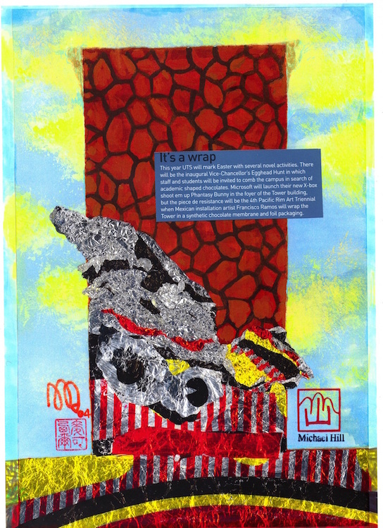
This fake story was reported as fact by one Sydney news agency!

Dr. Michael Hill (a.k.a. Doctor Comics)
©2004 Dr. Michael Hill (a.k.a. Doctor Comics)
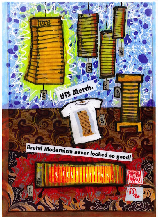
Fictitious merchandise in a non-existent shop in the foyer!…the Information Desk reported some enquiries as to the shop’s location after publication of this cartoon.

Originally I proposed using Nokia University of Technology but the sign on the tower would read NUTS! The University said “NO WAY!” to that…but the Virgin ad was O.K.!

I did an alternate version of the building relaxing on a banana lounge on Bondi Beach reading a novel…but the Vice Chancellor thought it was “A bit silly!” He preferred this one.
As always, my thanks for the excellent advice, assistance and cartooning expertise from the wonderful COUNTDOWN Magazine cartoonist, Louise Graber. Other posts of my cartoon based material include:
(All text, photos and artwork-©2016 Dr. Michael Hill a.k.a. Doctor Comics).

Lyn Brook says on May 26, 2016
Memories
LikeLike
Doctor Comics says on May 26, 2016
Indeed!
LikeLike
Kay Rodriques says on May 26, 2016
That building reminds me of the school of architecture’s building at Yale. That one, for sure, is deemed brutalist. I still am not sure if I like that style! Love your work here.
LikeLike
Doctor Comics says on May 26, 2016
Thank you Kay. I don’t know that one at Yale but I do like the link to both architecture and university.
LikeLike
Kay Rodriques says on May 26, 2016
Architect is Paul Rudolph — photo can be found here: https://en.m.wikipedia.org/wiki/File:Yale_Art_and_Architecture_Building,_October_20,_2008.jpg
LikeLike
Doctor Comics says on May 27, 2016
Thanks for the link Kay. It’s good to see Rudolph’s design. Some of the interior views of concrete columns and the vaulted atrium space are uncannily similar to the UTS building.
LikeLiked by 1 person
Kay Rodriques says on May 27, 2016
Yes, and the inside is what is truly brutal. It is not inviting and yet, there’s something to it that manages to hold your gaze. Still, you just can’t escape the architect’s ego, you know, a kind of, “Look at me! Look what i can do!” That is the feeling/part of experiencing brutalist architecture that i do no like. A little humility, please, sir!
LikeLike
Doctor Comics says on May 28, 2016
Yes in my experience of design there is often a gap between what the designer delivers and what the ‘users’ of that design expect. In the case of the UTS Tower Building for example the external rims of concrete bands on each level looked striking but from the inside the classrooms the windows were located so high that one had to stand on the chair or desk to see out of them and the view was worth the effort-you could see the sea and out to the airport and Port Botany and that was just taking two sides of the building into account. So the staff and student experience of being inside those rooms was affected by the design and possibly the engineering aspects of the building.
LikeLiked by 1 person
Kay Rodriques says on May 29, 2016
That is some picture you painted, students and faculty standing on chairs to see the view. In that case, I’d say the design was a failure!
LikeLike
Doctor Comics says on May 29, 2016
I did also hear from colleagues of a suspected and somewhat cynical client requirement and response in that the classroom layout design worked by virtue of the fact that students could more easily focus on lecturer, blackboards/whiteboards and presentation screens as they were not distracted by exterior views! But you and I would have been standing on chairs with our noses pressed up against the glass taking in the view.
LikeLiked by 1 person