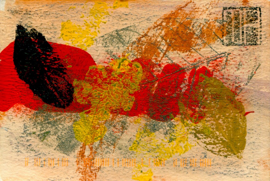
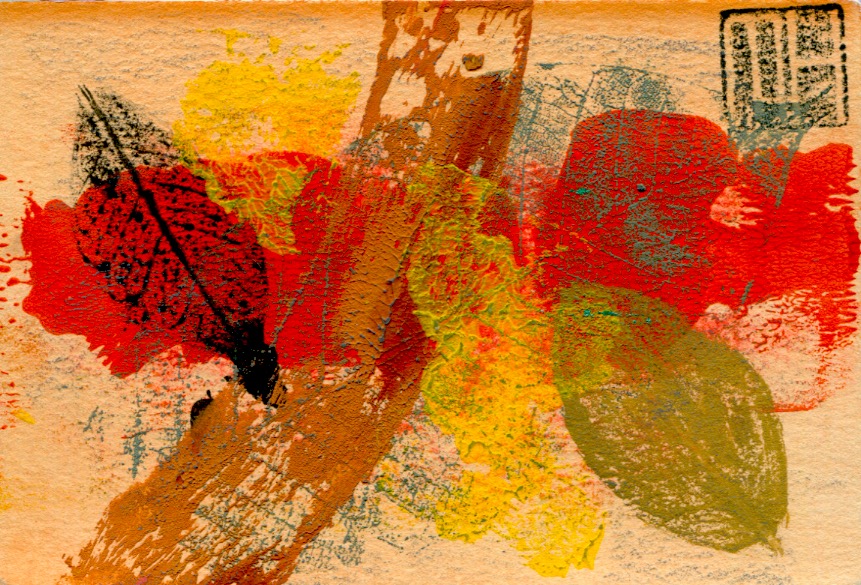
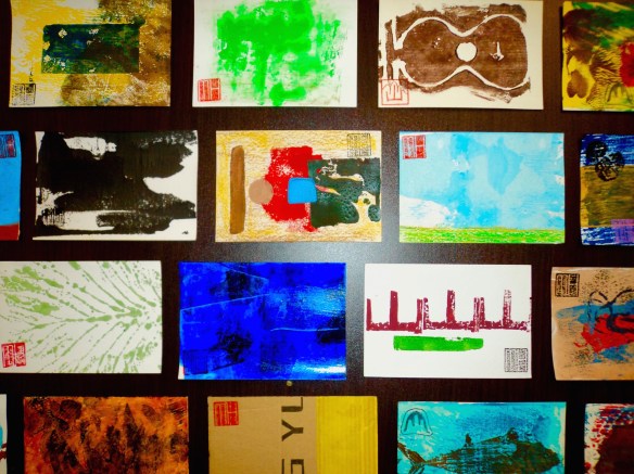
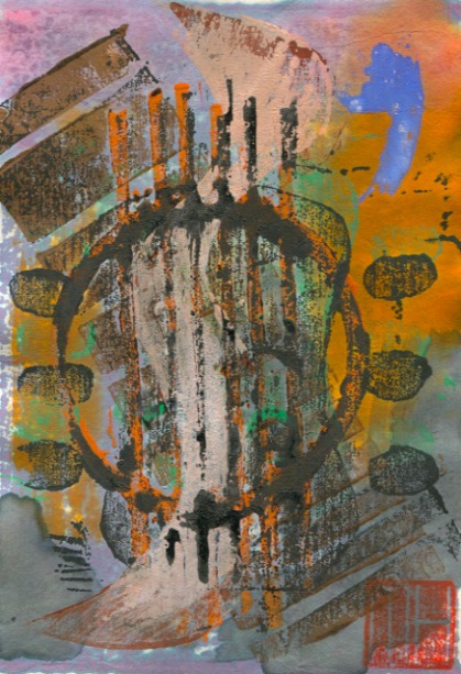
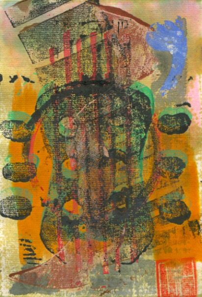
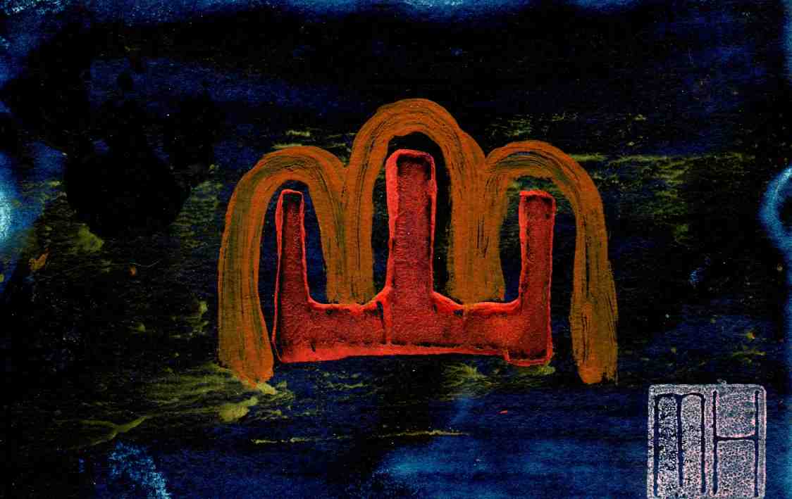
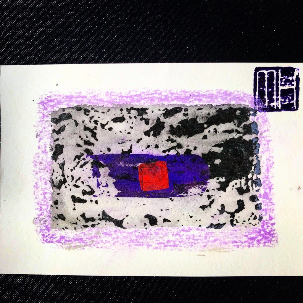
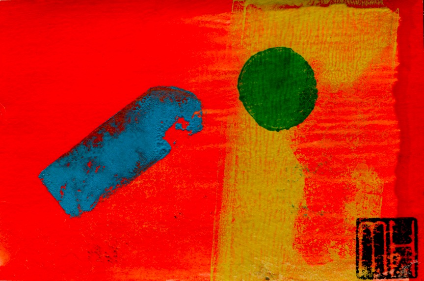
Continuing the profiling of my art postcards…here are some recent examples of on various themes. These cards are hand-printed, created from a combination of drawing and printmaking in low print run editions. Once I finished a session it meant the end of that particular batch. I would not repeat the design or reprint it. Cards in an edition are all original prints…similar in design but classified as mono prints as there are no exact duplicates. They fall within the standard postcard size dimensions of 10cm x 15cm or a near approximate. More information about this project can be found on the four previous POSTCARD posts…see the links below at the bottom of this post.
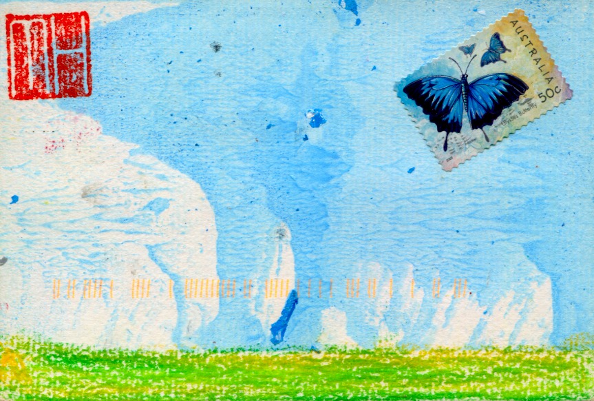
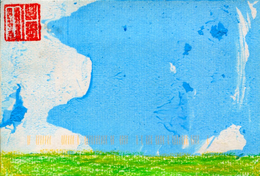
Continuing the profiling of my art postcards here are some early ones from the years 2007-2009 on the theme of The Seasons. These cards were hand-printed, created from a combination of drawing and printmaking in low print run editions. Once I finished a session it was the end of that particular batch and I would discontinue using the design. Cards in an edition are all original prints, named monoprints, i.e. the cards look similar in design and together form a series with no exact duplicates, but variations…thus the label of monoprints. The cards fall within the standard postcard size dimensions of 10cm x 15cm. The horizontal band of vertical orange print marks visible on some cards come courtesy of Australia Post…my cards were stamped on the surface with a code as part of the postal process. Consequently I began to post my cards in an envelope. More information about this project is contained on the three previous POSTCARD posts (see the links below).
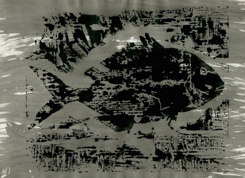
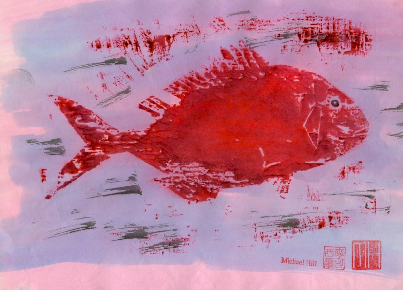
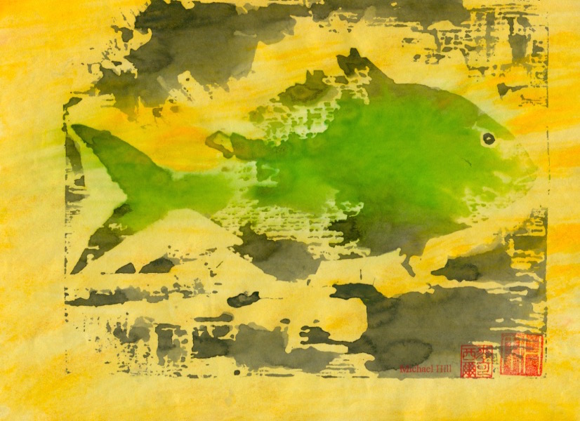
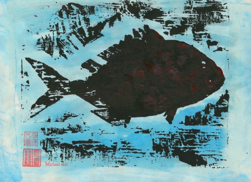
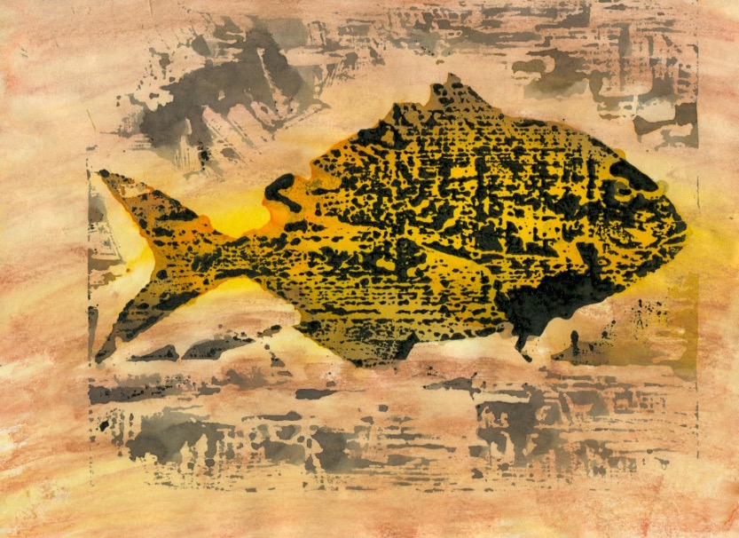
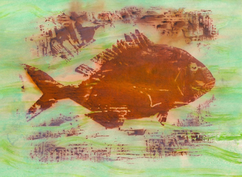
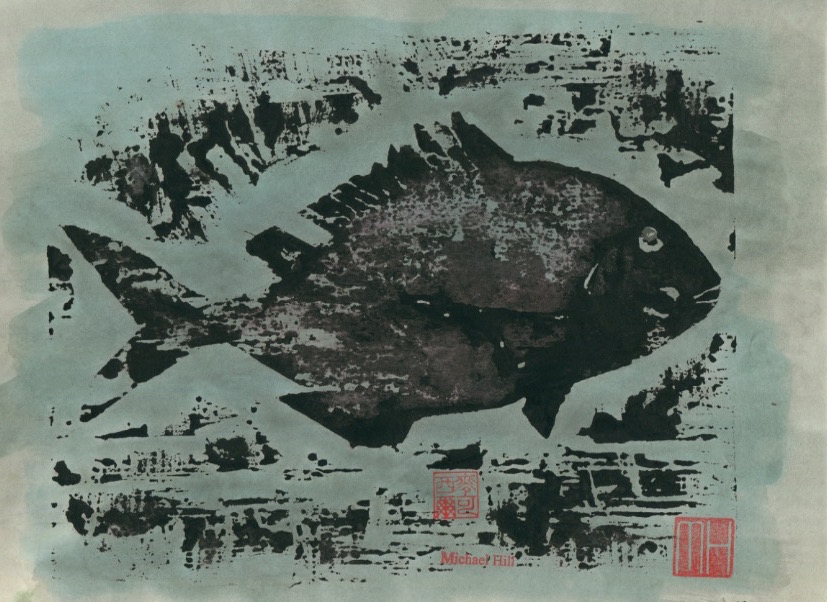
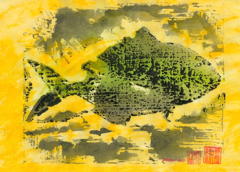
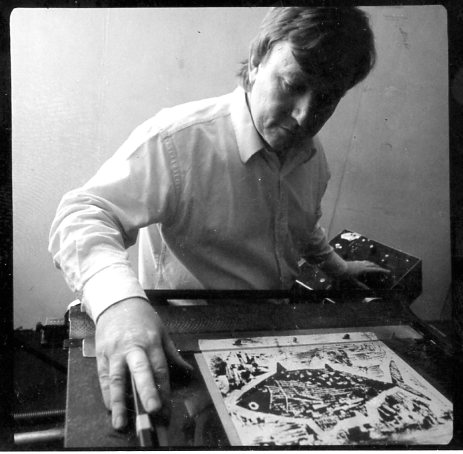
This series of posts will profile a collection of creative prints that I have made, beginning with a series of fish. I used the woodblock printmaking method with variations in inking to make monoprints so that the prints produced could also be used in animation sequences. Six species of fish were featured, the first of which is the Japanese Tai or sea bream. I was very attracted to the idea of working in both animation and printmaking at the time but found it difficult to sustain both in the available time and ultimately had to choose between the two. I found the solution in combining both mediums. Animation’s enormous need for artwork could be more speedily met by using the printmaking medium. I was doubly happy but have since settled on making comics which falls in the space located somewhere in-between and requires a lot less artwork.
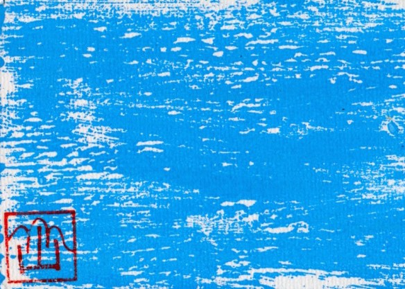
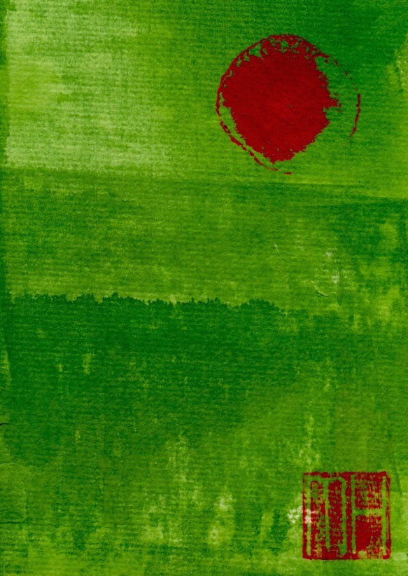
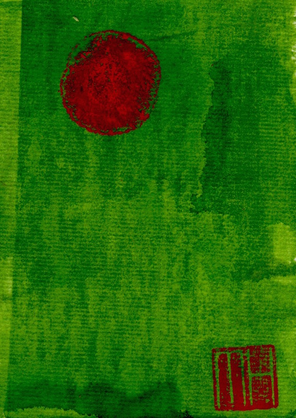
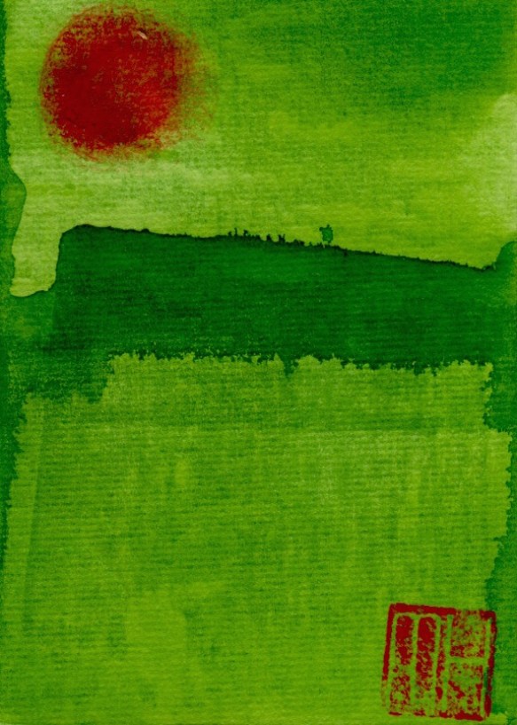
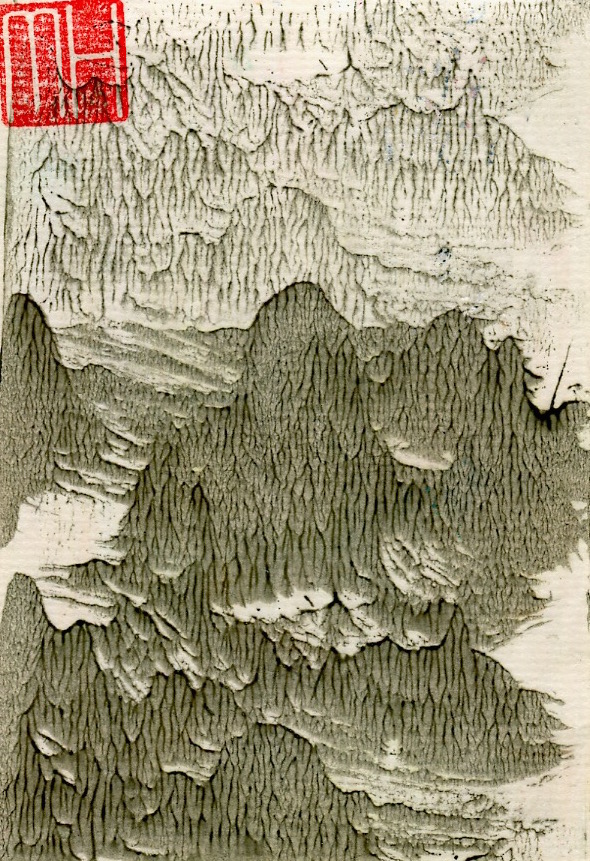
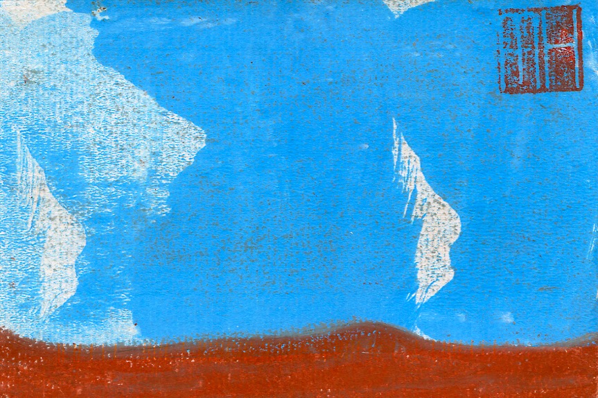
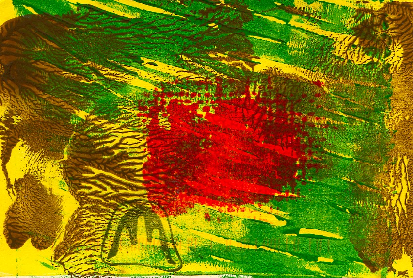
This post continues the profiling of the production of my handmade art postcards. These works were created from a combination of drawing and printmaking in small editions of 10 to 50. It must be stated that each of the cards is an original print, or monoprint…similar in design but with no exact duplicate. For example the three prints from the Landscape No. 2 edition below, whilst carrying the same title, number and technique, all bear some visual differences. My first postcard post was from the Abstract series…the postcards in this post are from the subsequent Landscape series. Some have abstract elements. With few exceptions these cards fall within the postcard size dimensions of 10cm x 15cm.
In the postcard art above I employed a restricted palette in comparison to the Landscape No.3 and No.4 cards which followed (see below in this post). These have a combination of textures that range from watery and weedy to grassy and sandy surfaces.
UPDATE MARCH 6, 2017: Below are are photos of my completed art postcards…bundled up for carting to the gallery and then spread out on a display table for sale.
Art postcards sorted and stacked for cartage to gallery. (Photo by Dr. Michael Hill)
Those cards spread across a table in the gallery for sale. (Photo by Dr. Michael Hill)
I can’t repeat often enough how much I enjoy the process of design and production of my art postcards!
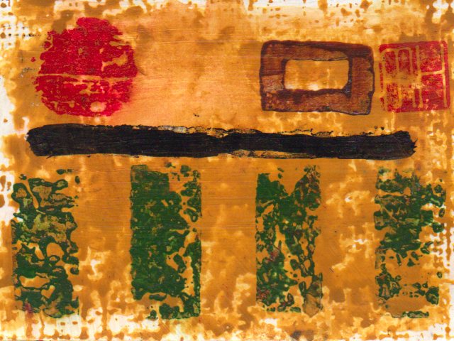
This post profiles another artistic medium that I have been printmaking in recent years. This is the design of limited edition art postcards. These are some of my earliest designs. More will be added in future posts. I hand-printed these postcards that were created from a combination of drawing and printmaking. I would make random, numbered editions of say 8, 19 or 33. A print run greater than 50 was rare. The total would be determined by the amount of blank cards, ink and time available for finishing. Once I completed a session it meant the end of that particular batch as I would not repeat the design. Cards in an edition are all original prints. These are called monoprints, so-called by being similar in design but with no exact duplicates in the batch.
The following three postcards show variations produced in the same edition. (1) the overlaid pink patch is in a different position on each card…and its shape and strength of colour vary. (2) the dragon stamp(the small curvy line) is not in the exact same position. It is on two cards but not the third. Its legs seem absent in two of the impressions. (3) the large black and yellow mass varies in colour and texture from card to card. (4) the Post Office franking machine marking is at the top, bottom or missing(only visible on reverse side of card). (5) my MH signature seal, whilst generally in the same position, is actually upside down on two of the cards…an bloody unbelievable, creative oversight! I’m sorry!
The drinking of beer, usually a bottle of stout, marked the end of an edition and celebration of completion. This was often late in the afternoon as I never seemed to print in the mornings or evenings. After a couple of years I supplemented this hand-made approach with digital printing, making copies from the scanned original. But then, lacking satisfaction…and missing the additional ink staining on my jeans, I abandoned that and returned to the hand-made printmaking process. Consequently, both my level of satisfaction and the print marks on my jeans improved, Michael.
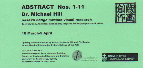
UPDATE OCTOBER 12, 2015: A selection of these art postcards have been displayed in exhibitions. The first in 2007 titled Abstract Nos. 1-11 at the DAB LAB Gallery, Faculty of Design, Architecture and Building of the University of Technology, Sydney.
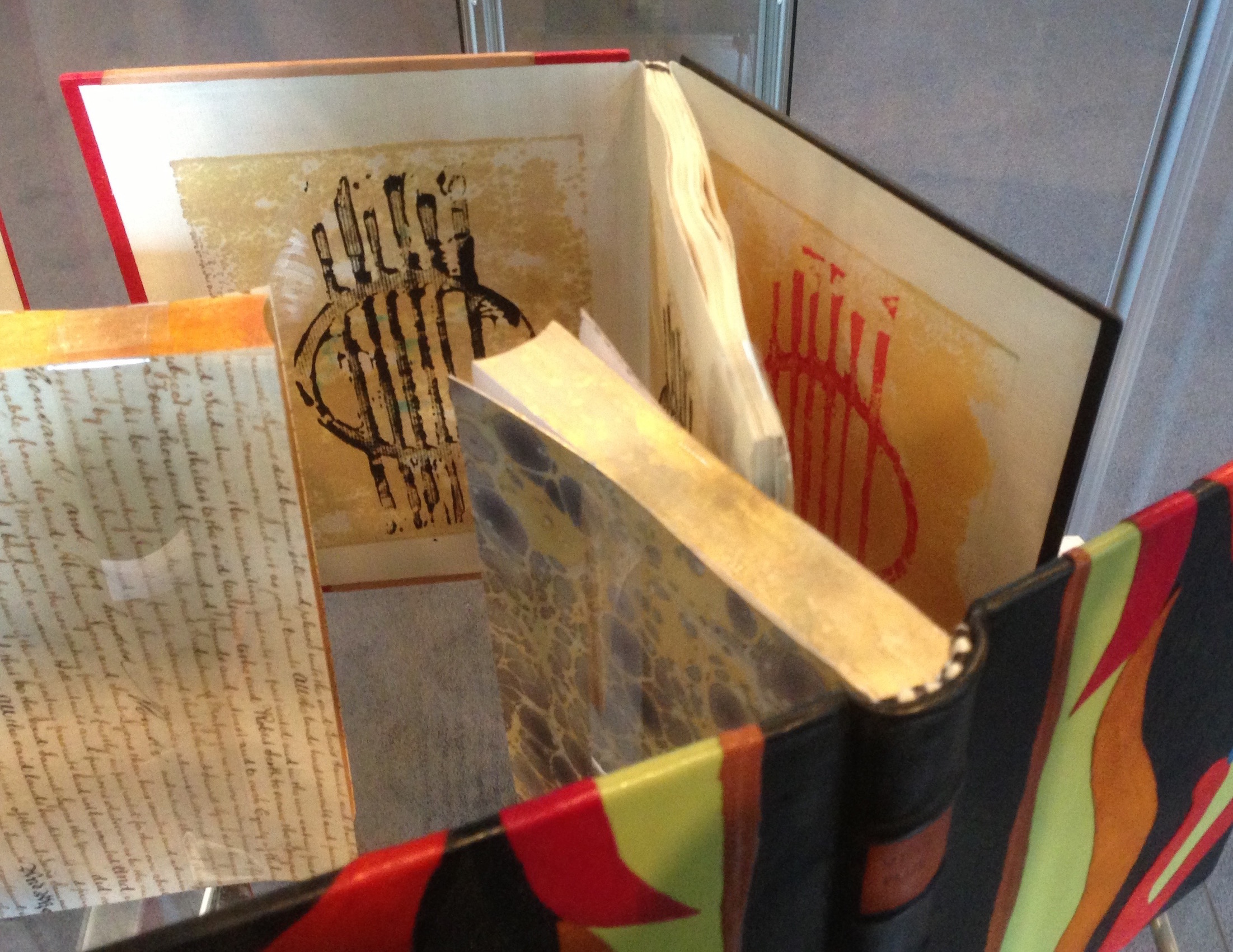
Pop-Up Postcard Exhibition by Dr. Michael Hill: Abstract Nos.1-11, DAB LAB Gallery, UTS, 2007.
Detail: Pop-Up Postcard Exhibition by Dr. Michael Hill: Abstract Nos.1-11, DAB LAB Gallery, UTS, 2007.
Exhibition flyer designed by Dr. Michael Hill a.k.a. Doctor Comics.
Reverse of ABSTRACT exhibition flyer designed by Dr. Michael Hill a.k.a. Doctor Comics.
UPDATE NOVEMBER 6, 2015: At Hondarake Full of Books in 2012…the launch of my comic Blotting Paper was accompanied by a mini exhibition of my art postcards…33 in all from 32 different designs.
An exhibition of handmade art postcards…accompanying the launch of my artist book/comic Blotting Paper at Hondarake Bookshop, February 2012 (Photo by Louise Graber).
Fukushima Kids 2013 Auction, Japan: 10 of my art postcards…each print a monoprint and thus unique…were contributed to this cause and event. The reverse side was signed and dated with my artist’s stamp. These postcards were made on machine made cardboard following the Japanese sosaku hanga method of printmaking.
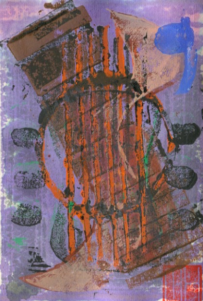
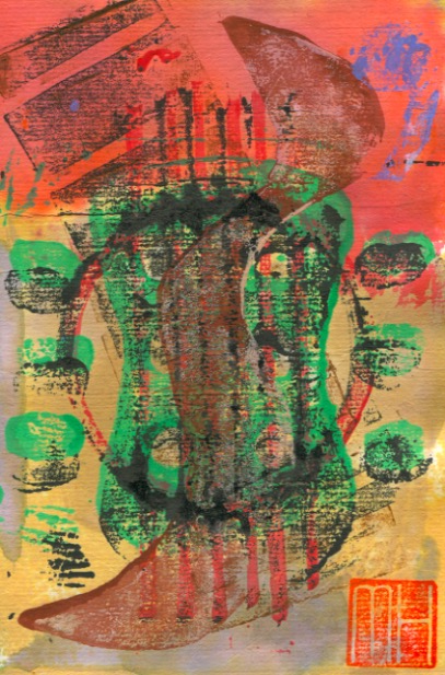
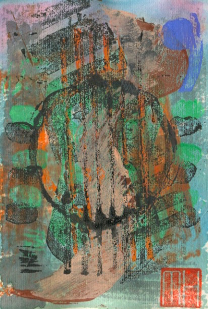
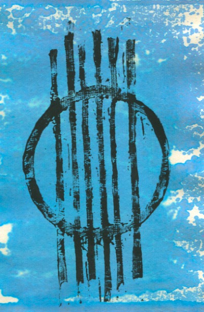
My artist book, The Grafik Guitar, has undergone a marked transformation by being bound and covered by designer Imogen Yang. This has resulted in an elegant and artistic encasing collection of the prints.
The book consists of 38 prints on the theme of deconstructing the elements of the guitar. The images were carved in lino and wood. I followed the Japanese creative print (sosaku hanga) approach using Japanese knives, gouges and chisels. The book was then printed on Chinese 2 ply paper with Dr. Ph. Martin’s water colour ink and some sumi.
Imogen emboss-printed the guitar strings block onto a strip of kangaroo skin for the front cover. Then she got me add my MH signature chop. Her use of 6 thick binding strings to the front and back cover boards echoes the guitar’s 6 strings. I can’t explain the stitching pattern she has employed to bind the pages together. As an iteration of the cover design she used my separate guitar strings prints for the endpapers.
The book is currently on display at the Art Gallery of NSW. It is part of the 16th annual exhibition of the Australian Bookbinders. The exhibition runs from 7th November to 14th December in the Research library and archive.
THE MAKING OF The Grafik Guitar ARTIST BOOK This follow-up addition to the above post shows some of the printmaking. I made 38 monoprints on the theme of the deconstruction of some elements of the acoustic guitar. These included the machine head, tuning pegs, fretboard, strings and sound hole. The separate elements were carved in lino or wood then overlaid in various combinations and intensities to form composite monoprints. The Japanese creative print method (sosaku hanga) was employed. This blocks were carved with Japanese knives and chisels. They were printed on Chinese paper with water colour ink, sumi and additional hand colouring.
I incorporated elements of that design in a subsequent project. It involved the design of the cover for publication of the conference proceedings of the international popular music studies conference. Titled CHANGING SOUNDS: New Directions And Configurations In Popular Music in Sydney, IASPM 1999. (Picture below). I also presented a research paper at that conference.
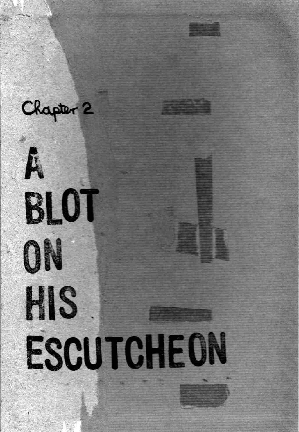
This is the first report documenting the production of the second issue of my artist book/comic…Blotting Paper: The Recollected Graphical Impressions Of Doctor Comics. The new chapter is titled A Blot on His Escutcheon. It delves deeper into the character of Doctor Comics, the environment in which he lives and his life in comics. I am making progress with this and hope to self-publish it next year. The book is partly based on my career in art and design education in Sydney. I worked within these disciplines and their application within the areas of film, video, animation and visual communication. I have employed aspects of comics art in my teaching. Storyboarding, word and image projects and as a medium in itself are examples. I have also employed it in my study and research…the presentation of lectures and conference papers…the staging of conferences, symposiums and exhibitions and the writing of a doctoral thesis. My own comic has fictive passages as well as auto-biographical elements. Printmaking is being utilised as an image-making medium. This includes the Japanese sosaku hanga method, along with pen and ink drawing, collage and found materials.
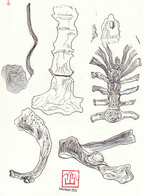
I’m currently learning to draw bones by reading the osteology chapters in anatomy books and studying the illustrations really carefully. In Chapter 1 I used fish bones as an image and as a printmaking substrate for the sosaku hanga technique. In Chapter 2 there will be drawings of human bones of the hand and foot. I have had the opportunity to study some broken bones incurred in falls from bicycles. Speaking of cyclists I also make reference to the Bookseller of Glee character.
This bookseller rides a penny farthing type of bicycle and will play a part in this issue. I had my portrait of this fine gentleman in the Glebe Sesquicentenary Art Exhibition(see below). It was also a finalist in the 2010 Bald Archy Prize. Titled The Bookseller of Glee (mixed media-drawing, painting and collage on paper)…it is a postmodern portrait of Roger Mackell, co-owner of Gleebooks (4 times Australian Bookseller of the Year). He is a generous character gleefully disseminating books and promoting the joy of reading. The portrait caricatures him and his store’s contribution to the intellectual life of Glee Village and its nearby universities. In my portrait the main street is constructed from the writings of French literary critics and philosophers…whose work the bookshop stocked in the 1980s.
The artist…Dr. Michael Hill a.k.a. Doctor Comics and his portrait of a particular Glebe bookseller. (Photo by Louise Graber)
I have been drawing more bones. In the meantime I am putting a call out for feedback on this post. I would really love to hear what you think of what I am doing with my blog and bones.
Good news for me! The first issue of my comic Blotting Paper: The Recollected Graphical Impressions Of Doctor Comics is to be published…in a signed, limited edition. Scheduled for 11 February 2012 at HONDARAKE Full of Books in Sydney (details in the poster below). The comic will be launched by my friend and colleague Gene Kannenberg, Jr. via a Skype link from the U.S.A. Kannenberg, a noted comics historian, is the director of ComicsResearch.org. He is former Chair of the International Comic Arts Festival…and the Comic Art & Comics Area of the Popular Culture Association…and he has written widely on comics art including the book “500 Essential Graphic Novels.”
Poster designed by Louise Graber incorporating original print by Dr. Michael Hill a.k.a. Doctor Comics.
The launch will be accompanied by an exhibition of 33 of my handmade art postcards. These have been produced following the sosaku hanga ‘creative print’ style. This method originated in a movement that emerged just over a century ago in Tokyo. Creative prints became the voice of a group of artists who went under the name Pan. They met for sake parties by the Sumida River. It was the centre of the Floating World of old Edo and site of the classic Ukiyo-e print movement. James Michener wrote: “…in contrast to the classical system in which the artist merely designed the print, leaving the carving of the blocks to one technician and the printing to another, the newer print artists preached that the artist himself must do the designing, carving and printing. A new term was devised to describe such a print-sosaku hanga, meaning “creative print.” ” (Michener, 1968: The Modern Japanese Print p.11). I follow this method in my printmaking.
Above is a collage of 4 separate pen and ink/felt-tipped pen drawings. These separate drawings have been collaged together: (1) Sydney Harbour Bridge. (2) rear view of Doctor Comics walking (3) hand holding bag (4) hand inserting key in door. These drawings will be included in the first issue of the comic. The drawings are from different pages in the comic but have been brought together in this collage…and have been overlaid in the same graphic space. This grouping forms a visual sign or motif for promotion of the comic. I would love to read feedback on this and my other posts.
Last month I spent a wonderfully productive week in Fiji…on behalf of the Japanese Embassy and the Japan Foundation in Sydney…to present a lecture and workshop at the School of Arts, Language and Media, University of the South Pacific. I also introduced films at an Anime festival held there. It was part of Japan Culture Week 2011 in Suva, the capital city on the largest of the 300 islands. It seemed like an act of cultural colonisation…with the raising of the Anime and Manga flags and the flying of their colours on Treasure Island…creating a little Anime and Manga paradise in the Pacific Ocean.
Dr. Michael Hill at the University of the South Pacific in Fiji…presenting a slide lecture for the Japan Foundation on the global spread of Japanese pop culture in the 1980s. (Photo by Louise Graber)
My lecture titled Up In The Air: Anime’s Journey To The Stars described the global success of Japanese animation…and its rise to prominence both in the film world and in popular culture. It covered the work of Osamu Tezuka and its international success. It also referred to Rintaro’s involvement with him as an animation director on Astro Boy…prior to his subsequent productions that included his Tezuka homage film Metropolis…his adaption of Leiji Matsumoto’s manga Galaxy Express 999, and of Sanpei Shirato’s manga The Dagger of Kamui. Describing Shirato’s beginnings as a kamishibai artist…before moving to manga and the alternative publication GARO…the lecture included anecdotes from my time as a lecturer at Sydney College of the Arts…and the University of Technology, Sydney where I observed the growing interest of students in Japanese popular culture. They became fascinated with manga, Anime, cosplay, fashion,…J-Pop, scanlations, computer games…cameras, turntables, TV game shows,…food and fashion, not to mention learning Japanese and visiting Tokyo. The lecture concluded with an analysis of the productions…and the rise to prominence of Hayao Miyazaki and Studio Ghibli…who, like Tezuka, found both both an international audience and critical acclaim.
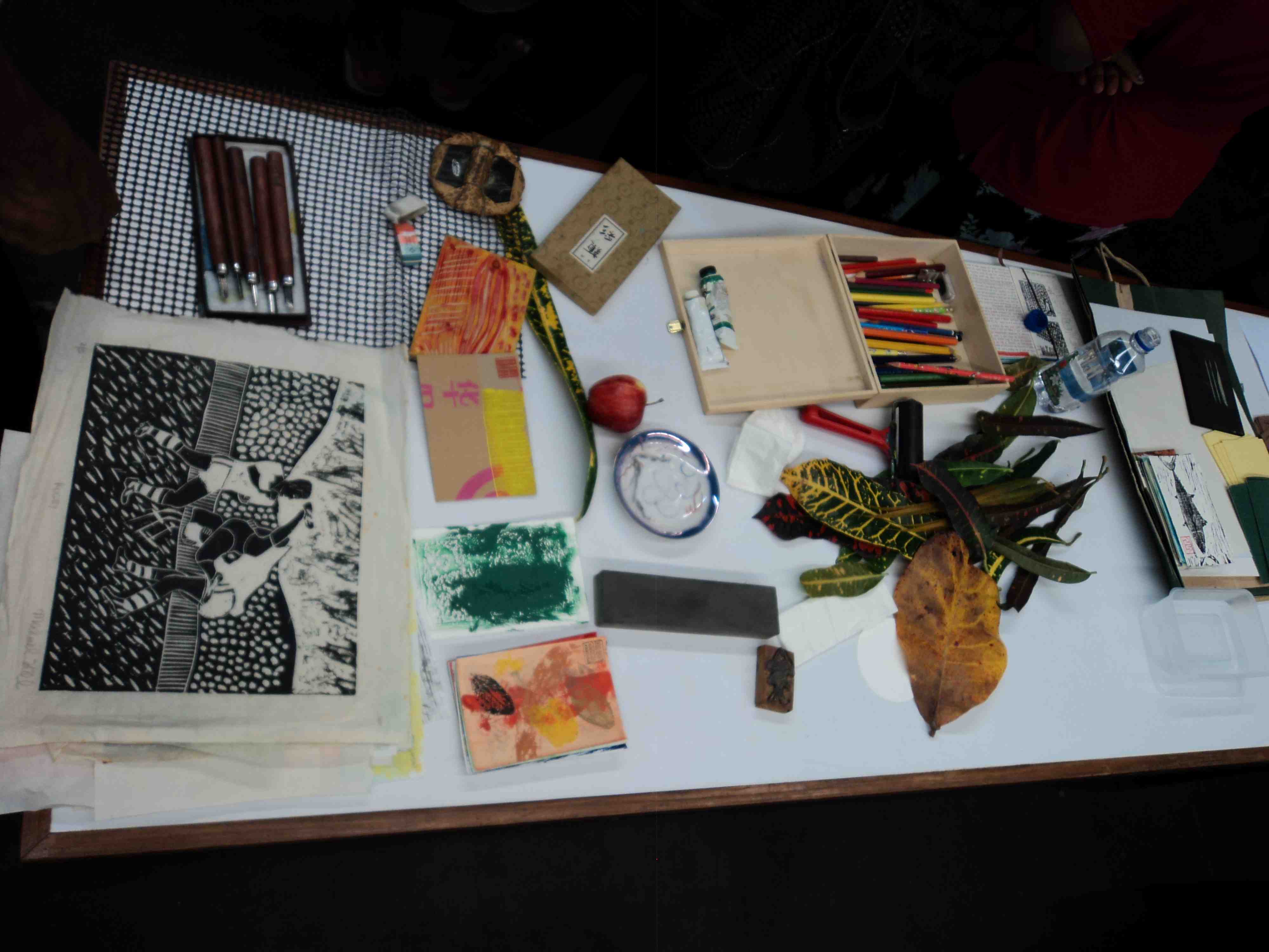
The tools and materials for the printmaking workshop. My Rugby woodblock print is on the table alongside some of my art postcards and printmaking tools. (Photo by Louise Graber)
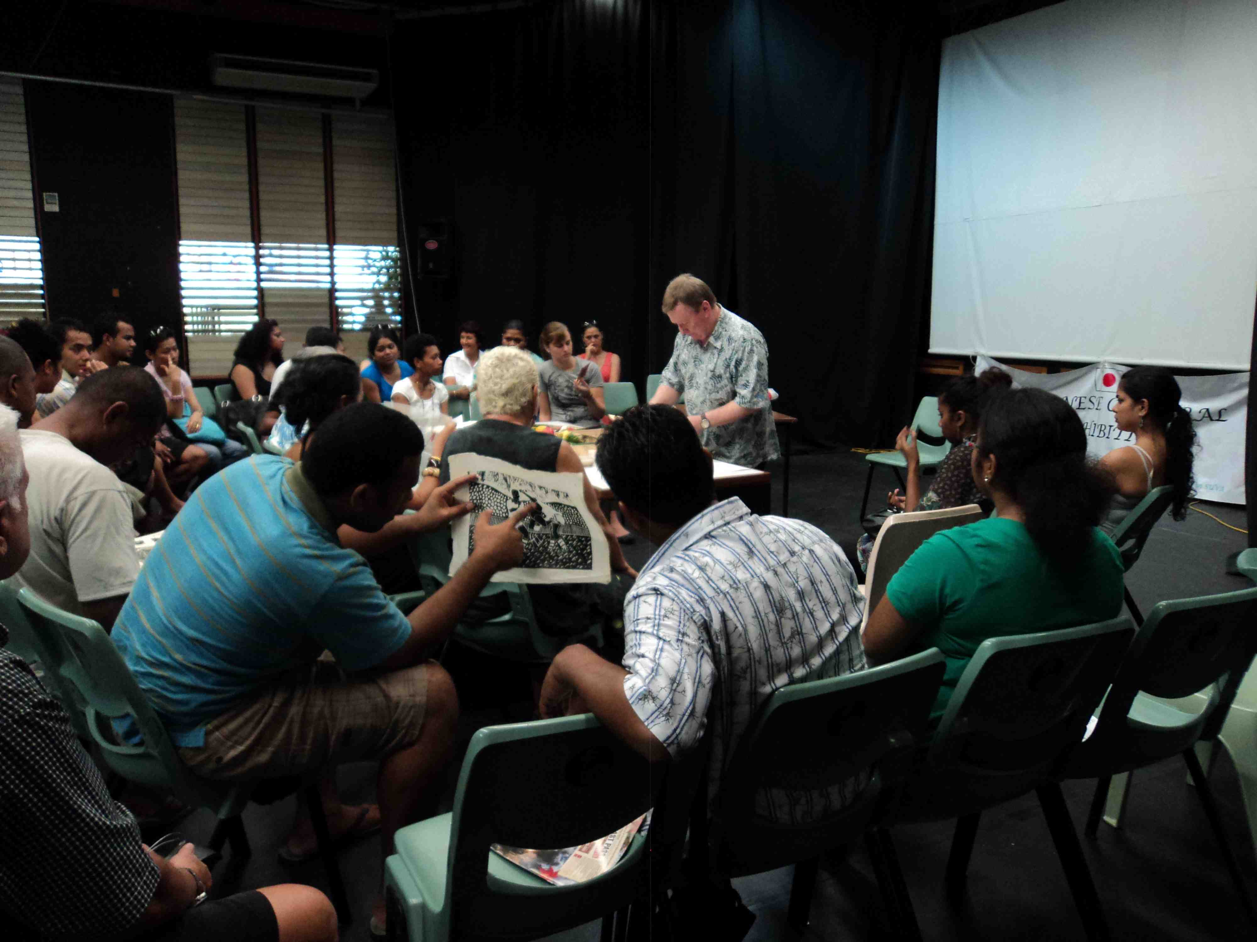
In addition to the theory lecture I presented a practical arts workshop…demonstrating the printmaking technique I had developed as part of my artistic practice. Based on the Japanese creative print movement Sosaku Hanga,…and the work of Koshiro Onchi and Shiko Munakata in particular. I showed examples of my work that had been made using this approach and methodology…and applied to my prints, postcards, T-shirts and comics.
Dr. Michael Hill teaching printmaking techniques to students of the University of the South Pacific. In the foreground his Rugby themed woodblock print is being studied. (Photo by Louise Graber)
After the demonstration the students had the opportunity to make their own prints. By chance, the cultural activities took place in the same week as the Rugby World Cup finals…and the only paint colours to hand were those of the Wallabies, yellow and green. My own rugby woodblock print (being passed around the class, in the photos above) provided some amusement and interest.
The ‘sosaku hanga’ creative printmaking workshop. (Photo by Louise Graber)
Downtown, on the roof of the Village Cinema complex Batman and Spiderman look down…intrigued at the sight of people going in to see the Ninja super hero Kamui. It was here that the Anime Film Festival was held each evening. Films screened included Galaxy Express 999…The Dagger of Kamui…Laputa: Castle in the Sky and The Girl Who Leapt Through Time. Anime is now a fixed part of the Japanese cultural coat of arms…emblematic of the country’s long history of graphic arts which feeds into and nurtures both Anime and manga. The week long festival of Anime films and supporting cultural events was an alternative offering to American movies…and helped spread Japanese popular culture in the South Pacific.
Village Cinema Centre, Suva, with superhero cinema on the screens. (Photo by Louise Graber)
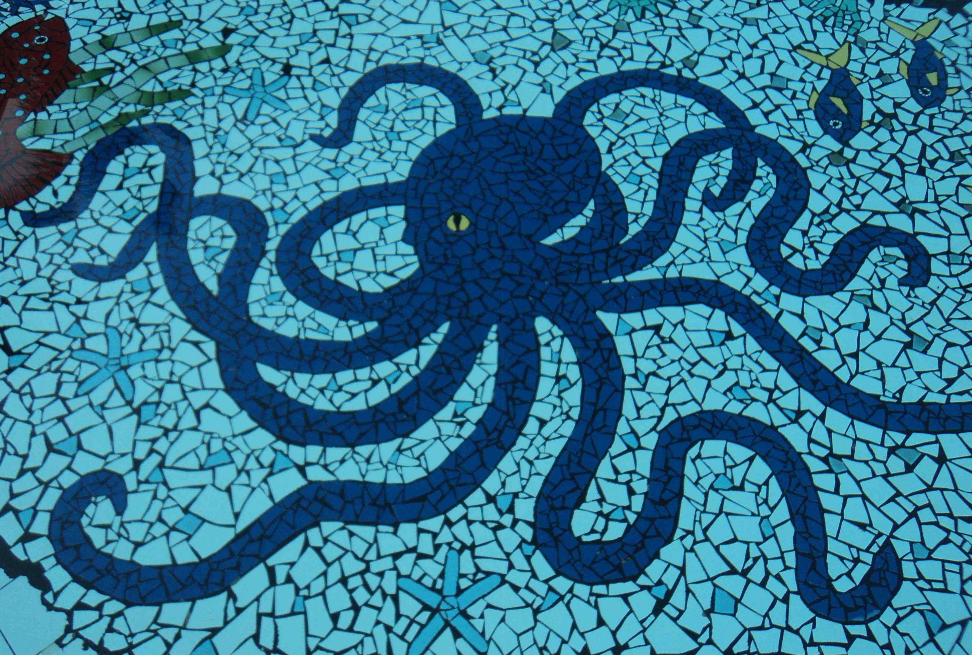
At the bottom of the hotel pool in Nadi, the elegant octopus tile design. (Photo by Louise Graber)
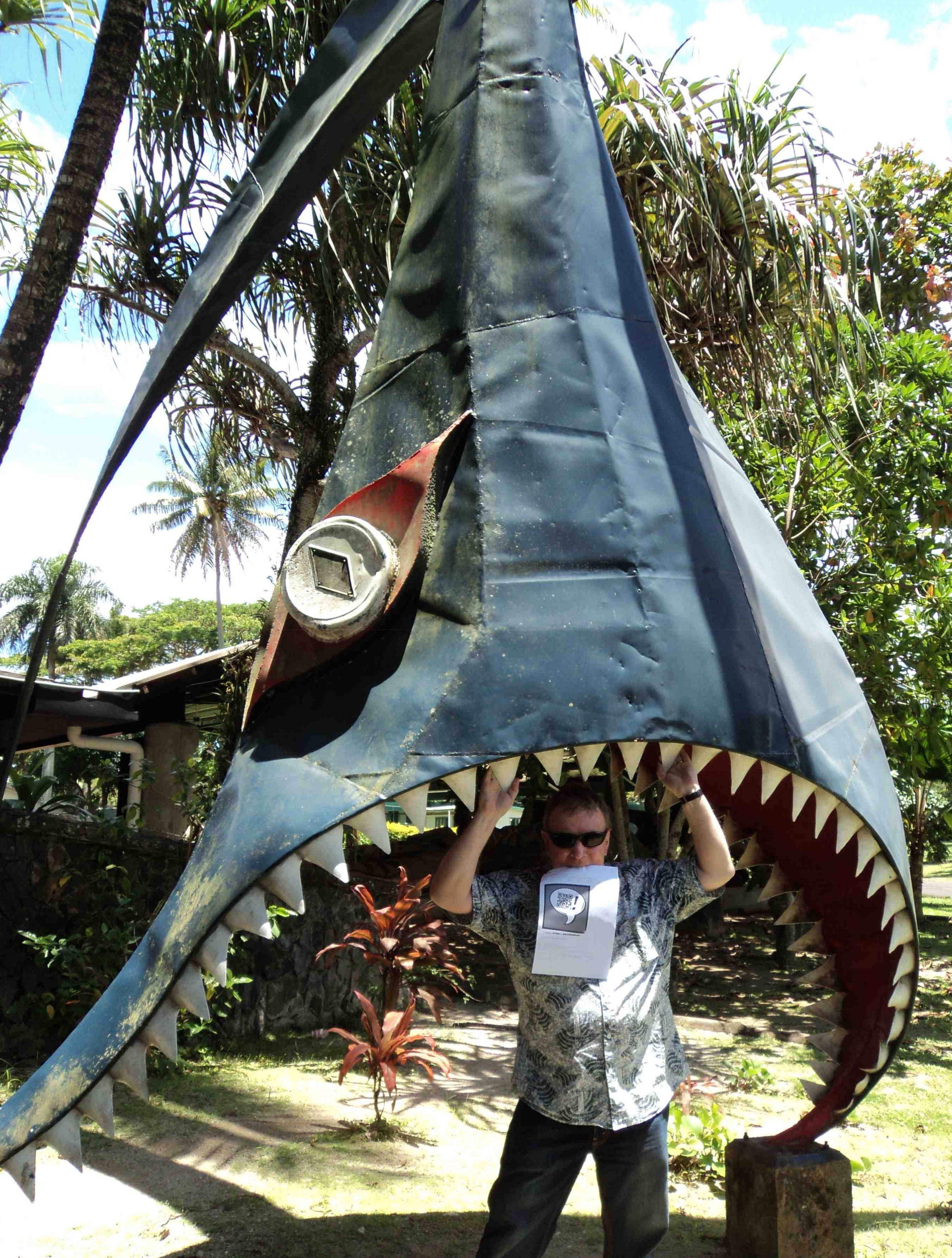
Dr. Michael Hill a.k.a. Doctor Comics playfully poses in shark jaws at the University of the South Pacific in 2011. (Photo by Louise Graber)
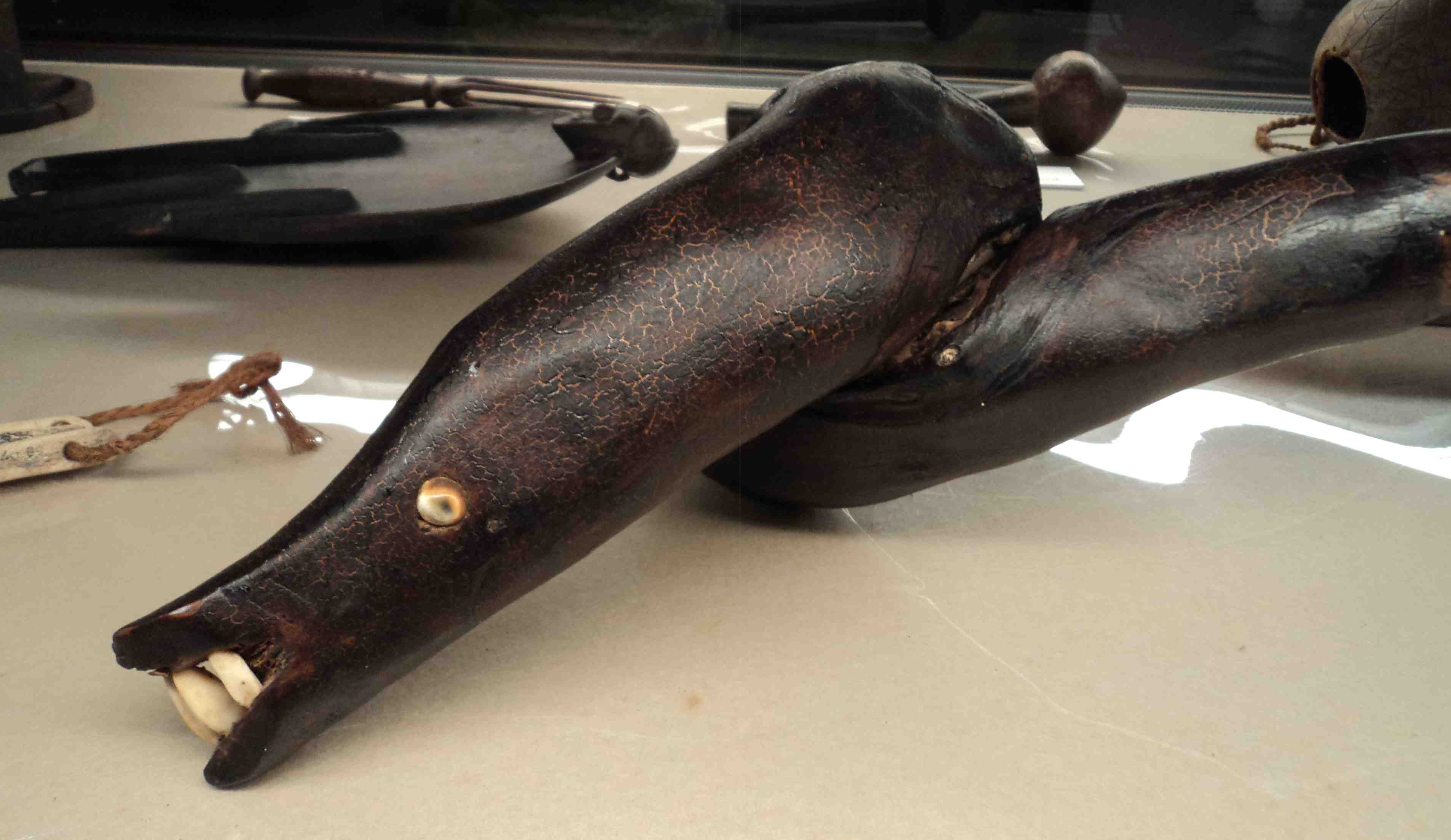
In the Fiji Museum in Suva, the Eel God sacred club. (Photo by Louise Graber)
In addition to my admiration of the octopus and various fish I am also a fan of the eel. During my Fiji visit I was pleased to find that the eel had acquired the status of a deity…and a creative one at that…in Melanesian mythology. Below is an artwork I had created, featuring eels once found in the Parramatta River near Blacktown in Sydney.
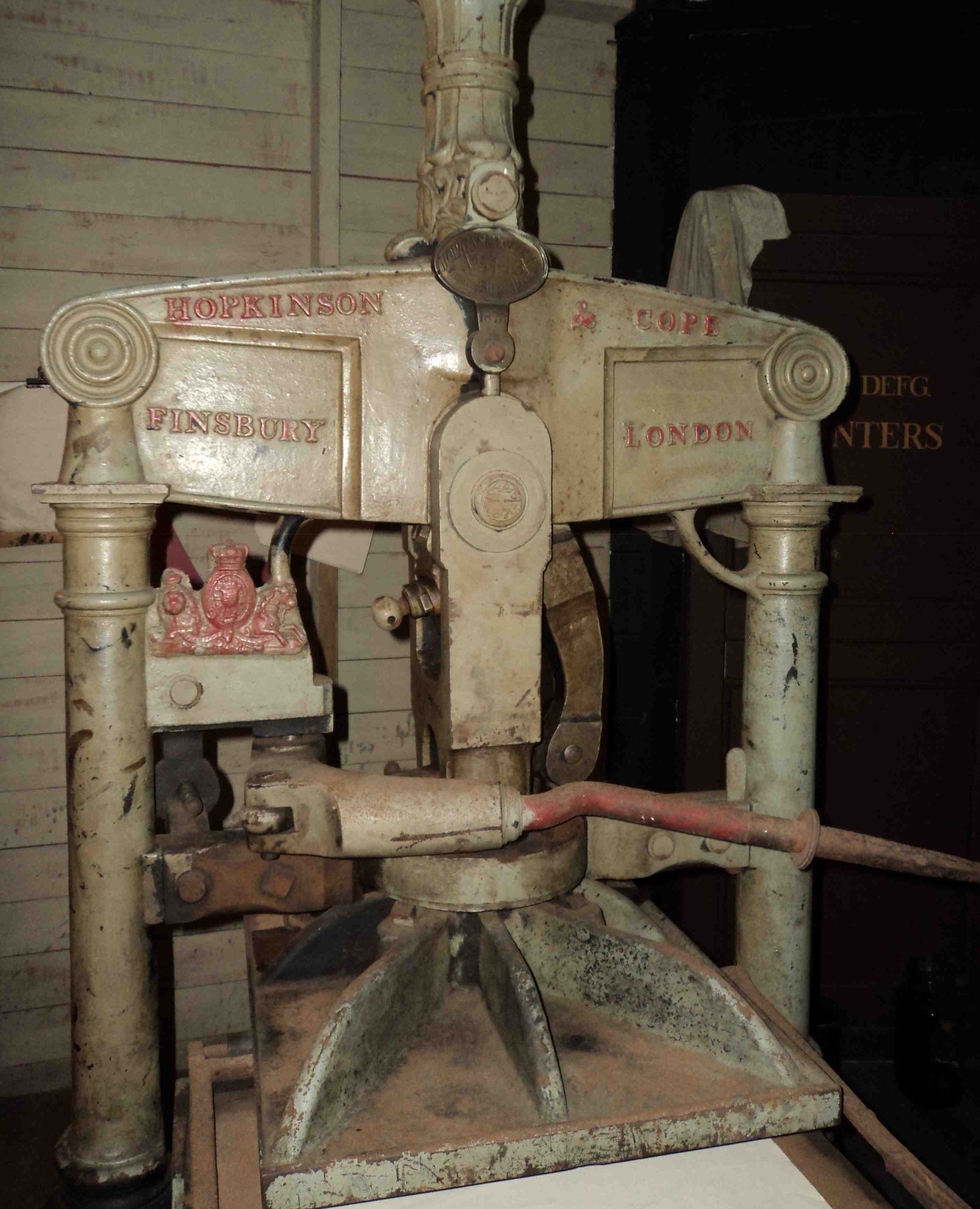
Another treasure inside the Fiji Museum was this old metal Hopkinson & Cope printing press…imported from England in earlier days. At my printmaking workshop in Suva I demonstrated an alternative, Japanese method…that employs one’s body weight as a press instead of a device such as this.
Old metal, pre-digital printing press. (Photo by Louise Graber)
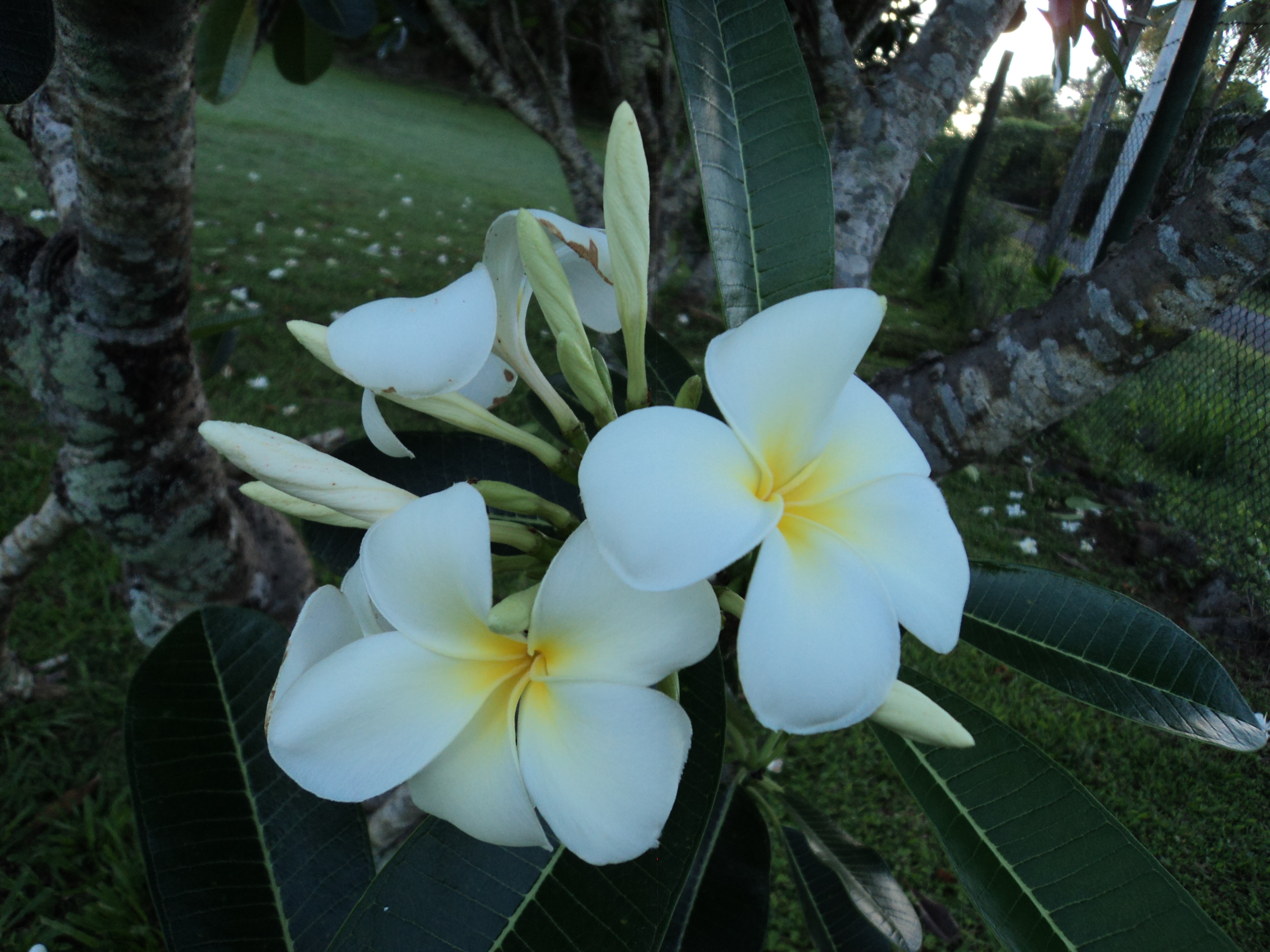
On this “Treasure Island”…in addition to the art and marine life…there were collections of coconuts, palm trees and flowers including red hibiscus and white frangipani.
An example of the abundant frangipani presence on the island. (Photo by Louise Graber)
Many thanks to Sayuri Tokuman and Susan Yamaguchi of the Japanese Studies & Intellectual Exchange Department…and Tokiko Kiyota, Director of the Japan Foundation in Sydney…and to Nobuko Iwatani, Mako Nakauchi and Mele of the Embassy of Japan in Fiji..and His Excellency Yutaka Yoshizawa, Ambassador of Japan, for their ideas, assistance and support with this project.
INVITATION: Please respond to this post if you would like to make a comment…or suggest topics for future posting. Being new to blogging I would love to hear any feedback about my posts. Are they too long?…have too many images?…or too much text?…or there are too many of them?…or not enough? Michael.
This is the first post documenting the production and progress of my own creative comics project. After studying and researching comics for the past few years…and reading them since I was seven…I have now decided to have a go at making my own. I have more experience of researching comics than producing them. In fact I gained a Ph.D. for my research into comics. That is where I picked up the “Doctor Comics” tag. Then I decided to write some blog posts on the topic…and that led to the decision to create my own comic. The title of my comic is Blotting Paper: The Recollected Graphical Impressions Of Doctor Comics. My research into comics art is now being followed by the creation of it…in a self-reflective approach. I like the juxtaposition of research and production although it may prove difficult to balance. We will see. Please let me know what you think of my efforts. I expect that my comic will be partly autobiographical and partly fictive. It will include comics art related events from my academic career…and my attempts to carry the comics flag in art and design tertiary education. There will be anecdotes relating to my Doctor Comics’s adventures and to my own longstanding interest in comics art studies.
Following a few false starts the first chapter has been written, the design roughed out and the artwork constructed. My experience in printmaking was employed in the generation of some of the graphic work. Techniques included woodblock, linocut and Japanese sosaku hanga techniques along with the use of rubber stamps and seals. Printmaking has also shaped the title of the comic, namely Blotting Paper. It suggests the sometimes messy outcome of shaping words and images in ink on paper…and the latter’s absorption and rejection of it. It is a process where things can get messy at times…but I enjoy the appearance of inkblots and stains and attempts to resolve graphic issues arising from it. Drawing, photography, typography, collage and handwriting have all been utilised as image-making techniques. My intention is to construct a free form, creative comic in an artist’s book format. I really enjoy the process of printmaking…including its potential to produce variations on a theme e.g. unexpected blots, streaks and stains. I would also like to acknowledge of how I first learned it. That was at Sydney College of the Arts whilst working in the Film and Video department of the Design School. I was approached by a fellow academic from the Art School who wanted to learn animation. So we arranged a swap deal. If I taught her basic animation techniques she would introduce me to the art of printmaking. That sounded interesting and it worked like a charm. I fell under the printmaking spell. In fact, I’m still under it!
I am how much more time it takes to create a comic than to read or review one…but I am enjoying the creative and technical challenges. I now expect I shall be spending more time creating and less time critiquing comics art in the future. I have since altered the order of emphasis in my social media profile…from ‘critiquing and creating’ to ‘creating and critiquing!’
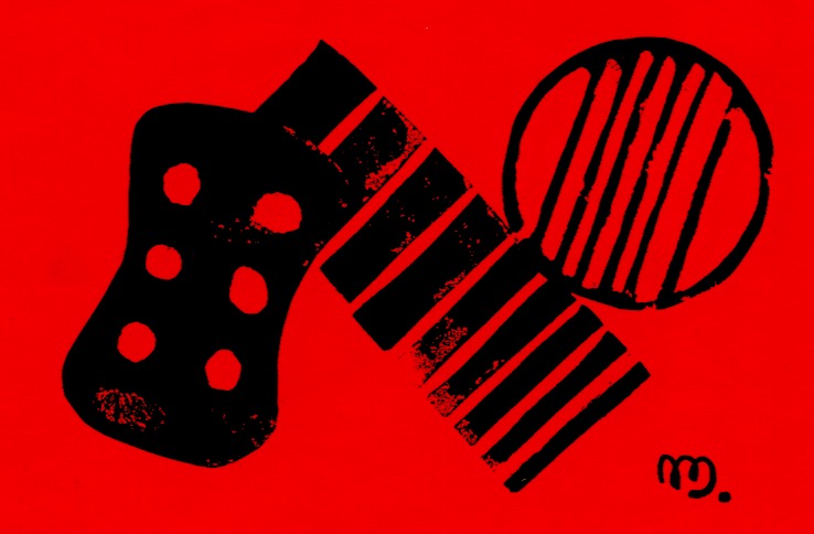
Accompanying the Doctor Comics character in the comic are his cats, Busch and Cohl. They not only live with him and keep him company but they also read his comics and critique them! Being talking cats they also give him feedback, advising him in a critical manner, of his skills, shortcomings and selections. These comics reading cats are a seeming contrast to him…although their characters are still being designed. One possible design is the Red Cat above. Future posts will document the graphic resolution of this matter.
Well that’s the third post on my blog…three weeks since the last one…smaller in size…and the first one dealing with my own developing creative project. I think I’m starting to get the hang of it. Thanks for the feedback I have received…I welcome any comments about my blog and my comics project. Here’s to comics art, Michael.