This previously published post has been re-edited and transferred to this newly added RESEARCHING COMICS ART series. It documents articles and items from my comics art library research collection. This particular post focuses on Hergé and his creation Tintin. I have collected and read a complete edition of the albums, including the unfinished final one. I also have a copy of the Tintin magazine Le Journal Des Jeunes De 7 A 77 Ans. I have viewed the complete Adventures of TINTIN DVD set. My bande dessinée franco-belge exhibition review has been included in this post (see below). I have also acquired a few items of clothing related to the character. In my experience as a researcher, it is always useful to approach one’s subject with an open, playful attitude.

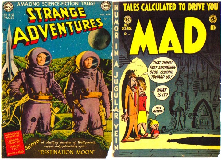
The Adventures of Tintin albums…24 in all including the unfinished final one, were executed in the ligne clair (clear line) drawing style. This was developed by Hergé and his colleague and collaborator Edgar Pierre Jacobs. I missed the opportunity to read these as a child. Two kind aunties occasionaly bought me American comics by Carl Barks and Hank Ketcham and “boys papers” from England. These included The Eagle with a Dan Dare feature story on the cover that inspired my interest in Space travel…plus a The Adventures Of Tintin episode in the centre-spread. Another weekly they bought me, TIGER and Hurricane, with a Roy of the Rovers episode, started my love of football. My father read the occasional war and western comics and the comics lift-out section of the Sunday Mail newspaper. That was when my interest in comics really began to develop. I found it a fascinating form of storytelling, combining writing and drawing.
My English lessons at Primary School and later in Secondary college prioritised words in reading rather than accompanying illustrations…although maps always seemed to be given at least a cursory glance. Consequently, when I started reading comics I automatically read and prioritised the captions and word balloons…before proceeding to look at the drawings. Sometimes I even skipped from panel to panel following the text and only cursorily scanning the images. It took me a years to unlearn this ‘upside down’ approach…and alter the balance of attention between words and images! Ultimately I learned to look at a comics page and individual panels holistically…one that included both image and text, sometimes even obtaining a degree of simultaneity. As a result my English language skills dropped a little, however, my art skills blossomed. Neither the Dominican nuns nor the Christian Brothers who taught me offered Art as a subject in their curriculums…so I was largely left to learn it by myself.
I had an uncle who read Western comics. He could also draw horses, hats and guns…and he taught me basic sketching, done quickly with a pencil. Once I started I practiced a lot. I made nuns cry in Primary School with my art…a sketch of Saint Therese rising up to Heaven as “the little flower.” It was for an essay and not expected to have any accompanying illustrations. My submission was 95% art with an accompanying paragraph. This response gave me some odd feeling of encouragement about my art…to think that I could make nuns cry! It also occurred to me that art was valued as the nuns took my drawing and never returned it! Somewhat surprisingly, I was awarded the Religious Studies prize that year…much to the dismay of the dux of the class who topped every other subject!
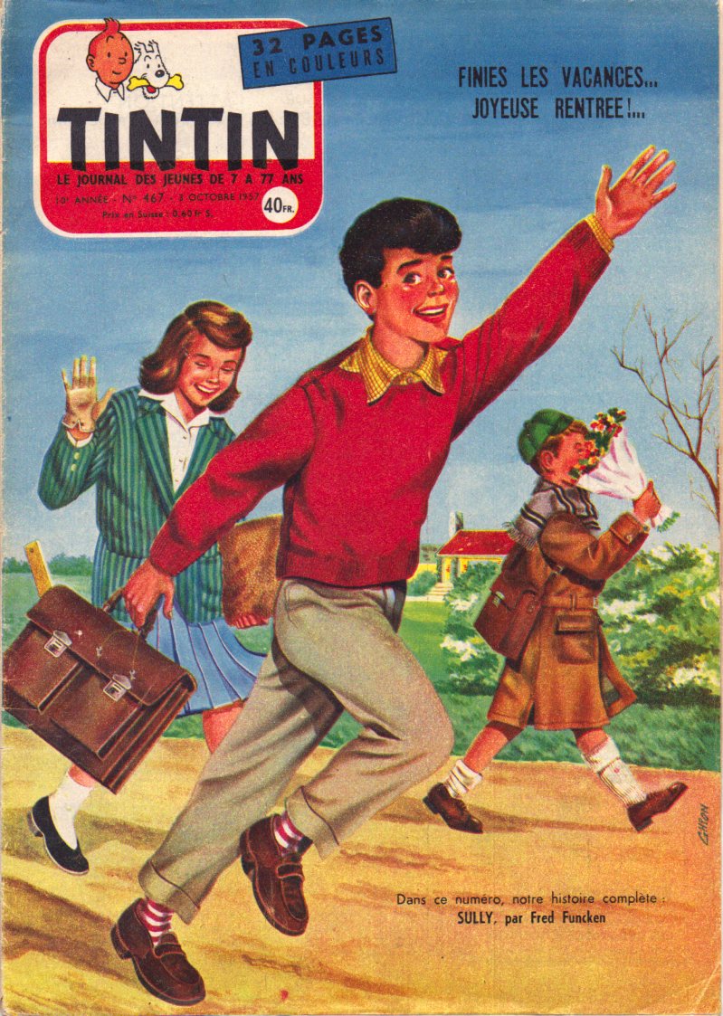
I didn’t actually discover Tintin until adolescence. That was when the English translations had been published. I also began to find the odd volume in libraries. They were actually the first comics that I found in libraries. That sounds surprising but in the 1960s librarians seemed reluctant to have comics in library collections…although they seemed to made an exception in the case of Tintin. They didn’t admit that they were actually comics. Instead these were referred to as European narrative, pictorial albums. They were foreign and published in hardcover editions rather than the soft, pamphlet form of North American comics…so they seemed more like books than comics…and so were suitable for library collections.
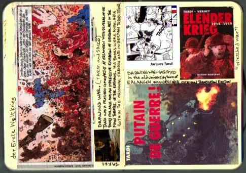
And they were really popular! Students read and borrowed them to the extent that it was often difficult to find them on the library shelves. Following tertiary study and research and I collected and read all of the Tintin comics…admiring their beautifully printed colour drawings…their adventures in unfamiliar geography…the amusing babble from Captain Haddock…and the entertainment provided by the surprising amount of slapstick. These elements combined to further my appreciation of bande dessinée and the Ninth Art. That was consolidated and extended in subsequent years as I admired Hergé’s comics art skill…and finally found myself looking at the illustrations before reading the word balloons. The adoption of my Doctor Comics persona followed. It was later that I became aware of unresolved, racist allegations against Hergé that possibly impacted on his creative work. Some of my Tintin related acquisitions are displayed in this post…along with a copy of the published review that I wrote of a Tintin themed art exhibition in Sydney.
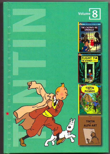
Volume 8 of the TINTIN series.

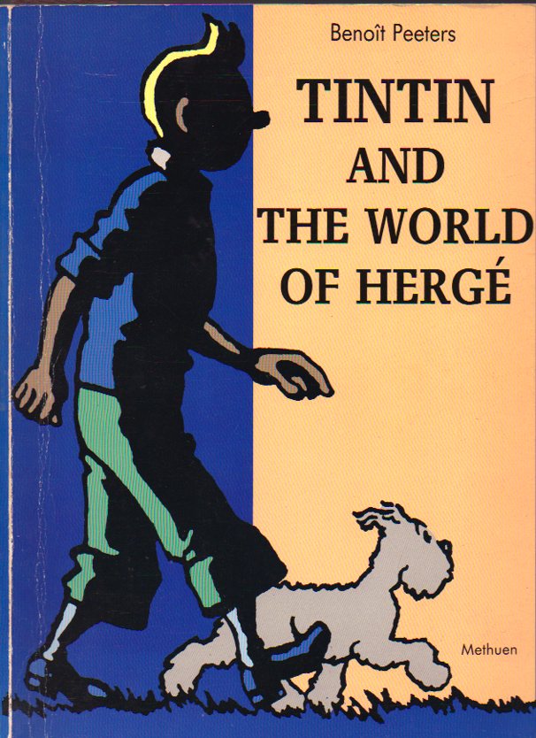
Harry Thompson’s Tintin profile book.
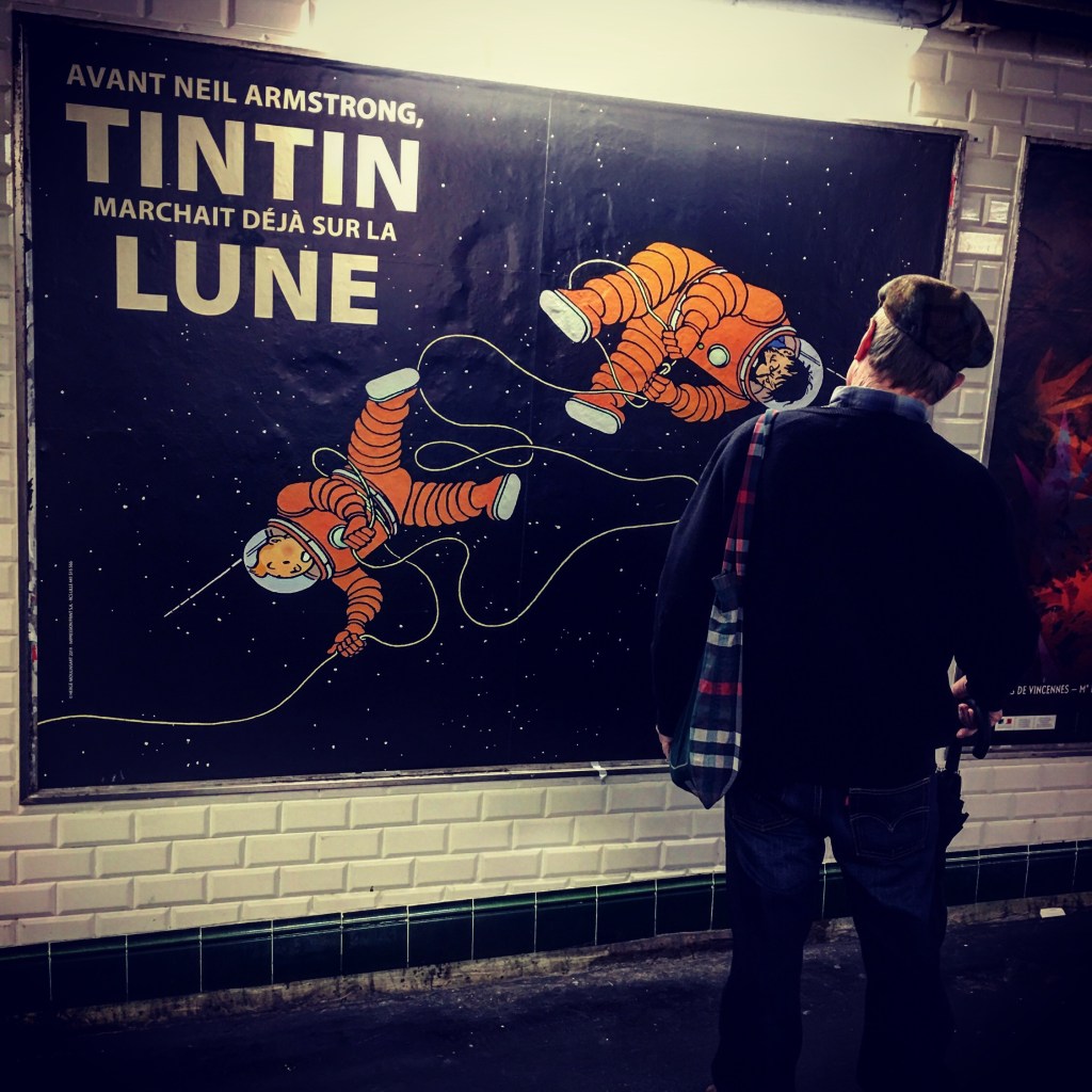
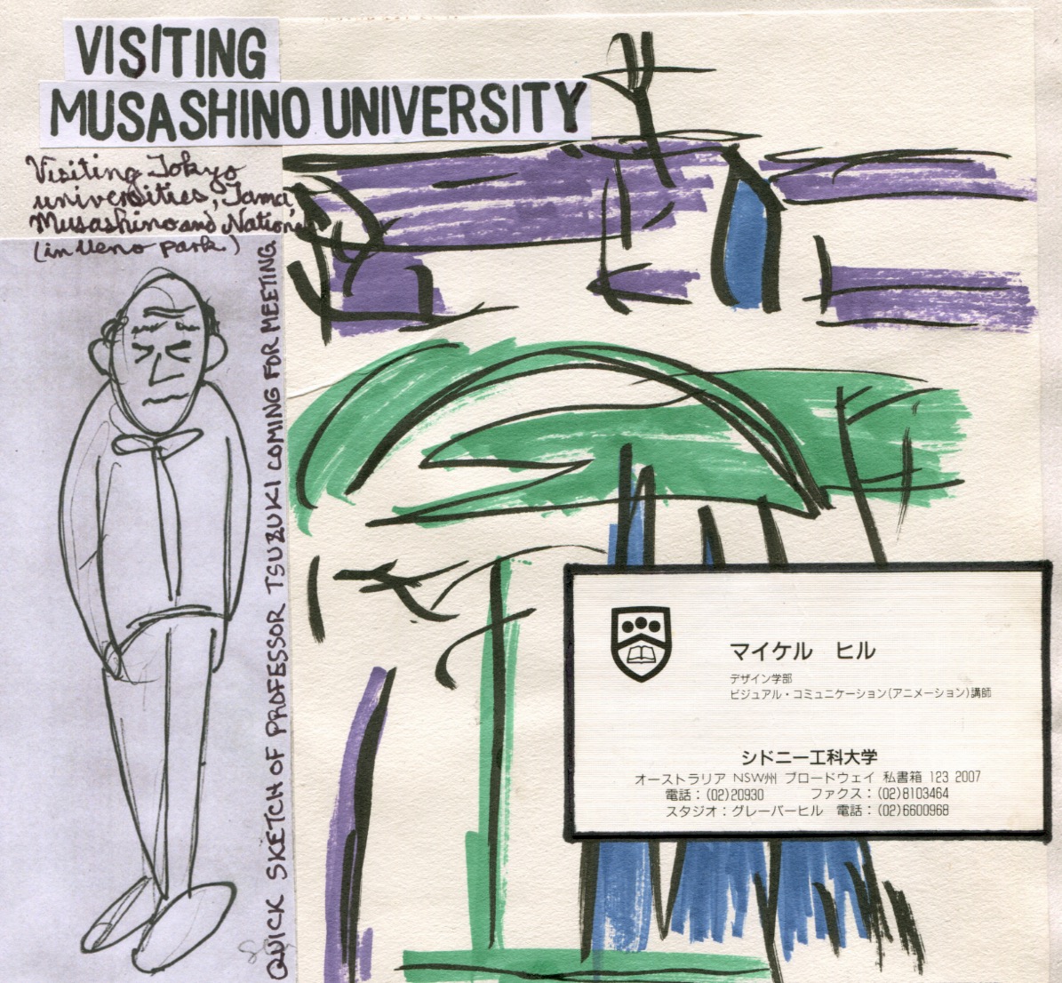
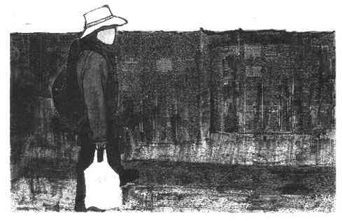
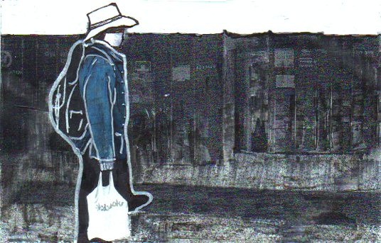
Doctor Comics finds cartoon character friends in the Paris Metro. (Photo by Louise Graber).
EXHIBITION REVIEW: Comic Strip, Passion’s Trip, Sydney, Alliance Francais de Sydney, November 18-December 20, 2002, review by Dr. Michael Hill (a.k.a. Doctor Comics), first published in International Journal of Comic Art, Vol.5 No.1 Spring/Summer 2003
The “Tintin” Qantas Flight 714 finally touched down in Sydney in November 2002. Originally carrying Tintin and associates to a scientific symposium in in 1968 his party left the plane in Jakarta. They then went off on a private jet and another adventure. Now, 34 years later, the Tintin entourage has arrived in Sydney in the shape of a cargo of beer, chocolates and comics, three of Belgium’s significant export commodities, accompanied by members of the Royal family and an exhibition of French language Belgian comics titled Comic Strip, Passion’s Trip,
Belgium exports considerable quantities of comics (approximately 65% of publication exports). It refers to comics as the Ninth Art. It also has a museum devoted to them. So it was no surprise that the exhibition was opened by members of the Belgian monarchy. Prince Philippe and Princess Mathilde attended, giving the exercise the Royal seal of approval. (see invitations to both the exhibition opening and the following Royal reception event, below). The exhibition formed part of an economic mission organised by the Wallonia-Brussels Sydney Trade Office. 300 different comics titles in French plus a further 70 in English were shipped to Sydney. These were put on sale in Dymocks, one of Sydney’s larger bookstores. This created a mini-venue for Euro comics in the local retail market…and competition for Japanese manga and Hong Kong comics.

A page from my graphic novel BLOTTING PAPER: The Recollected Graphical Impressions of Doctor Comics. It shows the invitations to the events referred to in the above text.
The exhibition was staged at Alliance Francais de Sydney, a combination gallery, café and French language teaching centre. It was a noisy location next to a city bus stop. Passengers could admire the window display of old comics whilst waiting for the bus. There were also staged acrobatics of a large model by the Belgian cartoonist André Franquin of his character Marsupilami. The exhibition had undergone a serious design process by the curator Jean-Marie Derscheid. It had a multi-strand focus that included comic books, comics art and rough process comics art. There was a display revealing the workings of the comics artist’s studio. There was a child’s bedroom decorated with comics art merchandise. There were also videos, and an oversized mock-up comics album, 82cm(heigth) x 56 cm(width). These were beautifully bound and designed. They contextualised Belgium comics and featured brief biographies and examples of the work of 20 significant artists. These included Didier Comes, André Franquin, Greg, Hergé, Hermann Huppen,…Edgar Pierre Jacobs, Jijie, Lambil, Raymond Macherot, Morris,…Peyo, Francois Schuiten, Jean-Claude Servais, Tibet, Maurice Tillieux, Tome and Janry, Will, and Yslaire. References were made to Spirou magazine and to two emergent schools of comics: the Brussels School and the Marcinelle School.
The bed in the child’s room had a printed Tintin doona cover and bed sheets. There was also a Gaston Lagaffe reading lamp by the Belgian cartoonist André Franquin and a Marsupilami alarm clock. Various posters and a cupboard containing Lucky Luke figurines were present. Interestingly there was not a Smurf in sight! The room also had a small television and video player with a collection of Belgian animated cartoon series. Amusingly, by the end of the opening night, the child’s room was littered with empty beer bottles. These had been deposited by the noisy and appreciative guests viewing the exhibition. This gave the installation a bizarre visual association between beer and comics in the nursery. If only I had taken a photograph of that! In any case, my character Doctor Comics would have approved of the pairing of beer and comics. He may even have shouted his occasional cry of “beer, chocolate and comics!” He holds this to be an excellent combination in which to indulge…the reading of comics whilst eating chocolate and drinking beer.
Another section of the exhibition consisted of individual displays of the work of particular artists.These included Hermann, Geerts, Midam, Yslaire, Morris, Jacobs,…Herge, Francois and Luc Schuiten, Francqu and Van Hamme, Dufaux and Marini,…Lambil, Marc Bnoyninx, Tome and Janry, Constant and Vandamme. There were even examples of original artwork and a copies of comics albums that were accessible for visitors to read. Some of thee appeared quite soiled near the end of the exhibition, let alone the opening night.
Upstairs in a small seminar room there was a mock-up setting called ‘the artist’s studio.’ Large blow-up photographs on the walls showed the interiors of various comic book creators’ work spaces. A working drawing table had been set up with pencils and other equipment. There was a video corner screening a documentary on one of the featured artists, Frank. It showed him at work on illustrations for his comic book The Source about Australia. This had been specially commissioned for the exhibition and scheduled for release with it. His watercolour sketches of Australian animals were impressive. Despite never having been to Australia prior to the exhibition…Frank did come to Sydney for the opening…his story showed the desert. Although his use of colour was accurate some of his conceptual content was neither sensitive nor politically correct. What he refers to as Ayers Rock, a giant natural rock formation, is now known as Uluru. having had its ownership and management reverted to the control of the indigenous owners. Consequently it is regarded as a sacred place. In his comic Frank freely plays with Aboriginal art and icons. This practice is respected by local artists as the cultural domain and ownership of the indigenous people. Conscious of the lack of local knowledge and in tongue-in-cheek fashion, perhaps?…the exhibition points to “our delightfully cliched images of Australia: kangaroos, boomerangs, mythical Aborigines and smouldering red deserts.” This exhibition was about culture in any case…the culture of a country whose comics have been elevated to the level of art…and treasured and collected by libraries and museums. I praise the high profiling of comics art in Belgium!