Production of the first issue of my comic Blotting Paper continues despite delays from my ongoing academic commitments. However, my intention of having the first chapter finished by the end of the year remains. Comparing research to production I have discovered the enormous amount of time it takes to design and create artwork. I can write a thousand word critique of a comic in just over an hour…but creating one page of comics art will take me several times that. Many of the comics creators that I have interviewed say their rate was “a day per page”. I wish!…but I don’t really mind as I love the feeling of being deep in creative space. At the moment, besides printmaking, I am also doing some drawing. I love it and the mental space it takes me into. I like the feeling of getting lost in there.


(© 2011 Dr. Michael Hill a.k.a. Doctor Comics)
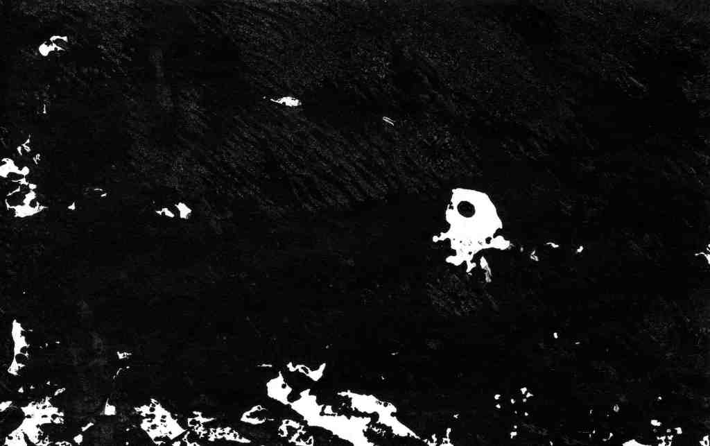
I am experimenting with a range of image-making media to produce the artwork and text. Below are some of the images that have been generated through printmaking at Studio Buljan, in Sydney. (My thanks to Katharine Buljan for the access to her studio). These prints appear in the first chapter of my comic The Ingurgitator. The chapter begins in sunshine in Sydney then things take a dark turn into the subconscious terrain. There is also the evening ritual wherein Doctor Comics cooks dinner…then drinks wine whilst reading his recent comics purchases. During this time he converses with his feline friends. The evening often ends in a dream state that is a melange of art, thought, taste and reflection.

(Monotype print-© 2011 Dr. Michael Hill a.k.a. Doctor Comics)

(Monotype print-© 2011 Dr. Michael Hill a.k.a. Doctor Comics)

(Monotype print-© 2011 Dr. Michael Hill a.k.a. Doctor Comics)
These images are monoprints, so called for their singularity…only one of each is made. However, by re-inking the block and marginally alterating the images, a degree of continuity is maintained. This enables a sequential element to come into play. I have learned this approach in creating the artwork for animation projects. For me, working in printmaking, comics and animation is both labour saving and exhaustive. The images come up quickly but the act of re-inking and printing the block destroys the originals. There is no going back. I enjoy working with the inky element of printmaking. It is so graphic! Any thoughts? Comments about this and my posts are welcome, Michael.
(All text, photos and artwork-©2011 Dr. Michael Hill a.k.a. Doctor Comics).
ragingyoghurt says on August 10, 2011
wow. gorgeous drawing! i love the stark shadows in the tower bits. what are you using for the type, michael?
LikeLike
Doctor Comics says on August 10, 2011
Thanks Bobbie. You’re too kind. The bridge looks a bit wobbly to me but I ran out of time. The shadows on the towers were done with a Copic marker and the type I bought from the Rozelle markets. It was a shoebox full of old and worn rubber letters from some printing business. It’s done by hand, no registration, inky fingers. BTW I’m loving your blogging of paper, print and cakes adventures: http://www.ragingyoghurt.org/blog/
LikeLike
Maya W says on April 10, 2025
I admire the dedication involved in creating comics.
LikeLike
Doctor Comics says on April 10, 2025
Thanks for your comment Maya, it does take a lot of time to produce…especially if you are doing both the writing and the drawing…but the feeling you get on completion is very satisfying. Michael
LikeLike