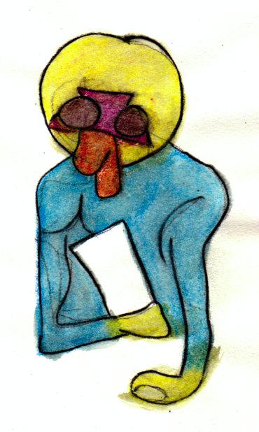
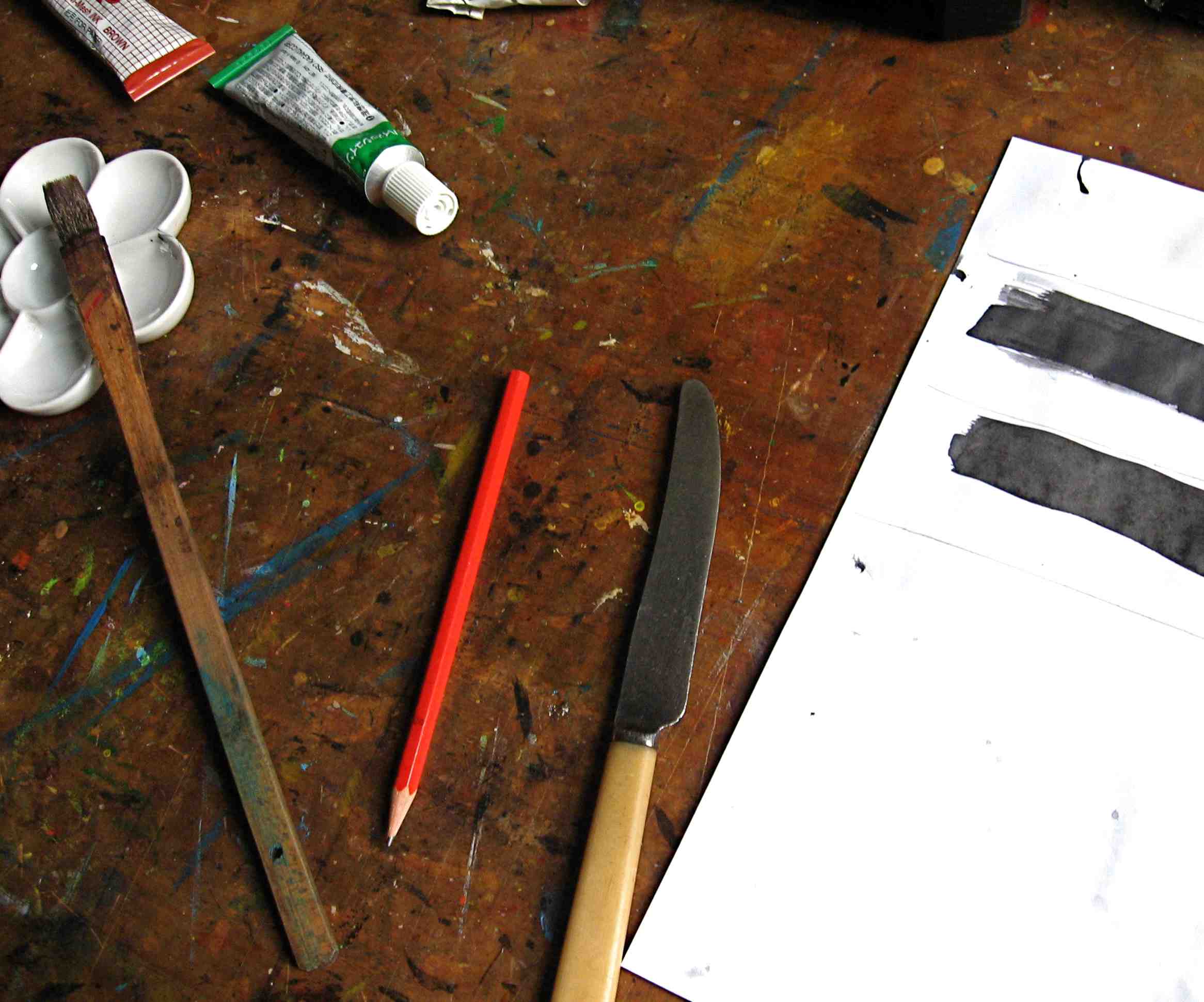
I decided to participate in this event in which participants do a drawing each day during the month of October. I took the option, however, of only doing it every other day. So I planned to produce an inked image on the odd numbered dates-1st, 3rd, 5th, 7th etc. That amounts to a potential 16 drawings over the period. These were progressively posted here on my blog and dated. I also added an image of the drawing implement(s) employed. I saw this exercise as an opportunity to ‘warm up’ for issue 4 of my Blotting Paper artist book/comic…another experimental image-making outlet.
A new drawing made on every odd numbered date of the month.
Midway through the month…I managed to maintain my planned participation of posting an ink image every other day. Next stage…I am move in the direction of making blind contour drawings of moving subjects.
A return to abstraction for the final four images! I am switching to printmaking, exchanging the pen for a brush and using sumi ink to make monoprints.
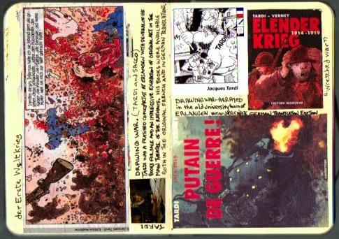
An awesome aspect of the recent Internationaler Comic-Salon Erlangen that I attended…in the old university town of Erlangen, Germany, near Nuremberg…was the staging of two contrastingly presented and equally impressive exhibitions of comics art on World War I…by Joe Sacco and Jacques Tardi.
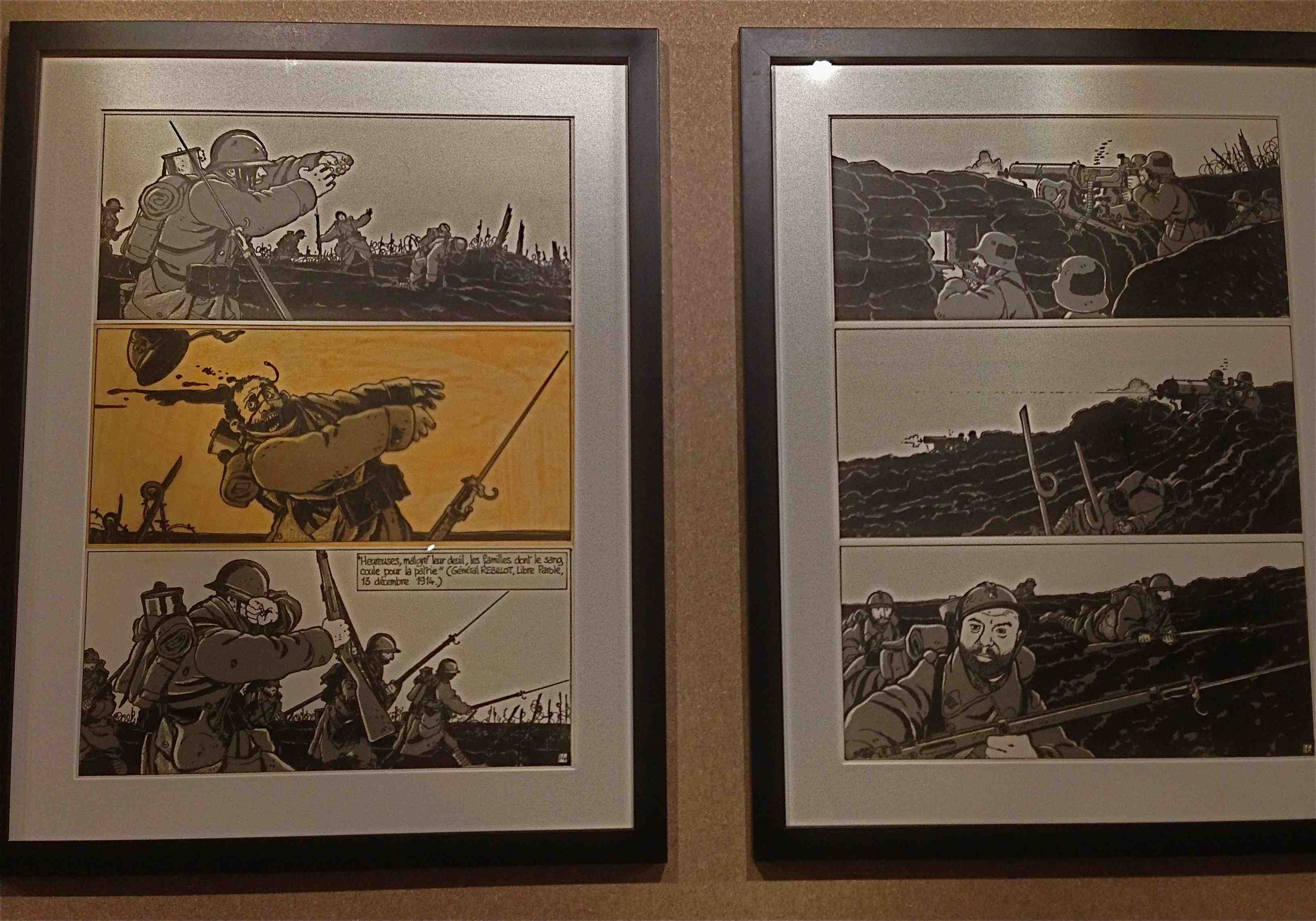
Joe Sacco’s The Great War was displayed as an open-air exhibit in Schlossplatz. It was enlarged on display boards arranged in a long series of folds. Seeing it spread across the square magnified the herculean task that Sacco undertook in drawing this epic, concertina work. It represented one day of the Battle of the Somme fitted into one panel.
His wordless comic is structured around this single seemingly endless panel. It had been folded into 24 segments that unfolds to form a single piece. It depicts events in a continuous, cinema-pan like take. That is spread across time and space with soldiers assembling, attacking, engaging in crossfire and then returning to their lines. The unfolded published comic is too long for a table. Consequently, for exhibition, it has to be spread across the floor of two adjoining rooms or a long corridor. In Schlossplatz it ran right across the square necessitating a reading whilst walking approach. With so much detail it required several passes to take it all in.
The panels above show the trenches and the movement of the soldiers into the hostilities of ‘No Man’s Land’. This includes their exposure to artillery attacks and its associated schrapnel, plus machine gun and rifle fire.
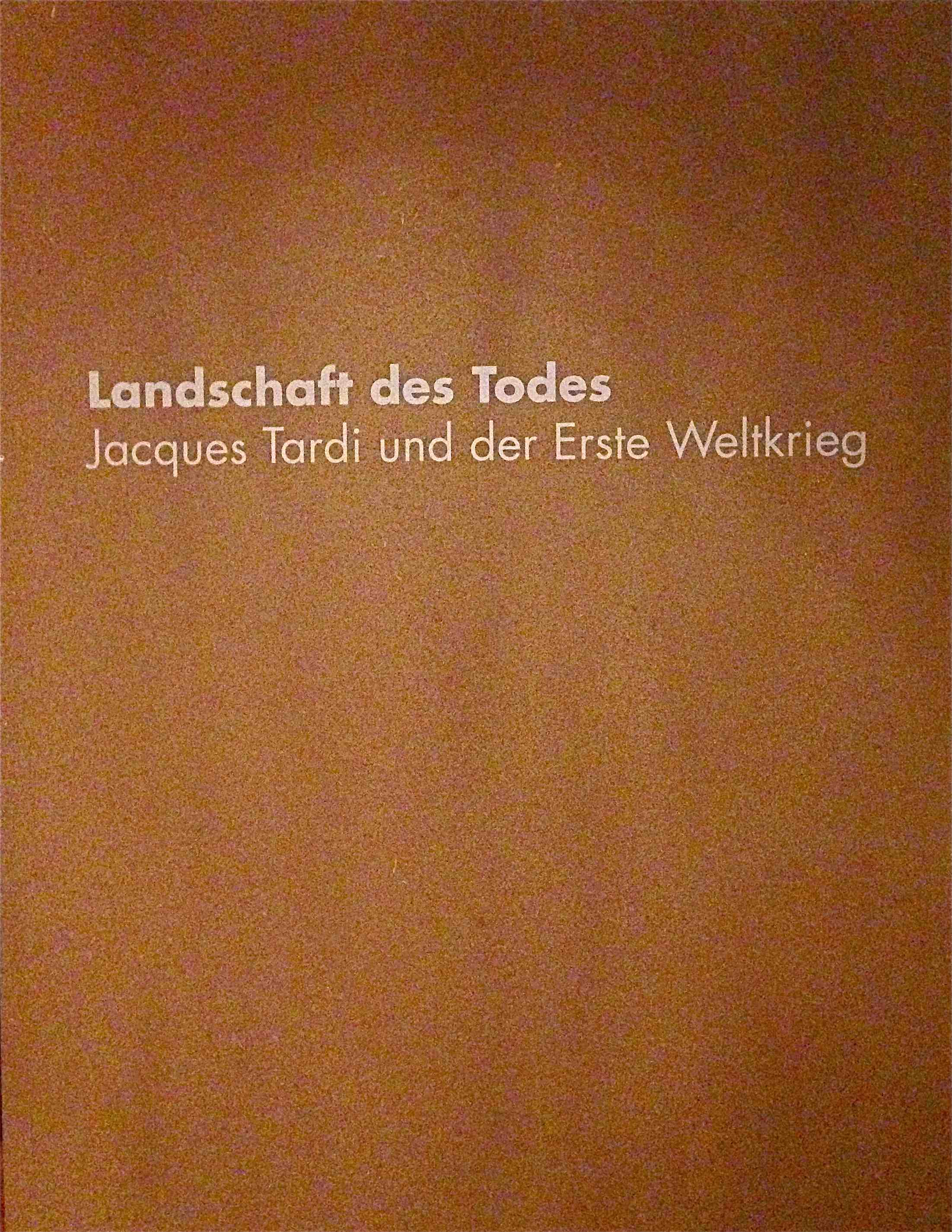
By comparison, the war comics art of Jacques Tardi were exhibited indoors. Low level lighting created a sombre mood appropriate to the theme. It also perhaps protected the original art work from exposure. Corrections such as the whiting-out of errant black border lines and some alignment and registration marks were visible. This was the original art on display! It was not it’s cleaned up and reduced size reproduction as seen in the published comics.
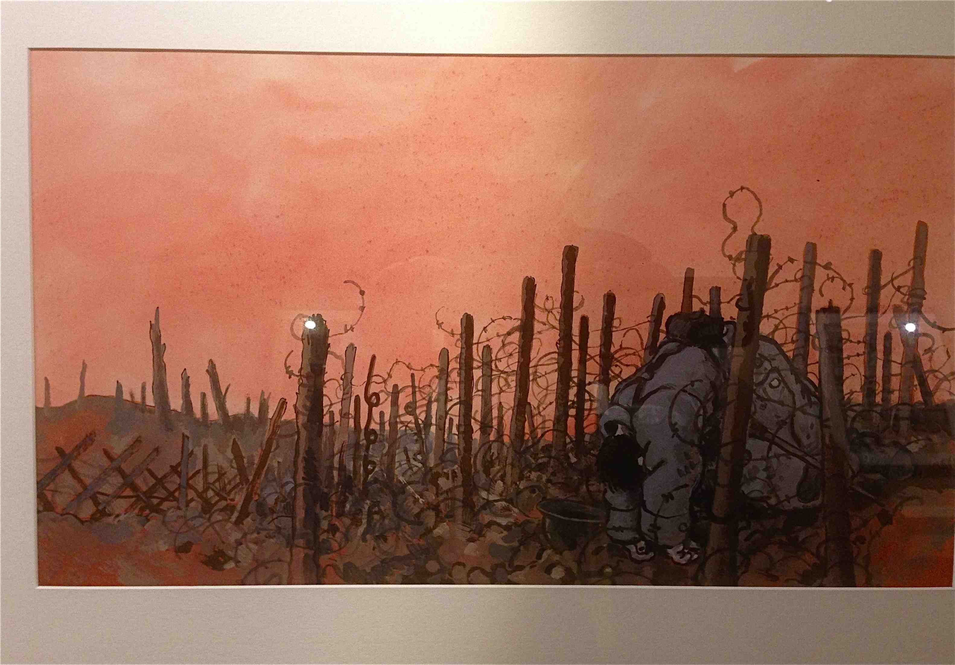
The work, titled Landscape of Death, was bleak, expressing the agony of those who fought in World War I. Many of the images were painful to view. These included soldiers’ bodies torn apart by flying pieces of shredded metal. They were lacerated, disfigured or rendered limbless, with some surviving in this state.
Exhibited in a darkened theatre, the low level of the light created a reverent atmosphere for the images. It also acted as a canopy of protection, from fading, for the original art work. The work was housed in a series of narrow wooden walled and roofed walk-throughs. Some shapes were cut into the walls so that one could see out to lessen the confined effect. Tardi’s use of colour was impressive. His delicate watercolour brushwork added a poignant hue to his poppies, pools of blood and rising smoke.
These two exhibitions, Sacco and Tardi respectively, had contrasting presentations:…open-air/indoor; …spacious/confined;…sunlight/low level artificial illumination;…expansive/confined;…complete/edited; …served to express and communicate aspects of the texts/open…the vulnerability of soldiers both out of the trenches and restricted by the narrow confines of the trenches;…time-one day or six years of living with gas masks, flame throwers, helmets, barbed wire…and the dampness, misery, the stench of rotting bodies, despair and the ongoing expectation of death. This all made a memorable imprint on me, Michael.
UPDATE 2017: I found this discarded Jacques Tardi sticker (below) from the set that the Erlangen organisers were disseminating…and decided to add it to this post, Michael.
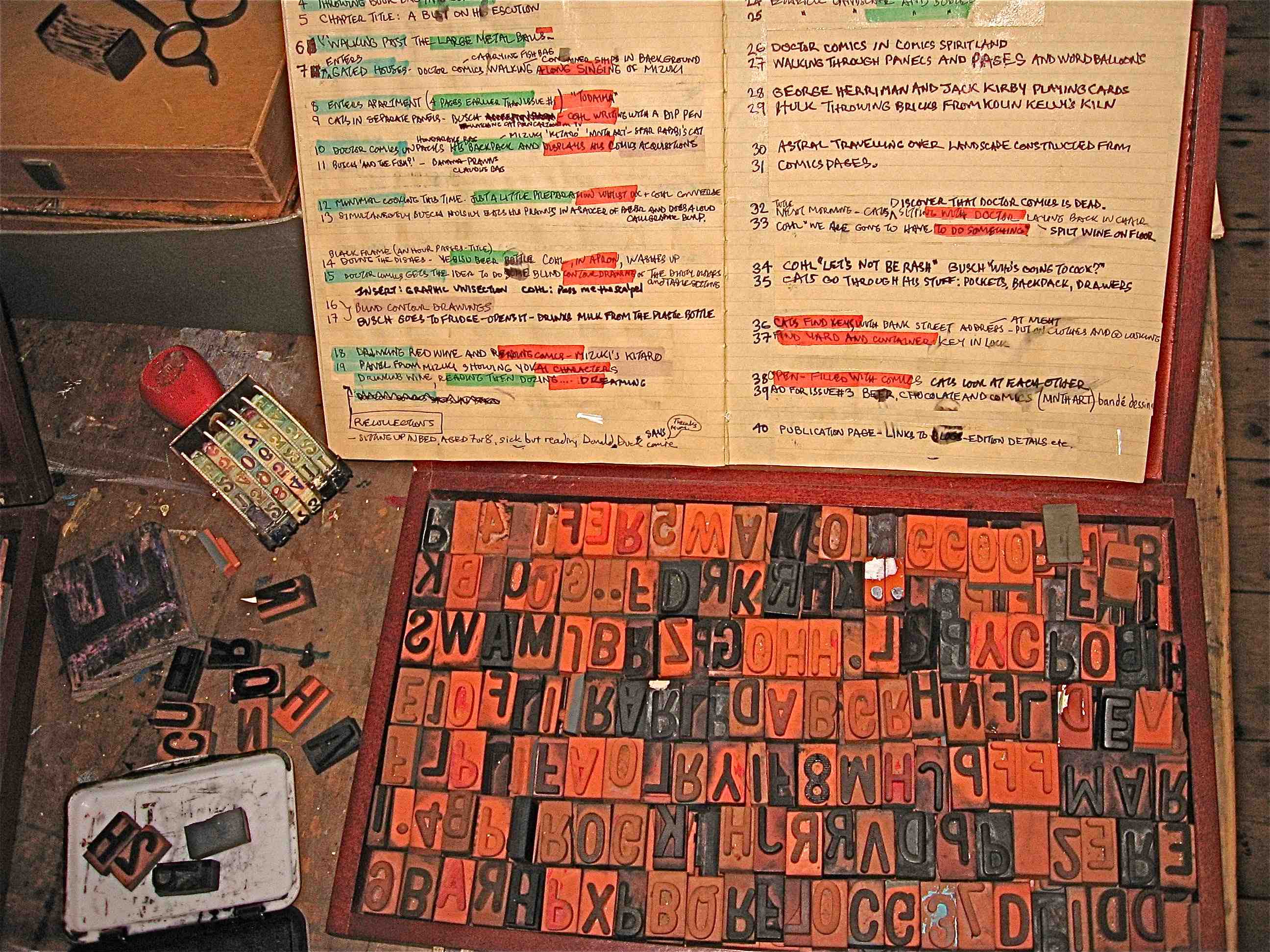
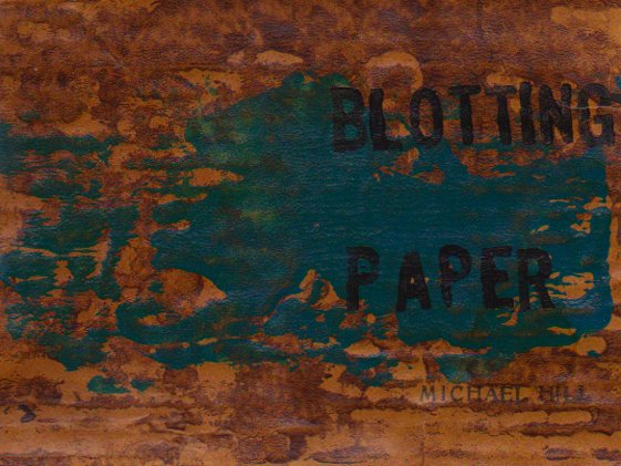
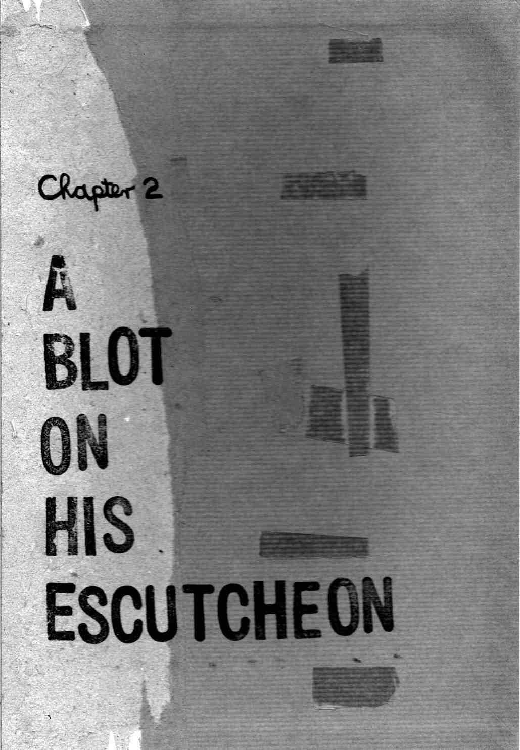
This is the first in a series of regular reports documenting the production of the third issue of my artist book/comic…Blotting Paper: The Recollected Graphical Impressions Of Doctor Comics. It continues on from my previous posts on the first chapter/issue The Ingurgitator…and the second chapter/issue A Blot On His Escutcheon. The new chapter, The Chthonian Turn: The Cats’ Revenge…deals with the feline characters’ reaction to the demise of Doctor Comics…and that gentleman’s adventures in another dimension to which he has travelled. I hope to self-publish it before the end of the year.
As with the two previous issues printmaking is involved in the generation of images…via woodblock, linocut, Japanese sosaku hanga technique, rubber stamps and wooden seals. In addition other visual communication techniques…such as drawing, painting, collage, cartooning and photography…with the intention of producing a limited edition artist’s book comic.
I also intend having more colour pages in this issue…following the use of sporadic spot colour in Issue #1 and the 8 full colour pages in Issue #2. The colour will assist in the graphic representation of both the real and imaginary worlds featured in the comic.
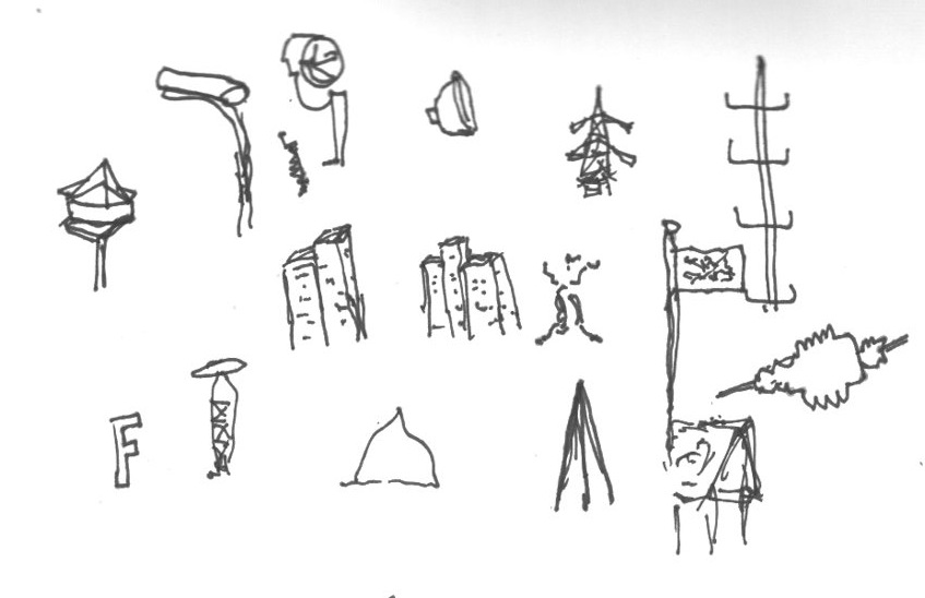
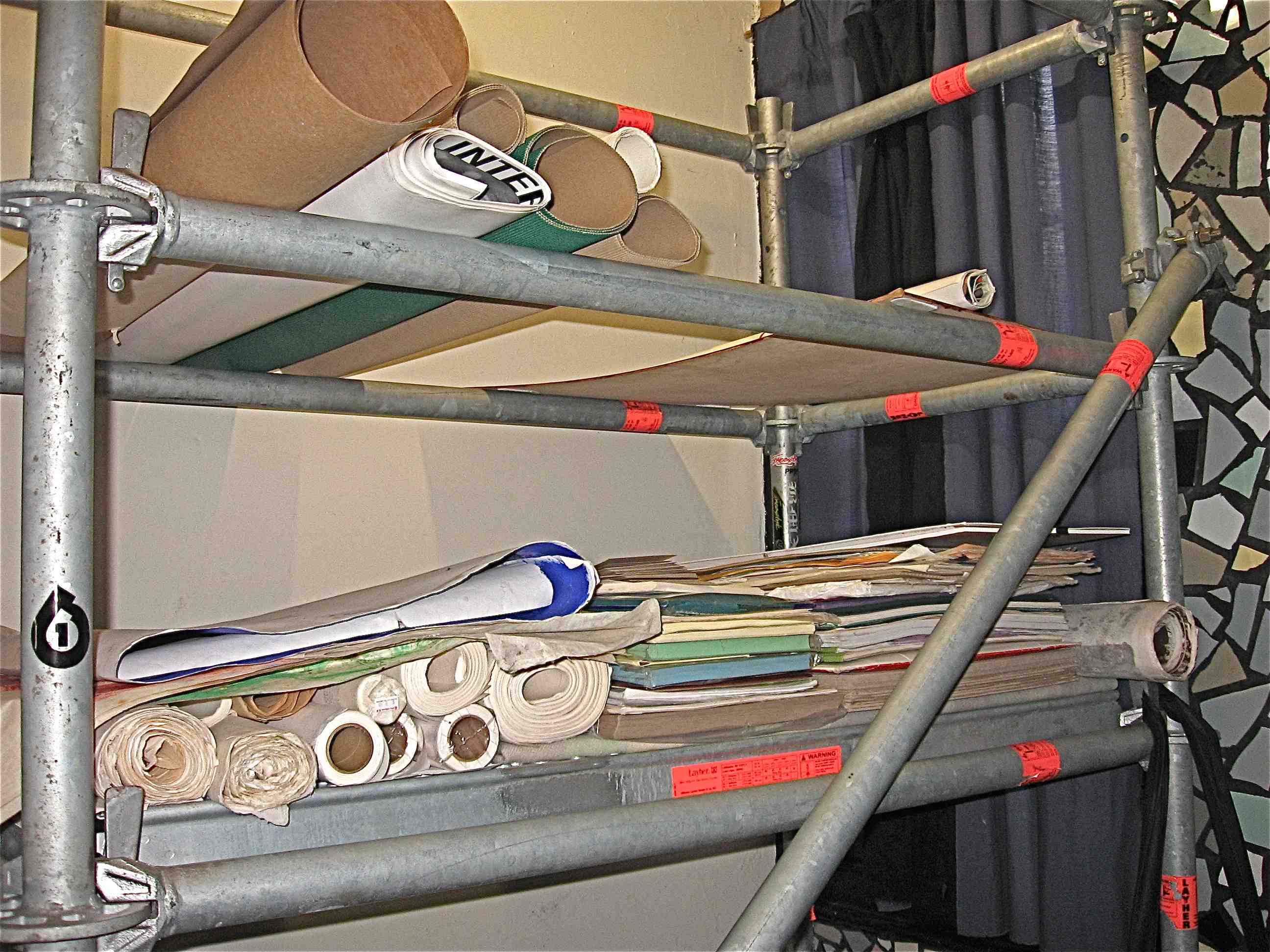
I am continuing to edit the script, refine ideas, and develop others. There has been some unscripted image-making and printmaking activity…with the intention of using this as a loose but parallel means of creating vaguely conceived and experimental visual content. Examples produced through this printmaking strategy are featured below.
In the present chapter the two feline characters deliberate over the decision of what to do following the sudden departure of Doctor Comics. Meanwhile the latter character continues his travels in the chthonian world…confronting various vaporous forms and ghostly figures…including a trio of roaming red shades (see the three red shade illustrations). The raw state of these printmaking images will most likely be subject to further graphic manipulation.
The target date for completion of the five 8-page signatures have been approximated…and with a good run the comic could possibly be ready for binding as early as June.
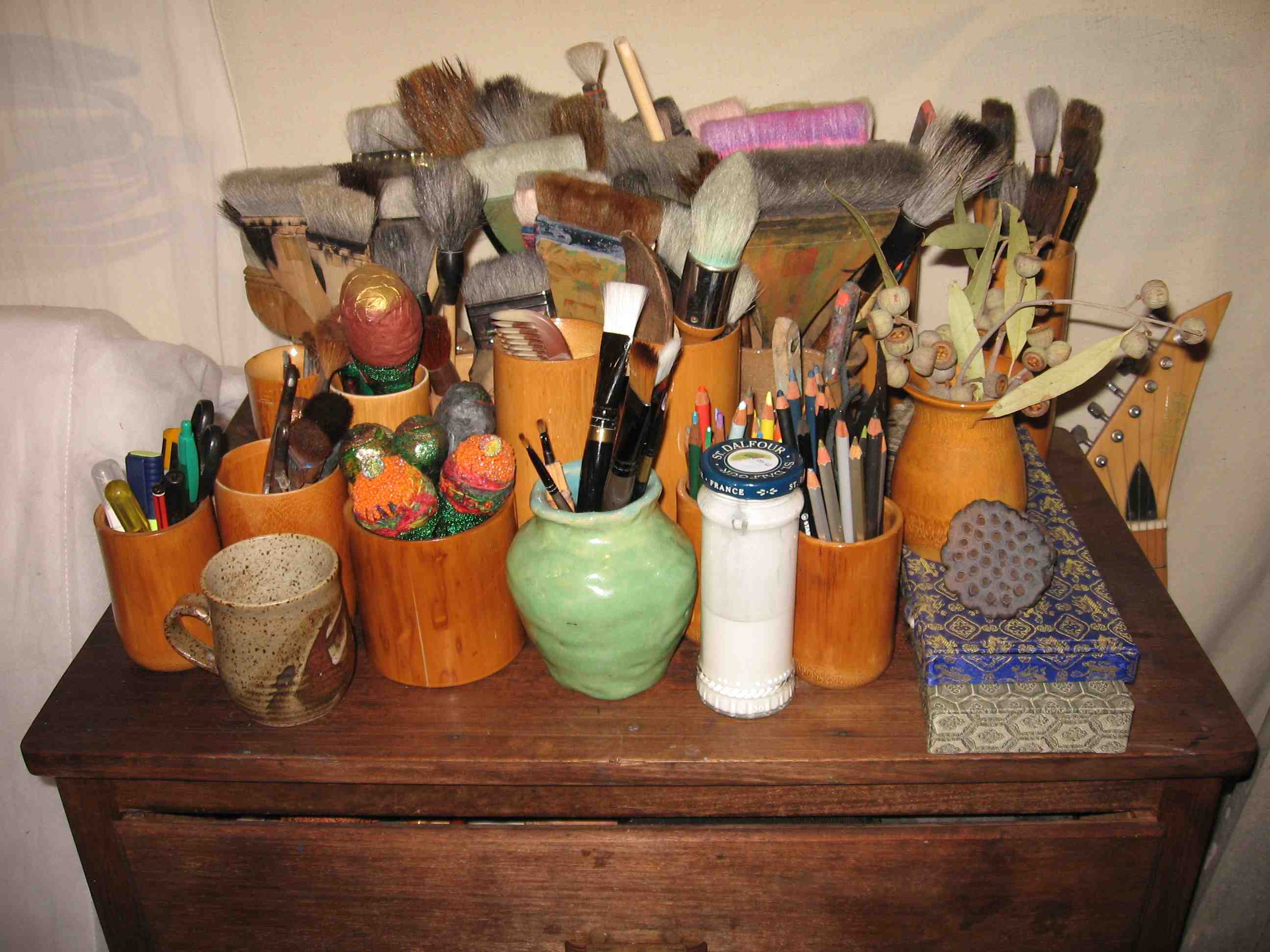
Ink, more so than paint, appears to be the dominant graphic ingredient in the production…with dip pens, drawing pens and brush calligraphy involved…although some of the inking will be made onto previously painted paper.
There are some pencils in there too…as well as the pens,…with drawing and handwriting components plus my regular use of printmaking for image generation.
Having gotten deeper into production modeI am now approaching completion of the artwork …having advanced from scripting to page layout…however, I am keeping things open in terms of the resolution of the story.
I find the creation of the images…and the entire image-making process…including the resultant generation of the artwork…to be the most pleasurable part of the production process. Culling, selecting and editing the artwork is a tougher task.
Printmaking has again been employed in the image-making…a little more than photography…but about the same proportion as drawing. In terms of style, abstraction is making an impression. The notion of developing this project into graphic novel form continues to firm.
Continuing reports documenting the production process of my artist book/comic Blotting Paper: The Recollected Graphical Impressions Of Doctor Comics…Chapter 1: The Ingurgitator andChapter 2: A Blot On His Escutcheon…this post shows more examples of the image-making aspects of the project. These include assemblage, drawings, design, photography, printmaking, plus project management.
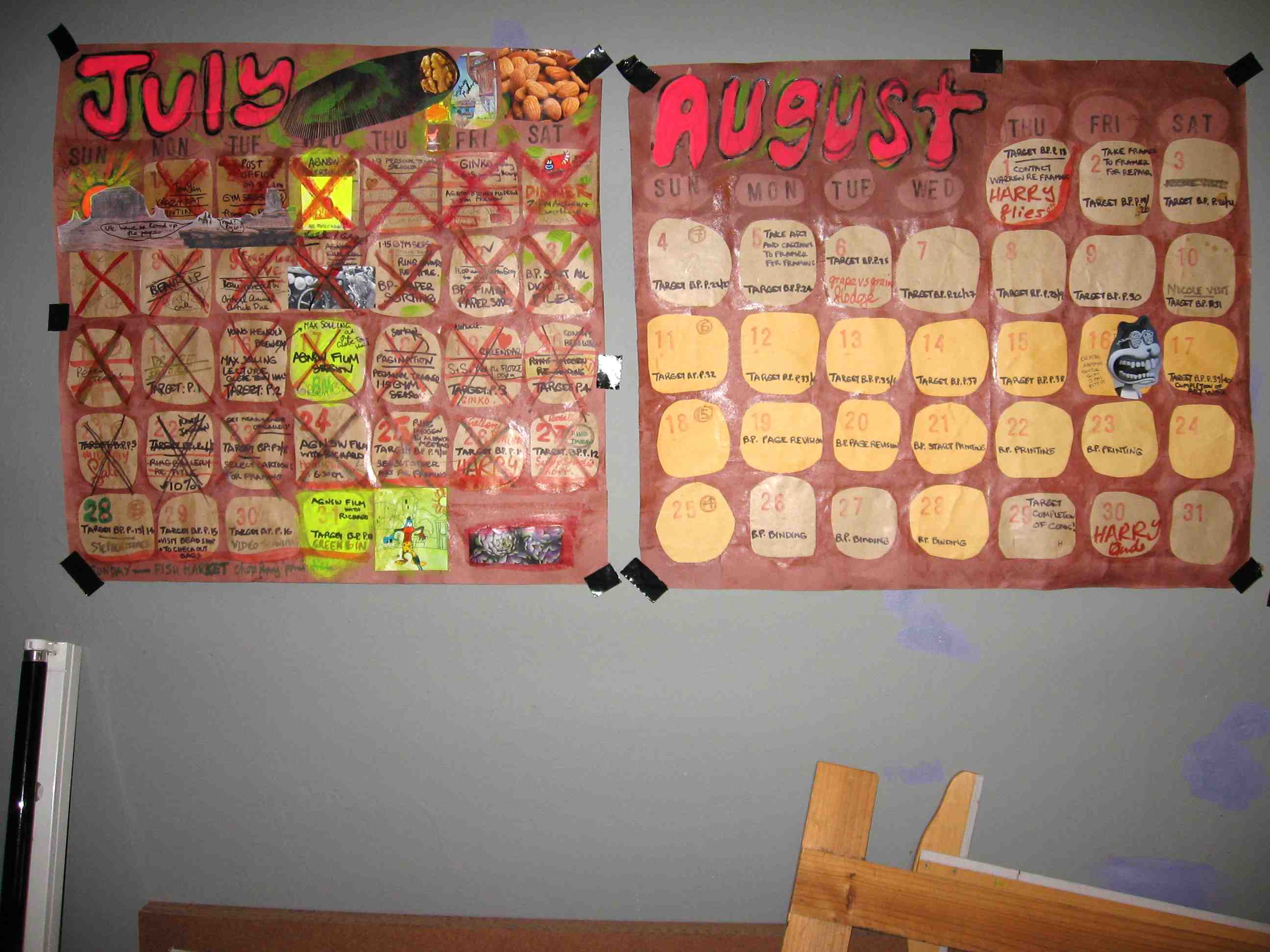
Some colourful project management in my blog log book.
This blog on my Blotting Paper comic has provided a means of documenting the production progress of the comic.
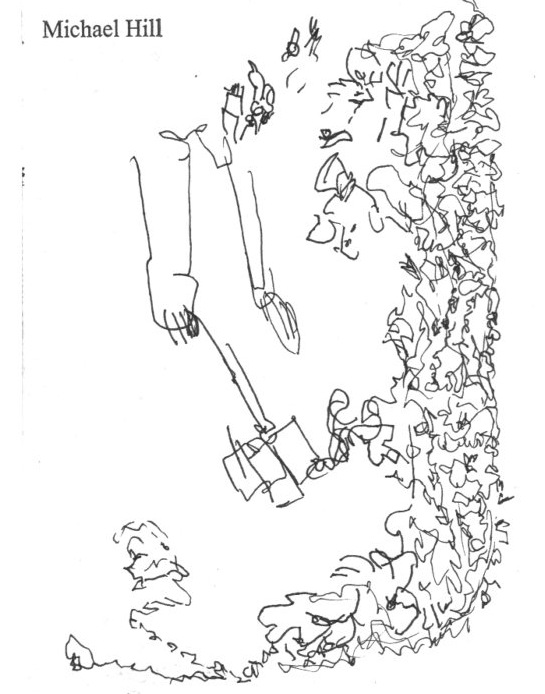
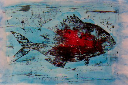
Both fish and cats feature in the comic, the fish more realistically rendered than the cats. Above is an image from my earlier fish animation, with added blood. Below is a rough sketch of one of the feline characters.
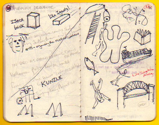
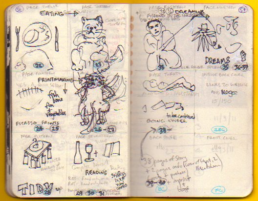
Continuing my series of reports documenting the production of my comic Blotting Paper: The Recollected Graphical Impressions Of Doctor Comics…this post illustrates the use of the note books, sketch books and design processes involved.
The larger notebook (above) is primarily used for making notes and writing drafts. It has information about the characters and the environment in which they live…plus ideas about the narrative and its construction. The smaller note books (below) contain rough sketches that were used to develop ideas from the main note book.
The design is a little on the rough and sketchy side! It does, however, show an outline of the character design and story sequencing. How did you find it? Let me know. I would love to read your responses to my posts, Michael.
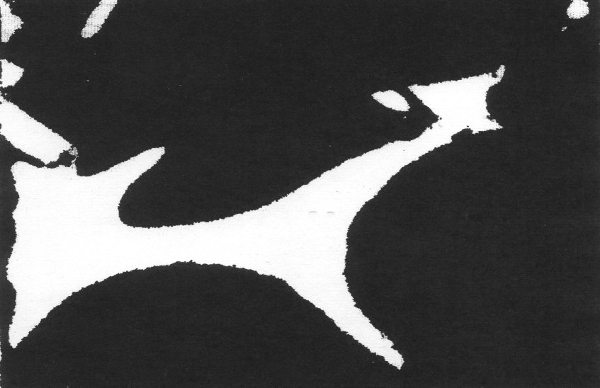
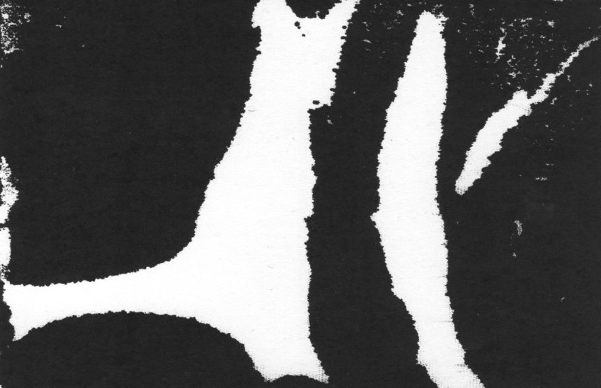
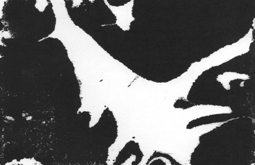
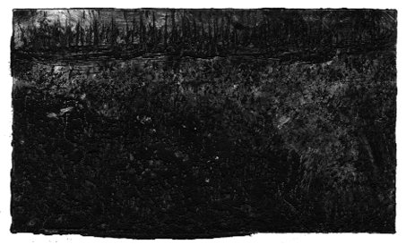
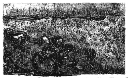
This post continues reportage of the production of my artist book/comic Blotting Paper: The Recollected Graphical Impressions Of Doctor Comics. It describes the use of printmaking in the image-making process, including the creation of landscapes of subconscious terrain.
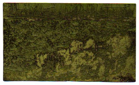
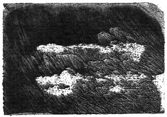
Doctor Comics finds himself in a shadowy landscape during an intense dream experience. I have tried to express the inky and murky feel of this etheric place he traverses. To achieve this I made a series of monochromatic monoprints.
This landscape can be seen more clearly as more light is added to each successive image. Despite the extra light he still finds it hard to trace his way through.
These prints were made using an etching process. It was a novel method of printmaking that involved exposure of the design to a light sensitive plate. This process marked the lines on a gelatin coated metal plate. The plate was then rubbed with a stiff brush under running water to carve the lines. This process is known as solar plate etching.
A deliberate ‘blotting’ effect was obtained from pressing a saturated inked block onto highly absorbent blank paper. This was for a scene from the second issue. After printing, the paper was peeled off the block carefully to avoid tearing. This was due to the combination of the wet inked areas and the paper’s soft, tissue texture.
Tails and fins of a cooked fish were inked and printed for some of the images used in Chapter 1. This approach was inspired by the Japanese sosaku hanga printmaking method. That involves inkable flat objects employed as ‘blocks’ as an alternative to woodblocks. The resultant graphic effect is shown in the print above. Photos of the image-making process involved in making that print are below.
Another unused print, above, from the first issue is a possible inclusion as a postcard insert in this issue. It was constructed from a combination of woodblock and object prints. I know I seem to be pushing the printmaking cart here but it has really got me going. I would love to hear of your experiences of printmaking, if you have done that, Michael.
Work continues on the production of the second chapter of my artist book/comic…Blotting Paper: The Recollected Graphical Impressions Of Doctor Comics. This report looks back at two of the main characters from the first chapter, the feline characters Cohl and Busch. These are funny animal characters that belong to Doctor Comics.
These feline characters Cohl and Busch are named after famous cartoonists of mine Émile Cohl and Wilhelm Busch. They live in the apartment with Doctor Comics as his companions. They l-o-v-e fish! They also know about comics, as much and possibly more than their owner, the so called Doctor Comics. In lecturing mode Doctor Comics has been known to channel Cohl! That cat is incredibly well read but with a distinct bias toward bandes dessinées.
Printmaking is playing a formidable role in the design of the spirits, ghosts and apparitions in this chapter. I am experimenting with sequential prints. This is a hangover from my animation days when I utilised the technique to generate large volumes of artwork.
In this chapter the Doctor Comics character is teleported into the supernatural world via a dream experience. To obtain a shadowy landscape for some ethereal figures he encounters, sumi-ink blots have been soaked on soft paper. Over and under-inking the blocks has resulted in intense black or under-inked white patches on the printed paper.
This dream sequence occurs toward the end of the chapter. There Doctor Comics confronts fearful looking ghostly figures that step out from the background. The monotype printing method and the use of sumi ink enabled the making of experimental images with a restricted palette. The incorporeal characters were manifested and embodied in this manner. Examples of these are in the monoprints of the etheric body and the shadowy phantoms above and below this paragraph.
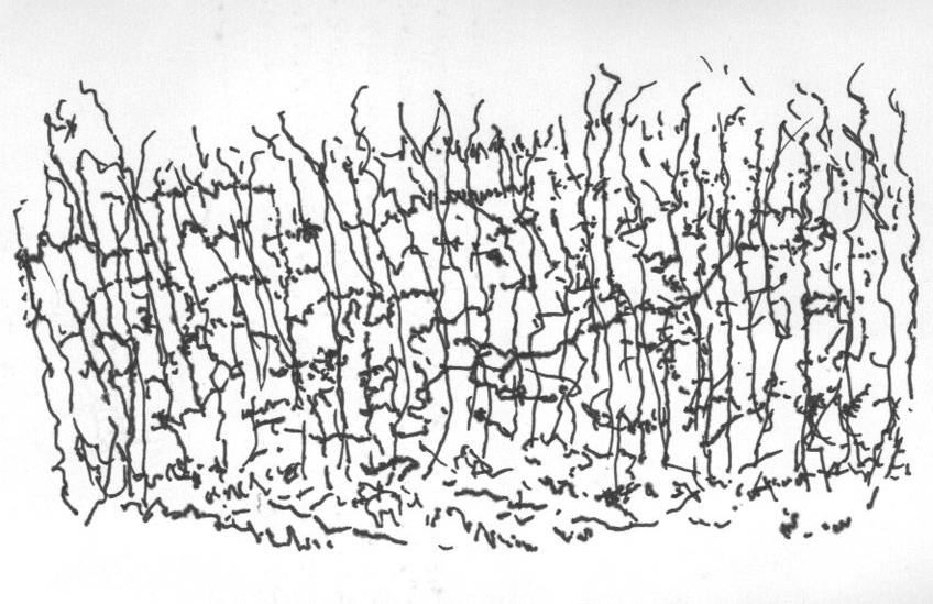
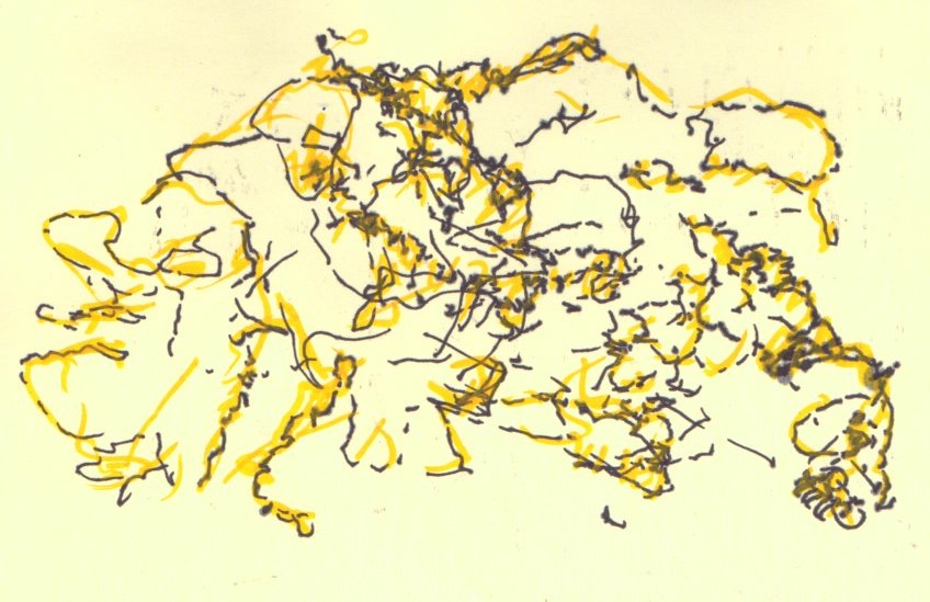
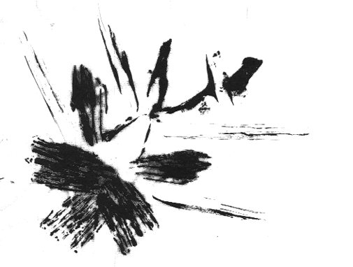
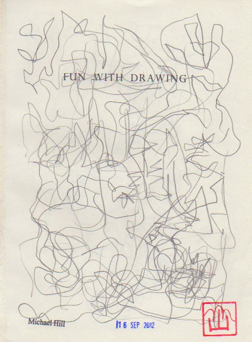
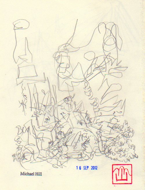
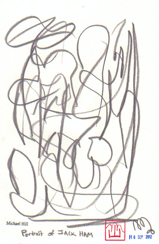
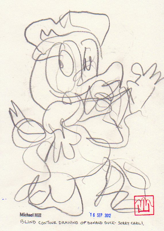
This new chapter also includes experimental approaches to drawing including abstract, contour and blind contour. It’s creative fun time with this drawing process.
Using line as an element of construction and expression, drawn, printed or written, although restrictive, is quite expressive. I find that drawing details very carefully of constantly changing scenes with accompanying alterations in point-of-view leads easily into abstraction.
Drawing anything whilst listening to music invariably produces a pattern of abstract lines on paper that is most expressive. I follow the lines whilst I am making them and try to keep up with the tempo of the music. No erasers! A quicker tempo produces less inhibited lines and surprising shapes.
Another fun drawing exercise I have utilised is copying a character or object without looking at my drawing. I try to follow the outlines of the object but don’t look down to see how the drawing looks. Without the constant checking things can drift and shift out of perspective and registration. The contours can be accurate but out of place. How about you? Do you draw? Have you ever created images using printmaking methods? I would love to hear. Feel free to post a comment about your image-making approach on this blog and I shall respond. Till next post, Michael.
This is the first report documenting the production of the second issue of my artist book/comic…Blotting Paper: The Recollected Graphical Impressions Of Doctor Comics. The new chapter is titled A Blot on His Escutcheon. It delves deeper into the character of Doctor Comics, the environment in which he lives and his life in comics. I am making progress with this and hope to self-publish it next year. The book is partly based on my career in art and design education in Sydney. I worked within these disciplines and their application within the areas of film, video, animation and visual communication. I have employed aspects of comics art in my teaching. Storyboarding, word and image projects and as a medium in itself are examples. I have also employed it in my study and research…the presentation of lectures and conference papers…the staging of conferences, symposiums and exhibitions and the writing of a doctoral thesis. My own comic has fictive passages as well as auto-biographical elements. Printmaking is being utilised as an image-making medium. This includes the Japanese sosaku hanga method, along with pen and ink drawing, collage and found materials.
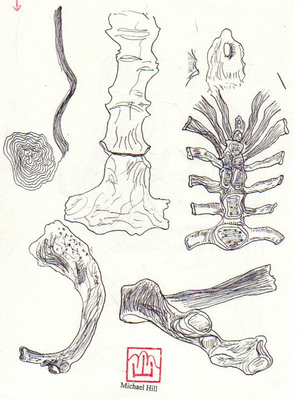
I’m currently learning to draw bones by reading the osteology chapters in anatomy books and studying the illustrations really carefully. In Chapter 1 I used fish bones as an image and as a printmaking substrate for the sosaku hanga technique. In Chapter 2 there will be drawings of human bones of the hand and foot. I have had the opportunity to study some broken bones incurred in falls from bicycles. Speaking of cyclists I also make reference to the Bookseller of Glee character.
This bookseller rides a penny farthing type of bicycle and will play a part in this issue. I had my portrait of this fine gentleman in the Glebe Sesquicentenary Art Exhibition(see below). It was also a finalist in the 2010 Bald Archy Prize. Titled The Bookseller of Glee (mixed media-drawing, painting and collage on paper)…it is a postmodern portrait of Roger Mackell, co-owner of Gleebooks (4 times Australian Bookseller of the Year). He is a generous character gleefully disseminating books and promoting the joy of reading. The portrait caricatures him and his store’s contribution to the intellectual life of Glee Village and its nearby universities. In my portrait the main street is constructed from the writings of French literary critics and philosophers…whose work the bookshop stocked in the 1980s.
The artist…Dr. Michael Hill a.k.a. Doctor Comics and his portrait of a particular Glebe bookseller. (Photo by Louise Graber)
I have been drawing more bones. In the meantime I am putting a call out for feedback on this post. I would really love to hear what you think of what I am doing with my blog and bones.
Production of the first issue of my comic Blotting Paper continues despite delays from my ongoing academic commitments. However, my intention of having the first chapter finished by the end of the year remains. Comparing research to production I have discovered the enormous amount of time it takes to design and create artwork. I can write a thousand word critique of a comic in just over an hour…but creating one page of comics art will take me several times that. Many of the comics creators that I have interviewed say their rate was “a day per page”. I wish!…but I don’t really mind as I love the feeling of being deep in creative space. At the moment, besides printmaking, I am also doing some drawing. I love it and the mental space it takes me into. I like the feeling of getting lost in there.
I am experimenting with a range of image-making media to produce the artwork and text. Below are some of the images that have been generated through printmaking at Studio Buljan, in Sydney. (My thanks to Katharine Buljan for the access to her studio). These prints appear in the first chapter of my comic The Ingurgitator. The chapter begins in sunshine in Sydney then things take a dark turn into the subconscious terrain. There is also the evening ritual wherein Doctor Comics cooks dinner…then drinks wine whilst reading his recent comics purchases. During this time he converses with his feline friends. The evening often ends in a dream state that is a melange of art, thought, taste and reflection.
These images are monoprints, so called for their singularity…only one of each is made. However, by re-inking the block and marginally alterating the images, a degree of continuity is maintained. This enables a sequential element to come into play. I have learned this approach in creating the artwork for animation projects. For me, working in printmaking, comics and animation is both labour saving and exhaustive. The images come up quickly but the act of re-inking and printing the block destroys the originals. There is no going back. I enjoy working with the inky element of printmaking. It is so graphic! Any thoughts? Comments about this and my posts are welcome, Michael.
Saturday July 16, 2011 was a day of comics and anime amusement at SMASH!(Sydney Manga And Anime Show). Over the past few years the local interest in manga and anime has been increasing. Initially ignored by existing comics conventions the manga fans went out and created their own event. Some even began learning Japanese so that they could translate the manga that they loved! The new conventions provided opportunities for fans to meet and enjoy these two media. Some local female creators even began making their own versions of shōjo manga. Interest continued to grow, as did the events. Within Australia, Sydney had Animania, Melbourne had Manifest...then along came SMASH! also in Sydney.
The SMASH! 2011 program.
In 2011 it was located, for the first time in its short 5 year history, at the Sydney Convention Centre. It had outgrown its previous smaller venues at the Roundhouse, University of New South Wales and the Sydney Town Hall.
Welcome from Box Man. (Photo by Louise Graber)
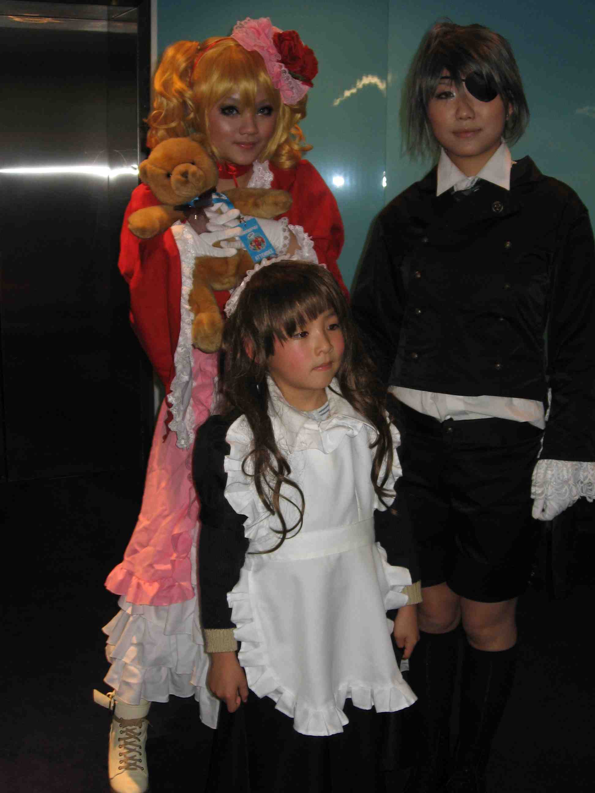
A suitable event for Cosplay, there were some costumes featuring sewing, beading, feathering and functioning. These were paraded both inside and outside the venue and on the cosplay stage.
Other events included a Gundam workshop, Karaoke session, videogames and a screening of the anime Summer Wars. There were also sewing, pattern and armour making workshops…plus the huge trading floor full of vendors, artists and fan clubs. It all flourished in the presence of the patronage of the Japan Foundation. Japanese popular culture thrived at this event and made it a wonderful day!
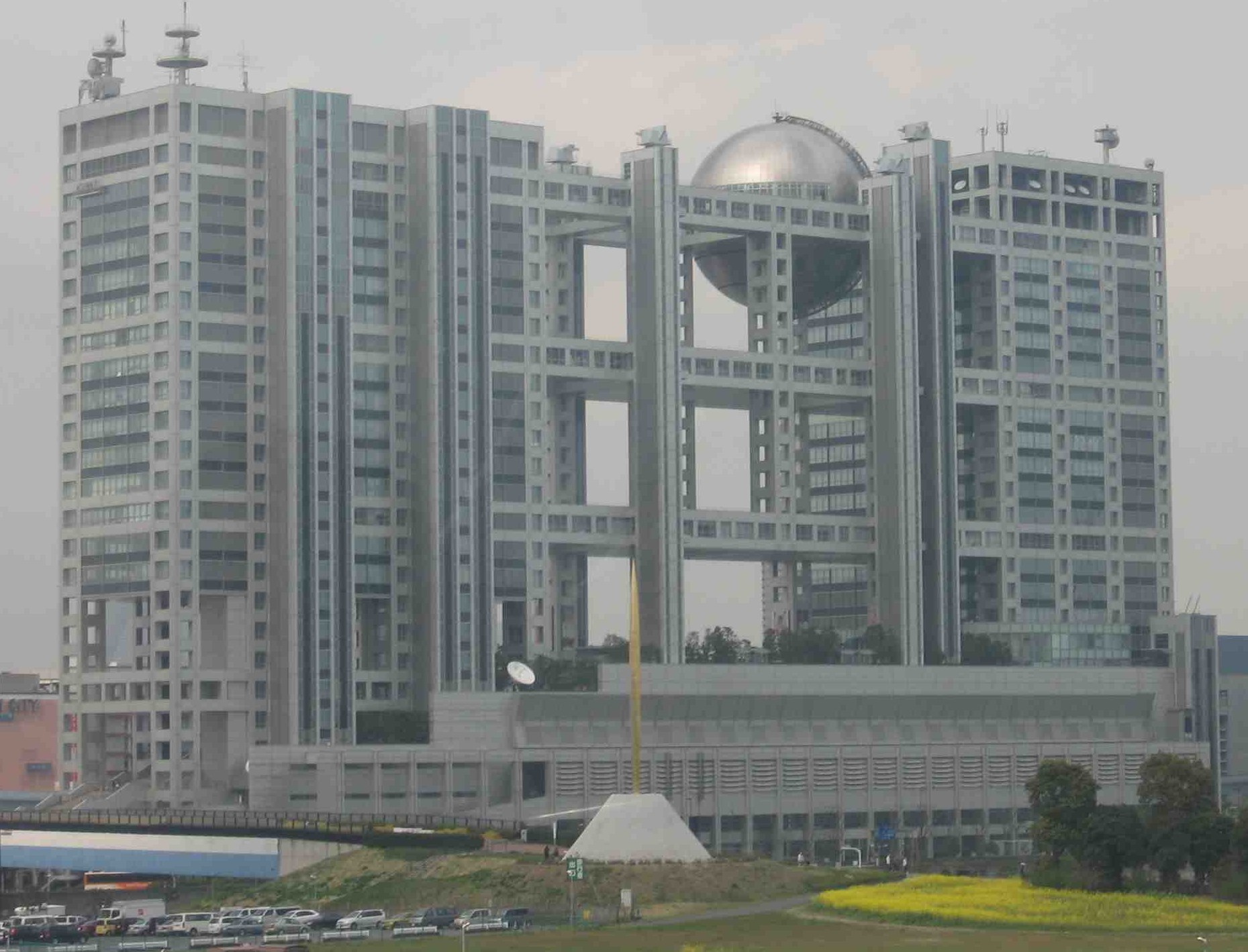
FOOTNOTE: I SAW A BIG SAW AT BIG SIGHT! As an addendum to this convention report I wish to mention an event I attended in Tokyo last year. I travelled by monorail to Odaiba Island, an artificial island built in Tokyo Bay…to attend the Tokyo Anime Fair at a venue called Tokyo Big Sight (pronounced Biggu Saito in Japanese). Big Sight? I thought that must be a misspelling along Japlish lines for the name of a large exhibition space. There were definitely some big architectural sights to behold as it was a very large exhibition space. No sign of Godzilla though! I thought of Thor as the monorail travelled over the Rainbow Bridge…but instead saw the high tech buildings of Fuji TV headquarters.
On arrival at the Big Sight location things started to look a little unusual. There was an open space beneath a series of inverted pyramids sitting on glass covered, cantilevered legs(see photo below). This giant entrance had the effect of considerably reducing the scale of the people passing beneath it. Then I understood the ‘big’ aspect implied in the name of the site.
The walk from the monorail station to the Big Sight exhibition also had an epic feel to it. It looked a lot closer than the long walk it took to get there. It was during this walk that I experienced a visual surprise…the sight of a large object embedded in the grass on the level below. It was a sculpture, an art installation of a large saw…unmistakably something by the Swedish/American Pop artist Claes Oldenburg. It also was a “big sight” to see at this big site.
This is the third in my series of posts on the theme of comics art…that document moments in the recent history of Australian comics, particularly alternative comics and the Australian Small Press..and related overseas comics events that I attended as part of my research. I had started researching this subject in the late 1990s and it eventually led to my PhD thesis. Details: Ph.D. Macquarie University, Division of Society, Culture, Media and Philosophy…A Study Of Contemporary Australian Alternative Comics 1992-2000…With Particular Reference To The Work Of Naylor, Smith, Danko And Ord, 2003. On completion of this research I donated my large collection of comics to the National Library of Australia…for listing as the Michael Hill Collection of Australian Comics.
NOTE: I wish to acknowledge the shorter gap between my posts in this instance…this was influenced by the attendance and timing of the anime and manga event in Sydney. BTW please let me know what you think about the content and frequency of my blog posts. With this post there’s an opportunity to compare the two events…Sydney and Tokyo…comics and anime…small scale and grand. I welcome any comparative comments, Michael.