GOING DEEPER INTO PRODUCTION MODE! Progress report on my artist book/comic Blotting Paper: The Recollected Graphical Impressions Of Doctor Comics, Chapter 3, The Chthonian Turn. It is subtitled The Cats’ Revenge as it starts heading in the direction of a funny animal comic.I am approaching the mid-way point in completion of the artwork, averaging one page per day. It’s been a struggle maintaining this rate.
Serial production offers the opportunity of revisiting the work at some future date with the opportunity to make changes. With hindsight, the possibility of reworking things and adding new material seems appealing. One hopes it would improve the material…as this wouldn’t happen till after I have published a first edition.
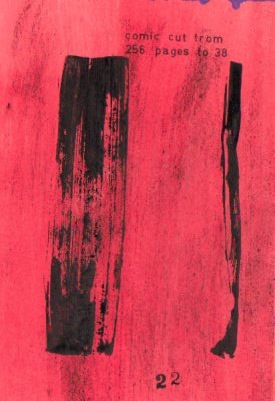
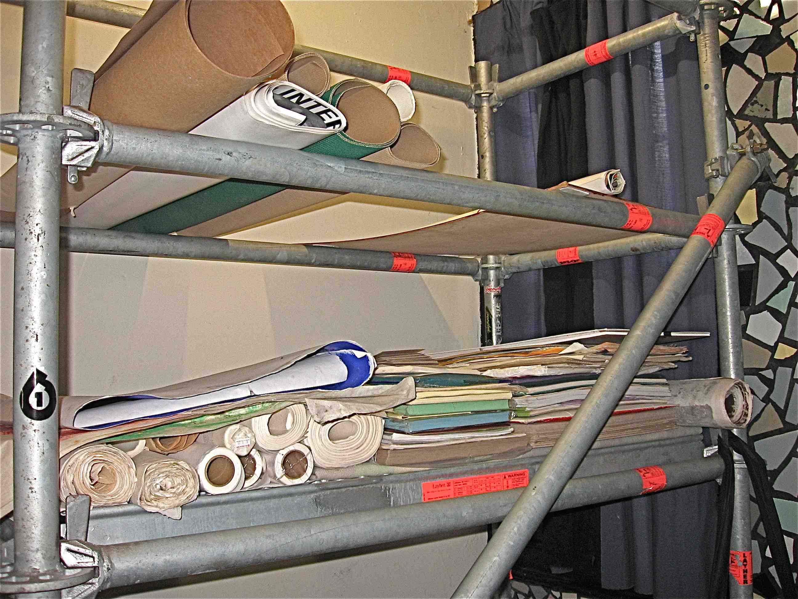
About half of this issue is being hand-printed and/or painted. Those are the areas I have spent most of the time working on. The remaining half will be digitally printed. Most of the page numbers are being stamped, some directly onto the page, others scanned then printed.
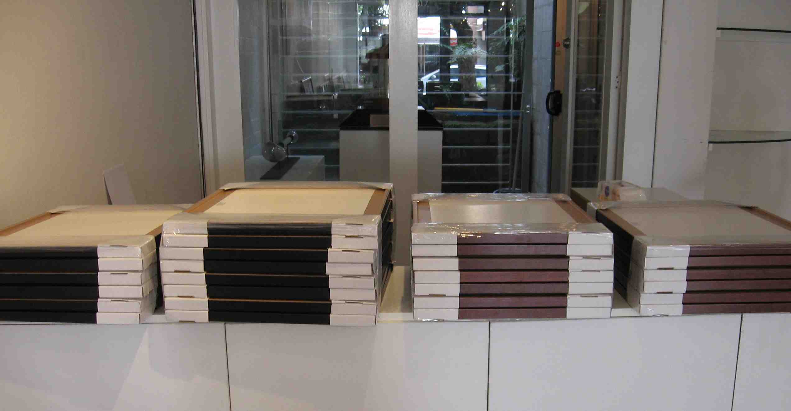
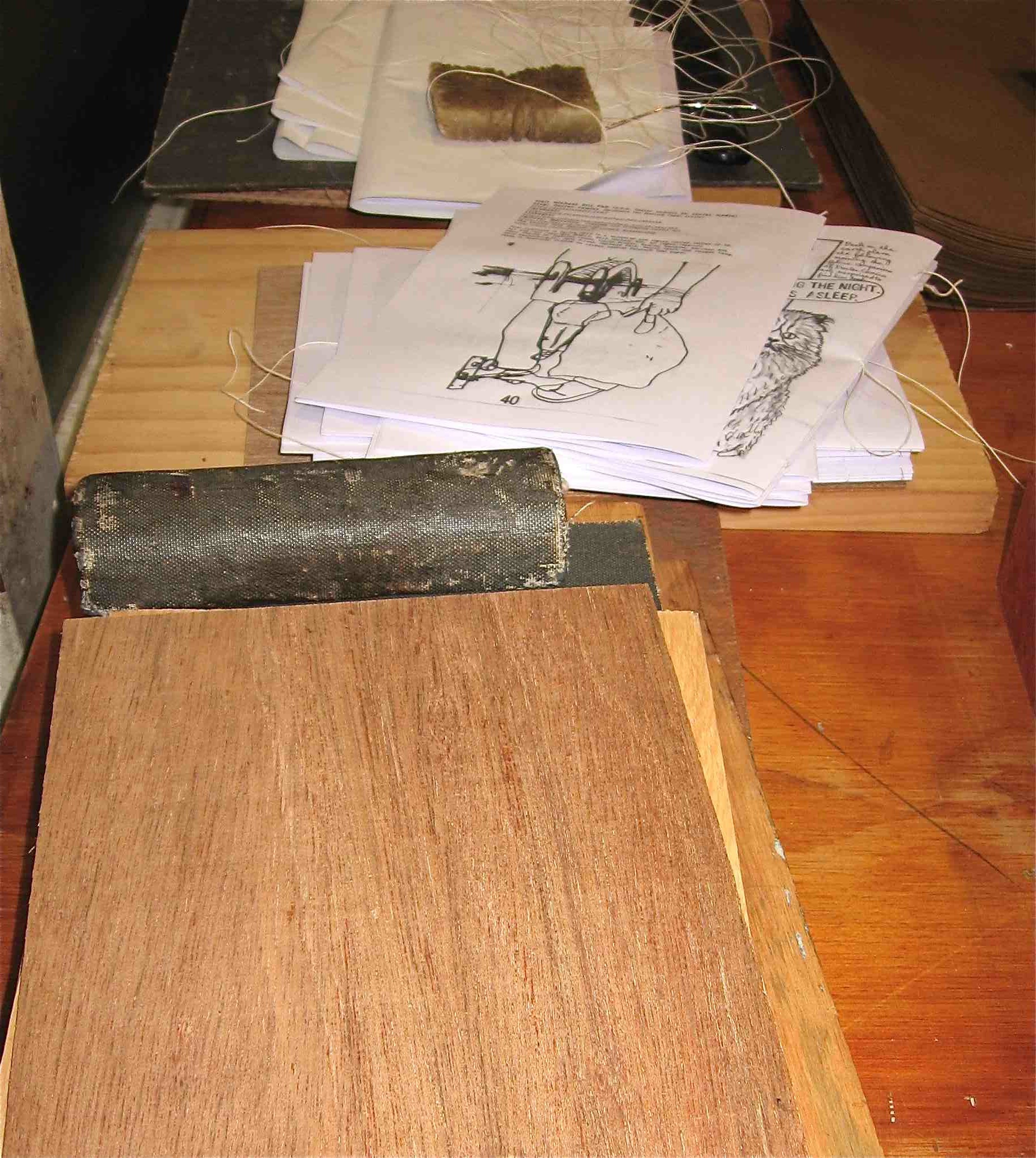
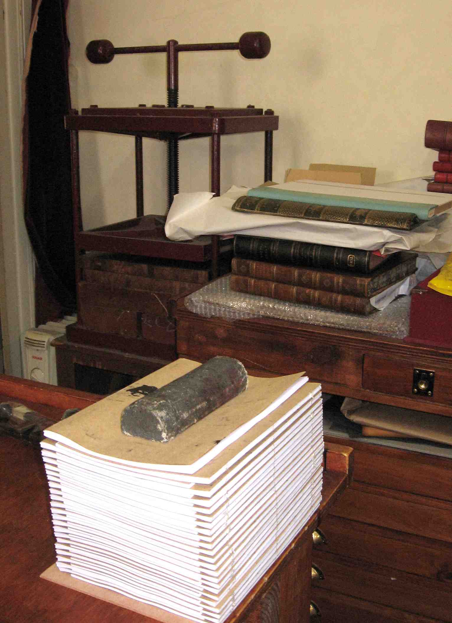
Over the past month I have completed the artwork, printing and the finishing stages of the labelling, stapling and bookbinding. I started out stitching the sections together but found that I lacked the skills to do the job properly. I abandoned this approach and switched back to the simpler form of stapling…however, I shall endeavour to master stitching techniques in future.
It looks interesting as a volume being half hand-printed and half digitally printed. The varying pages are sometimes shuffled together. In addition to adding pages of colour and print-made texture this method has resulted in a shorter period of production.
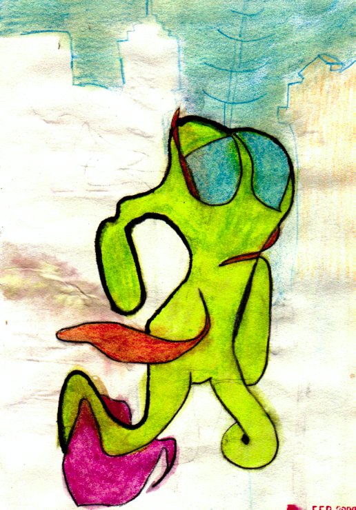
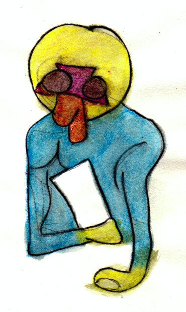
The feline characters continue to assert themselves. This altered the generic pattern from auto-bio to funny animal comics with the odd not so humorous scene.
Notice of publication should be posted on this Blog around the end of the month. It is intended take place at a comics event in Germany…but we will have to wait and see about that, Michael.
This is the first in a series of regular reports documenting the production of the third issue of my artist book/comic…Blotting Paper: The Recollected Graphical Impressions Of Doctor Comics. It continues on from my previous posts on the first chapter/issue The Ingurgitator…and the second chapter/issue A Blot On His Escutcheon. The new chapter, The Chthonian Turn: The Cats’ Revenge…deals with the feline characters’ reaction to the demise of Doctor Comics…and that gentleman’s adventures in another dimension to which he has travelled. I hope to self-publish it before the end of the year.
As with the two previous issues printmaking is involved in the generation of images…via woodblock, linocut, Japanese sosaku hanga technique, rubber stamps and wooden seals. In addition other visual communication techniques…such as drawing, painting, collage, cartooning and photography…with the intention of producing a limited edition artist’s book comic.
I also intend having more colour pages in this issue…following the use of sporadic spot colour in Issue #1 and the 8 full colour pages in Issue #2. The colour will assist in the graphic representation of both the real and imaginary worlds featured in the comic.
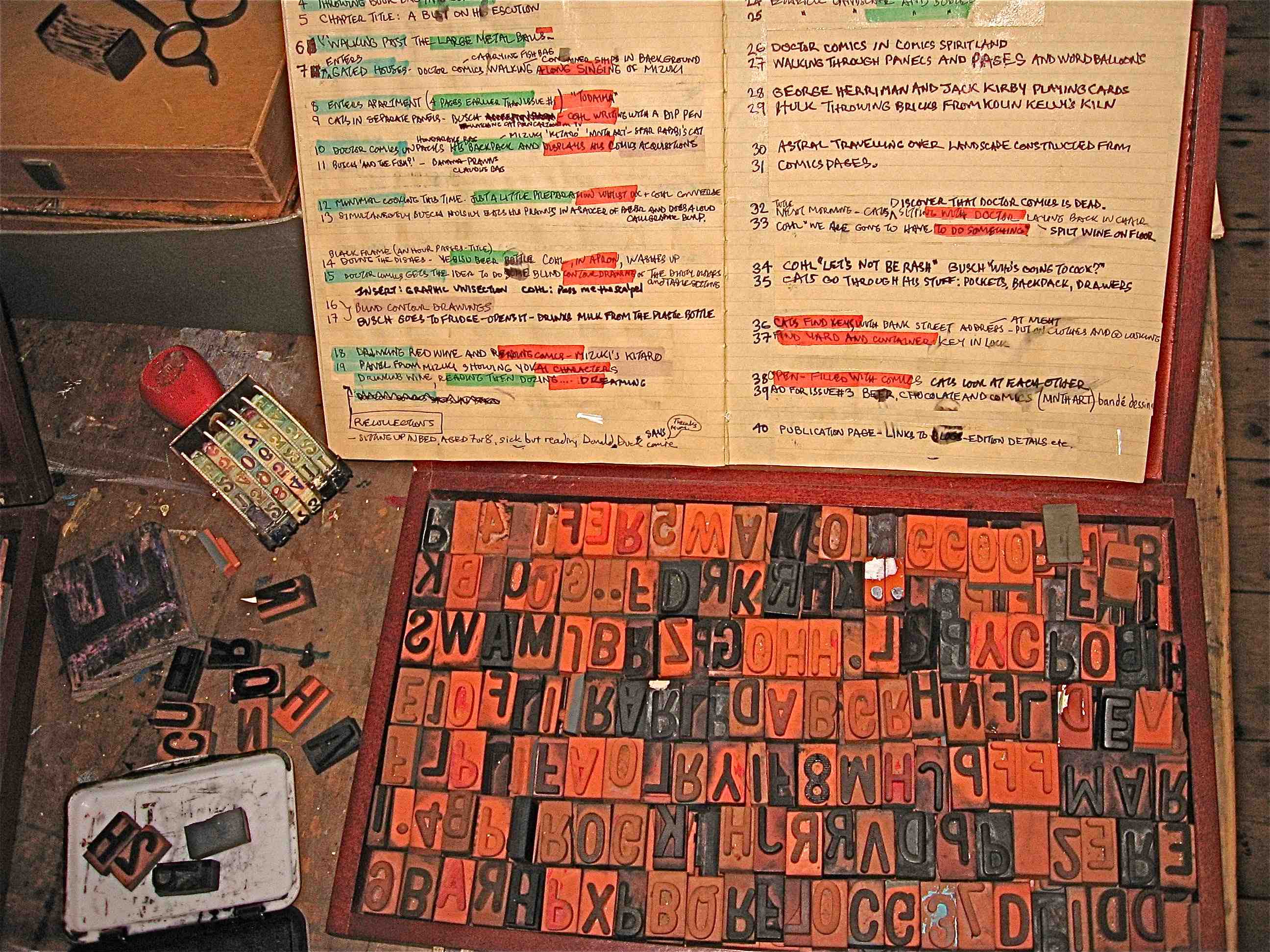
I am continuing to edit the script, refine ideas, and develop others. There has been some unscripted image-making and printmaking activity…with the intention of using this as a loose but parallel means of creating vaguely conceived and experimental visual content. Examples produced through this printmaking strategy are featured below.
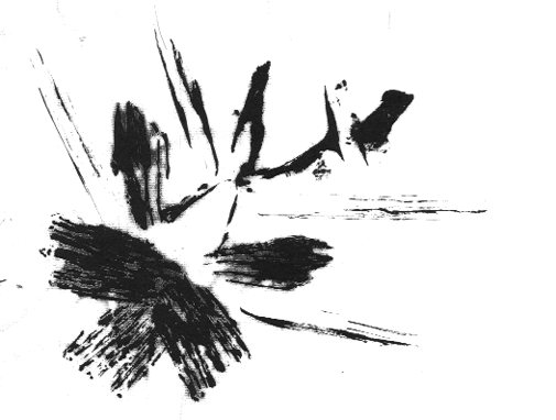
In the present chapter the two feline characters deliberate over the decision of what to do following the sudden departure of Doctor Comics. Meanwhile the latter character continues his travels in the chthonian world…confronting various vaporous forms and ghostly figures…including a trio of roaming red shades (see the three red shade illustrations). The raw state of these printmaking images will most likely be subject to further graphic manipulation.
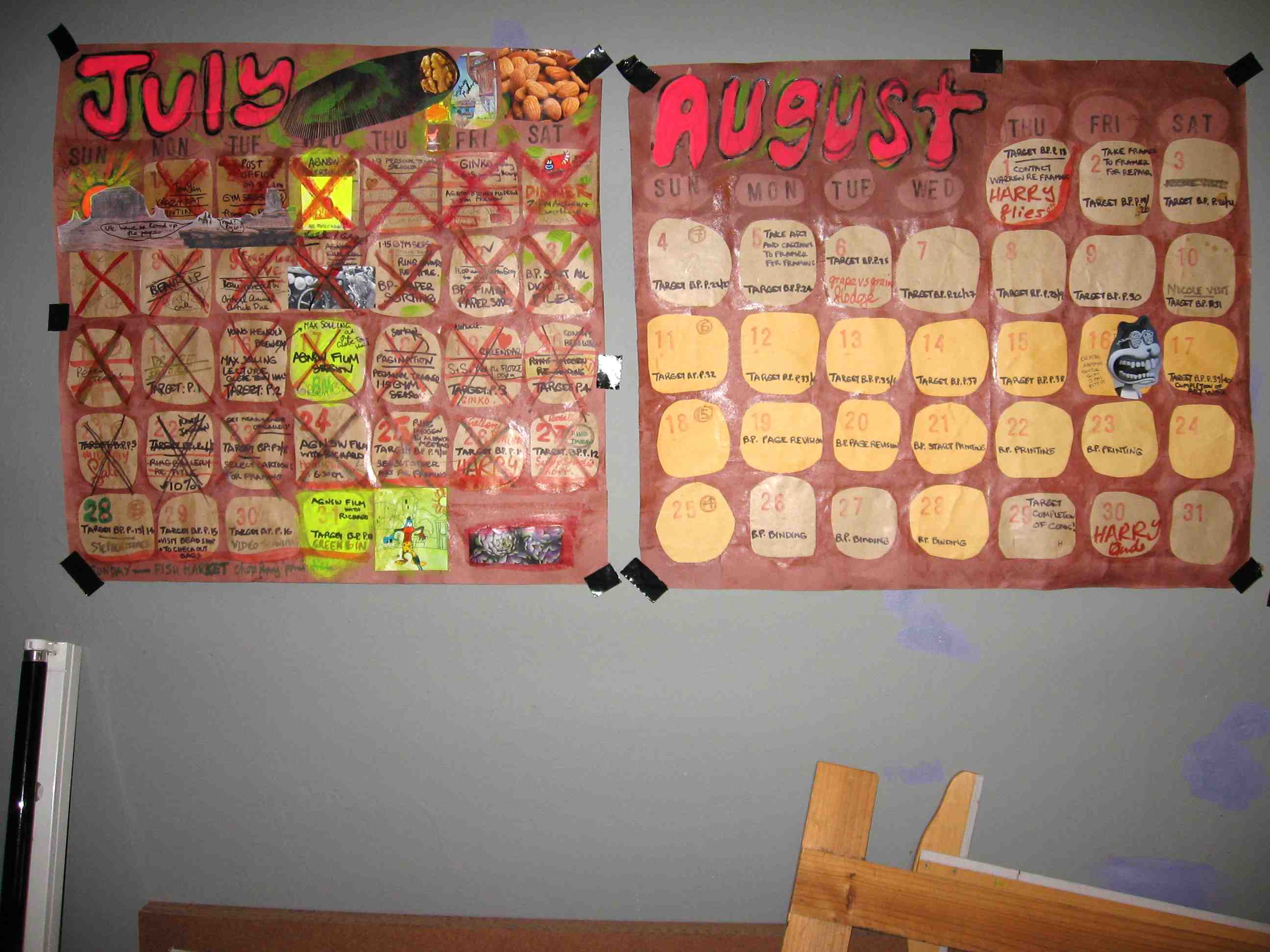
The target date for completion of the five 8-page signatures have been approximated…and with a good run the comic could possibly be ready for binding as early as June.
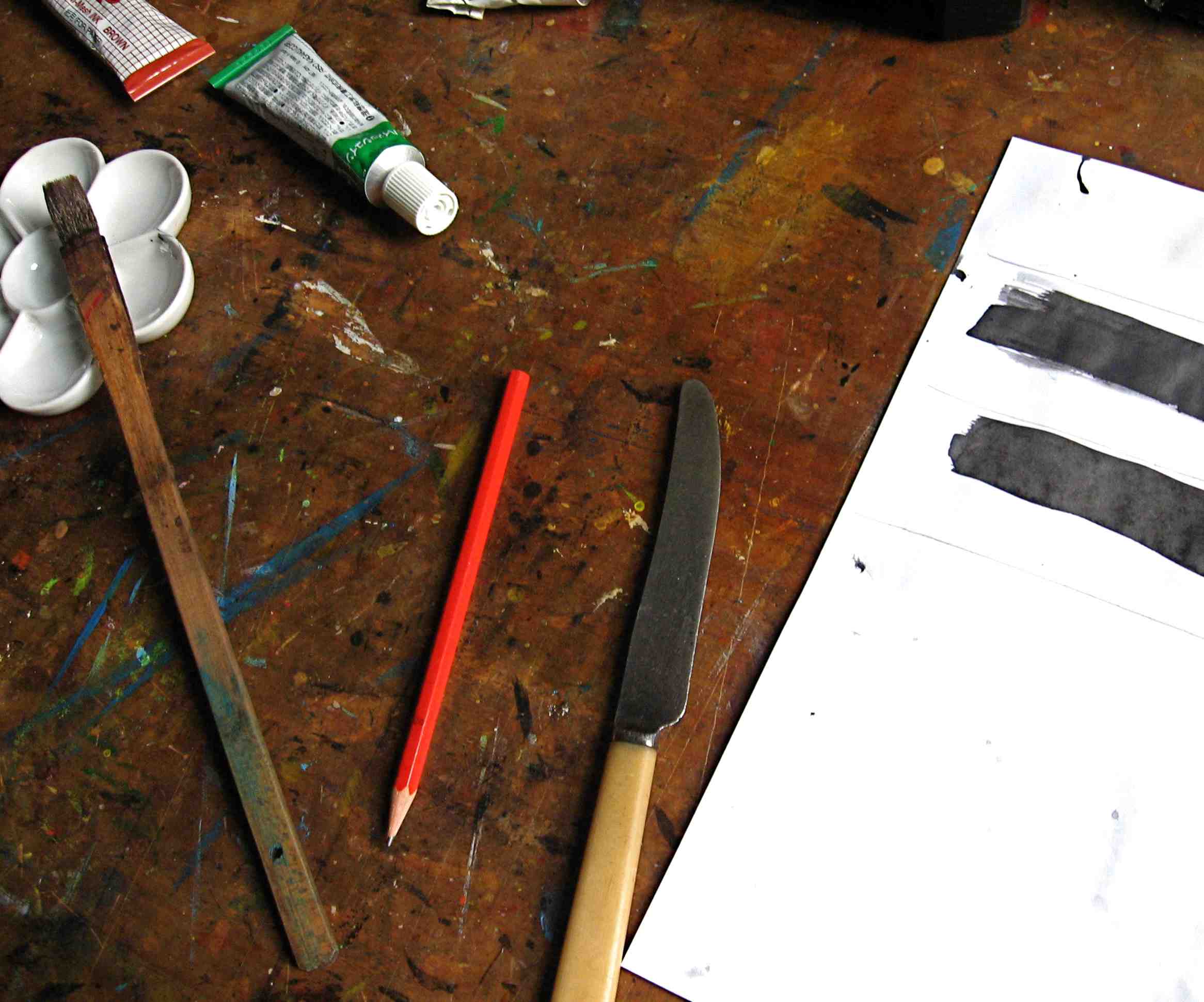
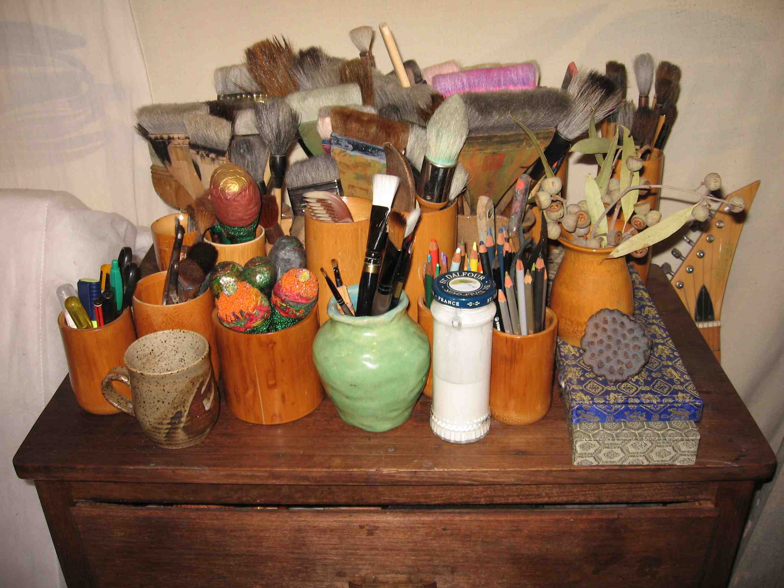
Ink, more so than paint, appears to be the dominant graphic ingredient in the production…with dip pens, drawing pens and brush calligraphy involved…although some of the inking will be made onto previously painted paper.
There are some pencils in there too…as well as the pens,…with drawing and handwriting components plus my regular use of printmaking for image generation.
Having gotten deeper into production modeI am now approaching completion of the artwork …having advanced from scripting to page layout…however, I am keeping things open in terms of the resolution of the story.
I find the creation of the images…and the entire image-making process…including the resultant generation of the artwork…to be the most pleasurable part of the production process. Culling, selecting and editing the artwork is a tougher task.
Printmaking has again been employed in the image-making…a little more than photography…but about the same proportion as drawing. In terms of style, abstraction is making an impression. The notion of developing this project into graphic novel form continues to firm.
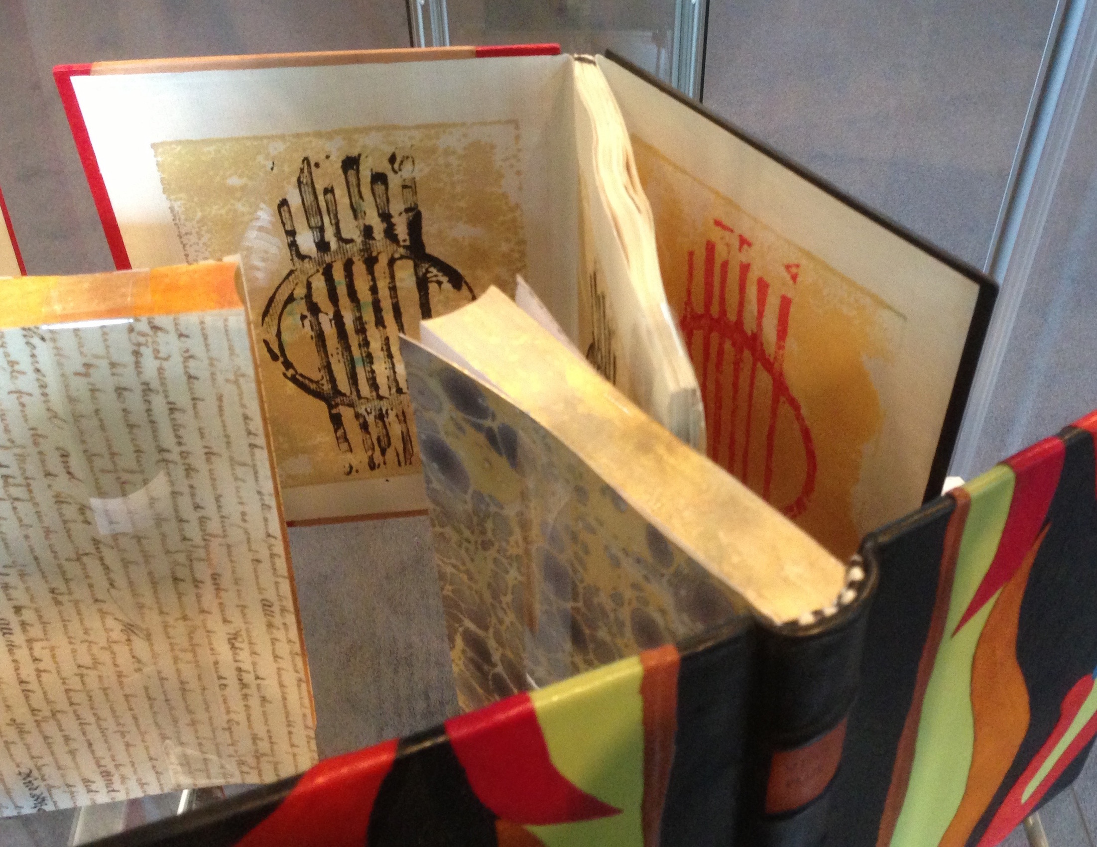
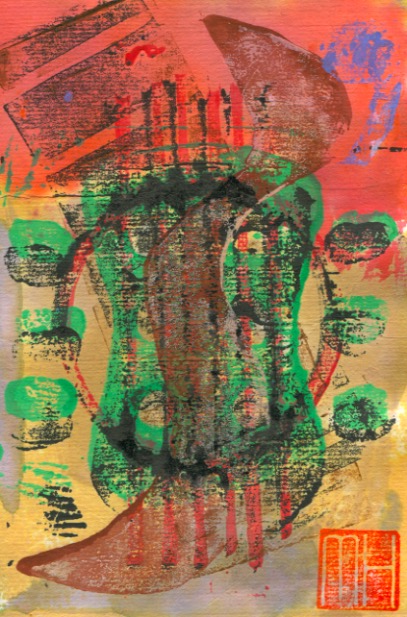
My artist book, The Grafik Guitar, has undergone a marked transformation by being bound and covered by designer Imogen Yang. This has resulted in an elegant and artistic encasing collection of the prints.
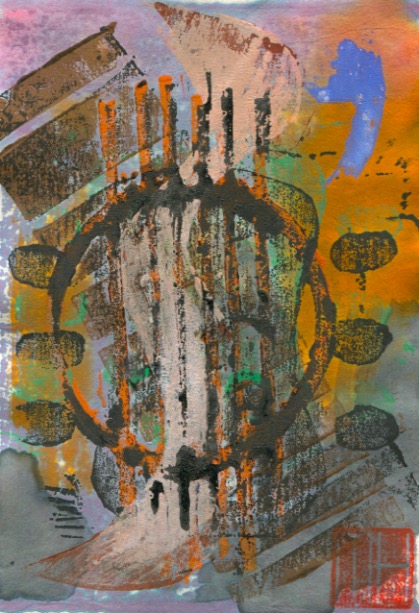
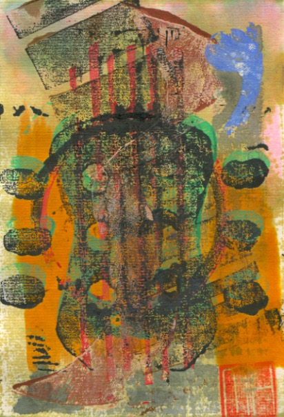
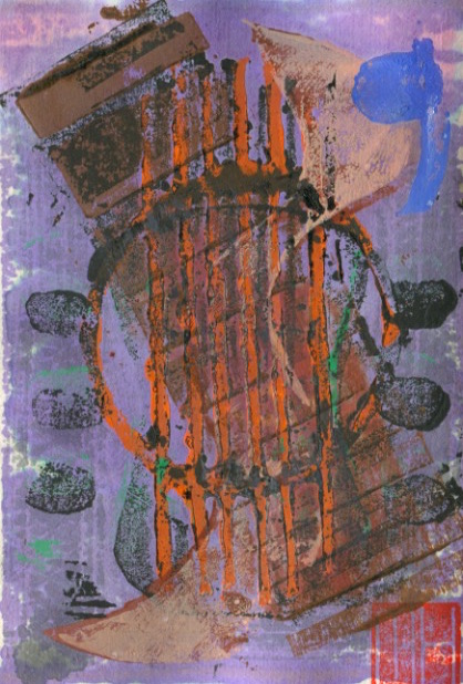
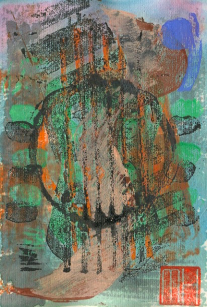
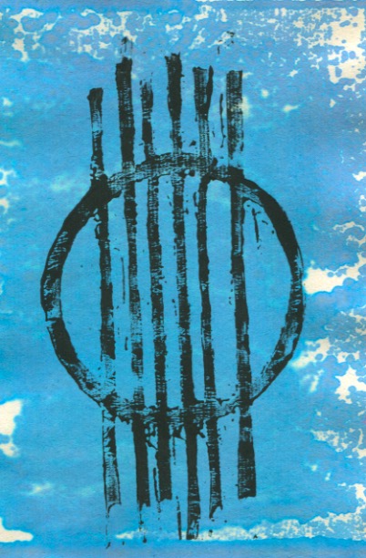
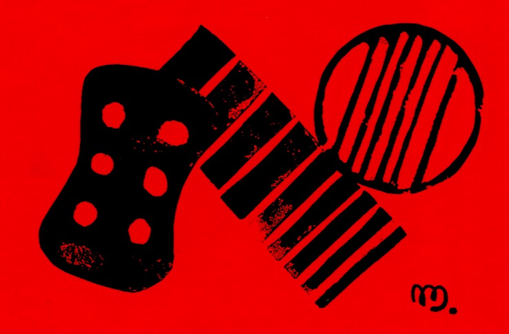
The book consists of 38 prints on the theme of deconstructing the elements of the guitar. The images were carved in lino and wood. I followed the Japanese creative print (sosaku hanga) approach using Japanese knives, gouges and chisels. The book was then printed on Chinese 2 ply paper with Dr. Ph. Martin’s water colour ink and some sumi.
Imogen emboss-printed the guitar strings block onto a strip of kangaroo skin for the front cover. Then she got me add my MH signature chop. Her use of 6 thick binding strings to the front and back cover boards echoes the guitar’s 6 strings. I can’t explain the stitching pattern she has employed to bind the pages together. As an iteration of the cover design she used my separate guitar strings prints for the endpapers.
The book is currently on display at the Art Gallery of NSW. It is part of the 16th annual exhibition of the Australian Bookbinders. The exhibition runs from 7th November to 14th December in the Research library and archive.
THE MAKING OF The Grafik Guitar ARTIST BOOK This follow-up addition to the above post shows some of the printmaking. I made 38 monoprints on the theme of the deconstruction of some elements of the acoustic guitar. These included the machine head, tuning pegs, fretboard, strings and sound hole. The separate elements were carved in lino or wood then overlaid in various combinations and intensities to form composite monoprints. The Japanese creative print method (sosaku hanga) was employed. This blocks were carved with Japanese knives and chisels. They were printed on Chinese paper with water colour ink, sumi and additional hand colouring.
I incorporated elements of that design in a subsequent project. It involved the design of the cover for publication of the conference proceedings of the international popular music studies conference. Titled CHANGING SOUNDS: New Directions And Configurations In Popular Music in Sydney, IASPM 1999. (Picture below). I also presented a research paper at that conference.
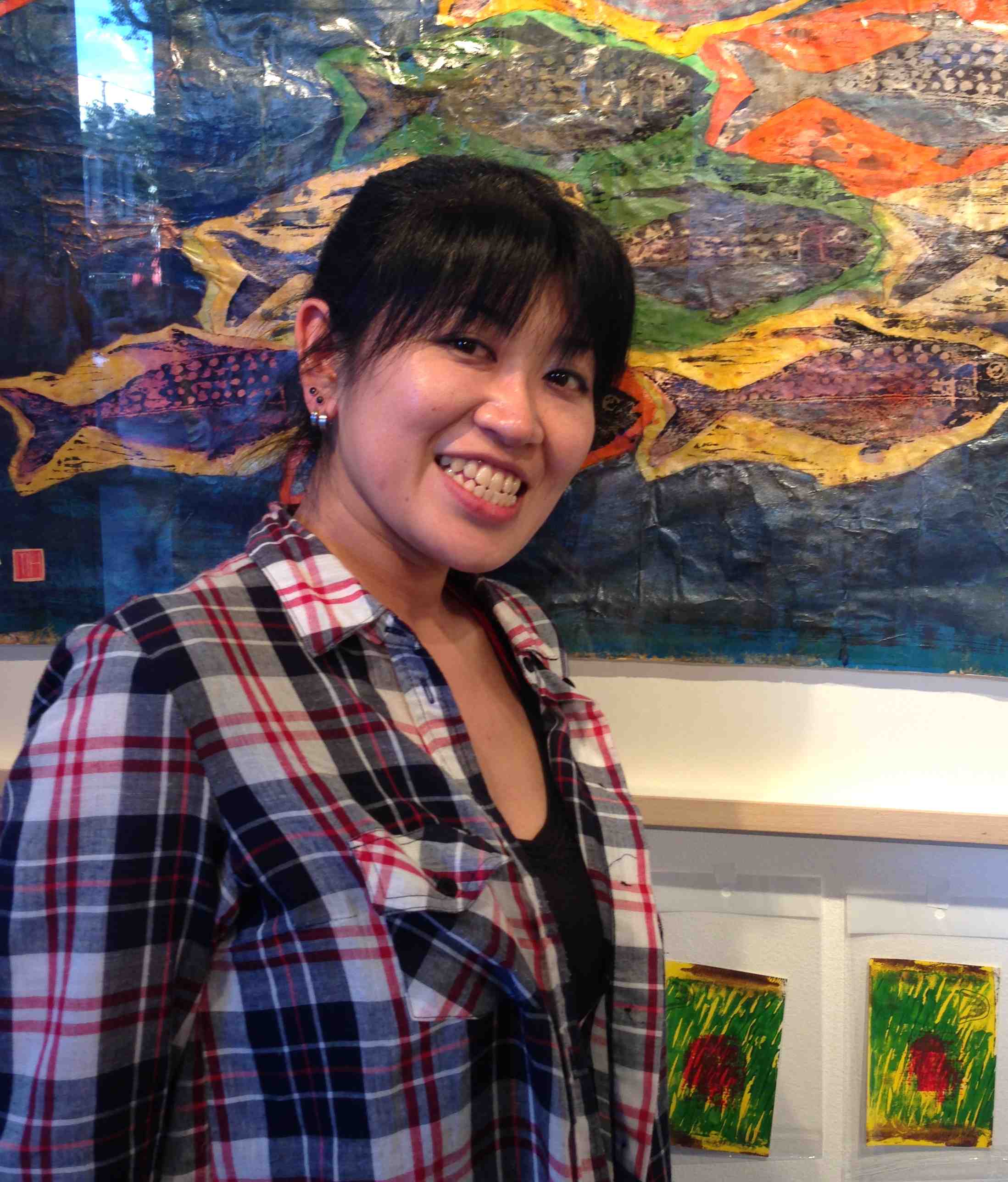
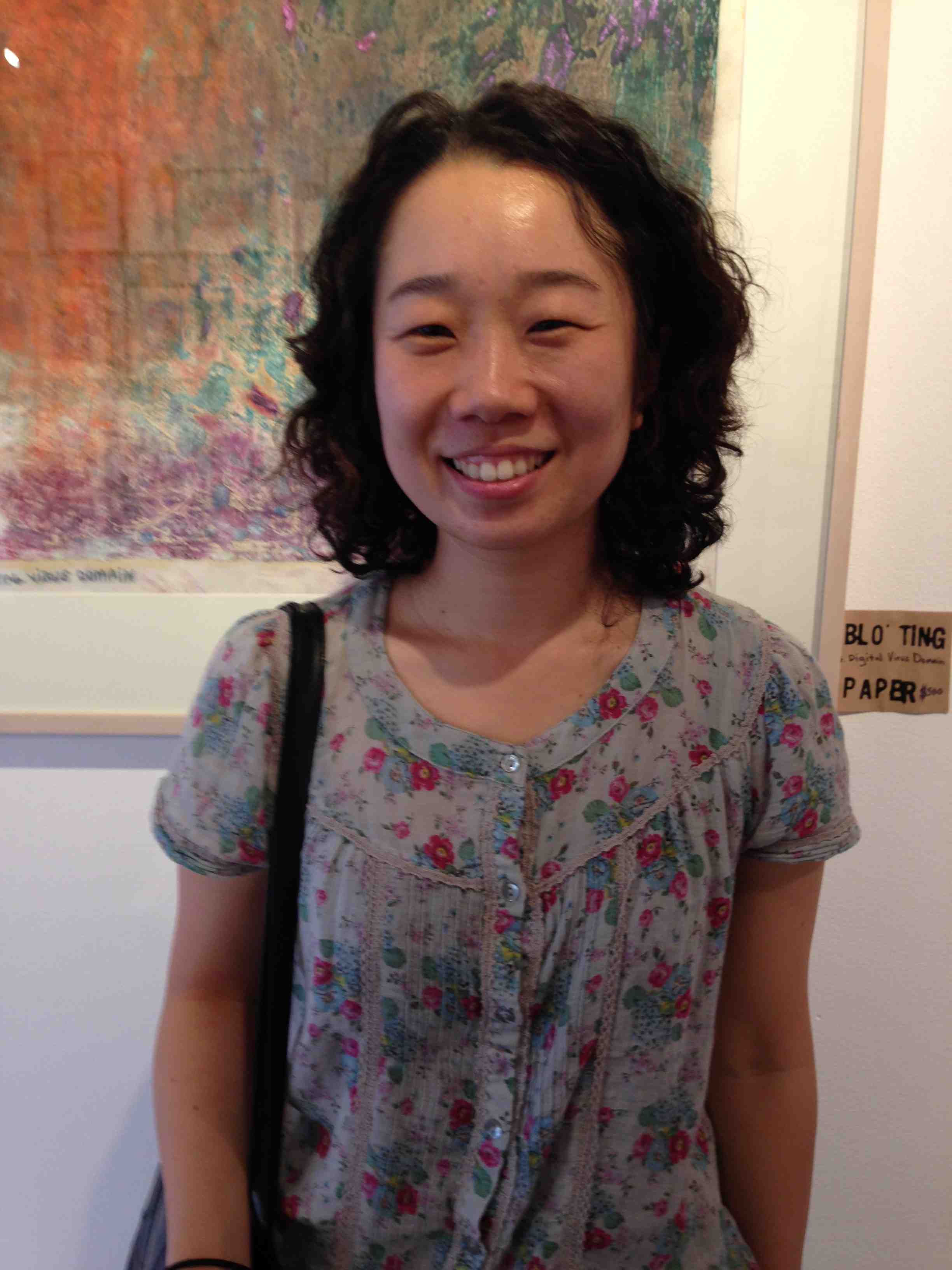
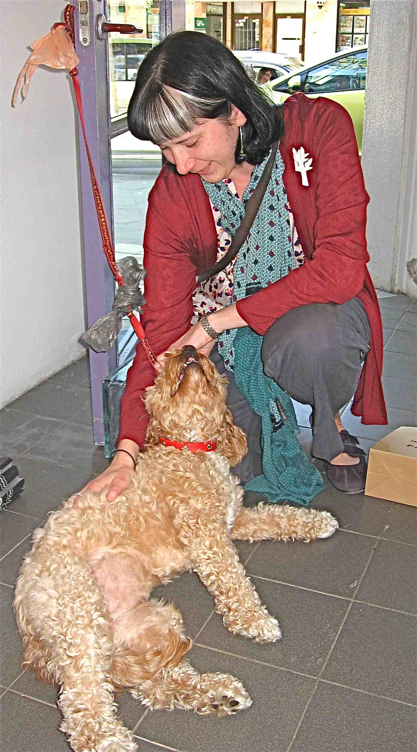
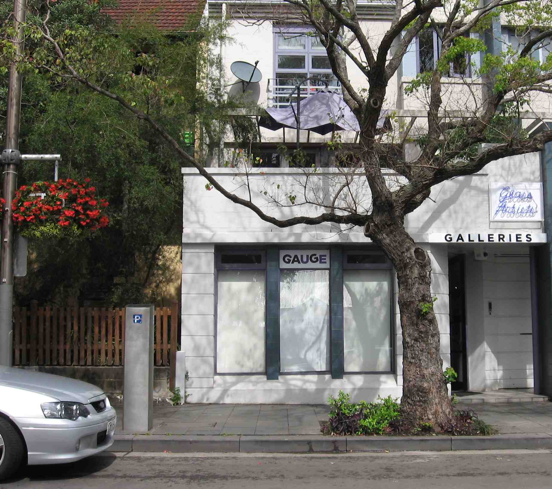
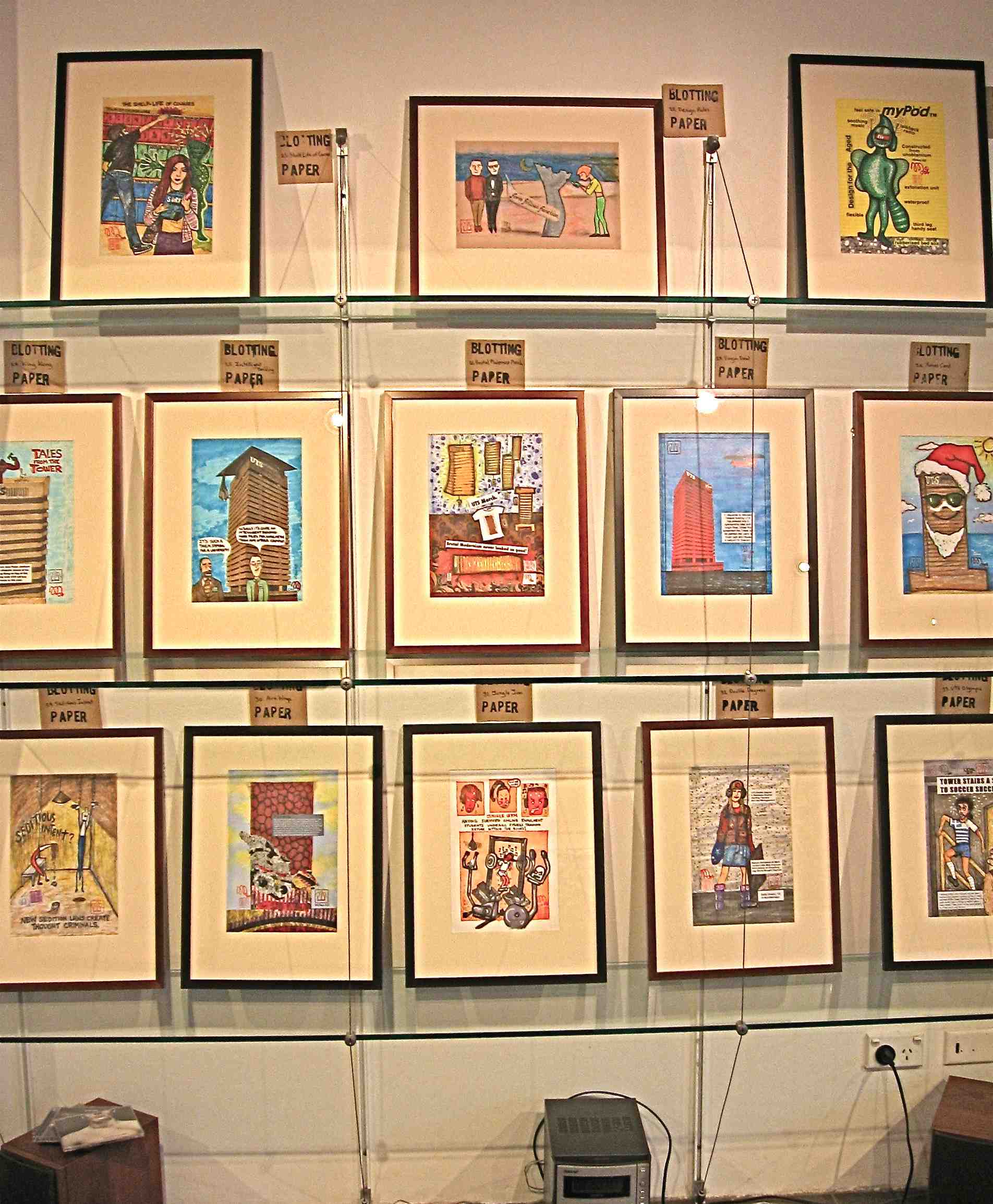
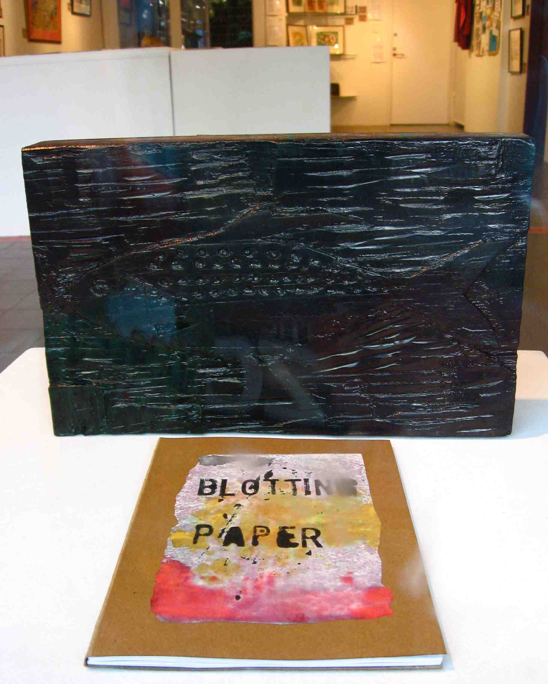
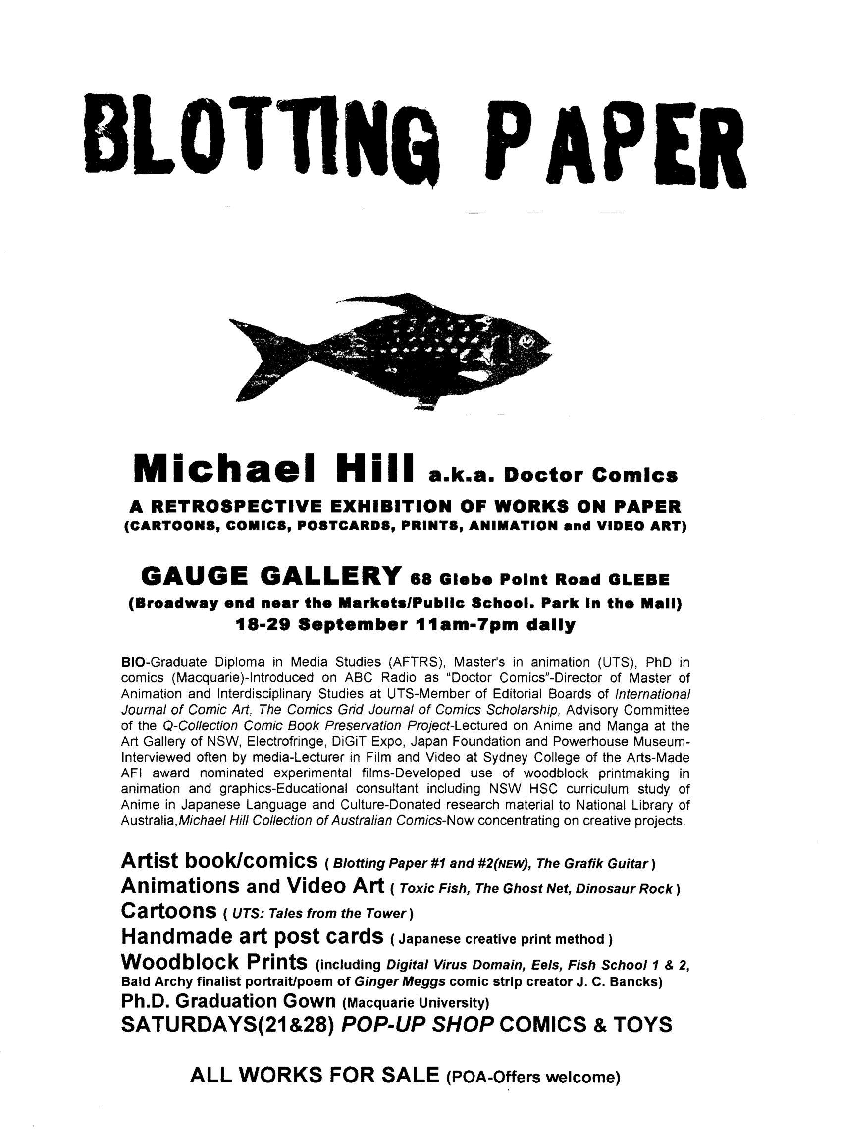
This post covers some glimpses of the works on display and visitors to the exhibition Blotting Paper: Works On Paper 18-29 September at GAUGE Gallery in Glebe, Sydney. It included the publication and launch of the second issue of my artist book/comic Blotting Paper: The Recollected Graphical Impressions Of Doctor Comics, Chapter 2: A Blot On His Escutcheon.
Did you see this exhibition? If so, I would love to hear of your impressions of the show and of my art…and/or of this post about it. You can post to this Blog, Michael.
This post covers the installation of my comics art exhibition Blotting Paper: Works On Paper. It was held from18-29 September at GAUGE Gallery in Sydney. It included publication of the second issue of my artist book/comic: Blotting Paper: The Recollected Graphical Impressions Of Doctor Comics, Chapter 2: A Blot On His Escutcheon.
The second issue of my artist book/comic… Blotting Paper: The Recollected Graphical Impressions Of Doctor Comics, Chapter 2: A Blot On His Escutcheon… has now been published. As with the first issue the publication was planned to be accompanied by an exhibition of associated art work. This time the exhibition opening, at GAUGE Gallery, preceded the publication. The exhibition was larger in scope and located in a gallery, as opposed to a bookshop. The comic was late! It arrived on the fourth day of the event. The launch had to be postponed due to its uncertain delivery date. When the book finally arrived at the gallery it went on sale but retained its “yet to be launched” status. With two issues now complete the thoughts of it potentially growing into graphic novel size continue to circulate in my mind! We’ll see! Michael
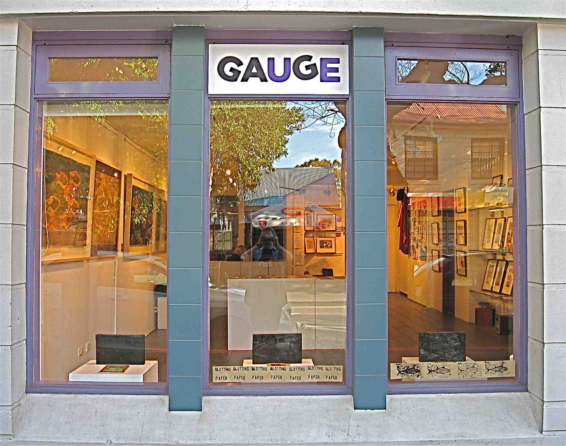
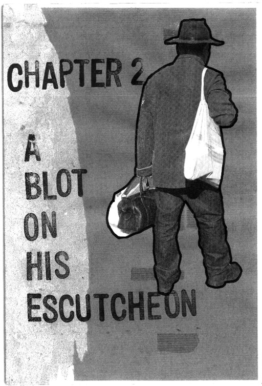
Publication of the second issue of my artist book/comic Blotting Paper: The Recollected Graphical Impressions Of Doctor Comics, Chapter 2: A Blot On His Escutcheon is forthcoming. September is looking increasingly likely subject to completion of the printing, binding and delivery of the comics. The comic will form part of an exhibition of my works on paper at a new gallery in Glebe called GAUGE. Below is an image of the title page. The image has been constructed from elements of photography, printmaking, typography and collage. It shows Doctor Comics returning from a shopping expedition. UPDATE: Exhibition dates have been firmed to 18-29 September 2013 but still no firm launch date for the comic…which is beginning to raise thoughts in the long term of its potential development into a graphic novel. We will have to wait and see about that!
Continuing reports documenting the production process of my artist book/comic Blotting Paper: The Recollected Graphical Impressions Of Doctor Comics…Chapter 1: The Ingurgitator andChapter 2: A Blot On His Escutcheon…this post shows more examples of the image-making aspects of the project. These include assemblage, drawings, design, photography, printmaking, plus project management.
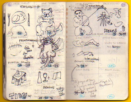
Some colourful project management in my blog log book.
This blog on my Blotting Paper comic has provided a means of documenting the production progress of the comic.
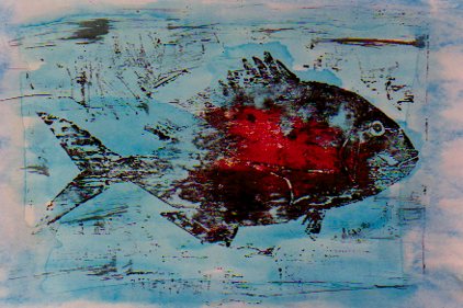
Both fish and cats feature in the comic, the fish more realistically rendered than the cats. Above is an image from my earlier fish animation, with added blood. Below is a rough sketch of one of the feline characters.
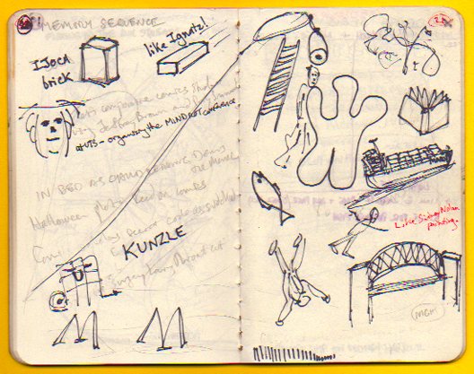
Continuing my series of reports documenting the production of my comic Blotting Paper: The Recollected Graphical Impressions Of Doctor Comics…this post illustrates the use of the note books, sketch books and design processes involved.
The larger notebook (above) is primarily used for making notes and writing drafts. It has information about the characters and the environment in which they live…plus ideas about the narrative and its construction. The smaller note books (below) contain rough sketches that were used to develop ideas from the main note book.
The design is a little on the rough and sketchy side! It does, however, show an outline of the character design and story sequencing. How did you find it? Let me know. I would love to read your responses to my posts, Michael.
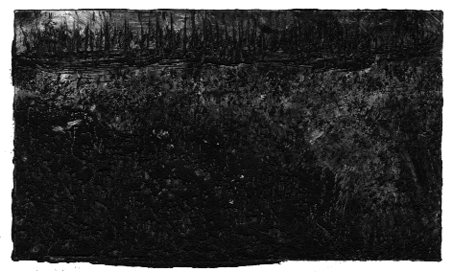
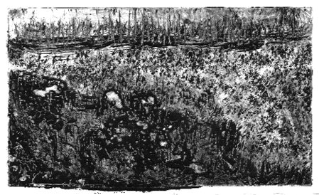
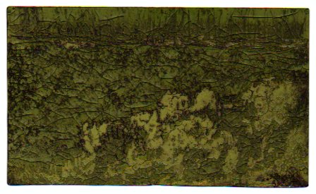
This post continues reportage of the production of my artist book/comic Blotting Paper: The Recollected Graphical Impressions Of Doctor Comics. It describes the use of printmaking in the image-making process, including the creation of landscapes of subconscious terrain.
Doctor Comics finds himself in a shadowy landscape during an intense dream experience. I have tried to express the inky and murky feel of this etheric place he traverses. To achieve this I made a series of monochromatic monoprints.
This landscape can be seen more clearly as more light is added to each successive image. Despite the extra light he still finds it hard to trace his way through.
These prints were made using an etching process. It was a novel method of printmaking that involved exposure of the design to a light sensitive plate. This process marked the lines on a gelatin coated metal plate. The plate was then rubbed with a stiff brush under running water to carve the lines. This process is known as solar plate etching.
A deliberate ‘blotting’ effect was obtained from pressing a saturated inked block onto highly absorbent blank paper. This was for a scene from the second issue. After printing, the paper was peeled off the block carefully to avoid tearing. This was due to the combination of the wet inked areas and the paper’s soft, tissue texture.
Tails and fins of a cooked fish were inked and printed for some of the images used in Chapter 1. This approach was inspired by the Japanese sosaku hanga printmaking method. That involves inkable flat objects employed as ‘blocks’ as an alternative to woodblocks. The resultant graphic effect is shown in the print above. Photos of the image-making process involved in making that print are below.
Another unused print, above, from the first issue is a possible inclusion as a postcard insert in this issue. It was constructed from a combination of woodblock and object prints. I know I seem to be pushing the printmaking cart here but it has really got me going. I would love to hear of your experiences of printmaking, if you have done that, Michael.
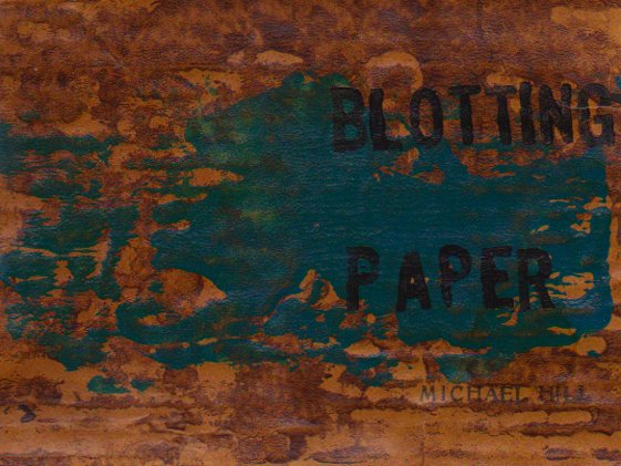
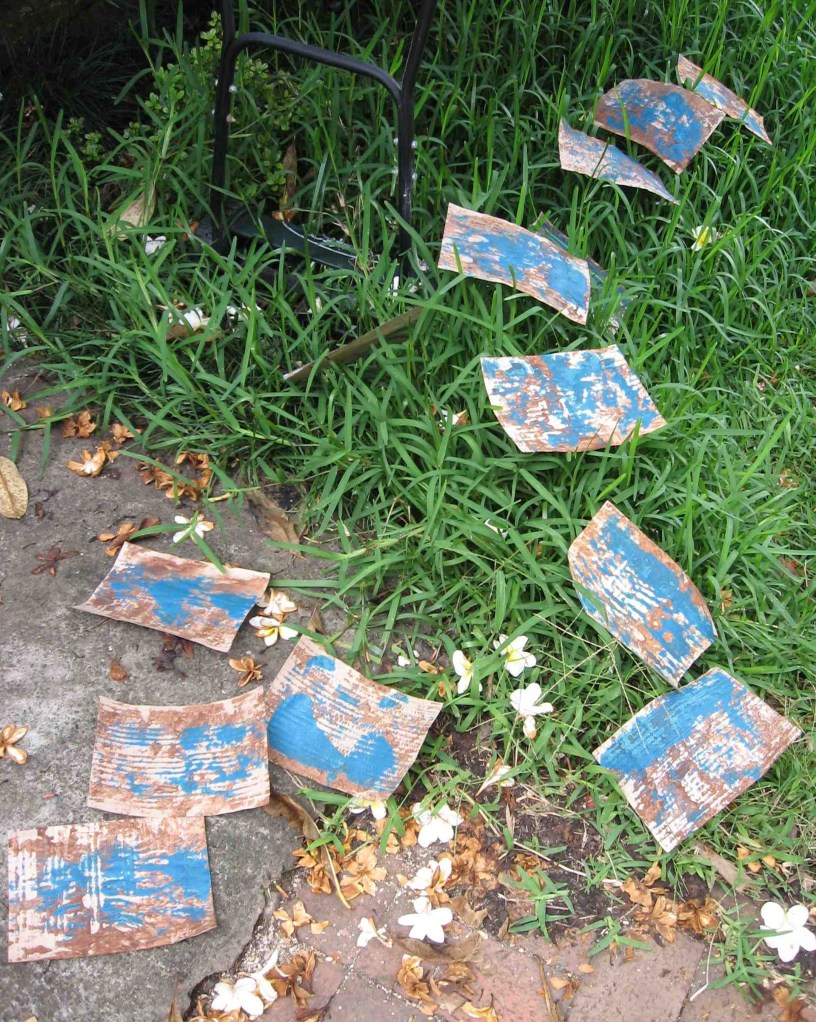
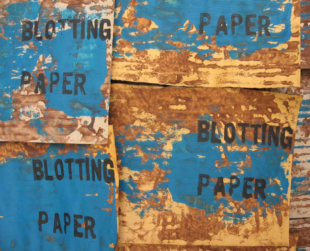
This is a further report on the production of my graphic novel Blotting Paper. This post focuses on print layers used to create the cover design. Planned for the first issue but not used until the second here are some images of the printmaking procedure.
Working in a small studio I had no bench space for drying. Letting the prints dry outside on the ground in the Spring sunshine proved a fast way to obtain the dryness. The prints were vulnerable to a breeze and were blown into the grass and garden.
The final stage involved printing the type over the blue overlay and brown background.
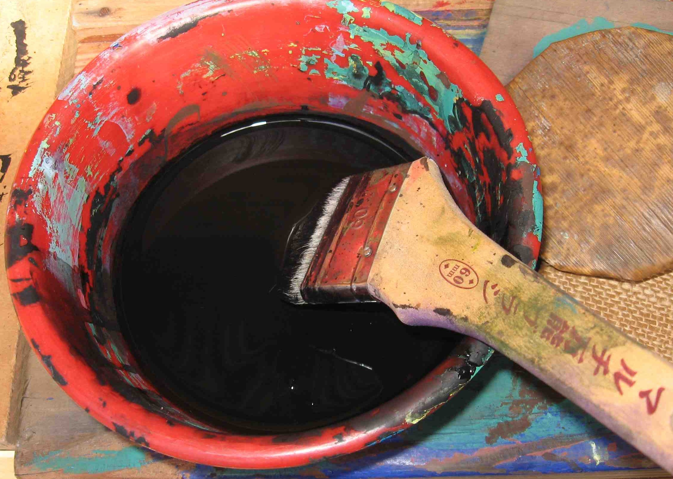
A bowl of sumi ink, a brush and a bamboo baren. (Photo by Dr. Michael Hill a.k.a. Doctor Comics)
Following the Japanese creative print approach of using sumi ink enabled me to obtain solid blacks. The ink was brushed onto the block. Then the paper was placed face-down onto this and rubbed with a bamboo baren to make firm contact.
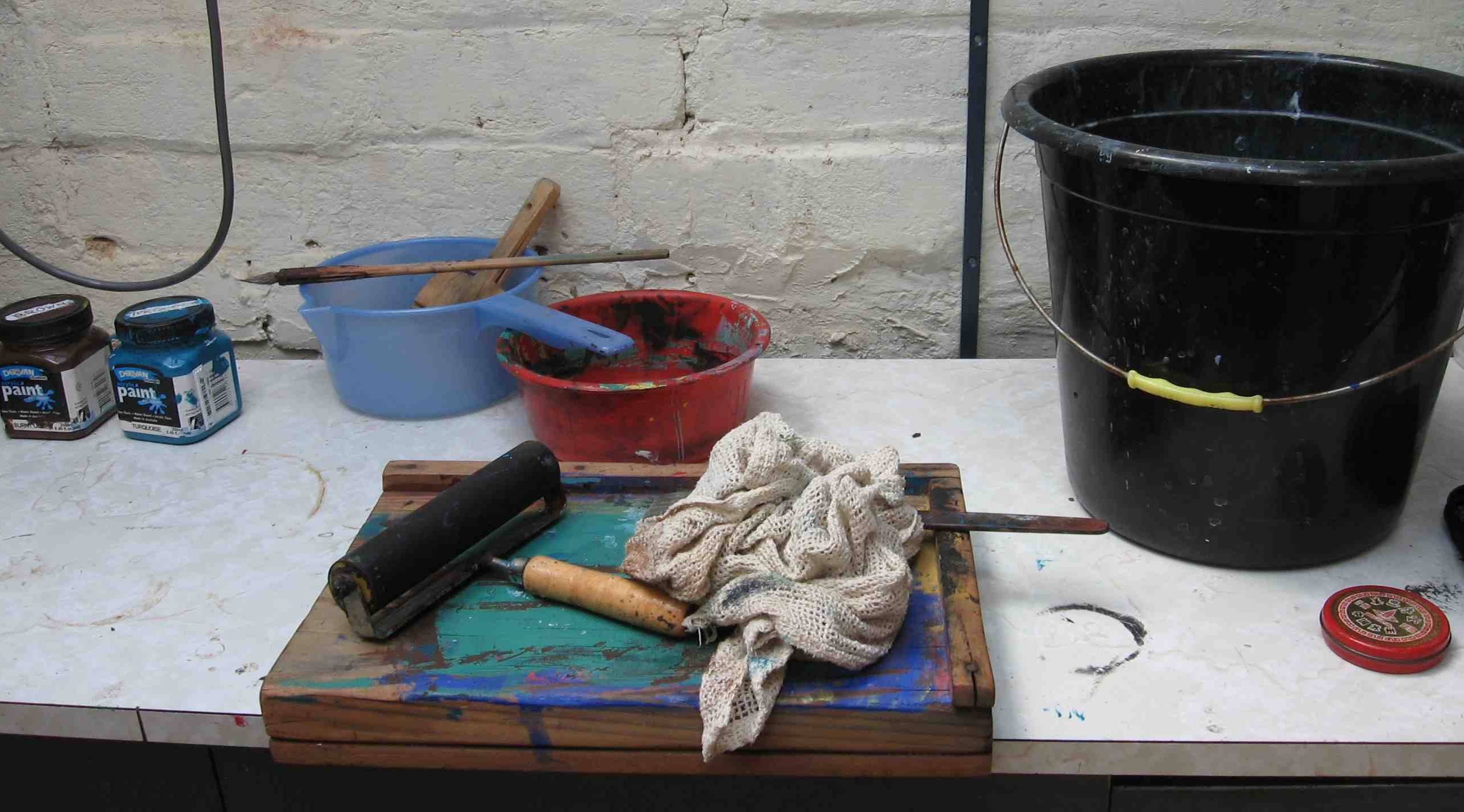
Bench hook, roller, rag and bucket on studio bench. (Photo by Dr. Michael Hill a.k.a. Doctor Comics)
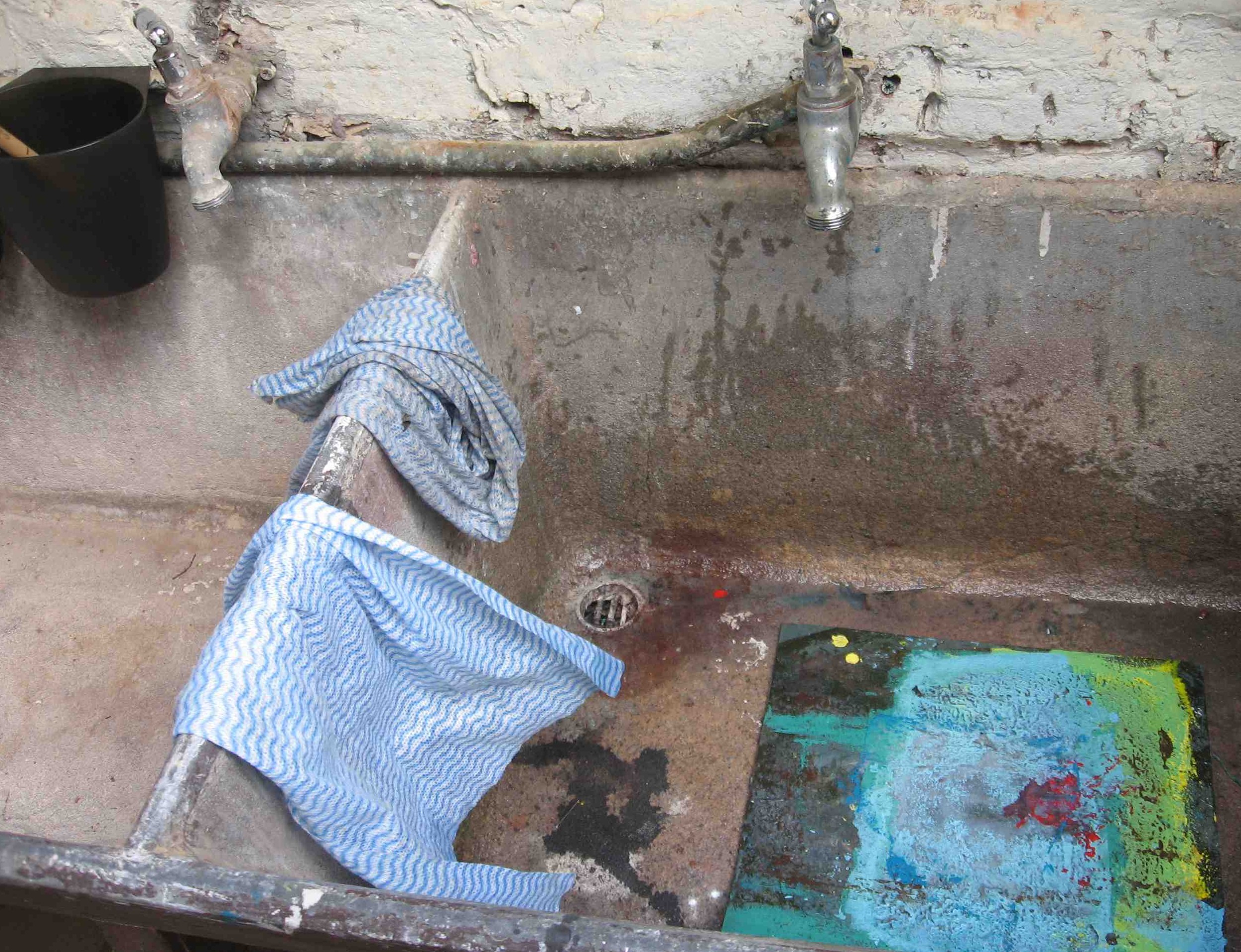
Materials used included ink, rags, cloth, plus water for washing the blocks, brushes and hands.
Water, cloths, sink and lino block. (Photo by Dr. Michael Hill a.k.a. Doctor Comics)
Despite the implied reference to woodblocks in Japanese print techniques the wood may be replaced by other materials. These include vegetables, fruit, leaves, rubber and other objects that are sufficiently flat to be inked and pressed onto paper. The creative print (sosaku hanga) approach places the emphasis on the act of making the print. It’s a joy! Please let me know if you share the joy of printmaking…or wish to make any comments about this post and blog, Michael.
Ink-stained printmaking attire. (Photo by Dr. Michael Hill a.k.a. Doctor Comics)