
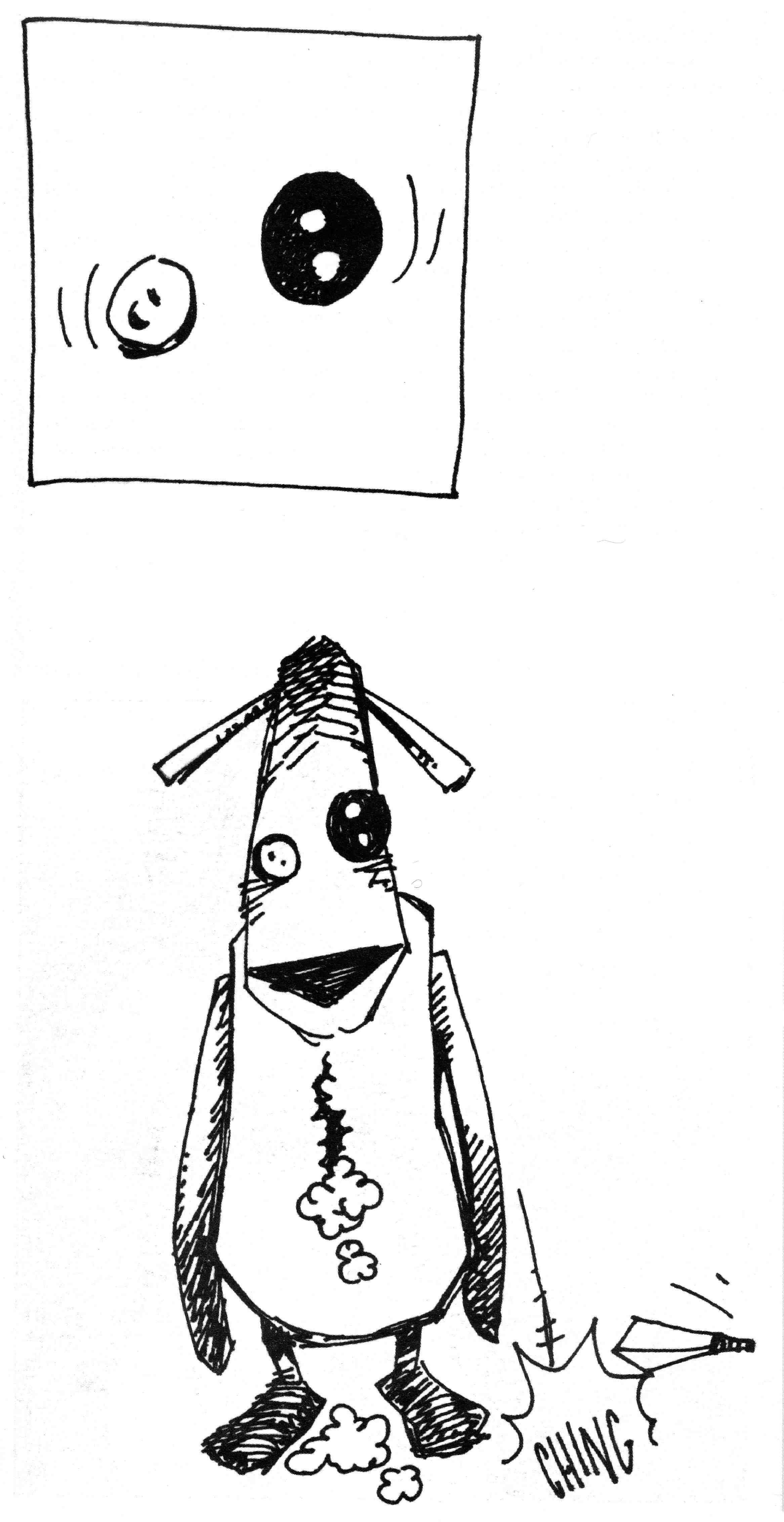
Panel from Krazy Kat comic strip October 17th, 1937.
Krazy Kat, created by cartoonist George “Garge” Herriman (1880-1944) initially as a family pet in his comic strip “The Dingbat Family” in 1910 before graduating to an eponymous strip in 1913, is without a doubt The Greatest of All Cartoon Cats – if only because “Krazy Kat” is the greatest comic strip of all time. (I don’t write those words lightly, but to me they’re true enough.)
As ever, the strip’s conceit: Ignatz Mouse, the antagonist, has it in for Kazy Kat, the sometimes-he, sometimes-she protagonist; Ignatz expresses his disdain usually in the form of a brick hurled at Krazy’s head. Krazy, in love with Ignatz, sees the brick as a sign of affection. Offissa Pupp, the local constabulary, is in love with Krazy and despises Ignatz. Many strips end with Pupp putting Ignatz in jail for his crime. It’s all that simple, and that complex – variations on a theme for four glorious decades.
It’s almost a cliche to say that the strip is “poetic,” but really, honestly, I don’t know of a better word. Herriman’s use of language, pulsing with puns and patois, is lyrical in and of itself. But look at the strip as a whole: each installment, especially each Sunday page, is a perfect little gem of an object, with visuals that are as malleable, marvelous, and magnificent as any sonnet. Form and meaning walk hand in hand in Krazy’s hometown of Coconino County.

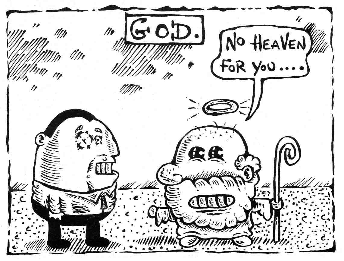
Panel from Krazy Kat comic strip October 8th, 1920.
I’ve seen it said at times that Krazy is delusional, or that she doesn’t understand Ignatz’s intentions. But I think that such ideas miss the point. Like a “real” cat*, Krazy creates hir own reality. Anyone who’s lived with an actual feline knows that, try as you might, you cannot control, cannot master a cat. Cats are subject to their own internal wants, needs, and whims; sometimes, rarely, these impulses correspond to what we want, and we then find this behavior charming and “cute.” But really, it’s the cat who’s calling the shots. So, too, does Krazy call the shots – literally: she calls the shooting bricks love tokens. So what if Ignatz doesn’t mean them that way? Ultimately, and to our benefit, it’s what Krazy desires that kounts.
* I use the “scare quotes” hesitantly as, to me, Krazy is as real a creation as is possible. Nothing fake; all genuine. All Art.
Many thanks to our guest blogger, the awesome “big guy” of comics art studies, Gene Kannenberg, Jr. for contributing to my CATS IN COMICS series with this wonderful post. Please let me know what you thought of Gene’s post and my BLOG in general. I would love to hear your feedback and suggestions. (Dr. Michael Hill a.k.a. Doctor Comics).
BIO: Gene Kannenberg, Jr. is the director of ComicsResearch.org. Formerly the Chair of the International Comic Arts Festival and the Comic Art & Comics Area of the Popular Culture Association he has written widely on comics art. His book “500 Essential Graphic Novels” was published in 2008.
NOTE! I am adding the two following posts on cartoon cats that I wrote…on this topic…to the one above by guest poster Gene Kannenberg, Jr.,…to make this a 3 Cartoon Cat Post! Read on for Doraemon followed by The Rabbi’s Cat, Michael.

Cover of Doraemon manga, issue 1.
This post is on Doraemon, the creation of Fujio Fujiki, the alias of two creators (mangaka) Motoo Akibo and Hiroshi Fujimoto, working in collaboration. Doraemon is a blue, earless, male, magical, back from the future, robot cat that lost his ears to a hungry rat. And like most cats he is very good to his owner, the little boy Nobita. This cat has been designed in a seriously super-deformed style with a large round head that takes up practically half its body length. First published in Japan in 1970 it was so successful it was developed into an animation series and franchise with an accompanying massive amount of merchandise including postage stamps! Doraemon has the distinction of being the first Anime Ambassador of Japan. Most recently a museum of Doraemon has opened in Kawasaki. This character is more than 40 years old although, as it is a cat that is back from the future, it has not yet been born, his birthday being just over a century away on 3rd September 2112. His popularity and merchandising goes on and on…such as this guitar I saw in a music shop in Ochanomizu, Tokyo, near Meiji University.

Doraemon guitar in Tokyo music shop. (Photo-© 2009 by Dr. Michael Hill a.k.a. Doctor Comics)

Doraemon in centre on this Anime character post card!
UPDATE 3 SEPTEMBER 2112: On September 3rd 2012 this character received an official residency certificate from Kawasaki city-100 years before his birth on September 3rd 2112.

Doraemon’s official residency certificate.

Doraemon on rails!
UPDATE 21 NOVEMBER 2016: On a trip to Tokyo last month I found these two sets of Doraemon stamps on sale at a Japan Post shop…
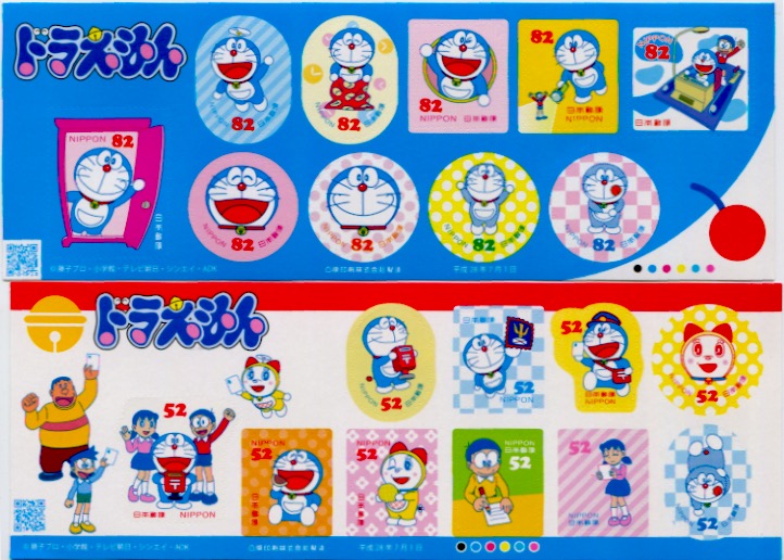
2 sets of Doraemon stamps on sale in Japan.
…and an old copy of the Doraemon magazine at a bookshop in the Jimbocho area of Tokyo…
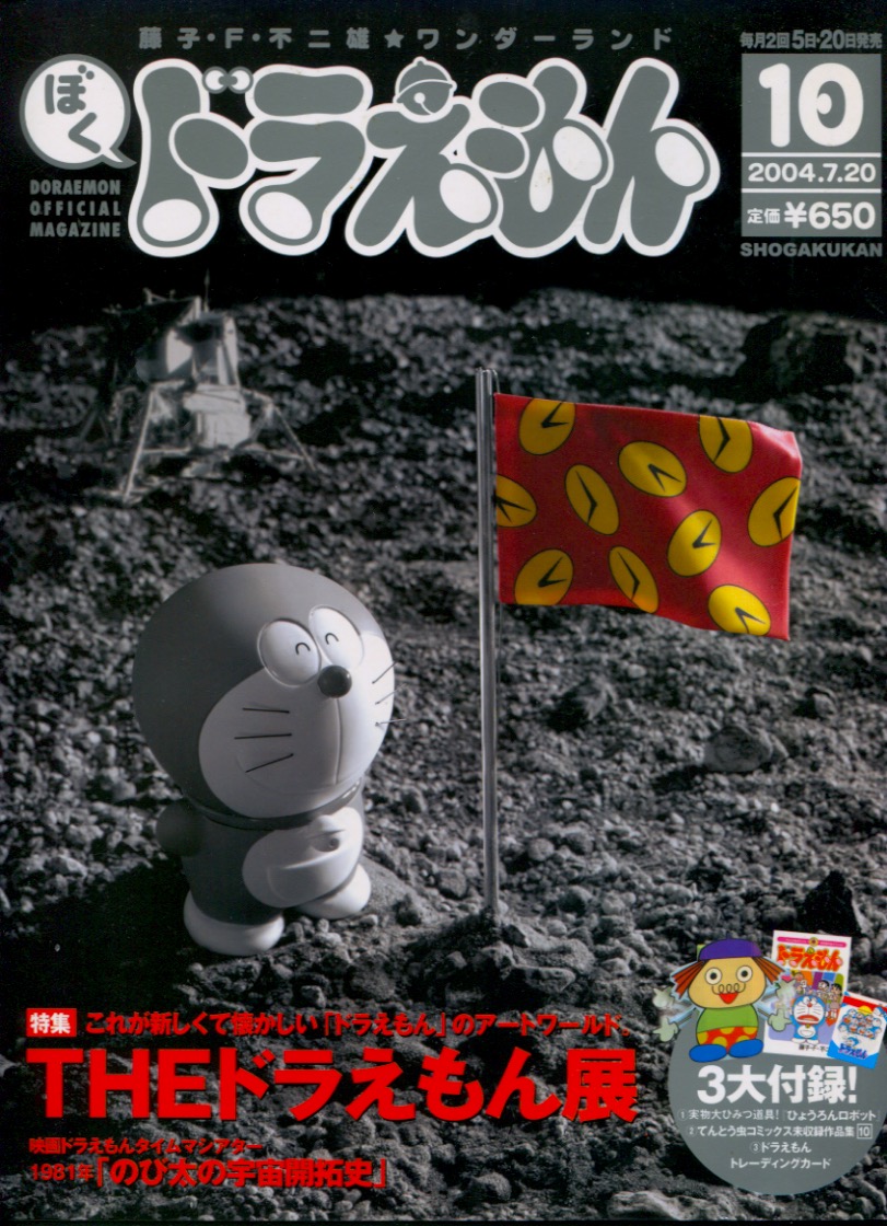
Copy of Doraemon Official Magazine 2004.7.20
…and a toy figure in a food shop in Kappabashi, Tokyo.
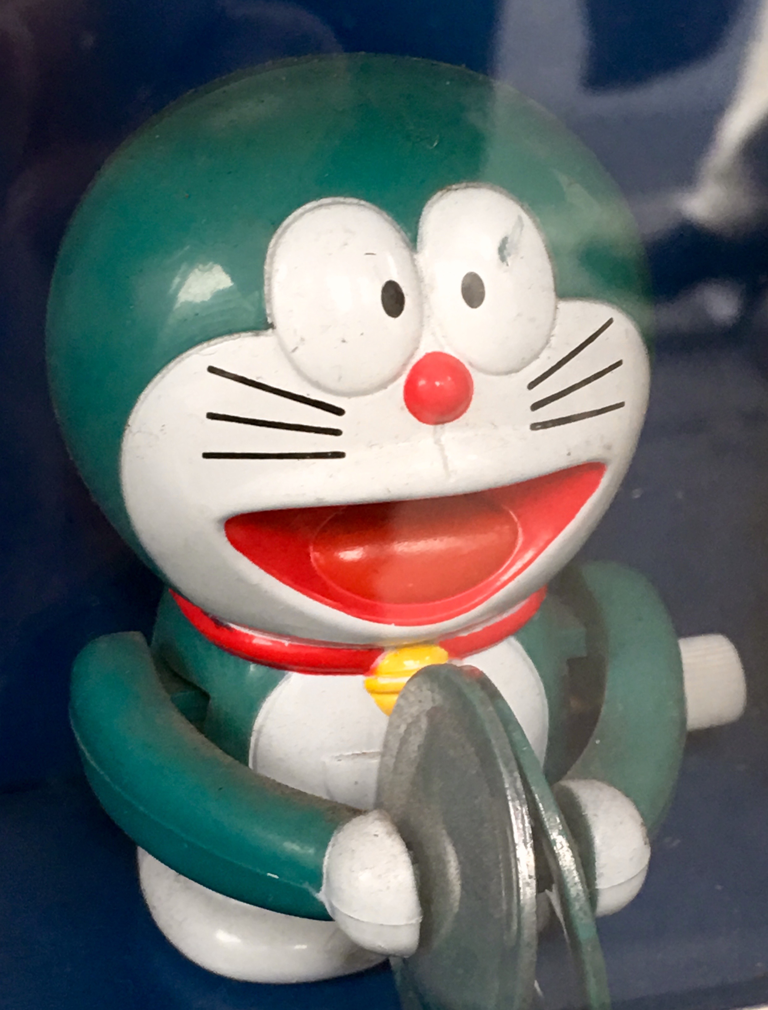
Doraemon toy in food store in Kappabashi-(Photo-© 2016 Louise Graber).
UPDATE 19 APRIL 2017: On a trip to New York last month I found this Doraemon doll dressed as Captain America in a shop window in Chinatown, along with a group of smaller Doraemons and a large ornate Japanese cat! How’s that for a cultural, comics crossover!

Doraeman as Cap, in shop window, Chinatown, New York. (Photo-© 2017 by Dr. Michael Hill a.k.a. Doctor Comics)
CATS IN COMICS: The Rabbi’s Cat by Michael Hill aka Doctor Comics
Art, Cats in Comics, Comics, Film … originally posted October 4, 2011 , Edit

This cat can talk! The Rabbi’s Cat by Joann Sfar.
This is a story about a talking cat from Algeria that lives with a rabbi and occasionally visits Paris. One day it ate the rabbi’s parrot and in so doing, gained the gift of speech. Being a clever cat it denied eating the bird and instead demanded conversion to Judaism. The design of the cat appears loose and improvised. Whilst it is rather thin and scrawny in physique it is big in terms of personality, intelligence and cheek. This richness of character and determination affords the cat the capability of comprehending foreign languages(he speaks Arabic, French, Latino and a bit of Spanish) and of learning the Torah. This rabbi’s cat is a marvellous, witty and charming cat that pleases itself, as cats do. It has appeared in several comics and most recently in an animated feature film of the same name. It is the creation of Joann Sfar, a jury prize winner at Angoulême for The Rabbi’s Cat graphic novel. The cat likes to hang out with the rabbi’s daughter and snuggle up close to her. It even tells her that it loves her. She tells it to shut up as she prefers it when it’s quiet or not around. It’s also inconvenient for both of them when her boyfriend visits. The cat loves a bit of a scratch, preferably on the ear by a female foot with painted toenails. Resilient, resourceful, stubborn, smart, curious and decidedly nocturnal, this cat is difficult to ignore.

This cat considers taking up painting to impress his love.
The Rabbi’s Cat (Le Chat Du Rabbin) film is a charming animated adaption of the graphic novels by Joann Sfar who also co-directed the film thus ensuring an authentic visual adaption of the bande dessinee. I saw the film at the 2012 French Film Festival in Sydney and I have been reading the graphic novels for a couple of years. Sfar is a prolific and award winning comics creator with awesome talent who is now transferring his talents to filmmaking. Sfar had previously directed the highly stylised live-action film Gainsbourg (vie héroïque) based on the life of the famous 1960’s French pop singer Gainsbourg (that’s Serge Gainsbourg, Charlotte’s dad). The film won the French Oscar, César Award, for Best First Film. The Rabbi’s Cat (Le Chat Du Rabbin) film also won a César for Best Animated Feature and the similar prize at the 2011 Annecy International Animated Film Festival. It is a traveller’s tale in more ways than one dealing with the cat’s progress from ordinary cat to talking cat, its enforced separation from its beloved mistress, the rabbi’s daughter, and its struggles with the rabbi in its attempts to convert to the Jewish religion. Then there is the overland journey in an antique Citroën half-track, all terrain vehicle from France to Africa with the rabbi, a Russian artist and others in search of African Jews in Ethiopia. The film is ambitious covering material from three of the graphic novels although some characters and sequences have been altered or omitted. Its visual design has also been modified into a more simplified cartoon look suitable for animation production from Sfar’s sumptious illustrative style but the images remain rich and varied. It contains plenty of satire including a few barbs aimed at Tintin and his dog Snowy whom the travellers meet in Africa and whom the cat finds somewhat obnoxious.
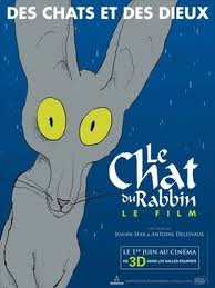
Poster of the film.
For a more formal analysis of The Rabbi’s Cat graphic novel see my post Gridlocking Joann Sfar’s Talking Cat on The Comics Grid. You can also watch an extract from a new documentary by Sam Ball called Joann Sfar Draws From Memory that shows Sfar cheerfully drawing in a restaurant with his pen and water-colours whilst dining and commenting on his cross-cultural background and port city upbringing.
I would love to hear your response to these cat posts and to my blog in general, Michael.

Doctor Comictopus alias for Michael Hill Ph.D (a.k.a. Doctor Comics) designed by Michelle Park.
(All text-©2011 Dr. Michael Hill a.k.a. Doctor Comics).


ragingyoghurt says on September 12, 2011 , Edit
oh doraemon! when i was growing up in malaysia and singapore he was known by his chinese name: xiao ding dang, and i was really more familiar with him as the packaging mascot for a brand of spherical puffed rice crackers coated in compound chocolate. the crackers were always stale. yum.
do you know komaneko? http://youtu.be/fbhs5P-xa4U
Like
Doctor Comics says on September 13, 2011 , Edit
Name changes! I know Mickey Mouse was known as Topolino in Italy. Xiao ding dang eh? That one’s had an interesting cultural and phonetic shift. Glad you enjoyed the crackers. Why were they stale? Were they imported from Japan or was the character licensed to another country’s brand?
Thanks for introducing me to Komaneko. I was impressed by the slow moving tempo and subdued soundtrack. Don’t often experience that in childrens animation. There were some nice touches there like when the cat’s eyes widen at the sight of having threaded the needle. Very careful and controlled animation.