Category: Art

Archive of Australian Alternative Comics: OZCON

Archive of Australian Alternative Comics, Art, Comics October 16, 2011

In terms of the large comics conventions in Australia prior to the current events Supanova,  Animania,  SMASH!,  Armageddon and the earlier Comic-Fest, there was OZCON. Before that there was one event called ComicCon back in 1979. OZCON was the big, annual comics convention at the time I began researching Australian alternative comics in the late 1990s. The promotion of the more mainstream imported comics seemed to be the raison d’être for the event…although there was some minor presence by independent creators and their publications despite the cost of their participation. Some comics discussion panels also took place. I recall one between Eddie Campbell and Dave Sim about the distribution of independent comics. That was both informative and entertaining. Campbell was most amusing. This event provided a sense of community for local creators to meet…discuss their self-published comics…and compare their work to the imported product.

Spidey seen swinging from the Sydney Harbour Bridge.
(Poster design by Ant Larcombe)

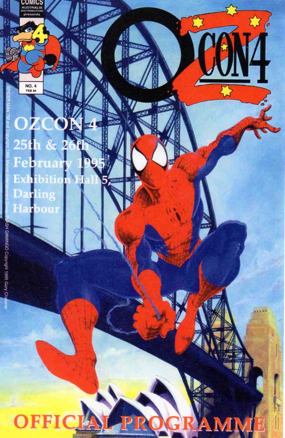
The poster for OZCON in 1995. Australian comics creators and fans back then had the spectre of the US super-hero genre hanging over them. It was a wonderful poster! It was designed by local comics creator and former student of mine Ant Larcombe…a graduate of Sydney College of the Arts. I had worked there as an academic staff member of the Visual Communication Design Department. The cover had an inset of the super-hero dressed avatar and character Flash Domingo by another Australian creator, Gary Chaloner.

Ticket to an earlier staging of the OZcon event.
(above) Ticket to an earlier staging of the OZcon event.
San Diego Comic Con T-shirt design. (artist unknown)

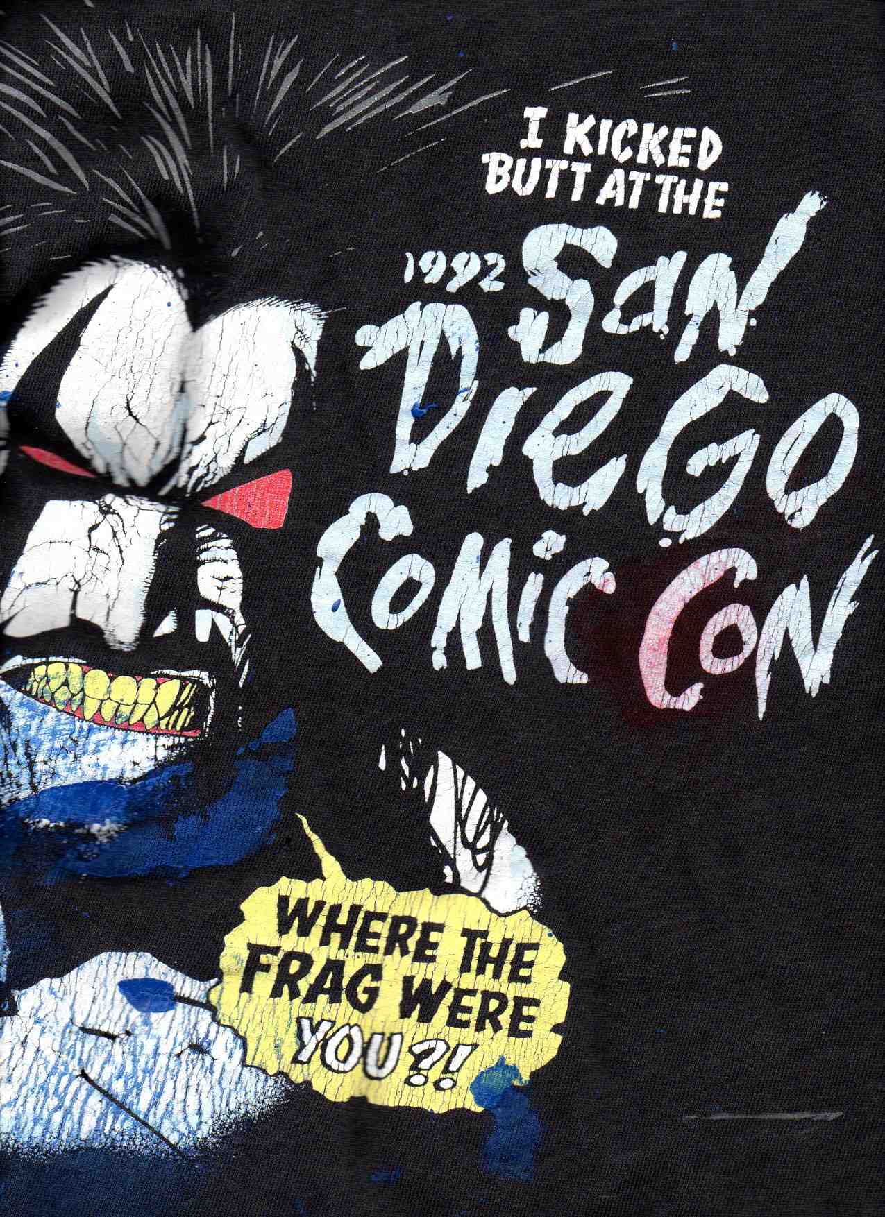
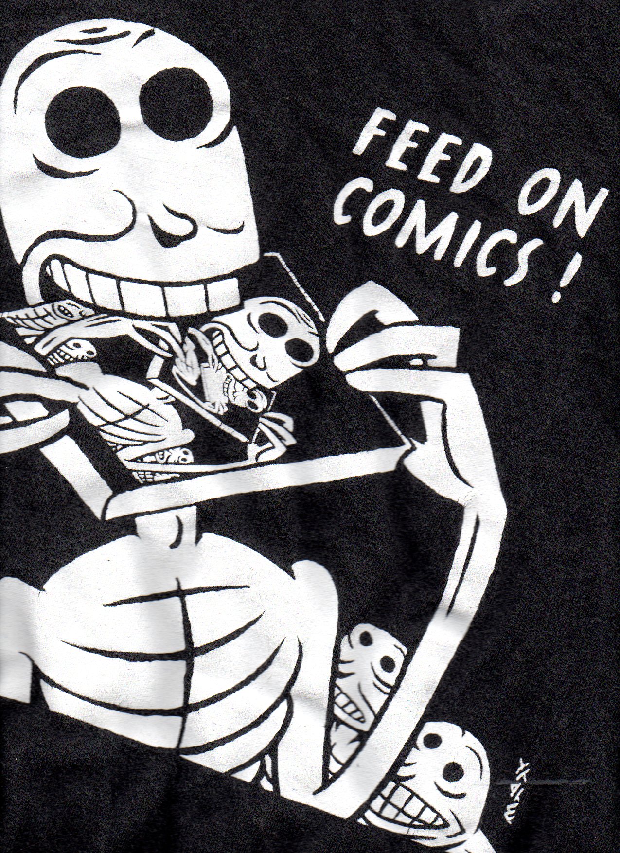
Reflecting on OZCON made me think of an American comics convention that I attended. “BIG” is a key descriptor. Above is a scan of the T-shirt I bought at what is considered the largest comics convention in the USA…San Diego Comic Con. It was from an earlier staging of that event, had been discounted as a remainder but caught my eye. The in-your-face aggression, confidence, swagger and speech balloon seemed to say what that convention was all about. The blue paint stains are a subsequent addition from my having worn it whilst doing one of my printmaking sessions. There were fewer than 50,000 attendees at the San Diego Con back in 2000. Over the past decade, however, this convention has grown in size to around three times that number. It remains considerably less than the 500,000 that go to Comiket in Tokyo, twice a year!…which makes a million of them, anually! Anyway, I was very impressed by the U.S.A. event. On the research front, in addition to presenting a paper on “Australian Gothic comics” at the conference…(shout out to my U.S.colleagues Randy Duncan and Peter Coogan)…I got to meet and chat with comics art figures: Will Eisner…Scott McCloud…Gahan Wilson…James Kochalka…Roman Dirge…Jhonen Vasquez…Los Bros Hernandez…Rumiko Takahashi and Jim Woodring. Oh joy! That was a very special and memorable experience for me.

Have you ever been to comics conventions? Which one? If you would like to post a comment about your experience, I would be happy to respond, Michael.

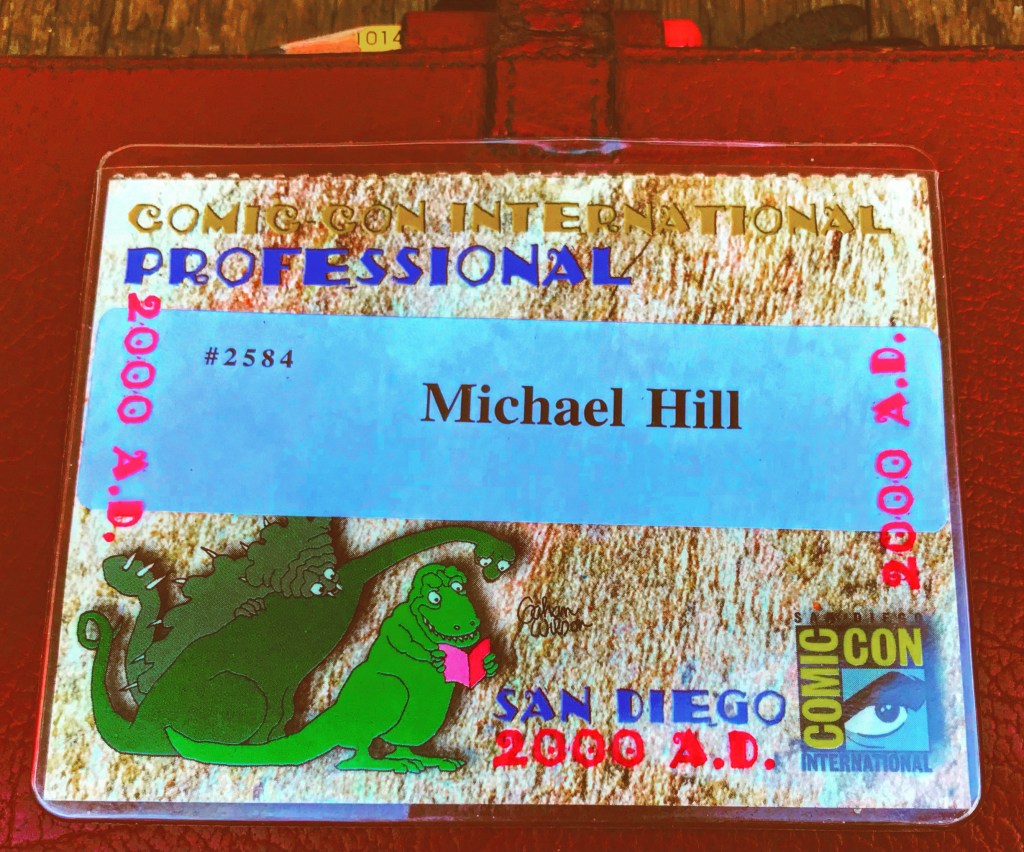
My ComicCon pass designed by Gahan Wilson whom I got to meet at this event.

MIND ROT AND OTHER COMICS ART SEMINARS AND WORKSHOPS AT UTS.

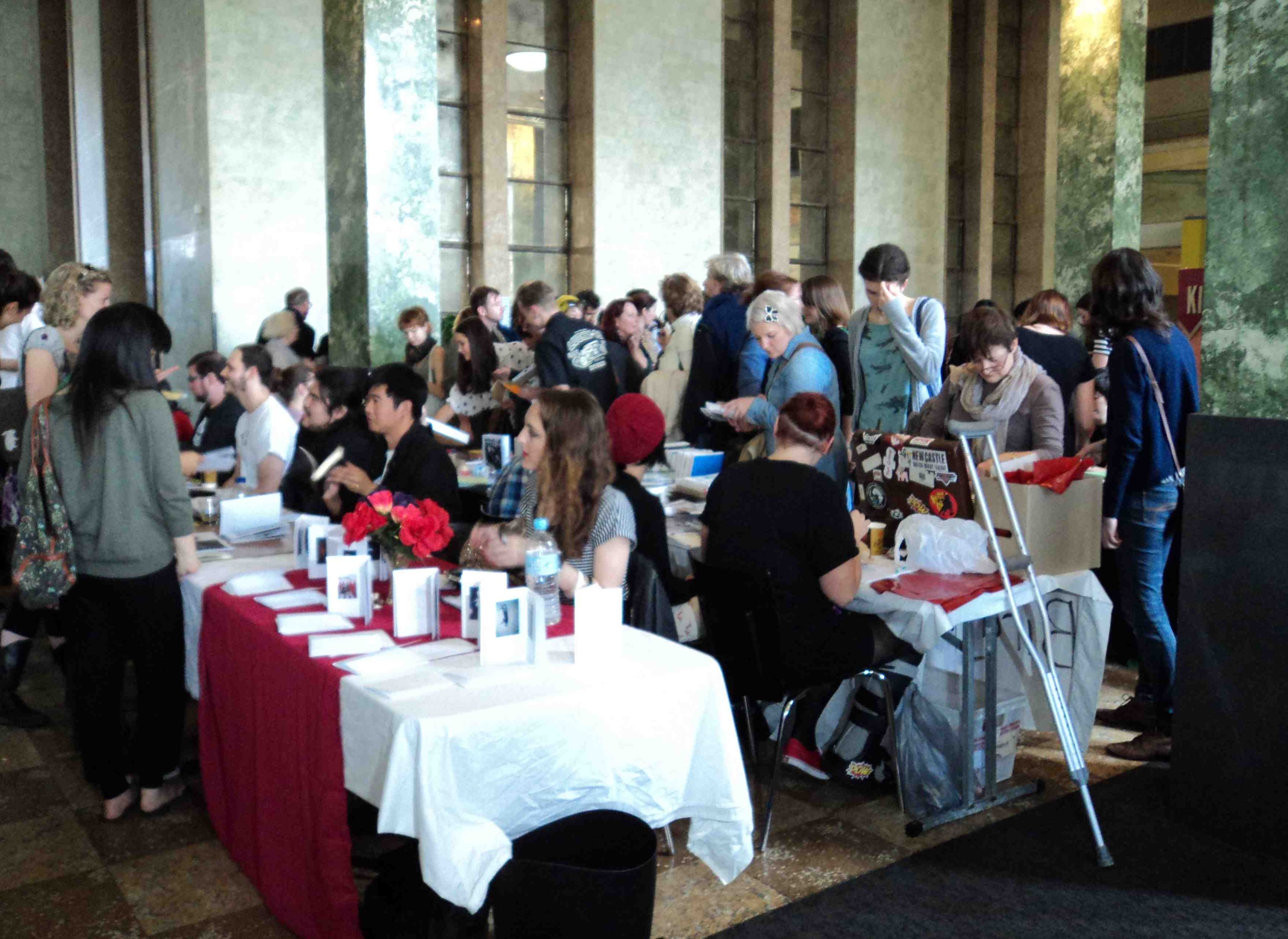
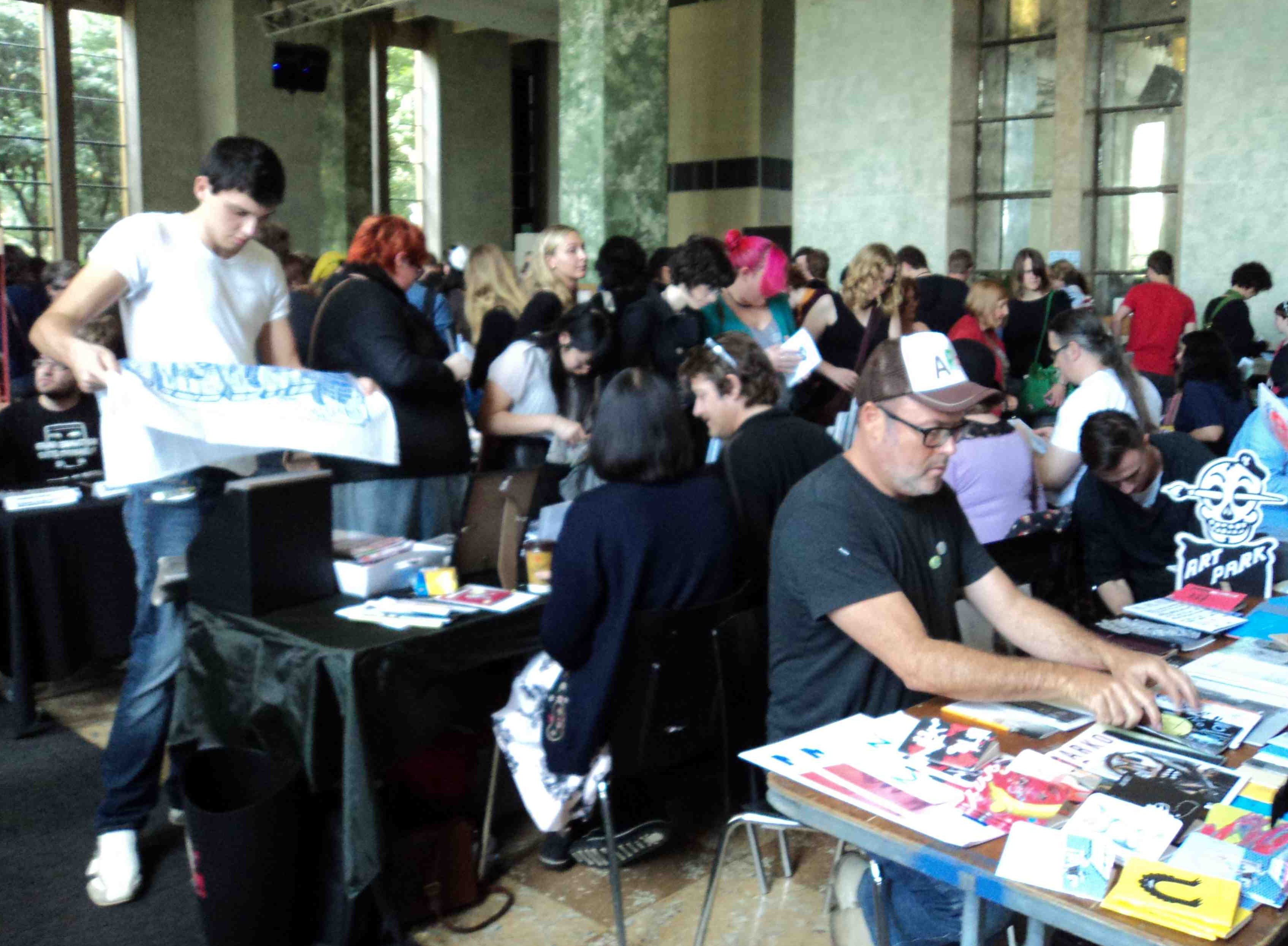
Besides the big comics conventions in Australia and overseas there were smaller Sydney based seminars and workshops. I organised for students of the Visual Communication Design Program at the University of Technology, Sydney. These included MIND ROT, a seminar and accompanying workshop in 1998, poster design by Neil Heymann…plus BIO-HAZARD, and BASICK-INKSTINCT both held in 1996(see posters  and post following below). 

Whist researching my collection of comics art research materials for my PhD thesis I came across this poster (below). It was for an event that I had conceived and organised at the University of Technology, Sydney, back in 1998. As a lecturer in the Visual Communication Department I was endeavoring to incorporate comics based projects into the course curriculum. It seemed to be an ideal medium in which to apply techniques of visual communication design. I found that students undertaking Word & Image projects were generally enthusiastic about comics. They enjoyed the combination of writing and drawing. To increase the students’ understanding of the professional practice of making comics I decided to involve some practitioners. The event poster(below) was designed by one of my students, Neil Heymann. His modestly carved signature can be discerned on the neck of the shouting head in the poster (below).

The MIND ROT comics seminar and workshop, Sydney, 1998. Poster design by Neil Heymann.

With funding from the student group Stop Motion Sickness I enlisted a trio of professional Australian comics creators. These were Mandy Ord from Canberra, Dillon Naylor from Melbourne and Glenn Smith from Sydney. They visited and displayed their comics art work to my Visual Communication Design students. They also described how they went about researching and designing their comics. Mindful of possible regional differences I selected these creators from three different Australian cities. Each comics creator made a 45-60 minute presentation of their work…showing visual examples to the whole class of students. This was followed by a Q&A session. Naylor profiled his comic about Melbourne share-household shenanigans Pop Culture & 2 Minute Noodles. Ord spoke about her intensely inky, autobiographical tales of life in Canberra, Wilnot. Smith described making his painstakingly, linear drawn, slice-of-life The Sydney Morning Hell. Each guest also led a practical, comics art workshop with a small group of students. Experienced comics creator Gerard Ashworth, also from Sydney, attended the seminar and kindly assisted with the workshop proceedings. The event was a small but significant moment in terms of the formal study of the medium.

The seminar’s title? Attempted irony with little bit of cheek, perhaps? I think I was put in a defensive position by the dim view of the medium in the community. There were one or two doubts from some of my colleagues. This was in relation to the presumption that comics be considered a valid form of design. Most of the academic staff supported the study of comics, especially the staff of the Visual Communication Design Department. Back in those days, thirteen years ago, photography was the most popular subject. This was followed by graphic design and illustration. Comics, animation and video were perceived as lesser, although emerging, forms…especially video with the then growing interest in music video. I was taking the study of comics seriously by undertaking academic research into comics art for my PhD degree. I saw this event as a stepping stone to the staging of a conference on comics for researchers and students. The poster was designed by one of students, Neil Heymann, who is now a New York based advertising designer. The notion of comics being a suitable medium of scholarly study and research had already been accepted. The teaching of comics as professional practice, however, remained a hurdle.

An earlier event: the Bio-Hazard comics workshop, Sydney, 1996. Poster design by Xander Black

An even earlier event: the Basick Inkstinct comics workshop, also held at UTS in Sydney, 1996. Flyer design by Neil Heymann

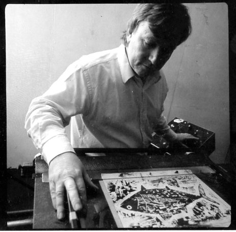
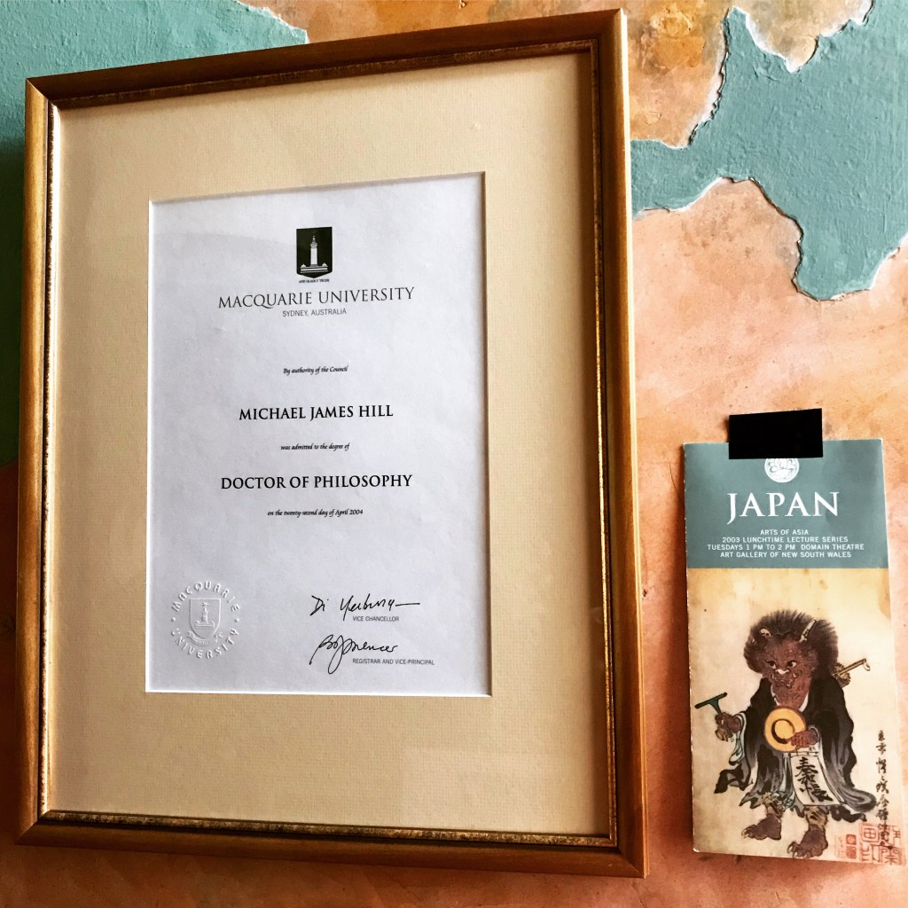
These posts form part of the series of posts titled Archives of Australian Comics that document events in the recent history of Australian comics, particularly alternative comics and the Australian Small Press. I started researching this subject in the late 1990s and it eventually led to my PhD thesis: Ph.D. Macquarie University, Division of Society, Culture, Media and Philosophy,  A Study Of Contemporary Australian Alternative Comics 1992-2000 With Particular Reference To The Work Of Naylor, Smith, Danko And Ord, 2003. On completion of the research I donated the materials and comics I had collected to the National Library of Australia: Michael Hill Collection of Australian Comics.

All comments welcome, Michael.

(All text-©2011 Dr. Michael Hill a.k.a. Doctor Comics).

CATS IN COMICS: Krazy Kat by Gene Kannenberg, Jr.

Art, Cats in Comics, Comics September 23, 2011

Panel from Krazy Kat comic strip October 17th, 1937.

Krazy Kat, created by cartoonist George “Garge” Herriman (1880-1944) initially as a family pet in his comic strip “The Dingbat Family” in 1910 before graduating to an eponymous strip in 1913, is without a doubt The Greatest of All Cartoon Cats – if only because “Krazy Kat” is the greatest comic strip of all time. (I don’t write those words lightly, but to me they’re true enough.)

As ever, the strip’s conceit: Ignatz Mouse, the antagonist, has it in for Kazy Kat, the sometimes-he, sometimes-she protagonist; Ignatz expresses his disdain usually in the form of a brick hurled at Krazy’s head. Krazy, in love with Ignatz, sees the brick as a sign of affection. Offissa Pupp, the local constabulary, is in love with Krazy and despises Ignatz. Many strips end with Pupp putting Ignatz in jail for his crime. It’s all that simple, and that complex – variations on a theme for four glorious decades.

It’s almost a cliche to say that the strip is “poetic,” but really, honestly, I don’t know of a better word. Herriman’s use of language, pulsing with puns and patois, is lyrical in and of itself. But look at the strip as a whole: each installment, especially each Sunday page, is a perfect little gem of an object, with visuals that are as malleable, marvelous, and magnificent as any sonnet. Form and meaning walk hand in hand in Krazy’s hometown of Coconino County.

Panel from Krazy Kat comic strip October 8th, 1920.

I’ve seen it said at times that Krazy is delusional, or that she doesn’t understand Ignatz’s intentions. But I think that such ideas miss the point. Like a “real” cat*, Krazy creates hir own reality. Anyone who’s lived with an actual feline knows that, try as you might, you cannot control, cannot master a cat. Cats are subject to their own internal wants, needs, and whims; sometimes, rarely, these impulses correspond to what we want, and we then find this behavior charming and “cute.” But really, it’s the cat who’s calling the shots. So, too, does Krazy call the shots – literally: she calls the shooting bricks love tokens. So what if Ignatz doesn’t mean them that way? Ultimately, and to our benefit, it’s what Krazy desires that kounts.

* I use the “scare quotes” hesitantly as, to me, Krazy is as real a creation as is possible. Nothing fake; all genuine. All Art.

Many thanks to our guest blogger, the awesome “big guy” of comics art studies, Gene Kannenberg, Jr. for contributing to my CATS IN COMICS series with this wonderful post. Please let me know what you thought of Gene’s post and my BLOG in general. I would love to hear your feedback and suggestions. (Dr. Michael Hill a.k.a. Doctor Comics).

BIO: Gene Kannenberg, Jr. is the director of ComicsResearch.org. Formerly the Chair of the International Comic Arts Festival and the Comic Art & Comics Area of the Popular Culture Association he has written widely on comics art. His book “500 Essential Graphic Novels” was published in 2008.

NOTE! I am adding the two following posts on cartoon cats that I wrote…on this topic…to the one above by  guest poster Gene Kannenberg, Jr.,…to make this a 3 Cartoon Cat Post! Read on for Doraemon followed by The Rabbi’s Cat, Michael.

CATS IN COMICS: DORAEMON by Michael Hill aka Doctor Comics

Art, Cats in Comics, Comics, Japanning, originally posted September 10, 2011

Cover of Doraemon manga, issue 1.

This post is on Doraemon, the creation of Fujio Fujiki, the alias of two creators (mangaka) Motoo Akibo and Hiroshi Fujimoto, working in collaboration. Doraemon is a blue, earless, male, magical, back from the future, robot cat that lost his ears to a hungry rat. And like most cats he is very good to his owner, the little boy Nobita. This cat has been designed in a seriously super-deformed style with a large round head that takes up practically half its body length. First published in Japan in 1970 it was so successful it was developed into an animation series and franchise with an accompanying massive amount of merchandise including postage stamps! Doraemon has the distinction of being the first Anime Ambassador of Japan. Most recently a museum of Doraemon has opened in Kawasaki. This character is more than 40 years old although, as it is a cat that is back from the future, it has not yet been born, his birthday being just over a century away on 3rd September 2112. His popularity and merchandising goes on and on…such as this guitar I saw in a music shop in Ochanomizu, Tokyo, near Meiji University.

Doraemon guitar in Tokyo music shop. (Photo-© 2009 by Dr. Michael Hill a.k.a. Doctor Comics)

See who is front and centre on this Anime character post card!

Doraemon in centre on this Anime character post card!

UPDATE 3 SEPTEMBER 2112: On September 3rd 2012  this character received an official residency certificate from Kawasaki city-100 years before his birth on September 3rd 2112.

Doraemon’s official residency certificate.

Doraemon on rails!

UPDATE 21 NOVEMBER 2016: On a trip to Tokyo last month I found these two sets of Doraemon stamps on sale at a Japan Post shop…

2 sets of Doraemon stamps on sale in Japan.

2 sets of Doraemon stamps on sale in Japan.

…and an old copy of the Doraemon magazine at a bookshop in the Jimbocho area of Tokyo…

Copy of Doraemon Official Magazine 2004.7.20

Copy of Doraemon Official Magazine 2004.7.20

…and a toy figure in a food shop in Kappabashi, Tokyo.

Doraemon toy in food store in Kappabashi-(Photo-© 2016 Louise Graber).

Doraemon toy in food store in Kappabashi-(Photo-© 2016 Louise Graber).

UPDATE 19 APRIL 2017: On a trip to New York last month I found this Doraemon doll dressed as Captain America in a shop window in Chinatown, along with a group of smaller Doraemons and a large ornate Japanese cat! How’s that for a cultural, comics crossover!

Doraeman as Cap, in shop window, Chinatown, New York. (Photo-© 2017 by Dr. Michael Hill a.k.a. Doctor Comics)

Comments

  1. ragingyoghurt says on September 12, 2011 , Edit

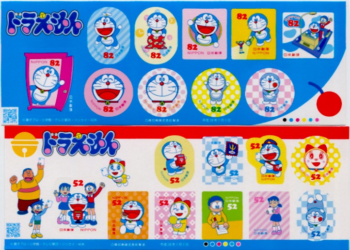
    oh doraemon! when i was growing up in malaysia and singapore he was known by his chinese name: xiao ding dang, and i was really more familiar with him as the packaging mascot for a brand of spherical puffed rice crackers coated in compound chocolate. the crackers were always stale. yum.

    do you know komaneko? http://youtu.be/fbhs5P-xa4U

    Like

  2. Doctor Comics says on September 13, 2011 , Edit

    Name changes! I know Mickey Mouse was known as Topolino in Italy. Xiao ding dang eh? That one’s had an interesting cultural and phonetic shift. Glad you enjoyed the crackers. Why were they stale? Were they imported from Japan or was the character licensed to another country’s brand?

    Thanks for introducing me to Komaneko. I was impressed by the slow moving tempo and subdued soundtrack. Don’t often experience that in childrens animation. There were some nice touches there like when the cat’s eyes widen at the sight of having threaded the needle. Very careful and controlled animation.

CATS IN COMICS: The Rabbi’s Cat by Michael Hill aka Doctor Comics

Art, Cats in Comics, Comics, Film … originally posted October 4, 2011 , Edit

This cat can talk! The Rabbi’s Cat by Joann Sfar.

This is a story about a talking cat from Algeria that lives with a rabbi and occasionally visits Paris. One day it ate the rabbi’s parrot and in so doing, gained the gift of speech. Being a clever cat it denied eating the bird and instead demanded conversion to Judaism. The design of the cat appears loose and improvised. Whilst it is rather thin and scrawny in physique it is big in terms of personality, intelligence and cheek. This richness of character and determination affords the cat the capability of comprehending foreign languages(he speaks Arabic, French, Latino and a bit of Spanish) and of learning the Torah. This rabbi’s cat is a marvellous, witty and charming cat that pleases itself, as cats do. It has appeared in several comics and most recently in an animated feature film of the same name. It is the creation of Joann Sfar, a jury prize winner at Angoulême for The Rabbi’s Cat graphic novel. The cat likes to hang out with the rabbi’s daughter and snuggle up close to her. It even tells her that it loves her. She tells it to shut up as she prefers it when it’s quiet or not around. It’s also inconvenient for both of them when her boyfriend visits. The cat loves a bit of a scratch, preferably on the ear by a female foot with painted toenails. Resilient, resourceful, stubborn, smart, curious and decidedly nocturnal, this cat is difficult to ignore.

This cat considers taking up painting to impress his love.

The Rabbi’s Cat (Le Chat Du Rabbin) film is a charming animated adaption of the graphic novels by Joann Sfar who also co-directed the film thus ensuring an authentic visual adaption of the bande dessinee. I saw the film at the 2012 French Film Festival in Sydney and I have been reading the graphic novels for a couple of years. Sfar is a prolific and award winning comics creator with awesome talent who is now transferring his talents to filmmaking. Sfar had previously directed the highly stylised live-action film Gainsbourg (vie héroïque) based on the life of the famous 1960’s French pop singer Gainsbourg (that’s Serge Gainsbourg, Charlotte’s dad). The film won the French Oscar, César Award, for Best First Film. The Rabbi’s Cat (Le Chat Du Rabbin) film also won a César for Best Animated Feature and the similar prize at the 2011 Annecy International Animated Film Festival. It is a traveller’s tale in more ways than one dealing with the cat’s progress from ordinary cat to talking cat, its enforced separation from its beloved mistress, the rabbi’s daughter, and its struggles with the rabbi in its attempts to convert to the Jewish religion. Then there is the overland journey in an antique Citroën half-track, all terrain vehicle from France to Africa with the rabbi, a Russian artist and others in search of African Jews in Ethiopia. The film is ambitious covering material from three of the graphic novels although some characters and sequences have been altered or omitted. Its visual design has also been modified into a more simplified cartoon look suitable for animation production from Sfar’s sumptious illustrative style but the images remain rich and varied. It contains plenty of satire including a few barbs aimed at Tintin and his dog Snowy whom the travellers meet in Africa and whom the cat finds somewhat obnoxious.

Poster of the film.

Poster of the film.

For a more formal analysis of The Rabbi’s Cat graphic novel see my post Gridlocking Joann Sfar’s Talking Cat on The Comics Grid. You can also watch an extract from a new documentary by Sam Ball called Joann Sfar Draws From Memory that shows Sfar cheerfully drawing in a restaurant with his pen and water-colours whilst dining and commenting on his cross-cultural background and port city upbringing.

I would love to hear your response to these cat posts and to my blog in general, Michael.

Doctor Comictopus alias for Michael Hill Ph.D (a.k.a. Doctor Comics) designed by Michelle Park.

Doctor Comictopus alias for Michael Hill Ph.D (a.k.a. Doctor Comics) designed by Michelle Park.

Comments 2

(All text-©2011 Dr. Michael Hill a.k.a. Doctor Comics).


READING COMICS IN PUBLIC

Art, Comics August 28, 2011

Today, 28 August 2011, is International Read Comics in Public Day! This celebratory, public reading of comics is being staged for the second time. It began last year and was created, sponsored and promoted by The Daily Cross Hatch. I take pride in participating in this event and have done so on both occasions (see photos below). I chose the location outside my local library in Sydney. The City of Sydney Library branches carry an increasing range of comics and graphic novel titles including some manga. Being comics artist Jack Kirby’s birthday I read the giant X-Men Omnibus that he created with writer Stan Lee. Last year I read early issues of Peanuts by Charles Schulz. I love reading comics in public!

Dr. Michael Hill a.k.a. Doctor Comics seen reading comics in public, Glebe 2011. (Photo by Louise Graber)
Dr. Michael Hill a.k.a. Doctor Comics participating in the inaugural Reading Comics In Public 2010 event. (Photo by Louise Graber)

UPDATE 2012. I participated in this event for the third time in 2012 when I read ZAP Comix No.4 on front the front steps of the Art Gallery of NSW in Sydney (photo below). In the full sunshine what a perfect place it was to enjoy comics art! This particular comic features a dazzling psychedelic cover design by Victor Moscoso which the morning sunlight illuminated. I often read comics in pubs and cafes, on public transport and in parks and gardens. I love reading comics…always have…thanks to my Dad!(see my first blog post).

Dr. Michael Hill a.k.a. Doctor Comics can sometimes be seen Reading Comics In Public, even on the steps of the Art Gallery of NSW. (Photo by Louise Graber)

UPDATE 2013: At the beach!

Reading Brian Ralph's Daybreak at the beach at dawn.
Reading Brian Ralph’s comic Daybreak in public near the pool on the beach at dawn. (Photo-© 2011 by Dr. Michael Hill a.k.a. Doctor Comics)

UPDATE 2016: VIVID Festival, Sydney Harbour Bridge

Reading Comics-Unflattening
Reading the graphic novel Unflattening by Nick Sousanis in public under lights with the Sydney Harbour Bridge in the background. (Photo-© 2011 by Dr. Michael Hill a.k.a. Doctor Comics)

Have you ever read comics in public…on a bus, train, plane, outside a gallery whilst waiting for a friend, or in a waiting room? How did it feel? Not that it is much of an issue these days…but back in my Primary and Secondary School days, my teachers the Dominican Nuns and Christian Brothers respectively…both banned comics from the classroom and the reading of them by their students…let alone the public reading of them! I would love to hear of your experiences. What was your choice of title and the location for your reading? Did you get any public response? And, if it was at school, did you ever have the comic you were reading confiscated and never returned? What happened to it? Was it burnt, or shredded, or torn? Let me know. In the meantime enjoy your comics reading wherever you are…in the park, on the bus, in the waiting room, at the opera or home in bed. Till next post, Michael.

(All text-©2011 Dr. Michael Hill a.k.a. Doctor Comics).

BLOTTING PAPER The Comic: Production Report No.3

Art, Blotting Paper, Comics August 9, 2011

Production of the first issue of my comic Blotting Paper continues despite delays from my ongoing academic commitments. However, my intention of having the first chapter finished by the end of the year remains. Comparing research to production I have discovered the enormous amount of time it takes to design and create artwork. I can write a thousand word critique of a comic in just over an hour…but creating one page of comics art will take me several times that. Many of the comics creators that I have interviewed say their rate was “a day per page”. I wish!…but I don’t really mind as I love the feeling of being deep in creative space. At the moment, besides printmaking, I am also doing some drawing. I love it and the mental space it takes me into. I like the feeling of getting lost in there.

My ink sketch of the Sydney Harbour Bridge for the first chapter of my comic…it could use a little more detail, perhaps? (Pen and ink drawing-© 2011 Dr. Michael Hill a.k.a. Doctor Comics)

The bridge and Doctor Comics, pen and ink drawing collage #1(© 2011 Michael Hill)
Rough collage of Doctor Comics out walking and contemplating near the Sydney Harbour Bridge…a rough draft design, including corrections, in pen and ink.
(© 2011 Dr. Michael Hill a.k.a. Doctor Comics)

I am experimenting with a range of image-making media to produce the artwork and text. Below are some of the images that have been generated through printmaking at Studio Buljan, in Sydney. (My thanks to Katharine Buljan for the access to her studio). These prints appear in the first chapter of my comic The Ingurgitator. The chapter begins in sunshine in Sydney then things take a dark turn into the subconscious terrain. There is also the evening ritual wherein Doctor Comics cooks dinner…then drinks wine whilst reading his recent comics purchases. During this time he converses with his feline friends. The evening often ends in a dream state that is a melange of art, thought, taste and reflection.

Doctor Comics has his evening proverbial swim in a sea of sumi ink.
(Monotype print-© 2011 Dr. Michael Hill a.k.a. Doctor Comics)
Losing one’s footing and feeling out-of-depth and the fear of ‘going under’.
(Monotype print-© 2011 Dr. Michael Hill a.k.a. Doctor Comics)
Struggling for breath and sinking into the blackness.
(Monotype print-© 2011 Dr. Michael Hill a.k.a. Doctor Comics)

These images are monoprints, so called for their singularity…only one of each is made. However, by re-inking the block and marginally alterating the images, a degree of continuity is maintained. This enables a sequential element to come into play. I have learned this approach in creating the artwork for animation projects. For me, working in printmaking, comics and animation is both labour saving and exhaustive. The images come up quickly but the act of re-inking and printing the block destroys the originals. There is no going back. I enjoy working with the inky element of printmaking. It is so graphic! Any thoughts? Comments about this and my posts are welcome, Michael.

(All text, photos and artwork-©2011 Dr. Michael Hill a.k.a. Doctor Comics).

DOMO ARIGATO MR. ROBOTO: Toy Porn 2 Exhibition Review

Art, Comics, Film, Japanning July 26, 2011

Domo Arigato Mr. Roboto! Earlier this evening I went to the opening of a comics art related exhibition in Chippendale. This area of inner Sydney is becoming something of an arts hub. In recent weeks I have visited galleries located within a stone’s throw of each other: MOP, NG and White Rabbit. This exhibition, titled Toy Porn 2, showcased the work of established artist Nick Stathopoulos. Nick recently made a portrait of the comics creator Shaun Tan for the Archibald Prize competition. It was on display in the restaurant downstairs. The portraits here, however, were of cartoon character creations from animation, comics and films. Titles selected included Astro Boy, Tintin, Batman, Thunderbirds, Robby the Robot, The Beatles in their Yellow Submarine, and assorted others.

Title: He always comes between us – Acrylic and oil glaze on canvas-2011-60 x 60 cm

Stathopoulos paints in a hyper-realistic style on a flat canvas but manages to deliver a convincing three dimensional effect. He does intensely detailed, fine painting with no visible trace of brush strokes. His rendering of plastic surfaces is extraordinary. It is a labour of love. There is tension evident in the work. He always comes between us portrays a moment of drama between the cartoon characters Snowy, Tintin and Captain Haddock. A painting of the package containing the Yellow Submarine toy is a delight. Collectors and toy hunters will enjoy its scratches and dents pointing to its less than mint condition.

Michael Hill a.k.a. Doctor Comics with the artist at the opening. (Photo by Louise Graber)
Dr. Michael Hill a.k.a. Doctor Comics with the artist Nick Stathopoulos at the opening. (Photo by Louise Graber)

The show was enthusiastically opened by Claudia Chan Shaw, of ABC-TV’s Collectors program and a former student of mine. She admitted to being something of a collector herself. She has a weakness for plastic and vinyl. She even brought one of her toys along to the event. Her speech was both erudite and amusing. She demonstrated a fine understanding of the business and motivation for collecting. In this instance, the need for re-connection with the playthings of one’s childhood. Discussing her own collecting habits Claudia mentioned the therapeutic value of going public and sharing stories with other collectors. From this she gained empathy in a form of collaborative complicity. She was the perfect choice to launch this exhibition. I am familiar with the term ‘shelf porn’ referring to the display of treasured collections. There are photos by comics collectors of their bookshelves with the spines of all the graphic novels they own. The notion of display, or as Claudia Chan Shaw described it, “one’s habit”, is an element of this behaviour. You look at these images of someone’s collection and envy the items and titles that they have and you don’t…a love for the object in question and the desire to add it to one’s own collection.

"Domo arigato, Mr. Roboto!" Claudia Chan Shaw, Doctor Comics and the artist Nick Stathopoulos. (Photo by Louise Graber)
“Domo arigato, Mr. Roboto!” Claudia Chan Shaw, Doctor Comics and the artist Nick Stathopoulos posing with Astro Boy dolls. (Photo by Louise Graber)

To the music of Domo arigato Mr. Roboto by Japanese band Polysics…and with robots, rockets, plastic and vinyl around…this exhibition is an affectionate tribute to toys, their collection and preservation. Well done Nick!  Good show. Comics lovers should definitely see it. Toy Porn 2 is on in Sydney at NG Art Gallery Little Queen Street, Chippendale, 26 July-13 August 2011, Michael.

(All text-©2011 Dr. Michael Hill a.k.a. Doctor Comics).

Archive of Australian Alternative Comics: GETTING SMASH(ed)!

Archive of Australian Alternative Comics, Art, Comics, Film, Japanning July 18, 2011

Saturday July 16, 2011 was a day of comics and anime amusement at SMASH! (Sydney Manga And Anime Show). Over the past few years the local interest in manga and anime has been increasing. Initially ignored by existing comics conventions the manga fans went out and created their own event. Some even began learning Japanese so that they could translate the manga that they loved! The new conventions provided opportunities for fans to meet and enjoy these two media. Some local female creators even began making their own versions of shōjo manga. Interest continued to grow, as did the events. Within Australia, Sydney had Animania, Melbourne had Manifest...then along came SMASH! also in Sydney.

The SMASH! 2011 program.

In 2011 it was located, for the first time in its short 5 year history, at the Sydney Convention Centre. It had outgrown its previous smaller venues at the Roundhouse, University of New South Wales and the Sydney Town Hall.

Welcome from Box Man. (Photo by Louise Graber)

A suitable event for Cosplay, there were some costumes featuring sewing, beading, feathering and functioning. These were paraded both inside and outside the venue and on the cosplay stage.

A tutu moment…(Photo-© 2011 Dr. Michael Hill a.k.a. Doctor Comics)
A posing trio. (Photo by Louise Graber)

In addition to university and high school students, many young children attended, some with their parents or older siblings.

Young cosplay fans. (Photo-© 2011 Dr. Michael Hill a.k.a. Doctor Comics)

There were Hobby Rooms for the construction and display of dolls and robots.

Some Dolfie dolls. (Photo-© 2011 Dr. Michael Hill a.k.a. Doctor Comics)

There were Art and Doodle Rooms…for art and doodling…and also manga making…and an epic Cosplay Competition in the main theatre. (Photo-© 2011 Dr. Michael Hill a.k.a. Doctor Comics)

Other events included a Gundam workshop, Karaoke session, videogames and a screening of the anime Summer Wars. There were also sewing, pattern and armour making workshops…plus the huge trading floor full of vendors, artists and fan clubs. It all flourished in the presence of the patronage of the Japan Foundation. Japanese popular culture thrived at this event and made it a wonderful day!

FOOTNOTE: I SAW A BIG SAW AT BIG SIGHT!  As an addendum to this convention report I wish to mention an event I attended in Tokyo last year. I travelled by monorail to Odaiba Island, an artificial island built in Tokyo Bay…to attend the Tokyo Anime Fair at a venue called Tokyo Big Sight (pronounced Biggu Saito in Japanese). Big Sight? I thought that must be a misspelling along Japlish lines for the name of a large exhibition space. There were definitely some big architectural sights to behold as it was a very large exhibition space. No sign of Godzilla though! I thought of Thor as the monorail travelled over the Rainbow Bridge…but instead saw the high tech buildings of Fuji TV headquarters.

The headquarters of Fuji TV(building designed by Japanese architect Kenzo Tange) and the Joyopolis Arcade. (Photo by Michael Hill)
The headquarters of Fuji TV(with the building designed by Japanese architect Kenzo Tange) and the Joyopolis Arcade. (Photo-© 2010 Dr. Michael Hill a.k.a. Doctor Comics)

 On arrival at the Big Sight location things started to look a little unusual. There was an open space beneath a series of inverted pyramids sitting on glass covered, cantilevered legs(see photo below). This giant entrance had the effect of considerably reducing the scale of the people passing beneath it. Then I understood the ‘big’ aspect implied in the name of the site.

Tokyo Big Sight-entrance. (Photo by Michael Hill)
Tokyo Big Sight-massive scale entrance. (Photo-© 2011 Dr. Michael Hill a.k.a. Doctor Comics)

The walk from the monorail station to the Big Sight exhibition also had an epic feel to it. It looked a lot closer than the long walk it took to get there. It was during this walk that I experienced a visual surprise…the sight of a large object embedded in the grass on the level below. It was a sculpture, an art installation of a large saw…unmistakably something by the Swedish/American Pop artist Claes Oldenburg. It also was a “big sight” to see at this big site.

Saw, Sawing by Claes Oldenburg. (Photo by Michael Hill)
Saw, Sawing by Claes Oldenburg. (Photo-© 2011 Dr. Michael Hill a.k.a. Doctor Comics)

This is the third in my series of posts on the theme of comics art…that document moments in the recent history of Australian comics, particularly alternative comics and the Australian Small Press..and related overseas comics events that I attended as part of my research. I had started researching this subject in the late 1990s and it eventually led to my PhD thesis. Details: Ph.D. Macquarie University, Division of Society, Culture, Media and Philosophy…A Study Of Contemporary Australian Alternative Comics 1992-2000…With Particular Reference To The Work Of Naylor, Smith, Danko And Ord, 2003. On completion of this research I donated my large collection of comics to the National Library of Australia…for listing as the Michael Hill Collection of Australian Comics.

NOTE: I wish to acknowledge the shorter gap between my posts in this instance…this was influenced by the attendance and timing of the anime and manga event in Sydney. BTW please let me know what you think about the content and frequency of my blog posts. With this post there’s an opportunity to compare the two events…Sydney and Tokyo…comics and anime…small scale and grand. I welcome any comparative comments, Michael.

(All text, photos and artwork-©2011 Dr. Michael Hill a.k.a. Doctor Comics).


BLOTTING PAPER The Comic: Production Report No.2

Art, Blotting Paper, Comics July 10, 2011
Title page from the first issue of my comic using experimental printmaking techniques with rubber stamp letter stamps and smudges.-© 2011 Dr. Michael Hill a.k.a. Doctor Comics

The above image is an experimental graphic impression of the typographic design of the title of my emerging first comic. Keen to experiment graphically with rubber stamping I have moved the letters during printing to create a smudged effect. I have also used some askew registration and mixed the fonts. How postmodern! My comic is based on my experiences…both practical and metaphorical…that I have had in a career in higher education. This involved teaching and research at an art and design college…followed by a university, in the disciplines of film, video, animation and visual communication design. The subject of comics often arose and I actively endorsed that. Initially considered as an effective method of teaching storyboarding it then became a medium in its own right. I also began to research the comics medium. This ultimately led to my doctoral research in comics studies and the gaining of my Ph.D in that field. The Art and Design schools of Sydney College of the Arts were virtually neighbours. As mentioned in my previous post, I became involved in printmaking when I temporarily swapped classes with a colleague…my graphics students with her printmaking students for a couple of sessions, and her students learning animation with me. I became very interested in the printmaking studio and its graphic methods…and began to learn printmaking techniques myself. The printmaking lecturer and I taught each other the rudiments of our respective skills. It was a good exchange. I enjoyed it both as a technical medium and as a form of artistic expression. Consequently, printmaking became an adopted part of my artistic practice. In my own comic production I have employed printmaking to generate titles and visual expressions. These have been edited and combined in my developing graphic novel project Blotting Paper.

My printmaking design of the title page of the comic…an attempt at animated typography but a bit on the blurry side!
© 2011 Dr. Michael Hill a.k.a. Doctor Comics.

I experimented with the visual communication design elements of the work and found this approach both exciting and productive. I also began to think of my project extending beyond a single issue…possibly even becoming a graphic novel?

Another example of expressive and experimental typography-© 2011 Dr. Michael Hill a.k.a. Doctor Comics.

The ‘graphical impressions’ are drawings and prints of graphic memories. These were generated and printed in ink from rubber, wood, lino and other surfaces. The titles were made with rubber type and my name credit from a linocut.  Besides printmaking as a method of image-making I also did some drawing…using traditional metal dip pens, pencils, felt-tipped pens and brushes plus a range of inks.

Title page for Chapter 1 of my comic/graphic novel Blotting Paper titled The Ingurgitator. (collage, sketch and printmaking assemblage- © 2011 Dr. Michael Hill a.k.a. Doctor Comics)

PRODUCTION UPDATE: Recently the production progress of my comic has experienced a few interruptions. On the plus side of this I have been working on interesting studies projects during the delays. One project involves the works of Tezuka, Rintaro, Matsumoto and Miyazaki, and their films. These include Galaxy Express 999, The Dagger of Kamui, Laputa-Castle in the Sky, and The Girl Who Leapt Through Time. Another project involves workshops in the sosaku hanga technique of creative Japanese printmaking. Both of these activities will form part of a Japanese Cultural Festival in Suva in the South Pacific. I shall be participating in and teaching at this event. In terms of my comic’s progress, I have pulled some pieces of completed work together. I have also been modifying other work that I had considered completed. That’s the title page design(above) for the first chapter The Ingurgitator, as it currently stands. Although created in colour a black and white version may appear in the comic. It consists of a combination of image-making techniques including drawing, painting, inking, printmaking and collage. The original collage/sketch, below, was made during a trip to Shanghai to attend the Animation Expo in Hangzhou in 2007.

Original image and early draft of The Ingurgitator  final image, above, from my Shanghai sketchbook. (Collage and rough sketch- © 2007 Dr. Michael Hill a.k.a. Doctor Comics)

So there is my third post on this blog…a month since my previous post…which seems to be a better and more manageable gap…and the second post on my comics project. I would love to hear any comments and suggestions about my blog…including the frequency of my postings, Michael.

(All text, photos and artwork-©2011 Dr. Michael Hill a.k.a. Doctor Comics).

BLOTTING PAPER The Comic: Production Report No.1

Art, Blotting Paper, Comics, Japanning June 12, 2011

This is the first post documenting the production and progress of my own creative comics project. After studying and researching comics for the past few years…and reading them since I was seven…I have now decided to have a go at making my own. I have more experience of researching comics than producing them. In fact I gained a Ph.D. for my research into comics. That is where I picked up the “Doctor Comics” tag. Then I decided to write some blog posts on the topic…and that led to the decision to create my own comic. The title of my comic is Blotting Paper: The Recollected Graphical Impressions Of Doctor Comics. My research into comics art is now being followed by the creation of it…in a self-reflective approach. I like the juxtaposition of research and production although it may prove difficult to balance. We will see. Please let me know what you think of my efforts. I expect that my comic will be partly autobiographical and partly fictive. It will include comics art related events from my academic career…and my attempts to carry the comics flag in art and design tertiary education. There will be anecdotes relating to my Doctor Comics’s adventures and to my own longstanding interest in comics art studies.

Following a few false starts the first chapter has been written, the design roughed out and the artwork constructed. My experience in printmaking was employed in the generation of some of the graphic work. Techniques included woodblock, linocut and Japanese sosaku hanga techniques along with the use of rubber stamps and seals. Printmaking has also shaped the title of the comic, namely Blotting Paper. It suggests the sometimes messy outcome of shaping words and images in ink on paper…and the latter’s absorption and rejection of it. It is a process where things can get messy at times…but I enjoy the appearance of inkblots and stains and attempts to resolve graphic issues arising from it. Drawing, photography, typography, collage and handwriting have all been utilised as image-making techniques. My intention is to construct a free form, creative comic in an artist’s book format. I really enjoy the process of printmaking…including its potential to produce variations on a theme e.g. unexpected blots, streaks and stains. I would also like to acknowledge of how I first learned it. That was at Sydney College of the Arts whilst working in the Film and Video department of the Design School. I was approached by a fellow academic from the Art School who wanted to learn animation. So we arranged a swap deal. If I taught her basic animation techniques she would introduce me to the art of printmaking. That sounded interesting and it worked like a charm. I fell under the printmaking spell. In fact, I’m still under it!

Typographic design with rubber type assemblage of title of my comic.(Photo-© 2011 Dr. Michael Hill a.k.a. Doctor Comics)

I am how much more time it takes to create a comic than to read or review one…but I am enjoying the creative and technical challenges. I now expect I shall be spending more time creating and less time critiquing comics art in the future. I have since altered the order of emphasis in my social media profile…from ‘critiquing and creating’ to ‘creating and critiquing!’

Some of the stamps, chops and seals. (Photo by Michael Hill)
Some of the stamps, chops and seals I have accrued and assembled for this project are from my printmaking days. (Photo-© 2011 Dr. Michael Hill a.k.a. Doctor Comics)

My basic set of woodblock printmaking chisels purchased in Tokyo. (Photo-© 2011 Dr. Michael Hill a.k.a. Doctor Comics)

Red cat (pencil and ink drawing-© 2010 Michael Hill)

My experimental character design of possible feline character, Red Cat (© 2010 Dr. Michael Hill a.k.a. Doctor Comics)

Accompanying the Doctor Comics character in the comic are his cats, Busch and Cohl. They not only live with him and keep him company but they also read his comics and critique them! Being talking cats they also give him feedback, advising him in a critical manner, of his skills, shortcomings and selections. These comics reading cats are a seeming contrast to him…although their characters are still being designed. One possible design is the Red Cat above. Future posts will document the graphic resolution of this matter.

My animated ink sketch of Doctor Comics rushing to buy cat food at feeding time. He had run out of it and his cats are unpleasantly difficult to deal with when hungry! I have used an animation technique approach of juxtaposed sequential stages of the action for this one…to emphasize Doc’s movement. (© 2010 Dr. Michael Hill a.k.a. Doctor Comics)

Well that’s the third post on my blog…three weeks since the last one…smaller in size…and the first one dealing with my own developing creative project. I think I’m starting to get the hang of it. Thanks for the feedback I have received…I welcome any comments about my blog and my comics project. Here’s to comics art, Michael.

(All text, photos and artwork-©2011 Dr. Michael Hill a.k.a. Doctor Comics).

Archive of Australian Alternative Comics: MCA ZINE FAIR

Archive of Australian Alternative Comics, Art, Comics May 22, 2011

Wow!…that was quick! I’m already publishing the second post on my blog only ten days after the debut post…a bit soon, perhaps? As a new blogger I am wondering how often I should post? Suggestions welcome! Anyway, having just attended this event I wanted to go straight home and blog about it! And that’s what have done!

Opposite the Sydney Opera House... (Photo by Michael Hill a.k.a Doctor Comics)
Sydney Opera House…just across the Sydney Harbour and opposite the MCA (Museum of Contemporary Art). (Photo-© 2011 by Dr. Michael Hill a.k.a. Doctor Comics)
...at the MCA (Museum of Contemporary Art)... (Photo by Michael Hill a.k.a Doctor Comics)
MCA(Museum of Contemporary Art…with comics and zines on display in an art gallery. (Photo-© 2011 by Dr. Michael Hill a.k.a. Doctor Comics)
The MCA Zine Fair 2011 program! (Photo-© 2011 by Dr. Michael Hill a.k.a. Doctor Comics)

So there was this Zine Fair in Sydney in 2011…at the Museum of Contemporary Art at Circular Quay on Sydney Harbour, just across from the Sydney Opera House. Were comics and zines moving up in the art and culture world? I could hear the comics art bell ringing even if it was primarily a zine affair. Some of the comics crew that I knew were attending…some even trading amongst the 50 tables to a busy crowd of attendees on the gallery floor. An odd presence of craft makers selling jewellery and accessories seemed curious…after all it was a zine fair! This led to queries about the selection process…as some comics creators had apparently been unable to acquire a table due to the limited trading space available? Despite the presence of the jewellery artists there was hectic selling of comics and zines. It seemed to be a “happening” event that had a “certain buzz” about it! It also provided a networking opportunity for the creators.

...2011 Sydney Writers' Festival-MCA Zine Fair. (Photo by Louise Graber)
Comics and zine creators at work on the trading floor. (Photo by Louise Graber)
L to R: Tim McEwen, Doctor Comics(wearing Sick Puppy Comix T-shirt), Cefn Ridout. (Photo by Louise Graber)
L to R: Tim McEwen, Doctor Comics a.k.a. Dr. Michael Hill (wearing a Sick Puppy Comix T-shirt designed by Australian cartoonist and comics creator Neale Blanden) and Cefn Ridout. We were delighted to see comics displayed and sold in an art gallery! What a hoot! (Photo by Louise Graber)
Busy trading on the floor of Foundation Hall. (Photo by Louise Graber)
Some very busy zines and comics trading took place in the Foundation Hall…along with the meeting and mingling and jewellery jingling. (Photo by Louise Graber)

Stuart Stratu, the creator of Sick Puppy Comix approved my wearing of a T-shirt featuring his comic. It had a Neale Blanden cartoon design(see photos above and below). Sick Puppy is a radical anthology of short pieces by Australian and overseas creators. Stratu has edited and self-published this comic having been motivated to commence small press publishing after visiting a comics convention. He said: “It was going to OZCON, one of the comics conventions…seeing the small press booth- that’s when I got the idea to make my own mini-comics. I had never done any comics or cartoons myself, just little drawings and things. So what I did was run an ad for contributors in the personals column of Drum Media. So all the people in the first issue…none of them had published their own comics at all. So that was basically how Sick Puppy No.1 came to be. That was April 96. Number two came out four months later. It was very primitive.”  A total of 13 issues off his comic have now been published! It features a range of graphic styles from alternative comics contributors and the content is both provocative and entertaining!

Sick Puppy Comix T-shirt with graphic logo by Neale Blanden. (Photo-© 2011 by Dr. Michael Hill a.k.a. Doctor Comics)

A common feature of the alternative comics scene is the practice of creators contributing to each other’s publications. Sick Puppy Comix is a prime example of this providing that comic with a variety of graphic styles. By contrast there was some commonality of content. Much of the material dealt with aspects of sex and/or violence. Whilst emphasising humour, it adopted a somewhat avant-garde attitude… encouraging its contributors to test both their own and their readers’ personal boundaries of taste and creativity. The print and presentation quality of the publication improved with each issue. This seemed to inspire contributing creators to produce better quality work. Contributors included Gerard Ashworth…Neale Blanden…Tim Danko…Anton Emdin…Michael Fikaris…Louise Graber…Maccad…Kieran Mangan…Chris Mikul…Mandy Ord…Pox Girls(Susan Butcher and Carol Wood)…David Puckeridge…Q-Ray…SCAR(named from the initials of its collaborators Steve Carter and Antoinette Rydyr)…Glenn Smith…Ross Tesoriero and Ryan Vella as well as Stratu himself.

Sick Puppy Comic creator Stuart Stratu. (Photo by Louise Graber)
Stuart Stratu, creator of Sick Puppy Comix at the Zine Fair. (Photo by Louise Graber)
David Puckeridge with his publication
David Puckeridge selling his comic BOX. (Photo-© 2011 by Dr. Michael Hill a.k.a. Doctor Comics)
Doctor Comics with Antoinette Rydyr of SCAR. (Photo by Louise Graber)
Dr. Michael Hill a.k.a Doctor Comics with comics creator Antoinette Rydyr at her table with a selection of alternative comics for sale. (Photo by Louise Graber)

This post is from my new, developing series Archive of Australian Alternative Comics. It was created as a result of my research into comics art conducted for my doctoral degree. Details: Macquarie University, Division of Society, Culture, Media and Philosophy, PhD awarded by virtue of the thesis…A Study Of Contemporary Australian Alternative Comics 1992-2000…With Particular Reference To The Work Of Naylor, Smith, Danko And Ord, 2003. On completion of my doctorate I donated most of my Australian small press comics collection(approximately 500 items)…that I had used in my comics art research…along with a copy of my thesis, to the National Library of Australia.

So there is the second post on my new blog. I think I’m beginning to get the hang of it…but that makes two posts in ten days! Should I have a longer gap between posts? Should I use fewer images and more text? I welcome any suggestions from readers on these matters, Michael.

(All text, photos and artwork-©2011 Dr. Michael Hill a.k.a. Doctor Comics unless otherwise noted).

BEGINNING MY BLOG: Creating and Critiquing Comics Art

Art, Blotting Paper, Comics May 12, 2011

Since retiring from the university, having concluded my full-time academic career, I have enjoyed having a lot more free time….especially time to read and also to draw comics, listen to music, watch films and go for walks. It has been wonderful! I have also found more time to work on my art projects…printmaking, designing art postcards, creating comics…and doing the odd bit of blogging. I had previously enjoyed doing a bit of guest blogging. I enjoyed this and subsequently decided to start my own blog, posting reports on my research and comics creation. I initially even thought of having two blogs: one formal and critical, as in my academic research work…and the other more playful and creative, about the making of comics. Ultimately, I decided to merge these two approaches into a single interwoven blog that would be both informative and entertaining. So here is my first post…on the new, one and only, Doctor Comics blog. It will include posts on both the creation and critiquing of comics art particularly documenting the creation of my own comic. Many thanks to my excellent agent, Andrew Hawkins, for obtaining the Doctor Comics name tag, website and email…and for his arrangement of media interviews for me. It’s now time to get my website and blog up and running. I welcome feedback from readers of my blog.

I want to begin my blog by declaring that I absolutely love both reading and creating comics. I have read, collected and studied comics since I was a child. Every Sunday morning after church, I would wait for the opportunity to read the comics section of the Sunday newspaper. My father had first reading rights. He began with the comics section before moving on to the sports pages. He didn’t like to separate the paper into sections, preferring to keep it all together…so the family had to wait till he had finished his complete reading of it. It was good to hear him laughing at the comics. He particularly loved The Potts by Jim Russell, whom I would meet years later at a comics convention in Sydney. He also loved Australian cartoonist Jimmy Bancks’s strip Adventures of Ginger Meggs. It was printed in glorious four tone colour (see my art tribute collage Bancksie Champion Drawer of Jokes, below). He also liked action comics, especially English war tales and American Wild West adventures. He had served as an Australian soldier in the Second World War. Whilst reading the war and western comic strips he would make the sounds of bombing raids and gunfights.

My art and poetry collage of my father’s favourite comic strip, James Bancks’s Adventures of Ginger Meggs…part of my solo exhibition at Gauge Gallery, Sydney.(Art-© 2011 by Dr. Michael Hill a.k.a. Doctor Comics).

Once he finished his reading he left the newspaper for the rest of the family. That was when it got separated into sections. I was usually the first to follow his reading and, like him, I started with the comics section. Unlike him, I didn’t proceed to the Sports pages but stopped reading there. For me the comics were the highlight of the Sunday paper. News of the world, sporting results and weather reports did not match the joy of reading the comics for me. My mother would buy me a comic when I was ill and absent from school…especially when I was hospitalised to have my tonsils out. It was usually a Donald Duck or Mickey Mouse…sometimes a Denis The Menace. The graphic humour would soothe my illness. I got to know comics by their titles and characters and gradually learned the names of the creators e.g. comics artists Carl Barks and Hank Ketcham. So I can claim that my parents contributed to my developing love of comics.

The T-shirt design by Max
The FEED ON COMICS! T-shirt design by Max. Doctor Comics intends to follow this call on his Blog.

I also had two kind aunties who would regularly buy me comics weeklies in the 1960s…titles like BEANO or EAGLE. These were shipped to Australia from England and arrived approximately three months after their U.K. publication date. I suspect my interest in space travel, English football and cartoon animals arose from reading and collecting these “boys papers”. Throughout my teenage years I continued to read and collect comics. This continued in adulthood. Some of my friends thought it somewhat childish and that I should grow up and stop reading comics. No way! Never! Eventually I was no longer limited to reading comics after church, after homework or during periods of illness. I had left school, found a job, and left home. This enabled me to stop going to church, buy my own comics and read them in bed!

Animating my woodblock prints on the Oxberry animation stand at Sydney College of the Arts.

My interest in and enthusiasm for comics continued and reached another level at Sydney College of the Arts. As an academic in the Visual Communication Design program…I developed a more formal interest in studying and researching comics and animation. I also learned the technique of printmaking from a colleague…(see photo above…more details to come in future posts). I had always loved to draw and often received colour pencil and paint sets as Birthday and Xmas presents. I had had no art tuition in my primary and secondary schooling…but one year I was awarded the Religious Prize in Primary School that was probably attributed to my artistic skills. My teachers were Nuns. It was for a drawing I did of The Little Flower (Saint Teresa) floating up to Heaven on her death. I drew her literally as a flower. It was my unknowing introduction to visual metaphor. My drawing made the nuns cry! At the time I thought I had done something wrong, upsetting them, but the tears were apparently joyous! I wish I still had that drawing but the nuns ran off with it. In fact they never returned it! I never saw it again and my parents never ever saw it! Those nuns did seemingly compensate me, however, by awarding me the Religious Prize that year! The top student in my class and his parents complained to them on Speech Night (the Prize giving event)…saying “Unfair!..he only got a Credit in the subject but he won the prize!” They just didn’t know about that drawing…and the magic of art. Despite this so-called “injustice” I managed to keep my prize…although I did lose my art! My parents were very proud of my award. They had taught me to never challenge a teacher, especially a Nun. So I had to forget about asking them for the return of my drawing. This proved to be sound advice in the long term.

After Primary School with the Dominican Nuns I came up against the much tougher Christian Brothers in my Secondary education. Their chosen instrument of punishment and persuasion was “the strap!” This consisted of layers of leather strips, stitched together, with which they vigorously struck the student’s open palm. Each Brother had his own particular “strap” and technique of administration. Some preferred fast, repeated strokes from a short distance…whilst others preferred the delayed but vigorous downward stroke from a higher level. It proved more painful than the nuns’ short but hard cane tap. These were rigid disciplinarians with seemingly little interest in art. Any mathematics or science drawing or doodle on the edge of a page was met with a disapproving frown. No extra marks were awarded if you added an illustration to an essay…you might get away with a map in History but not a landscape in Geography…and definitely no art in a composition in English! These were considered an unnecessary waste of word space! Years later, however, I was to experience the joy of visual expression in art and design schools. They absolutely loved it there!

My PhD was awarded for my original research into Australian comics art and production. The accompanying brochure refers to my interest in Japanese art.

Since early adolescence I have been involved in comics art studies and research. First, through leisurely reading of the English comic strips from my aunties…followed by compulsive collecting…some review writing…all leading to the creation of my own comics. Later, working at an Art College I found that comics were considered a valid field of study and research. Oh joy! This ultimately led to my PhD for research into Australian ‘small press’ comics. That is where my alias arose. I’m known as Michael Hill, PhD (a.k.a Doctor Comics). I completed the doctorate in 2003 and acquired the alias in 2006. It was on a radio chat show that my agent, Andrew Hawkins, arranged for me to be interviewed. One caller said he wanted to talk to “that Doctor Comics guy!” To the amusement of listeners the announcer informed them that I actually had a PhD in “comics”! So instead of “Doctor in comics”…or “Doctor of comics”…it was strategically shortened and sharpened in focus toDoctor Comics. My agent formalised this with the registration of my doctorcomics@gmail.com email account and the doctorcomics.com website. This caught on in the local media and led to a chain of interviews.

Conventioneer card for the 99 Expo in Maryland with Brian Ralph illo.
My entry card to U.S.A. comics event THE EXPO 99…with the Brian Ralph illustration.

My intention with this blog is to document my reading, researching, critiquing, creation and celebration of comics art. This is expressed by the Feed On Comics! T-shirt by the artist MAX (see illustration above). I acquired it at the  ICAF (International Comic Arts Festival) at Bethesda, Maryland, USA in 1999. I could not believe there was an academic conference on comics! Not only that…it was followed by a comics convention, the Small Press Expo! It turned out to be an inspiring event being both a conference and a convention. The academic conference was chaired by Gene Kannenberg, Jr., the “big guy” who enthusiastically led proceedings, to a gathering of like-minded souls, i.e. academics researching comics art. Gene made me feel very welcome. Amongst those who attended was Dr. John A. Lent who was selling the first issue of IJOCA, the International Journal of Comic Art Vol. 1, No. 1 Spring/Summer 1999, that he had produced and published as Editor-in-Chief. I became a member of the International Editorial Board of that journal, representing Australia. Other new comics colleagues I met at that event were Michael Rhode, Randy Duncan, Charles Hatfield…and Mike Kidson whose paper “William Hogarth: Printing Techniques and Comics” inspired my later graphic research into Hogarth and printmaking. That introduction to printmaking eventually led to my adoption of it as an artistic practice. Also in attendance were other comics art researchers…Pete Coogan, Pascal Lefèvre, Jeff Miller, Ana Merino, Jeff Williams, Mark Nevins, Guy Spielmann, and Joseph “Rusty” Witek. They were pleased to have another Australian attend (Spiros Tsaousis had attended the previous year). They even let me, as guest, choose the restaurant on the first day…I suggested “Mexican?” a novel choice for me, not familiar with the cuisine. They all smiled and took me to one of the many local Mexican restaurants. I have since, somewhat subliminally, associated dining on Mexican food with researching comics art!

The Small Press Expo Comic at ICAF where I also bought the Max T-shirt
SPX99, my copy of the Small Press Expo program in Bethesda, Maryland, U.S.A., the first comics art conference I attended.

This conference gave me the reassurance to undertake the academic study and research of comics art. It also connected me with other academics from around the world who studied and researched comics art. This ultimately led me to the gaining of my PhD in comics studies. At that Bethesda conference, I made a presentation on Australian indie comics based on the research I had been doing. As the conference concluded the comics expo kicked off downstairs. This convention, known as the Small Press Expo, honoured indie comics (see my99 EXPO card above). I bought several comics and even sold some I had brought with me from Australian small press creators. I also met Gary Groth, “wow!” the guy who runs The Comics Journal…he seemed to be on the look out for “comics stuff”…and Neil Gaiman, “yes, him!”, in the lift, speaking in his dulcet English tone that was wonderful to hear! They, and many others that I had only read about, were in attendance, wandering around at the event. Comics art was what they studied, created, promoted, traded or researched! In the evening there was an award ceremony at which comics artist James Kochalka performed, surprisingly, absolutely naked! Amazing! Each category winner was awarded a brick,  just like the one Ignatz threw at Krazy. I was most impressed and inspired by the level of comics art interest and the emerging philosophy surrounding it! The event celebrated both the study and creation of comics art. This has had ongoing resonance for me as I start this blog. I also intend continuing my reading, researching and writing about comics art.

Doctor Comictopus alias for Michael Hill Ph.D (a.k.a. Doctor Comics) designed by Michelle Park.
Doctor Comictopus alias for Michael Hill a.k.a. Doctor Comics, designed by Michelle Park.

So there is my first post….a little lengthy perhaps…but I am off and running along the blogging trail and feeling very excited about it…and I welcome any comments and suggestions from readers of my blog, Michael.

(All text, photos and artwork-©2011 Dr. Michael Hill a.k.a. Doctor Comics except where otherwise credited).