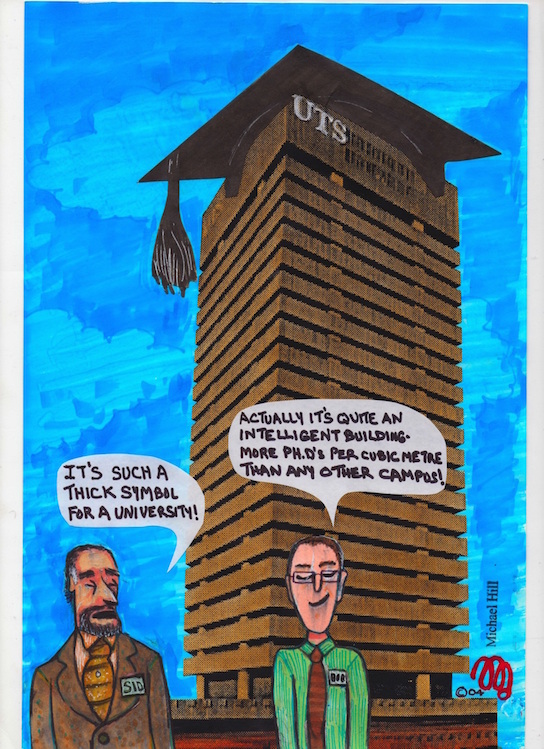
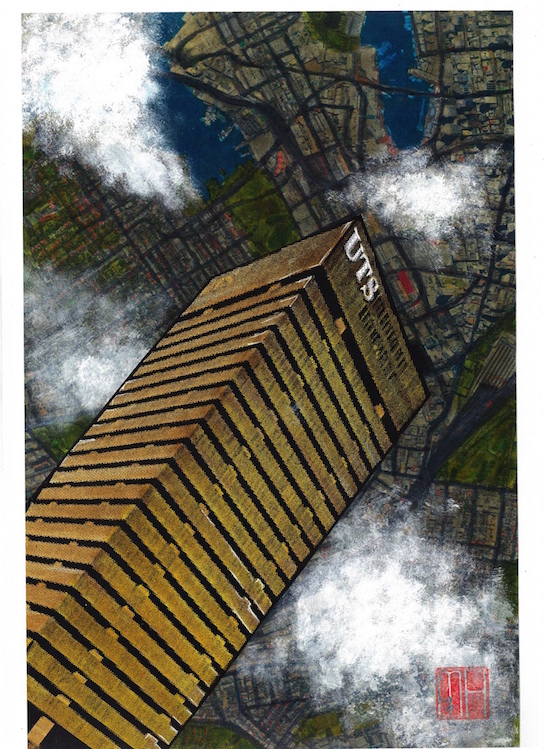
This post features the second instalment of cartoons I created during my academic tenure at the University of Technology, Sydney…and that were published in its magazine U:. These examples focus on the University’s Tower Building on Broadway near Railway Square. Labelled an example of “brutal modernism” despite its designer’s denial of it being that style…it is a monolithic stack of 27 storeys in concrete and glass… somewhat softened by the arrival of the newly constructed vertical garden clad Central Park building opposite. It was fun playing around with it as a satirical subject in these cartoons.
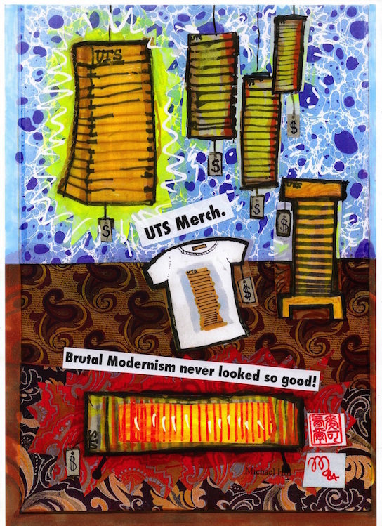
Fictitious merchandise in a non-existent shop in the foyer!…the Information Desk reported some enquiries as to the shop’s location after publication of this cartoon.
Originally I proposed using Nokia University of Technology but the sign on the tower would read NUTS! The University said “NO WAY!” to that…but the Virgin ad was O.K.!
I did an alternate version of the building relaxing on a banana lounge on Bondi Beach reading a novel…but the Vice Chancellor thought it was “A bit silly!” He preferred this one.
As always, my thanks for the excellent advice, assistance and cartooning expertise from the wonderful COUNTDOWNMagazine cartoonist, Louise Graber. Other posts of my cartoon based material include:
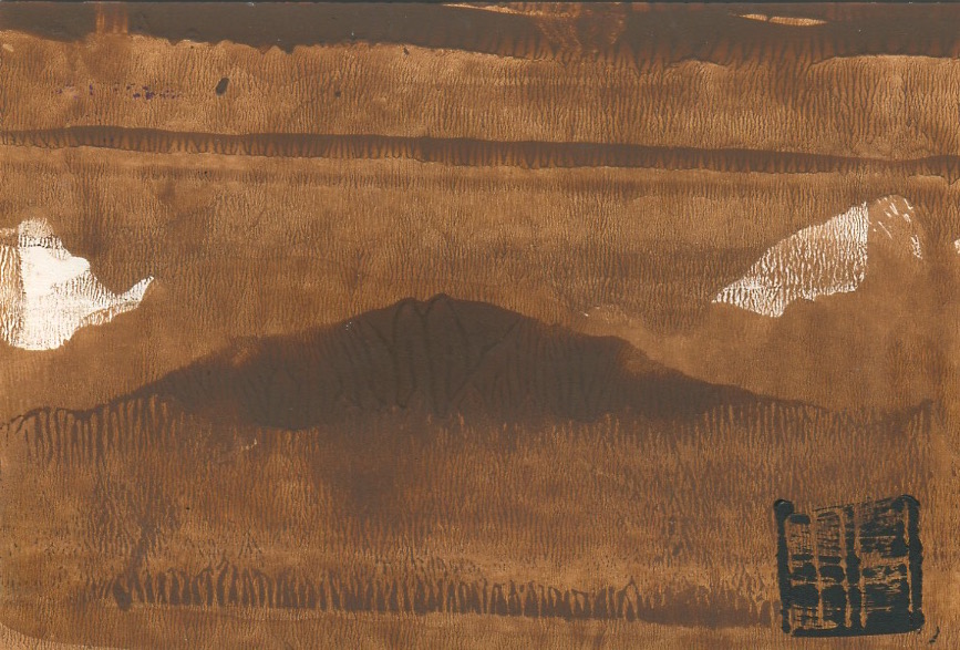
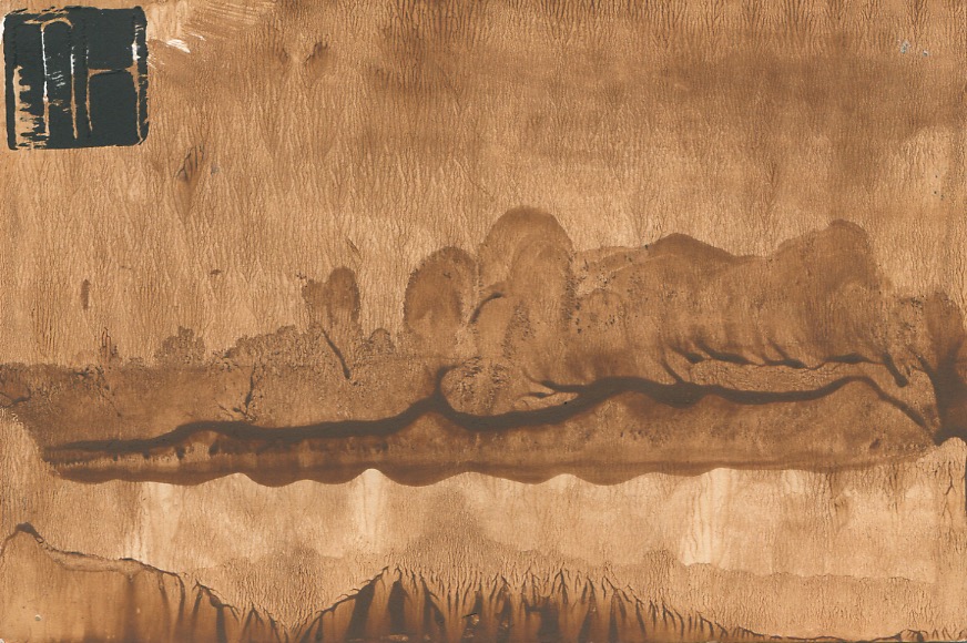
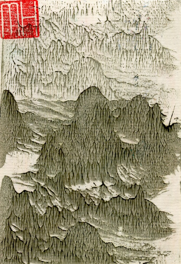
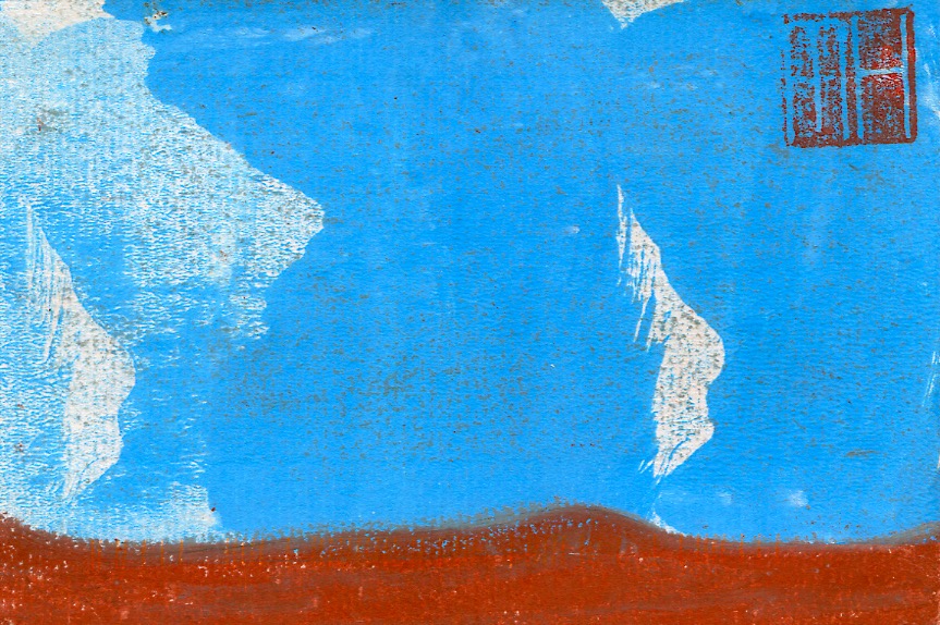
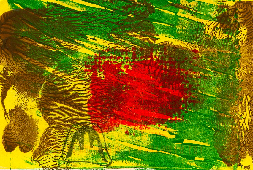
This post continues the profiling of the production of my handmade art postcards. These works were created from a combination of drawing and printmaking in small editions of 10 to 50. It must be stated that each of the cards is an original print, or monoprint…similar in design but with no exact duplicate. For example the three prints from the Landscape No. 2 edition below, whilst carrying the same title, number and technique, all bear some visual differences. My first postcard post was from the Abstract series…the postcards in this post are from the subsequent Landscape series. Some have abstract elements. With few exceptions these cards fall within the postcard size dimensions of 10cm x 15cm.
In the postcard art above I employed a restricted palette in comparison to the Landscape No.3 and No.4 cards which followed (see below in this post). These have a combination of textures that range from watery and weedy to grassy and sandy surfaces.
UPDATE MARCH 6, 2017: Below are are photos of my completed art postcards…bundled up for carting to the gallery and then spread out on a display table for sale.
Art postcards sorted and stacked for cartage to gallery. (Photo by Dr. Michael Hill)
Those cards spread across a table in the gallery for sale. (Photo by Dr. Michael Hill)
I can’t repeat often enough how much I enjoy the process of design and production of my art postcards!
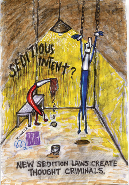
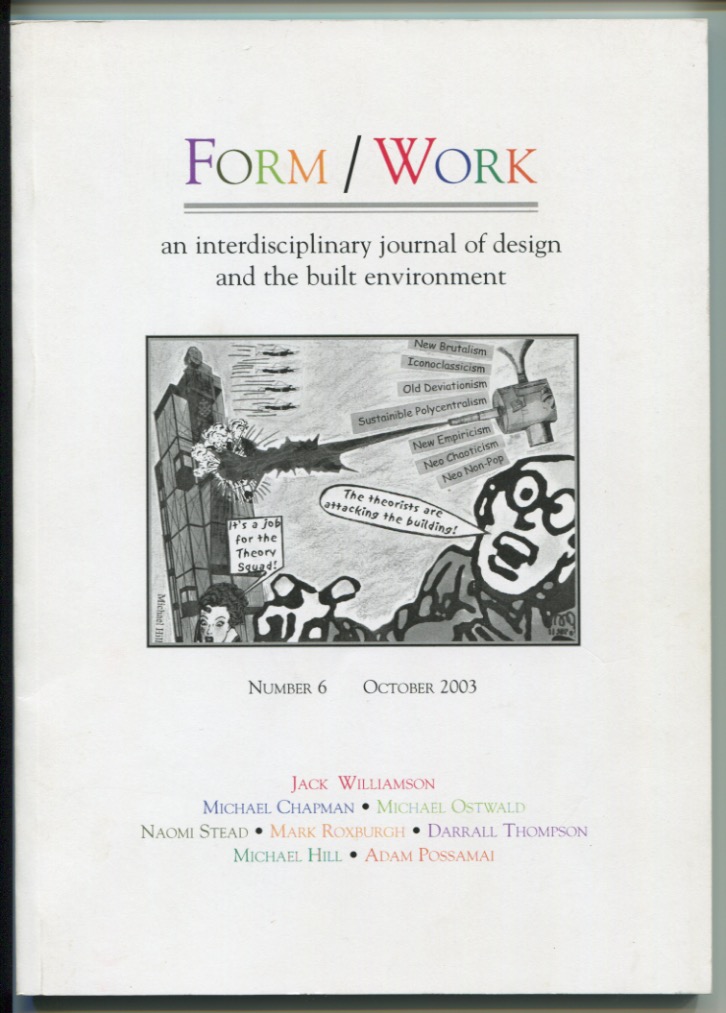
In this series of posts I profile a collection of my published cartoons. They currently total 30 in number. I am starting with those I contributed to U: magazine whilst working at the University of Technology, Sydney. These CARTOONS posts will help me to grow an online gallery of my single panel satirical work.
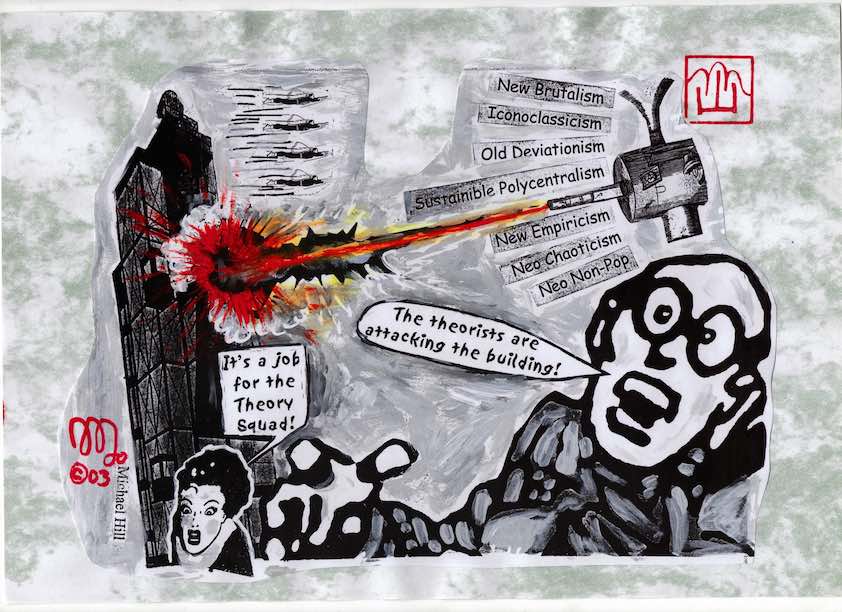
The “theorists” cartoon was put together hurriedly one afternoon. An academic design theory journal was being delayed at the printers awaiting a cover illustration which had failed to arrive. I received a panic phone call from the Faculty office along the “could I possibly please be of assistance” lines. I grabbed some images from old comics which I had in my office…invented some names for theories…and quickly collaged these elements together…all in an afternoon…and they published it!…on the cover!
How the cartoon looked on the cover of the journal.
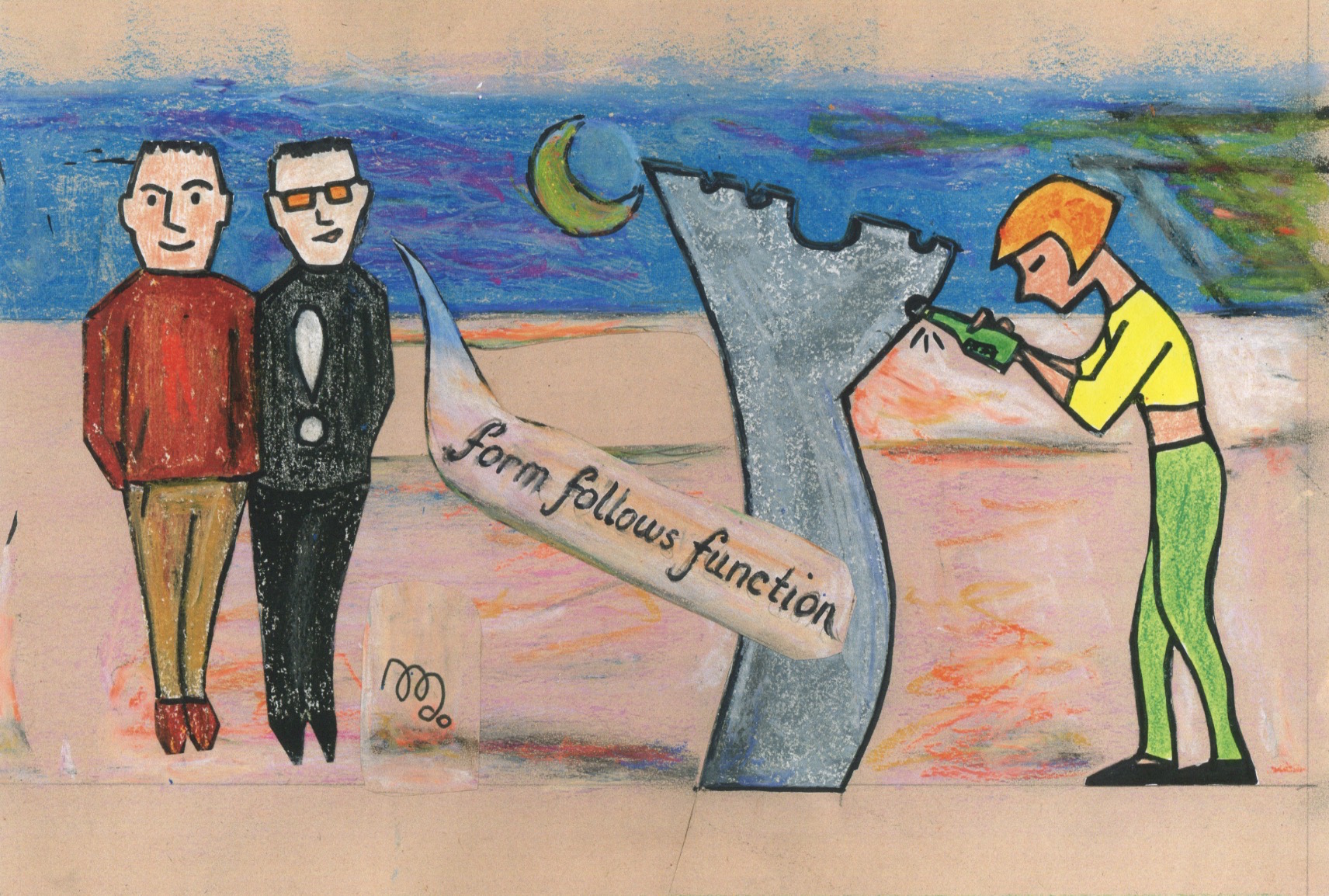
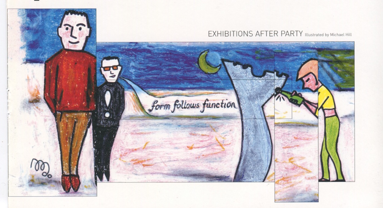
Form follows function was based on an incident at an end-of-semester design student party. This was held on the roof of the Design Faculty building. There was a semi-abstract modernist sculpture that resembled a large scale bottle opener mounted on the roof. I saw a less than sober female student tentatively approach it with a capped bottle of beer. After a short struggle she managed to open it despite the marked difference in scale between it and the bottle. It is quite amazing what Industrial Design students can do. Then I heard this comment from one of the two onlooking Industrial Design students: “Form follows function.” Yes, I really did hear that comment and observe that action…and salute that theory…and subsequently designed this cartoon!
And this is how the cartoon appeared in the magazine…the art director just couldn’t resist that trendy layout technique of chopping it into segments…and altering the colour, texture and proportions!
My thanks for the excellent cartooning assistance from the brilliant COUNTDOWN Magazine cartoonist…Louise Graber. Her Pop Music illustrative work made her an amazing manager of short notice deadlines…with an acute fashionista’s eye drawing perfect pop portraits, Michael.
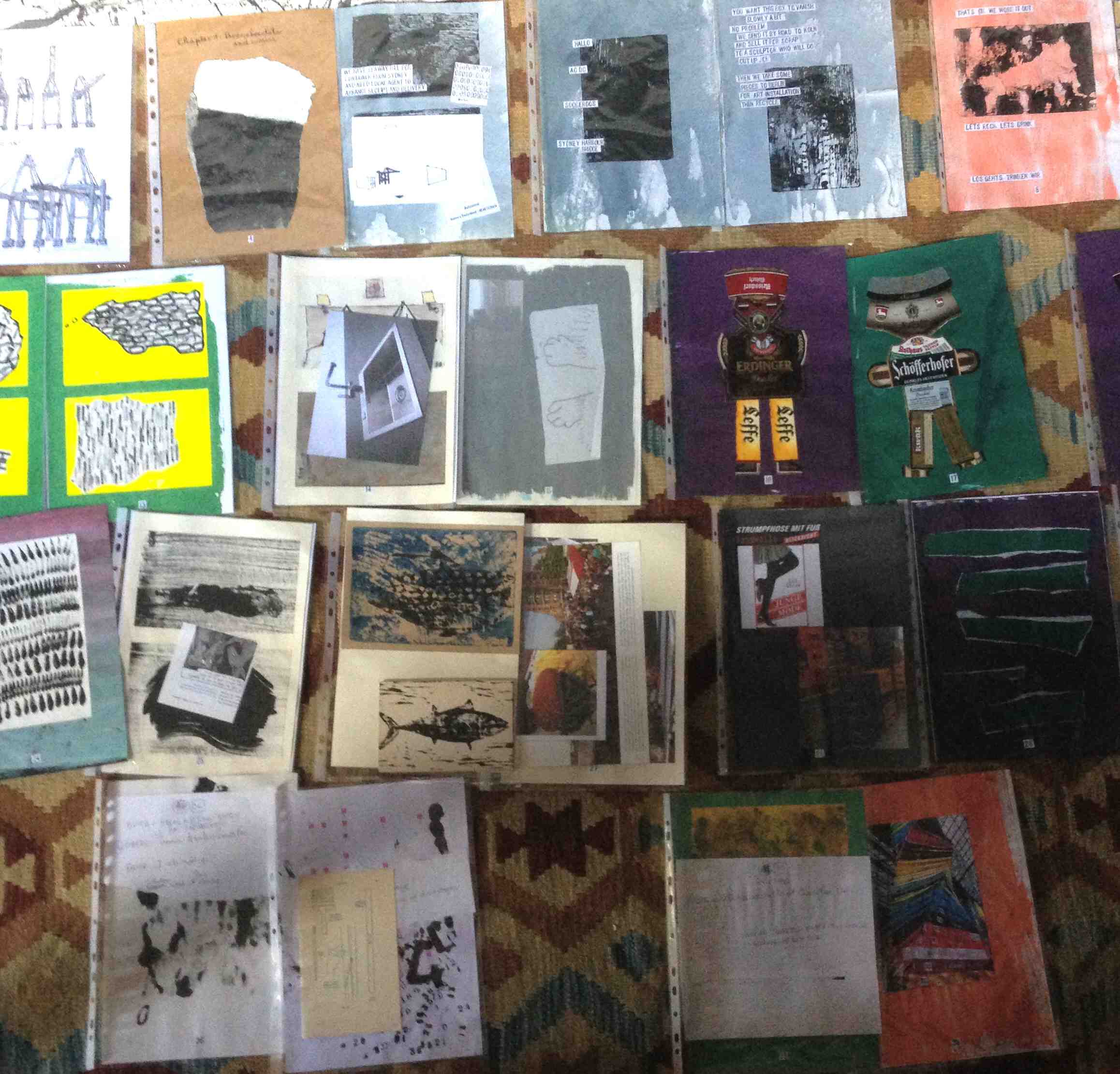
I have still not completed this issue of my comic but I am getting there! Completion of the fourth issue of my artist book/comic…and ultimately, graphic novel…Blotting Paper: The Recollected Graphical Impressions Of Doctor Comics is near. The printing and publishing process of those pages will follow. This includes the sequential stages of the pages being printed, collated, trimmed, covered and bound. As with the first three issues the fourth one has a total of 40 pages plus end-papers and covers. For this issue the covers will feature a wraparound print that includes the title. Being an artist book there will be a limited edition of 30. Each book in this first edition will be numbered and signed by the artist.
The addition of some spot colour plus a few paragraphs of handwriting is needed. It may also receive a bit of a toning touch-up and a little overprinting. I have spread out the pages in sequence on the floor of the studio. This reveals some sense of the overall flow of the comic. There might be the odd alteration to the sequencing in the final edit. I try to feel a sense of rhythm from reading and turning the pages.
UPDATE 6 JULY 2015: COMPLETION OF ISSUE #4! Although it took a little longer than expected I have now completed production of the fourth issue of my comic! The pages have been printed, collated, trimmed, bound and covered with title labels. Copies have been mailed to my supportive, personal readers. A possible launch is being looked at in Tokyo in October.
After running past the planned deadline and being slightly over budget I decided to finish in D.I.Y mode. This resulted in a somewhat hand-crafted look.
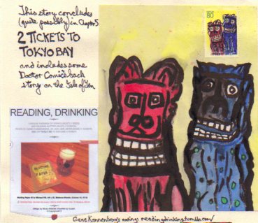
Now it’s on to the likely final issue…although reprints of previously published chapters are also a possibility…as is the eventual merging of all chapters into graphic novel form…I wish!…and can’t stop thinking about that possibility. Looking ahead, the tentatively titled 2 Tickets to Tokyo Bay Chapter 5 will be set in Germany and Japan. It depicts the continued activities of Doctor Comics’ cats and their new canine companion Barks in “funny animal” comics style. It may also contain further comics related recollections from Doctor Comics’ past, particularly his research of manga. Below is the ad for Chapter 5 on the back page of Issue 4.
Job done! Production of the third issue of my artist book/comic Blotting Paper: The Recollected Graphical Impressions Of Doctor Comics has been completed. The comic was launched in June at Comic-Salon Erlangen in Germany. I had been invited to attend the event by German design colleagues…Professors Markus Fischmann and Michael Mahlstedt…of Visuelle Kommunikation, Design und Medien Department…Hochschule Hannover University of Applied Arts and Sciences where I had a visiting academic engagement back in 2007. Comic-Salon is the largest comics convention in Germany with 25,000+ attendees. Oh wow!
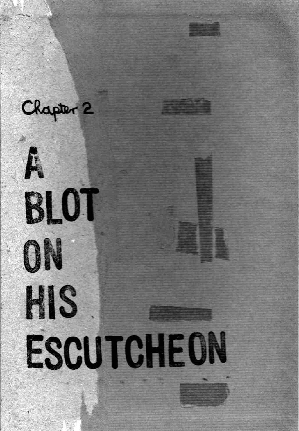
This is the first in a series of regular reports documenting the production of the third issue of my artist book/comic…Blotting Paper: The Recollected Graphical Impressions Of Doctor Comics. It continues on from my previous posts on the first chapter/issue The Ingurgitator…and the second chapter/issue A Blot On His Escutcheon. The new chapter, The Chthonian Turn: The Cats’ Revenge…deals with the feline characters’ reaction to the demise of Doctor Comics…and that gentleman’s adventures in another dimension to which he has travelled. I hope to self-publish it before the end of the year.
As with the two previous issues printmaking is involved in the generation of images…via woodblock, linocut, Japanese sosaku hanga technique, rubber stamps and wooden seals. In addition other visual communication techniques…such as drawing, painting, collage, cartooning and photography…with the intention of producing a limited edition artist’s book comic.
I also intend having more colour pages in this issue…following the use of sporadic spot colour in Issue #1 and the 8 full colour pages in Issue #2. The colour will assist in the graphic representation of both the real and imaginary worlds featured in the comic.
I am continuing to edit the script, refine ideas, and develop others. There has been some unscripted image-making and printmaking activity…with the intention of using this as a loose but parallel means of creating vaguely conceived and experimental visual content. Examples produced through this printmaking strategy are featured below.
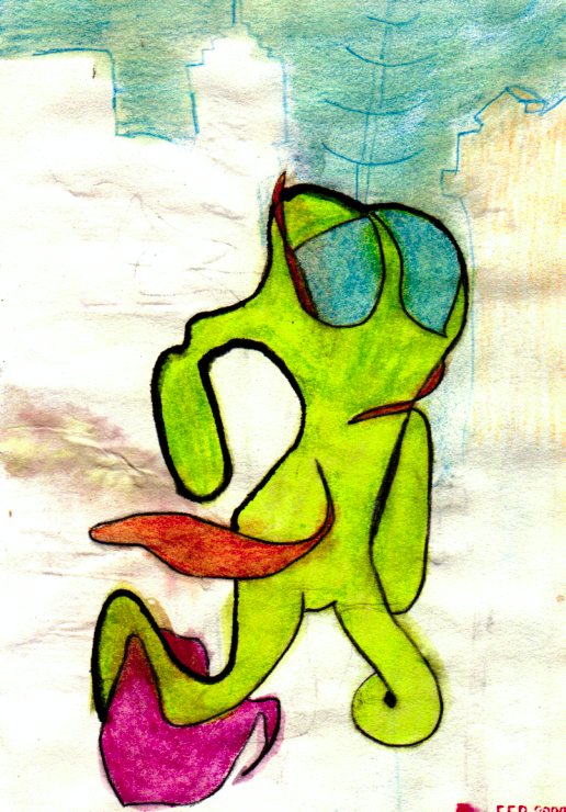
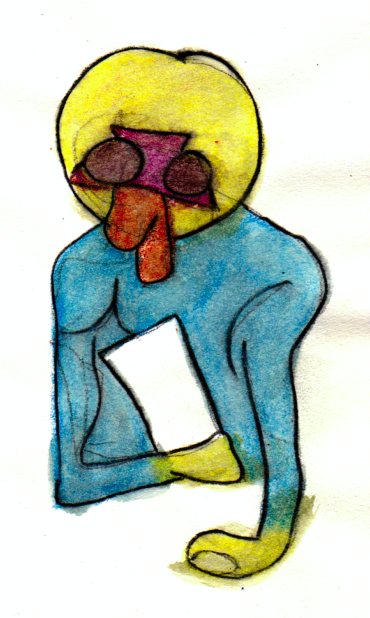
In the present chapter the two feline characters deliberate over the decision of what to do following the sudden departure of Doctor Comics. Meanwhile the latter character continues his travels in the chthonian world…confronting various vaporous forms and ghostly figures…including a trio of roaming red shades (see the three red shade illustrations). The raw state of these printmaking images will most likely be subject to further graphic manipulation.
The target date for completion of the five 8-page signatures have been approximated…and with a good run the comic could possibly be ready for binding as early as June.
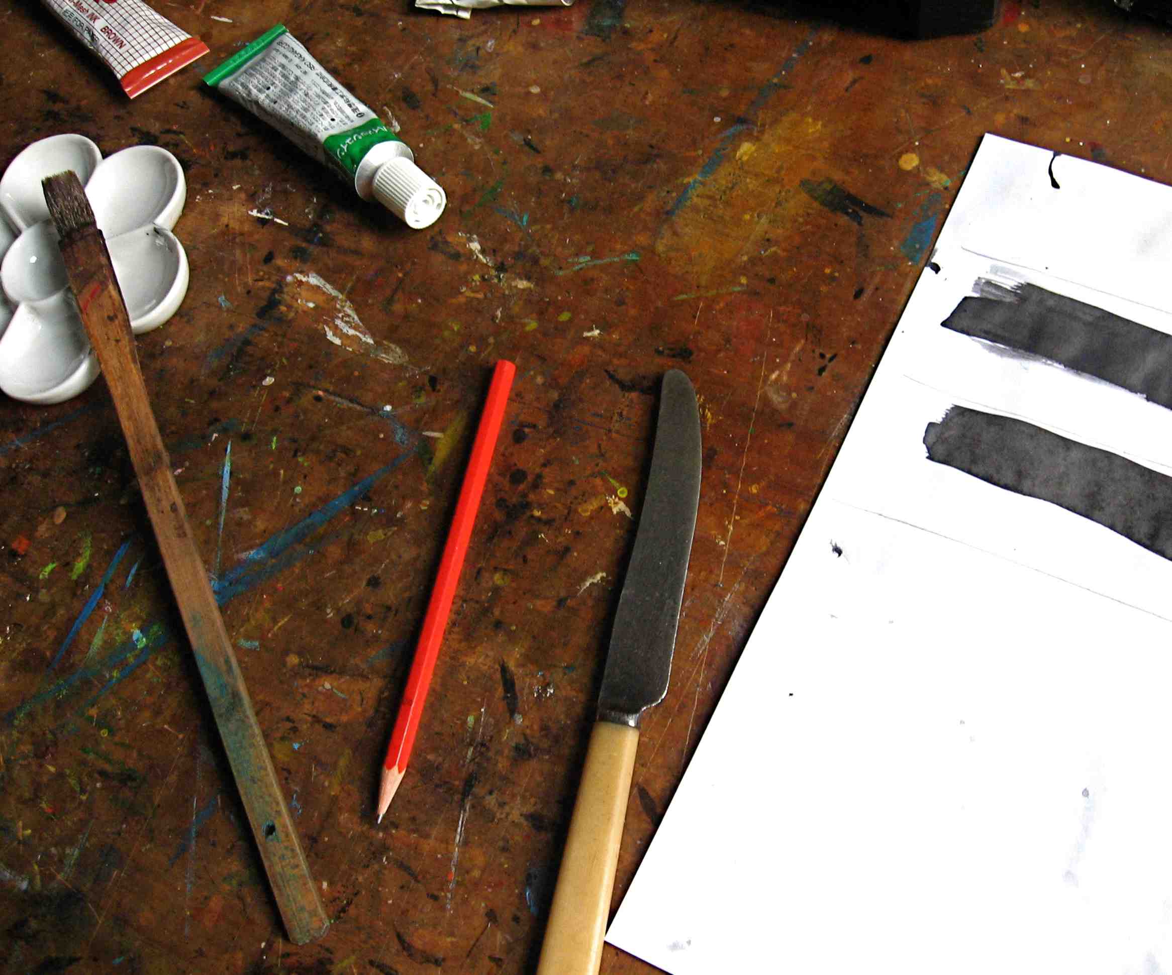
Ink, more so than paint, appears to be the dominant graphic ingredient in the production…with dip pens, drawing pens and brush calligraphy involved…although some of the inking will be made onto previously painted paper.
There are some pencils in there too…as well as the pens,…with drawing and handwriting components plus my regular use of printmaking for image generation.
Having gotten deeper into production modeI am now approaching completion of the artwork …having advanced from scripting to page layout…however, I am keeping things open in terms of the resolution of the story.
I find the creation of the images…and the entire image-making process…including the resultant generation of the artwork…to be the most pleasurable part of the production process. Culling, selecting and editing the artwork is a tougher task.
Printmaking has again been employed in the image-making…a little more than photography…but about the same proportion as drawing. In terms of style, abstraction is making an impression. The notion of developing this project into graphic novel form continues to firm.
This is the first report documenting the production of the second issue of my artist book/comic…Blotting Paper: The Recollected Graphical Impressions Of Doctor Comics. The new chapter is titled A Blot on His Escutcheon. It delves deeper into the character of Doctor Comics, the environment in which he lives and his life in comics. I am making progress with this and hope to self-publish it next year. The book is partly based on my career in art and design education in Sydney. I worked within these disciplines and their application within the areas of film, video, animation and visual communication. I have employed aspects of comics art in my teaching. Storyboarding, word and image projects and as a medium in itself are examples. I have also employed it in my study and research…the presentation of lectures and conference papers…the staging of conferences, symposiums and exhibitions and the writing of a doctoral thesis. My own comic has fictive passages as well as auto-biographical elements. Printmaking is being utilised as an image-making medium. This includes the Japanese sosaku hanga method, along with pen and ink drawing, collage and found materials.
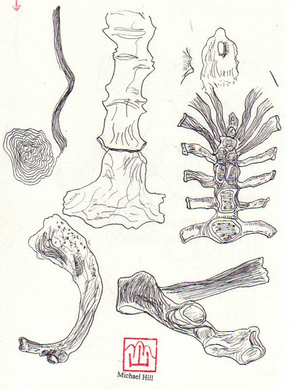
I’m currently learning to draw bones by reading the osteology chapters in anatomy books and studying the illustrations really carefully. In Chapter 1 I used fish bones as an image and as a printmaking substrate for the sosaku hanga technique. In Chapter 2 there will be drawings of human bones of the hand and foot. I have had the opportunity to study some broken bones incurred in falls from bicycles. Speaking of cyclists I also make reference to the Bookseller of Glee character.
This bookseller rides a penny farthing type of bicycle and will play a part in this issue. I had my portrait of this fine gentleman in the Glebe Sesquicentenary Art Exhibition(see below). It was also a finalist in the 2010 Bald Archy Prize. Titled The Bookseller of Glee (mixed media-drawing, painting and collage on paper)…it is a postmodern portrait of Roger Mackell, co-owner of Gleebooks (4 times Australian Bookseller of the Year). He is a generous character gleefully disseminating books and promoting the joy of reading. The portrait caricatures him and his store’s contribution to the intellectual life of Glee Village and its nearby universities. In my portrait the main street is constructed from the writings of French literary critics and philosophers…whose work the bookshop stocked in the 1980s.
The artist…Dr. Michael Hill a.k.a. Doctor Comics and his portrait of a particular Glebe bookseller. (Photo by Louise Graber)
I have been drawing more bones. In the meantime I am putting a call out for feedback on this post. I would really love to hear what you think of what I am doing with my blog and bones.
The above image is an experimental graphic impression of the typographic design of the title of my emerging first comic. Keen to experiment graphically with rubber stamping I have moved the letters during printing to create a smudged effect. I have also used some askew registration and mixed the fonts. How postmodern! My comic is based on my experiences…both practical and metaphorical…that I have had in a career in higher education. This involved teaching and research at an art and design college…followed by a university, in the disciplines of film, video, animation and visual communication design. The subject of comics often arose and I actively endorsed that. Initially considered as an effective method of teaching storyboarding it then became a medium in its own right. I also began to research the comics medium. This ultimately led to my doctoral research in comics studies and the gaining of my Ph.D in that field. The Art and Design schools of Sydney College of the Arts were virtually neighbours. As mentioned in my previous post, I became involved in printmaking when I temporarily swapped classes with a colleague…my graphics students with her printmaking students for a couple of sessions, and her students learning animation with me. I became very interested in the printmaking studio and its graphic methods…and began to learn printmaking techniques myself. The printmaking lecturer and I taught each other the rudiments of our respective skills. It was a good exchange. I enjoyed it both as a technical medium and as a form of artistic expression. Consequently, printmaking became an adopted part of my artistic practice. In my own comic production I have employed printmaking to generate titles and visual expressions. These have been edited and combined in my developing graphic novel project Blotting Paper.
I experimented with the visual communication design elements of the work and found this approach both exciting and productive. I also began to think of my project extending beyond a single issue…possibly even becoming a graphic novel?
The ‘graphical impressions’ are drawings and prints of graphic memories. These were generated and printed in ink from rubber, wood, lino and other surfaces. The titles were made with rubber type and my name credit from a linocut. Besides printmaking as a method of image-making I also did some drawing…using traditional metal dip pens, pencils, felt-tipped pens and brushes plus a range of inks.
PRODUCTION UPDATE: Recently the production progress of my comic has experienced a few interruptions. On the plus side of this I have been working on interesting studies projects during the delays. One project involves the works of Tezuka, Rintaro, Matsumoto and Miyazaki, and their films. These include Galaxy Express 999, The Dagger of Kamui, Laputa-Castle in the Sky, and The Girl Who Leapt Through Time. Another project involves workshops in the sosaku hanga technique of creative Japanese printmaking. Both of these activities will form part of a Japanese Cultural Festival in Suva in the South Pacific. I shall be participating in and teaching at this event. In terms of my comic’s progress, I have pulled some pieces of completed work together. I have also been modifying other work that I had considered completed. That’s the title page design(above) for the first chapter The Ingurgitator, as it currently stands. Although created in colour a black and white version may appear in the comic. It consists of a combination of image-making techniques including drawing, painting, inking, printmaking and collage. The original collage/sketch, below, was made during a trip to Shanghai to attend the Animation Expo in Hangzhou in 2007.
So there is my third post on this blog…a month since my previous post…which seems to be a better and more manageable gap…and the second post on my comics project. I would love to hear any comments and suggestions about my blog…including the frequency of my postings, Michael.