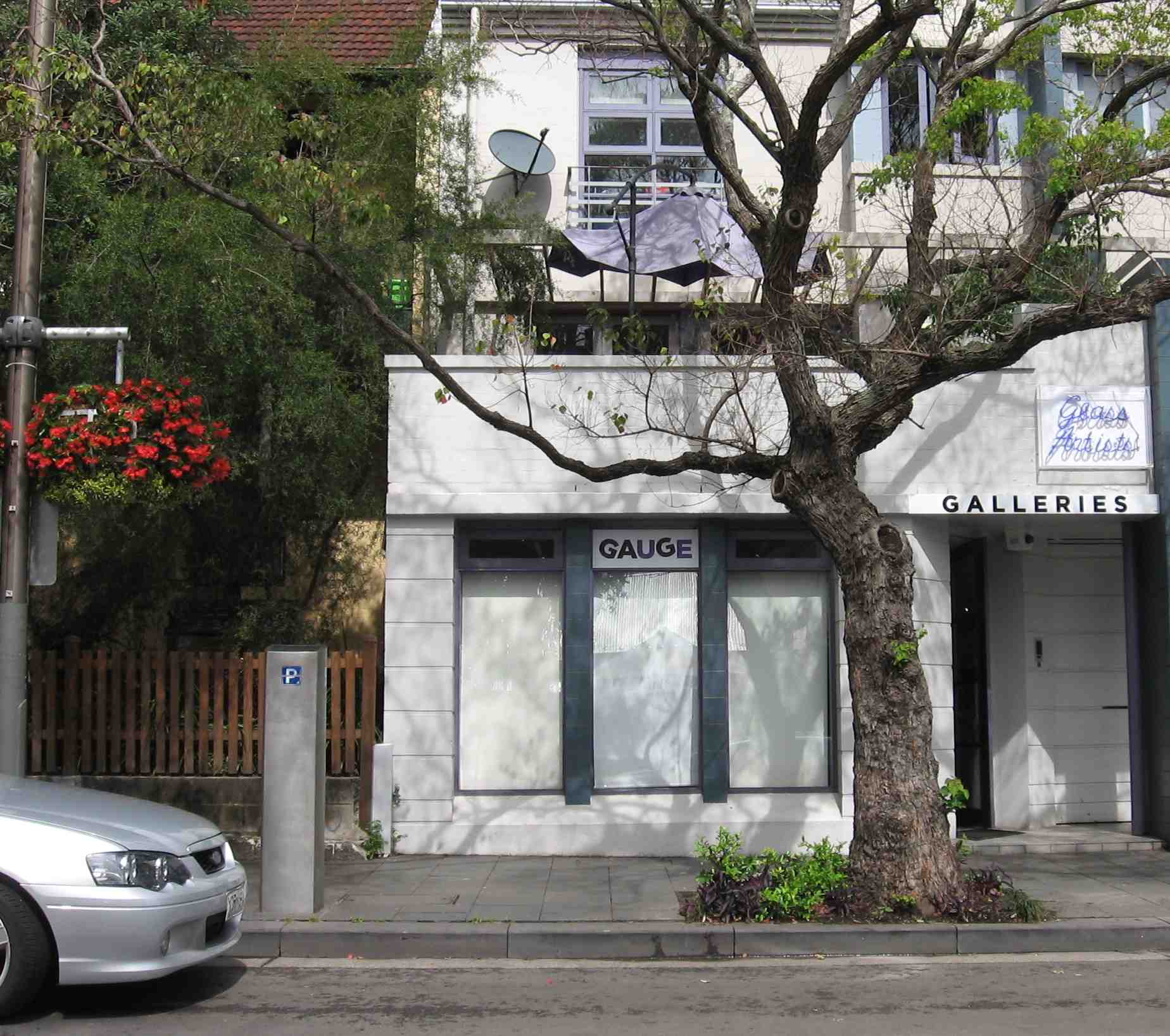
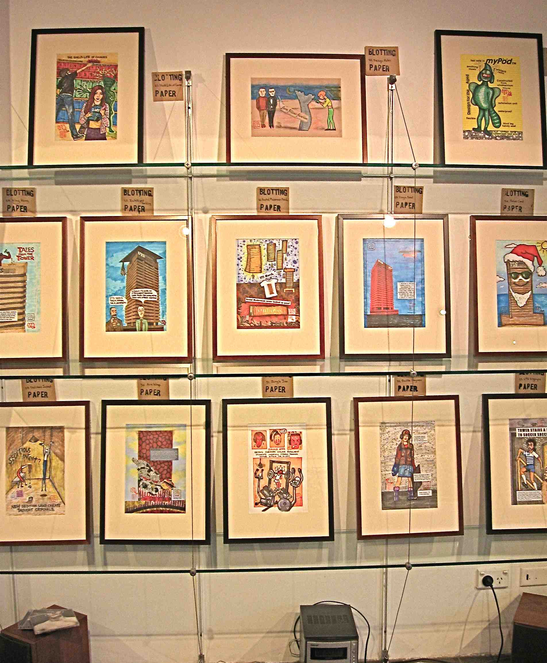
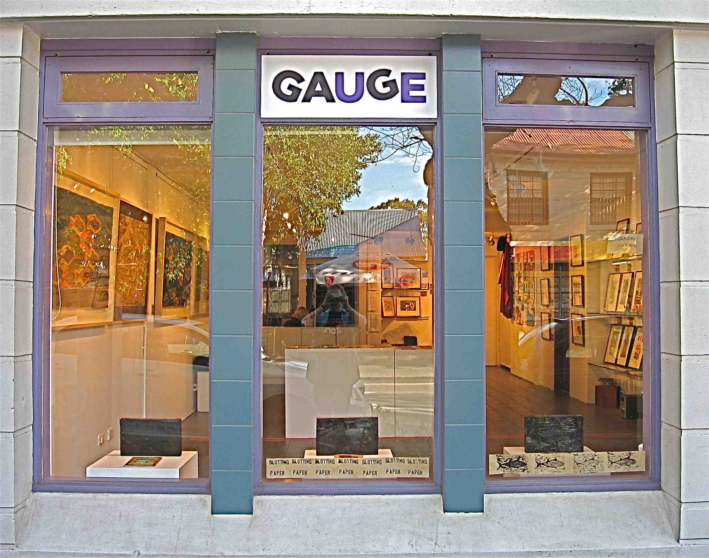
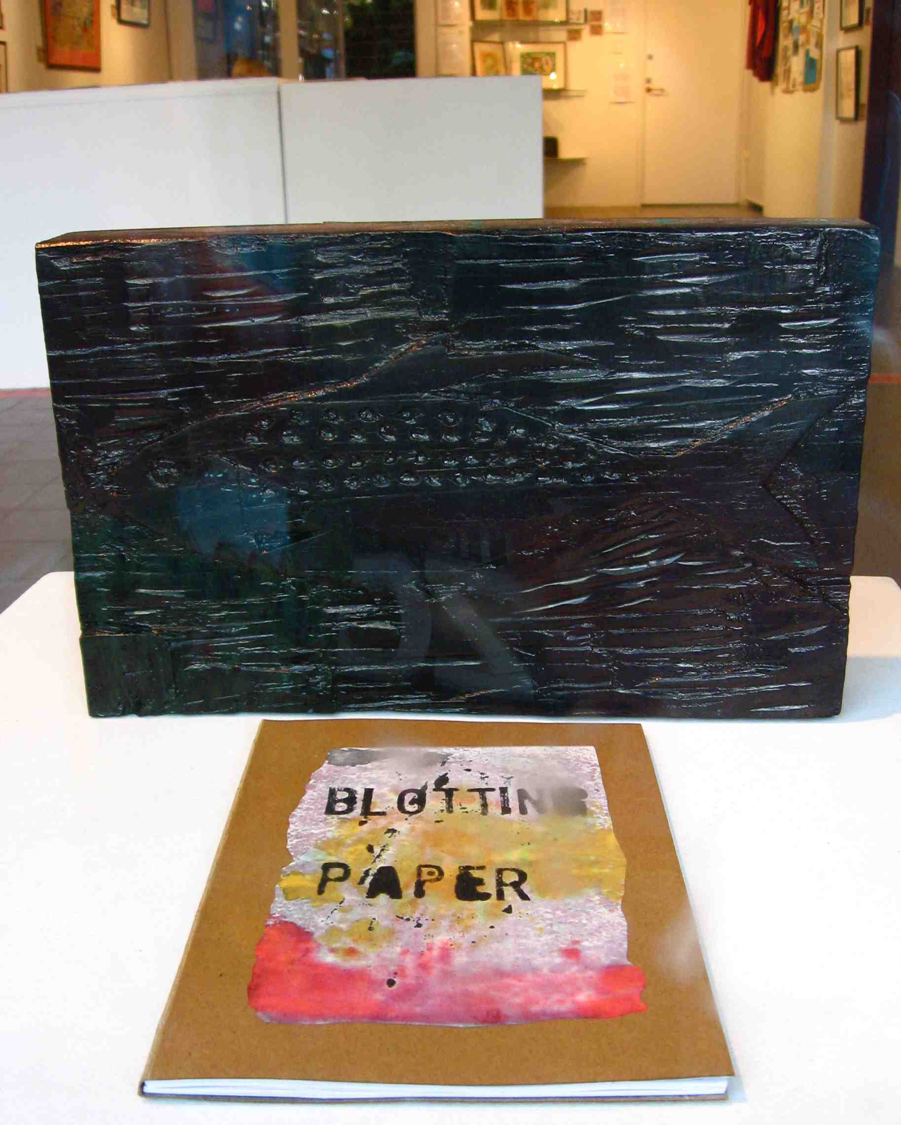
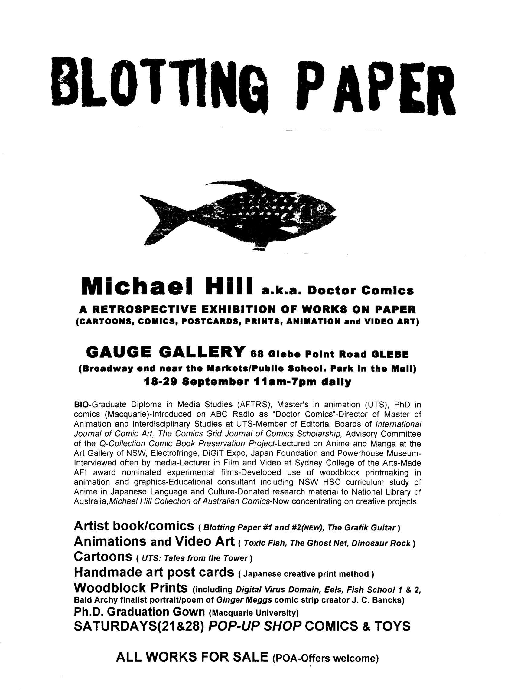
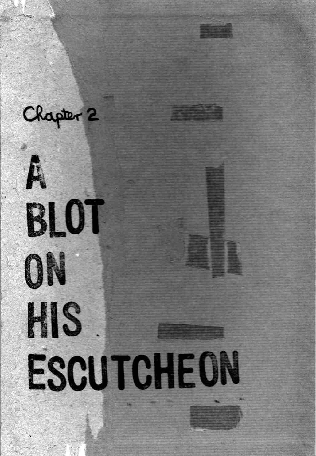
This post covers the installation of my comics art exhibition Blotting Paper: Works On Paper. It was held from18-29 September at GAUGE Gallery in Sydney. It included publication of the second issue of my artist book/comic: Blotting Paper: The Recollected Graphical Impressions Of Doctor Comics, Chapter 2: A Blot On His Escutcheon.
The second issue of my artist book/comic… Blotting Paper: The Recollected Graphical Impressions Of Doctor Comics, Chapter 2: A Blot On His Escutcheon… has now been published. As with the first issue the publication was planned to be accompanied by an exhibition of associated art work. This time the exhibition opening, at GAUGE Gallery, preceded the publication. The exhibition was larger in scope and located in a gallery, as opposed to a bookshop. The comic was late! It arrived on the fourth day of the event. The launch had to be postponed due to its uncertain delivery date. When the book finally arrived at the gallery it went on sale but retained its “yet to be launched” status. With two issues now complete the thoughts of it potentially growing into graphic novel size continue to circulate in my mind! We’ll see! Michael
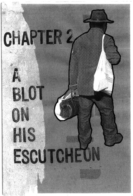
Publication of the second issue of my artist book/comic Blotting Paper: The Recollected Graphical Impressions Of Doctor Comics, Chapter 2: A Blot On His Escutcheon is forthcoming. September is looking increasingly likely subject to completion of the printing, binding and delivery of the comics. The comic will form part of an exhibition of my works on paper at a new gallery in Glebe called GAUGE. Below is an image of the title page. The image has been constructed from elements of photography, printmaking, typography and collage. It shows Doctor Comics returning from a shopping expedition. UPDATE: Exhibition dates have been firmed to 18-29 September 2013 but still no firm launch date for the comic…which is beginning to raise thoughts in the long term of its potential development into a graphic novel. We will have to wait and see about that!
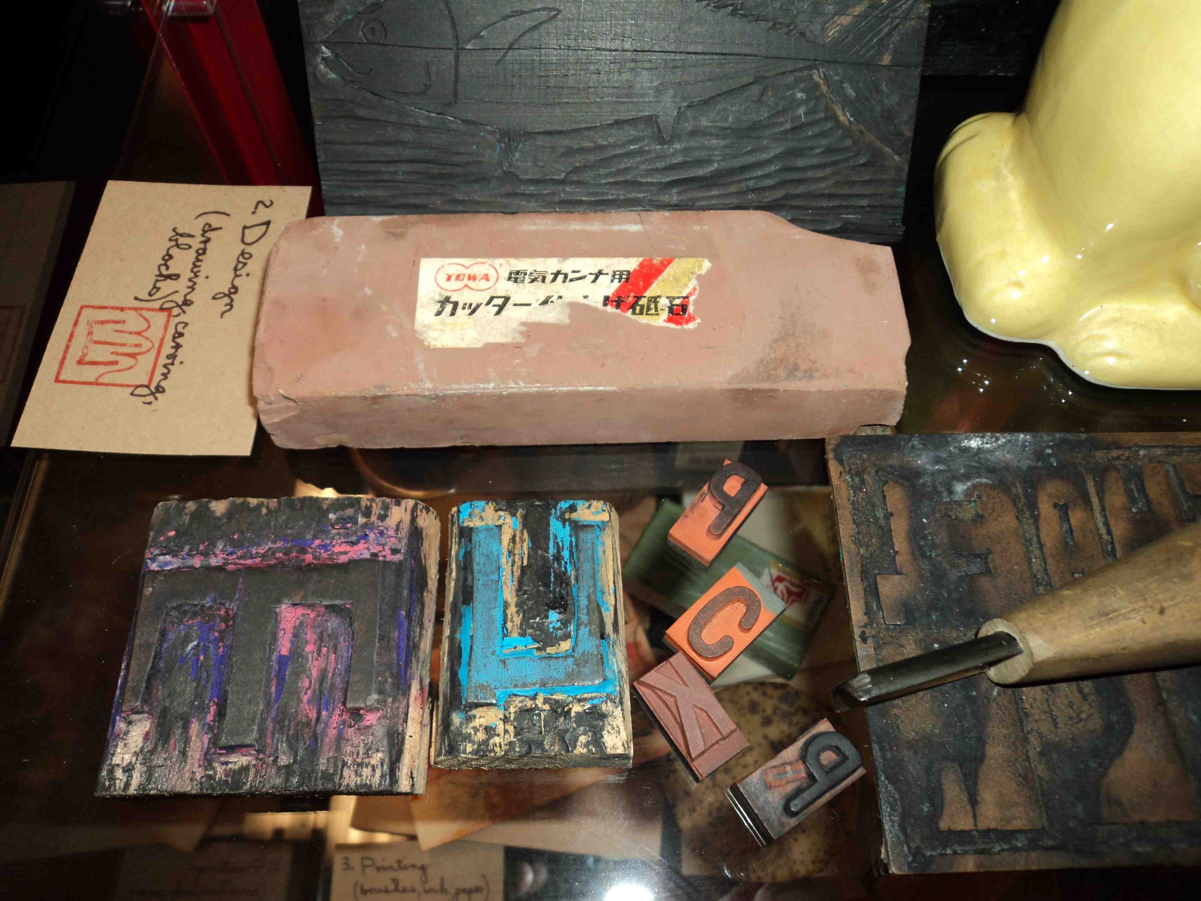
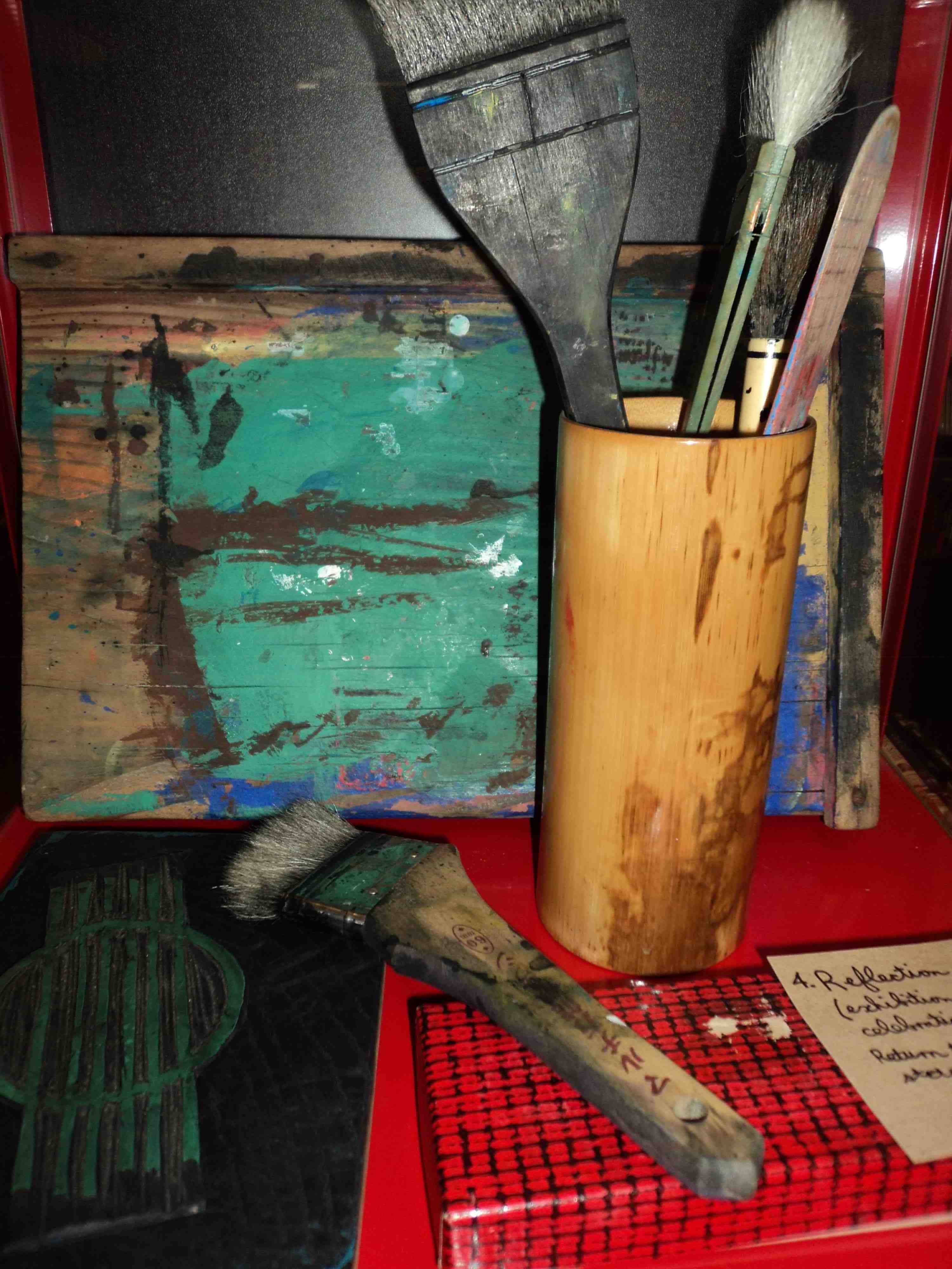
Continuing reports documenting the production process of my artist book/comic Blotting Paper: The Recollected Graphical Impressions Of Doctor Comics…Chapter 1: The Ingurgitator andChapter 2: A Blot On His Escutcheon…this post shows more examples of the image-making aspects of the project. These include assemblage, drawings, design, photography, printmaking, plus project management.
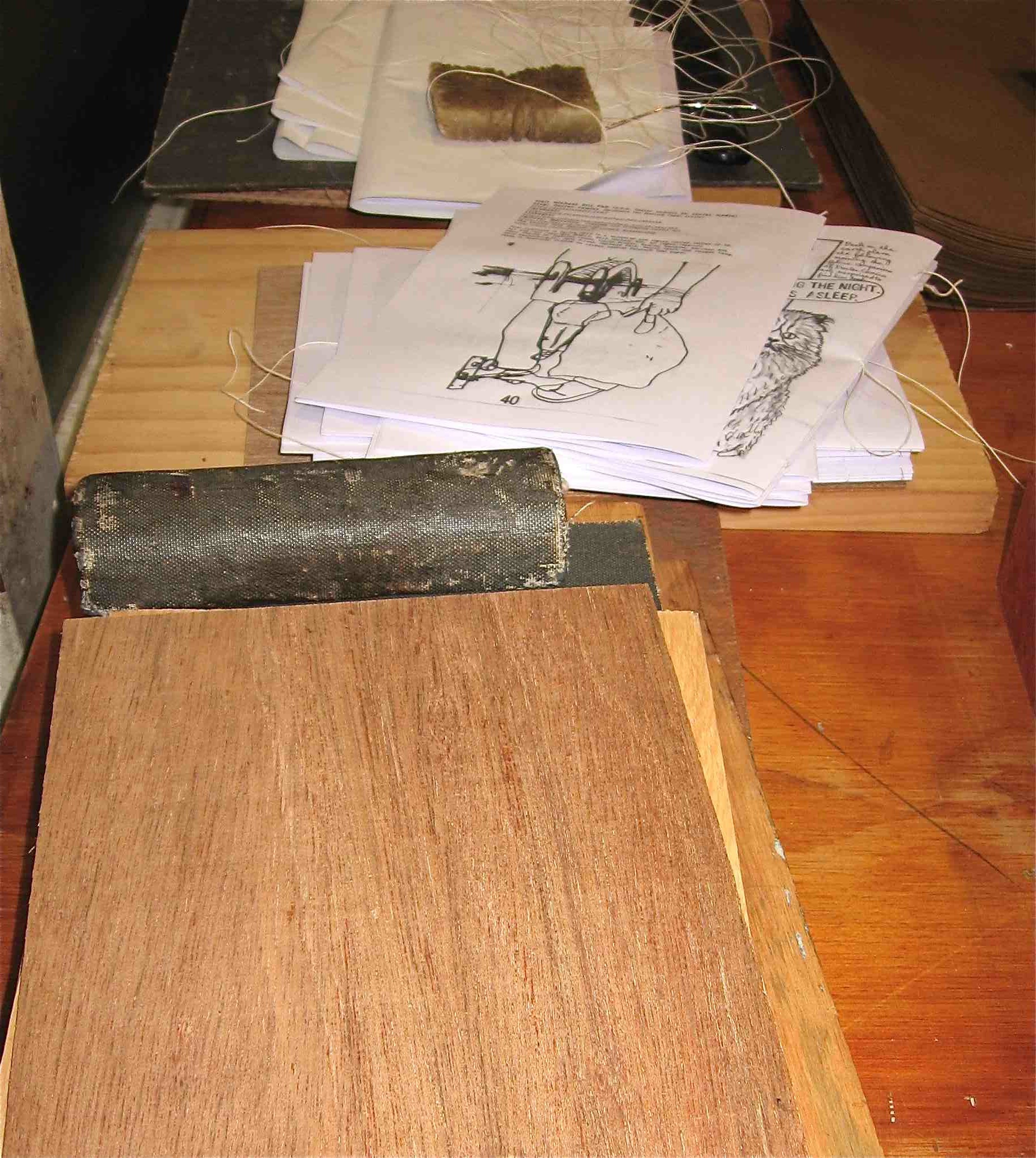
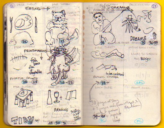
Some colourful project management in my blog log book.
This blog on my Blotting Paper comic has provided a means of documenting the production progress of the comic.
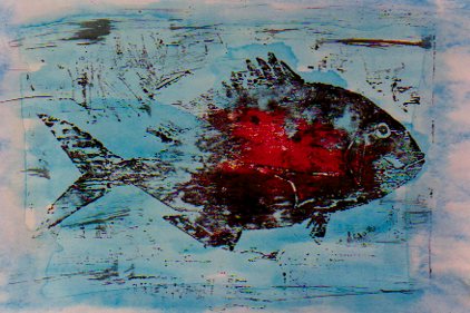
Both fish and cats feature in the comic, the fish more realistically rendered than the cats. Above is an image from my earlier fish animation, with added blood. Below is a rough sketch of one of the feline characters.
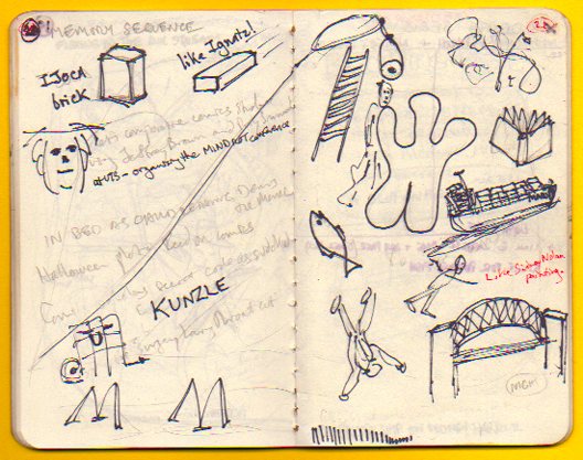
Continuing my series of reports documenting the production of my comic Blotting Paper: The Recollected Graphical Impressions Of Doctor Comics…this post illustrates the use of the note books, sketch books and design processes involved.
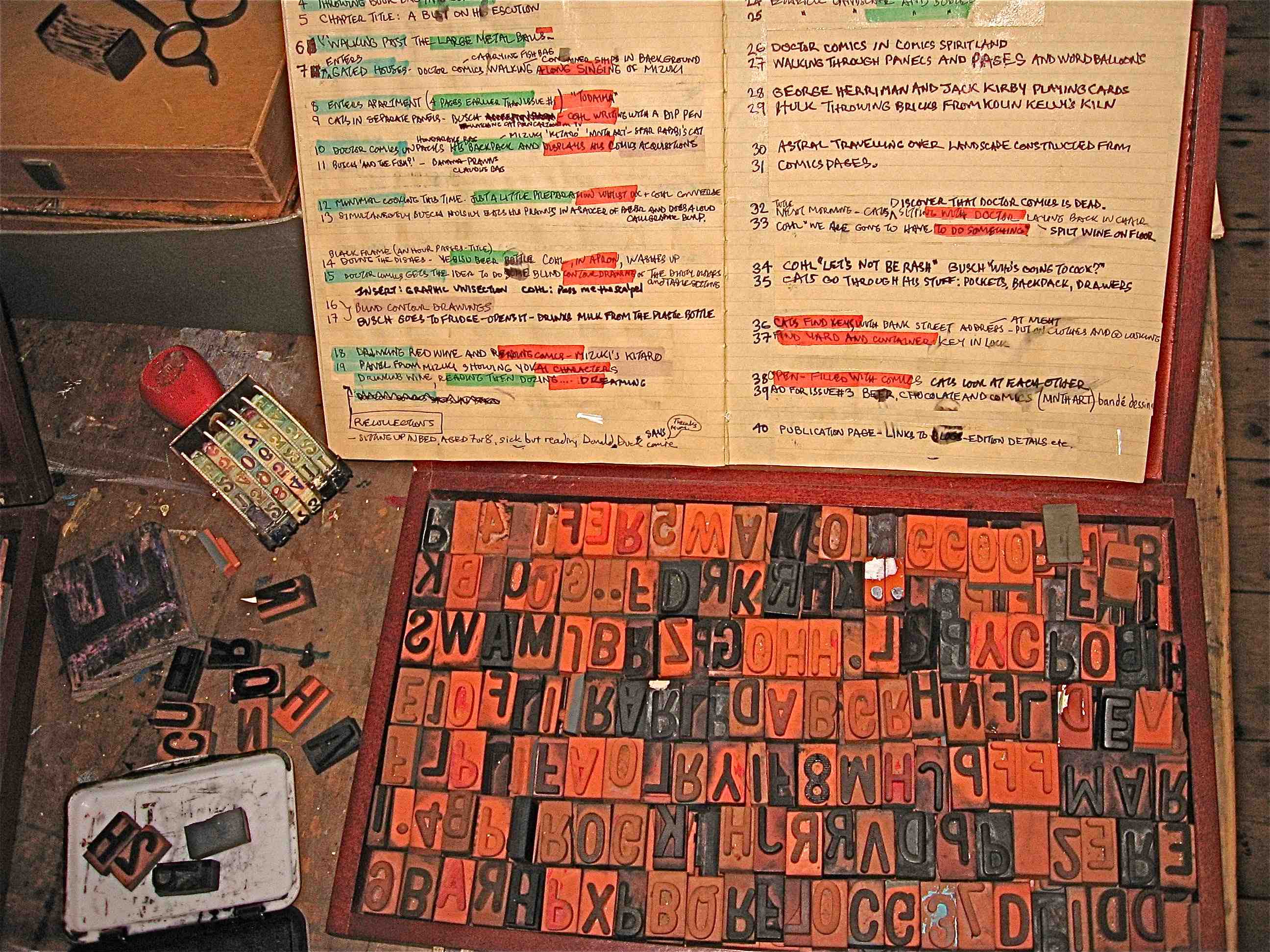
The larger notebook (above) is primarily used for making notes and writing drafts. It has information about the characters and the environment in which they live…plus ideas about the narrative and its construction. The smaller note books (below) contain rough sketches that were used to develop ideas from the main note book.
The design is a little on the rough and sketchy side! It does, however, show an outline of the character design and story sequencing. How did you find it? Let me know. I would love to read your responses to my posts, Michael.
This post continues reportage of the production of my artist book/comic Blotting Paper: The Recollected Graphical Impressions Of Doctor Comics. It describes the use of printmaking in the image-making process, including the creation of landscapes of subconscious terrain.
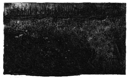
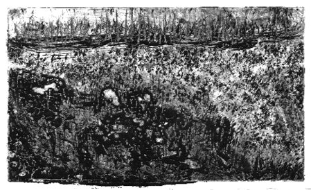
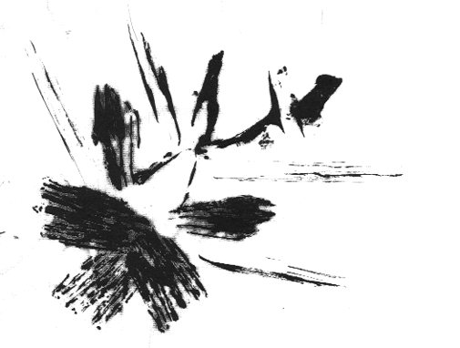
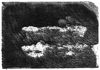
Doctor Comics finds himself in a shadowy landscape during an intense dream experience. I have tried to express the inky and murky feel of this etheric place he traverses. To achieve this I made a series of monochromatic monoprints.
This landscape can be seen more clearly as more light is added to each successive image. Despite the extra light he still finds it hard to trace his way through.
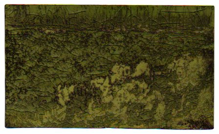
These prints were made using an etching process. It was a novel method of printmaking that involved exposure of the design to a light sensitive plate. This process marked the lines on a gelatin coated metal plate. The plate was then rubbed with a stiff brush under running water to carve the lines. This process is known as solar plate etching.
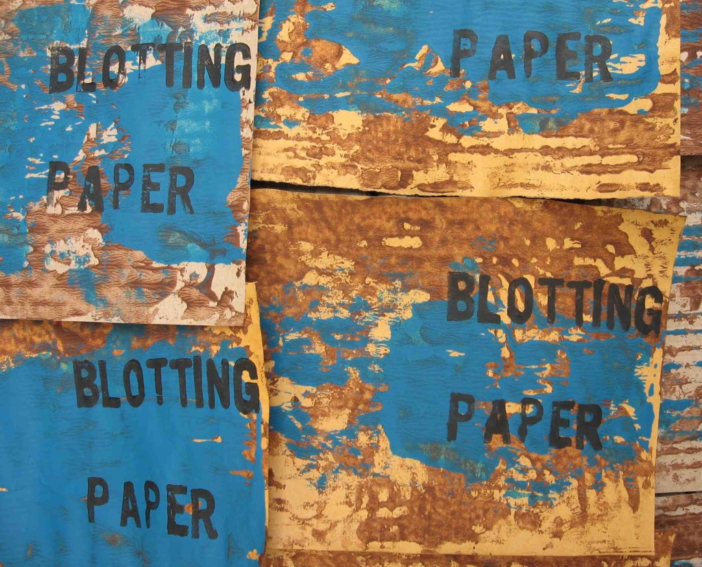
A deliberate ‘blotting’ effect was obtained from pressing a saturated inked block onto highly absorbent blank paper. This was for a scene from the second issue. After printing, the paper was peeled off the block carefully to avoid tearing. This was due to the combination of the wet inked areas and the paper’s soft, tissue texture.
Tails and fins of a cooked fish were inked and printed for some of the images used in Chapter 1. This approach was inspired by the Japanese sosaku hanga printmaking method. That involves inkable flat objects employed as ‘blocks’ as an alternative to woodblocks. The resultant graphic effect is shown in the print above. Photos of the image-making process involved in making that print are below.
Another unused print, above, from the first issue is a possible inclusion as a postcard insert in this issue. It was constructed from a combination of woodblock and object prints. I know I seem to be pushing the printmaking cart here but it has really got me going. I would love to hear of your experiences of printmaking, if you have done that, Michael.
This is a further report on the production of my graphic novel Blotting Paper. This post focuses on print layers used to create the cover design. Planned for the first issue but not used until the second here are some images of the printmaking procedure.
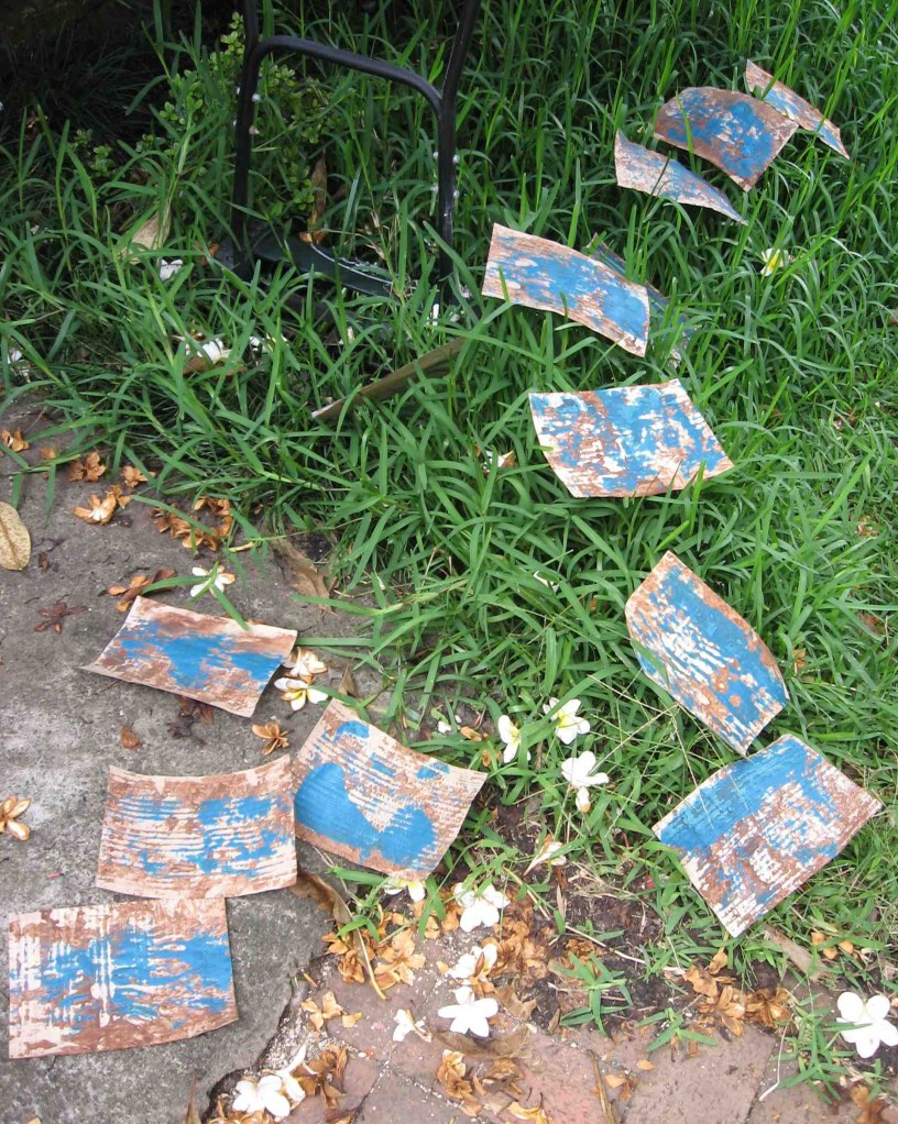
Working in a small studio I had no bench space for drying. Letting the prints dry outside on the ground in the Spring sunshine proved a fast way to obtain the dryness. The prints were vulnerable to a breeze and were blown into the grass and garden.
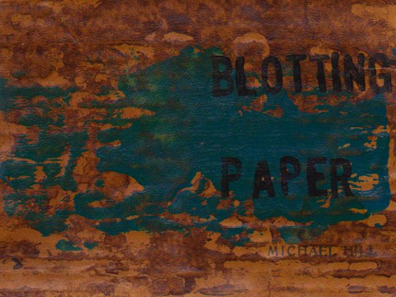
The final stage involved printing the type over the blue overlay and brown background.
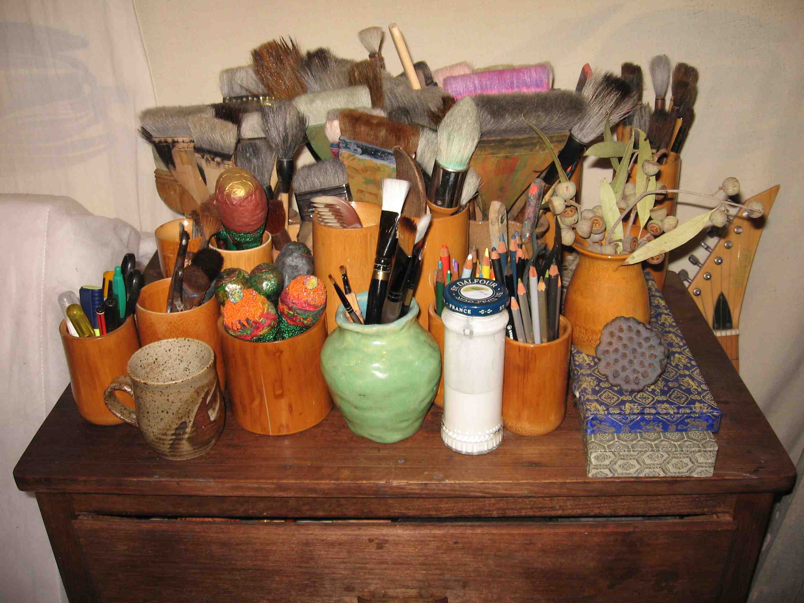
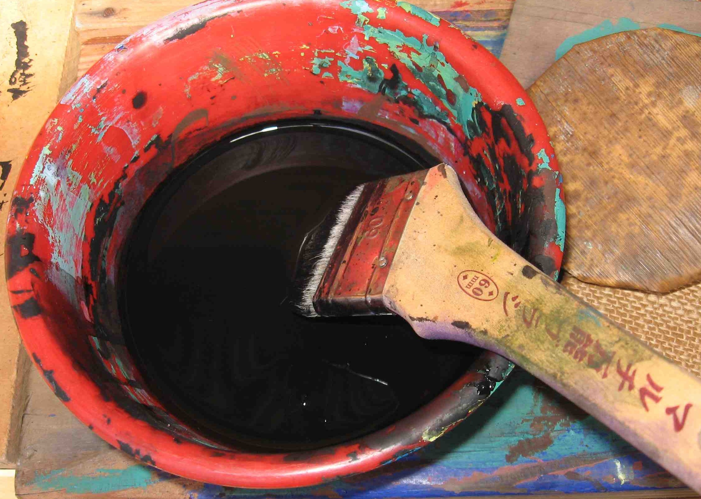
A bowl of sumi ink, a brush and a bamboo baren. (Photo by Dr. Michael Hill a.k.a. Doctor Comics)
Following the Japanese creative print approach of using sumi ink enabled me to obtain solid blacks. The ink was brushed onto the block. Then the paper was placed face-down onto this and rubbed with a bamboo baren to make firm contact.
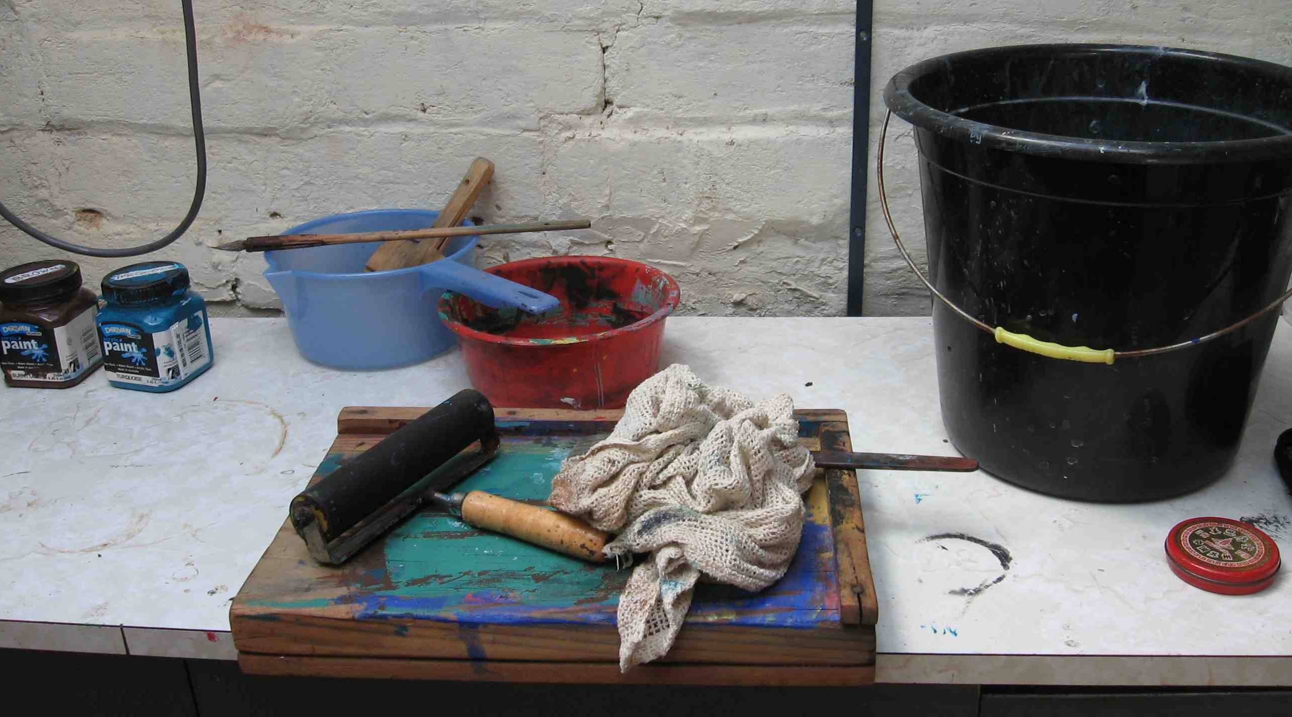
Bench hook, roller, rag and bucket on studio bench. (Photo by Dr. Michael Hill a.k.a. Doctor Comics)
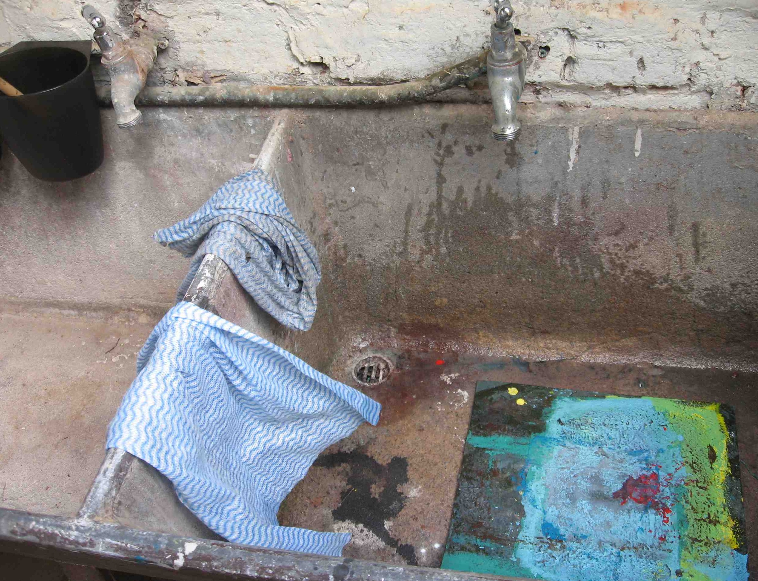
Materials used included ink, rags, cloth, plus water for washing the blocks, brushes and hands.
Water, cloths, sink and lino block. (Photo by Dr. Michael Hill a.k.a. Doctor Comics)
Despite the implied reference to woodblocks in Japanese print techniques the wood may be replaced by other materials. These include vegetables, fruit, leaves, rubber and other objects that are sufficiently flat to be inked and pressed onto paper. The creative print (sosaku hanga) approach places the emphasis on the act of making the print. It’s a joy! Please let me know if you share the joy of printmaking…or wish to make any comments about this post and blog, Michael.
Ink-stained printmaking attire. (Photo by Dr. Michael Hill a.k.a. Doctor Comics)
Work continues on the production of the second chapter of my artist book/comic…Blotting Paper: The Recollected Graphical Impressions Of Doctor Comics. This report looks back at two of the main characters from the first chapter, the feline characters Cohl and Busch. These are funny animal characters that belong to Doctor Comics.
These feline characters Cohl and Busch are named after famous cartoonists of mine Émile Cohl and Wilhelm Busch. They live in the apartment with Doctor Comics as his companions. They l-o-v-e fish! They also know about comics, as much and possibly more than their owner, the so called Doctor Comics. In lecturing mode Doctor Comics has been known to channel Cohl! That cat is incredibly well read but with a distinct bias toward bandes dessinées.
Printmaking is playing a formidable role in the design of the spirits, ghosts and apparitions in this chapter. I am experimenting with sequential prints. This is a hangover from my animation days when I utilised the technique to generate large volumes of artwork.
In this chapter the Doctor Comics character is teleported into the supernatural world via a dream experience. To obtain a shadowy landscape for some ethereal figures he encounters, sumi-ink blots have been soaked on soft paper. Over and under-inking the blocks has resulted in intense black or under-inked white patches on the printed paper.
This dream sequence occurs toward the end of the chapter. There Doctor Comics confronts fearful looking ghostly figures that step out from the background. The monotype printing method and the use of sumi ink enabled the making of experimental images with a restricted palette. The incorporeal characters were manifested and embodied in this manner. Examples of these are in the monoprints of the etheric body and the shadowy phantoms above and below this paragraph.
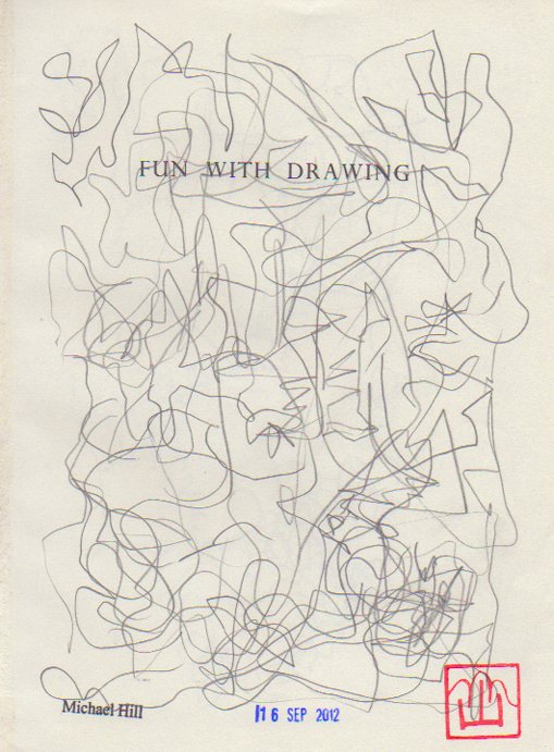
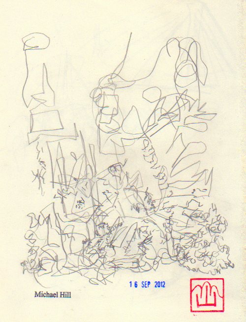
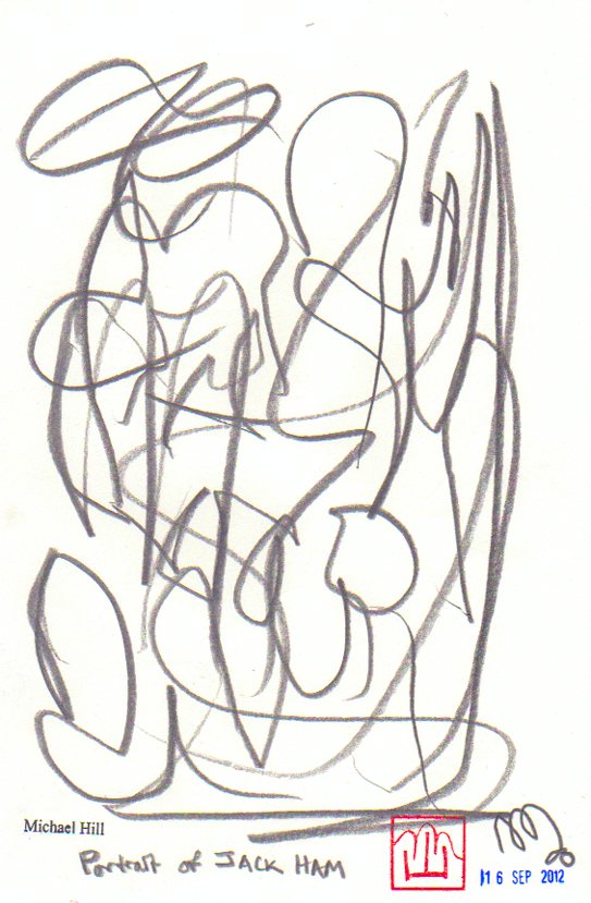
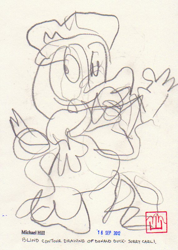
This new chapter also includes experimental approaches to drawing including abstract, contour and blind contour. It’s creative fun time with this drawing process.
Using line as an element of construction and expression, drawn, printed or written, although restrictive, is quite expressive. I find that drawing details very carefully of constantly changing scenes with accompanying alterations in point-of-view leads easily into abstraction.
Drawing anything whilst listening to music invariably produces a pattern of abstract lines on paper that is most expressive. I follow the lines whilst I am making them and try to keep up with the tempo of the music. No erasers! A quicker tempo produces less inhibited lines and surprising shapes.
Another fun drawing exercise I have utilised is copying a character or object without looking at my drawing. I try to follow the outlines of the object but don’t look down to see how the drawing looks. Without the constant checking things can drift and shift out of perspective and registration. The contours can be accurate but out of place. How about you? Do you draw? Have you ever created images using printmaking methods? I would love to hear. Feel free to post a comment about your image-making approach on this blog and I shall respond. Till next post, Michael.
This is the first report documenting the production of the second issue of my artist book/comic…Blotting Paper: The Recollected Graphical Impressions Of Doctor Comics. The new chapter is titled A Blot on His Escutcheon. It delves deeper into the character of Doctor Comics, the environment in which he lives and his life in comics. I am making progress with this and hope to self-publish it next year. The book is partly based on my career in art and design education in Sydney. I worked within these disciplines and their application within the areas of film, video, animation and visual communication. I have employed aspects of comics art in my teaching. Storyboarding, word and image projects and as a medium in itself are examples. I have also employed it in my study and research…the presentation of lectures and conference papers…the staging of conferences, symposiums and exhibitions and the writing of a doctoral thesis. My own comic has fictive passages as well as auto-biographical elements. Printmaking is being utilised as an image-making medium. This includes the Japanese sosaku hanga method, along with pen and ink drawing, collage and found materials.
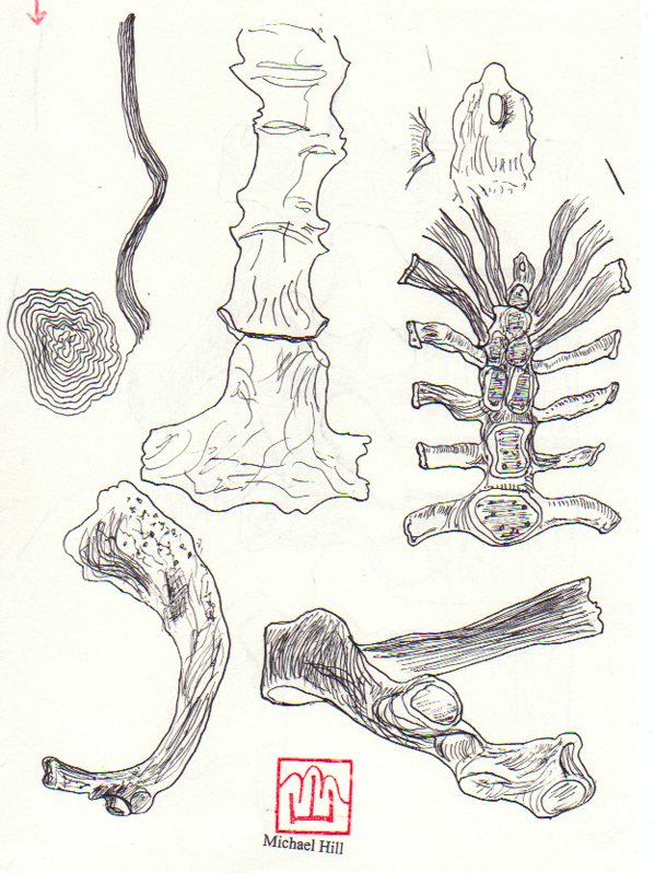
I’m currently learning to draw bones by reading the osteology chapters in anatomy books and studying the illustrations really carefully. In Chapter 1 I used fish bones as an image and as a printmaking substrate for the sosaku hanga technique. In Chapter 2 there will be drawings of human bones of the hand and foot. I have had the opportunity to study some broken bones incurred in falls from bicycles. Speaking of cyclists I also make reference to the Bookseller of Glee character.
This bookseller rides a penny farthing type of bicycle and will play a part in this issue. I had my portrait of this fine gentleman in the Glebe Sesquicentenary Art Exhibition(see below). It was also a finalist in the 2010 Bald Archy Prize. Titled The Bookseller of Glee (mixed media-drawing, painting and collage on paper)…it is a postmodern portrait of Roger Mackell, co-owner of Gleebooks (4 times Australian Bookseller of the Year). He is a generous character gleefully disseminating books and promoting the joy of reading. The portrait caricatures him and his store’s contribution to the intellectual life of Glee Village and its nearby universities. In my portrait the main street is constructed from the writings of French literary critics and philosophers…whose work the bookshop stocked in the 1980s.
The artist…Dr. Michael Hill a.k.a. Doctor Comics and his portrait of a particular Glebe bookseller. (Photo by Louise Graber)
I have been drawing more bones. In the meantime I am putting a call out for feedback on this post. I would really love to hear what you think of what I am doing with my blog and bones.
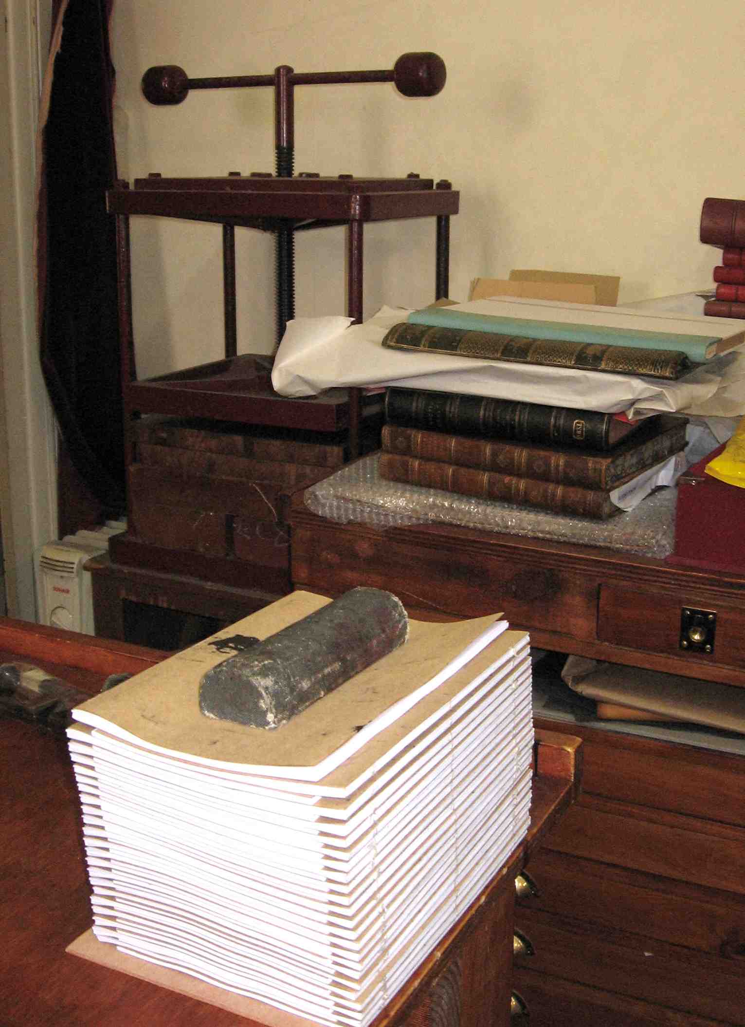
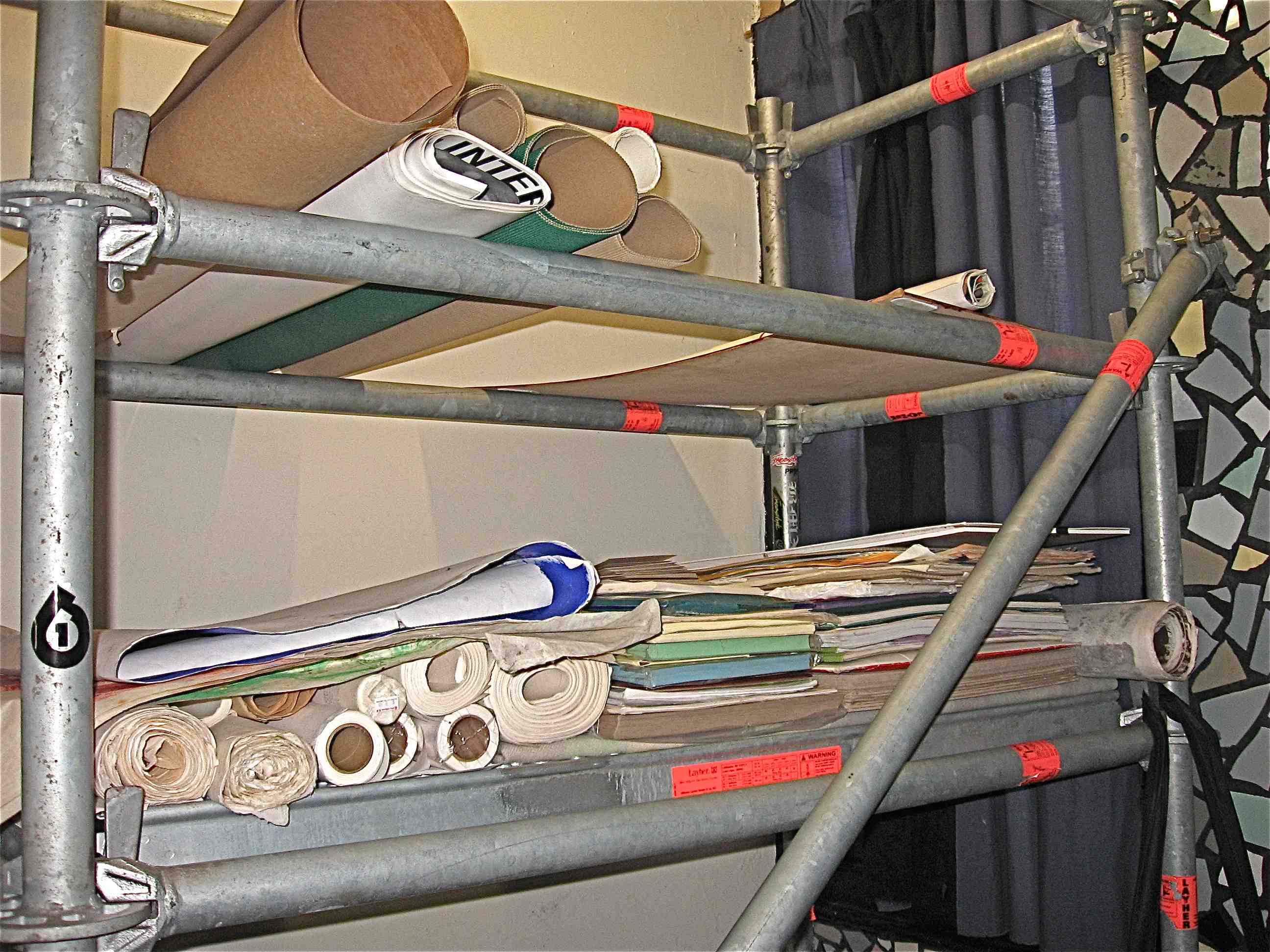
Design and production of Issue #1 of my artist book/comic…Blotting Paper: The Recollected Graphical Impressions Of Doctor Comics…involved a range of graphic techniques. These included drawing, handwriting, collage, photography, typography and printmaking. Selected production items were displayed at the launch with a description of my working method.
The first stage of the process is getting an idea. This may come from reading and research, travel, visits to galleries to look at art and objects and make sketches. One sketch book in the photo below shows a collaged image of a fictitious Japanese monster Shitake Man. Some sake also proved useful at this preliminary stage.
Where printmaking is involved the third stage brings out brushes, ink and paper for the printing part of the project. A baren is piece of dried bamboo that has been stretched over a board. It is used to ensure that the paper makes good contact with the inked block. The pressure applied can be varied to produce the degree of intensity of the ink. The autumn postcard print in the photo above has been constructed from 5 layers of print.
Copies of my artist book/comic…Blotting Paper: The Recollected Graphical Impressions Of Doctor Comics …are available exclusively from the launch venue Hondarake: Full Of Books till 31 May 2012. The store is located at Level 1, 465 Kent Street Sydney phone: 02 9261 5225 online shop: http://fullofbooks.com.au
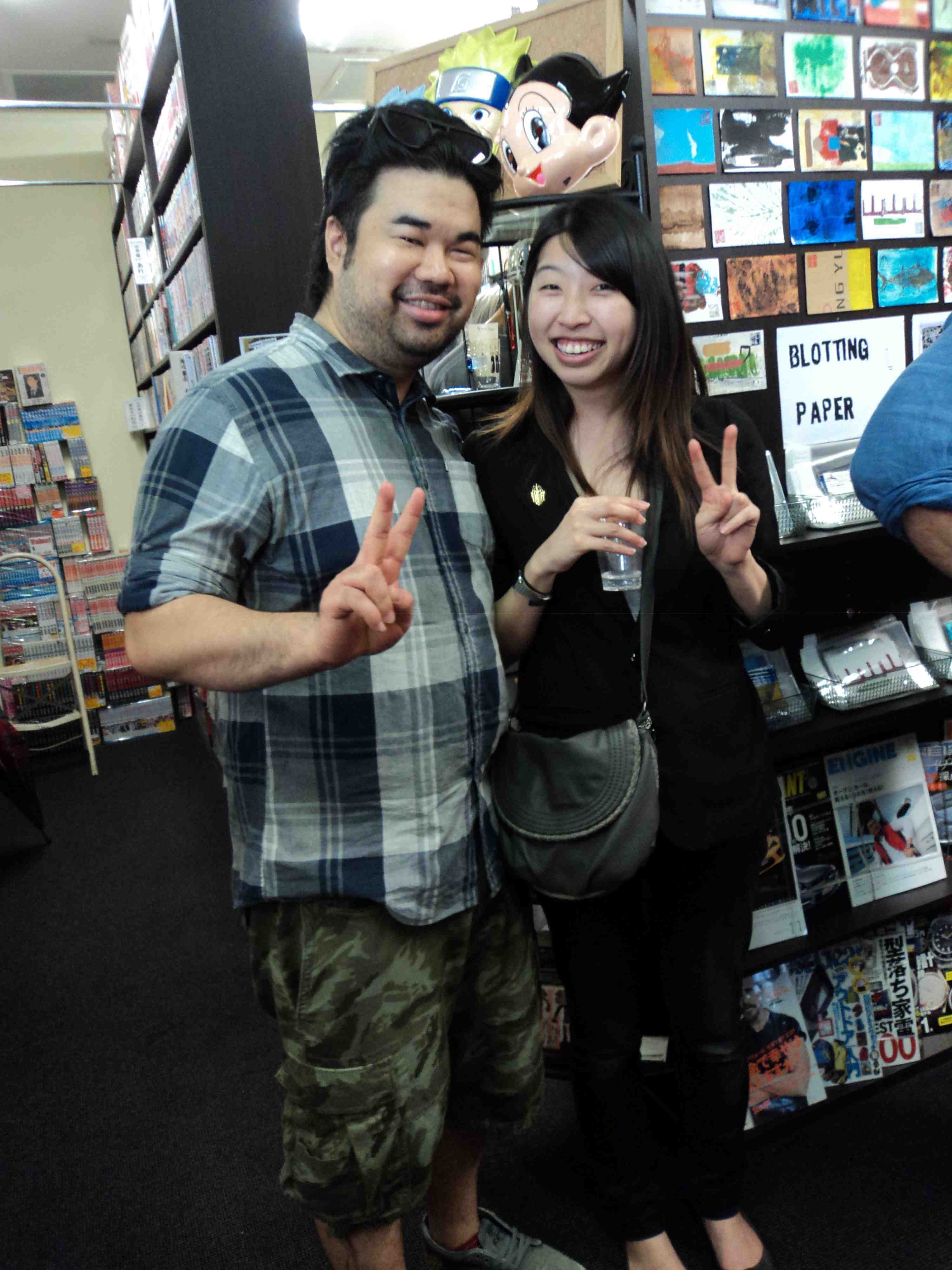
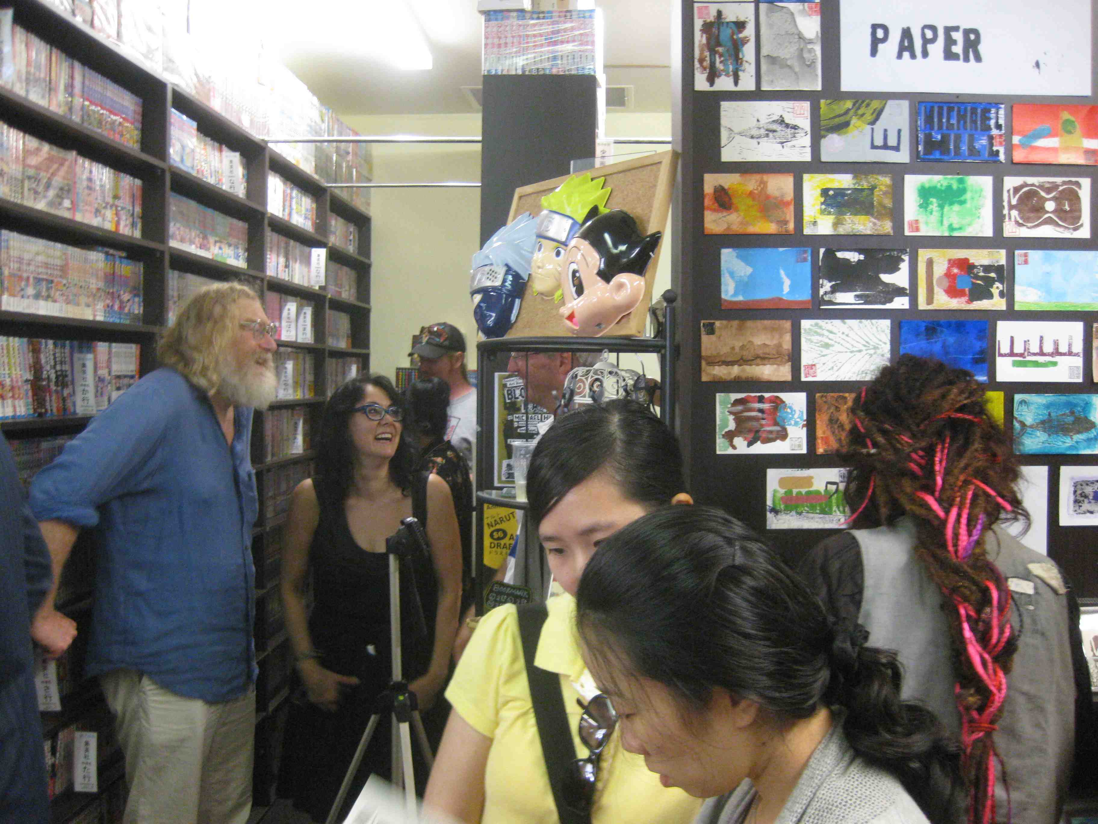
Returning to the shorter interval between posts again but for a good reason on this occasion. My artist book/comic Blotting Paper: The Recollected Graphical Impressions Of Doctor Comics was launched …at Hondarake Full of Books in Sydney in February, 2012. It was accompanied by an exhibition of my handmade art postcards and the printmaking tools used in their production. Having gained a reputation for researching comics art there I was attempting to create it. I was proud of my comic, its launch and the attendance of my friends and supporters.
My anime fish prints hanging overhead. (Photo by Sal Jones)
Australian comics legends Glenn Smith and Gerard Ashworth. (Photo by Louise Graber)
JMC Director of Animation Sean Callinan and Peregrine Besset creator Lewis P. Morley. (Photo by Louise Graber)
It Lives! CEO’s Nick and Liz. (Photo by Louise Graber)
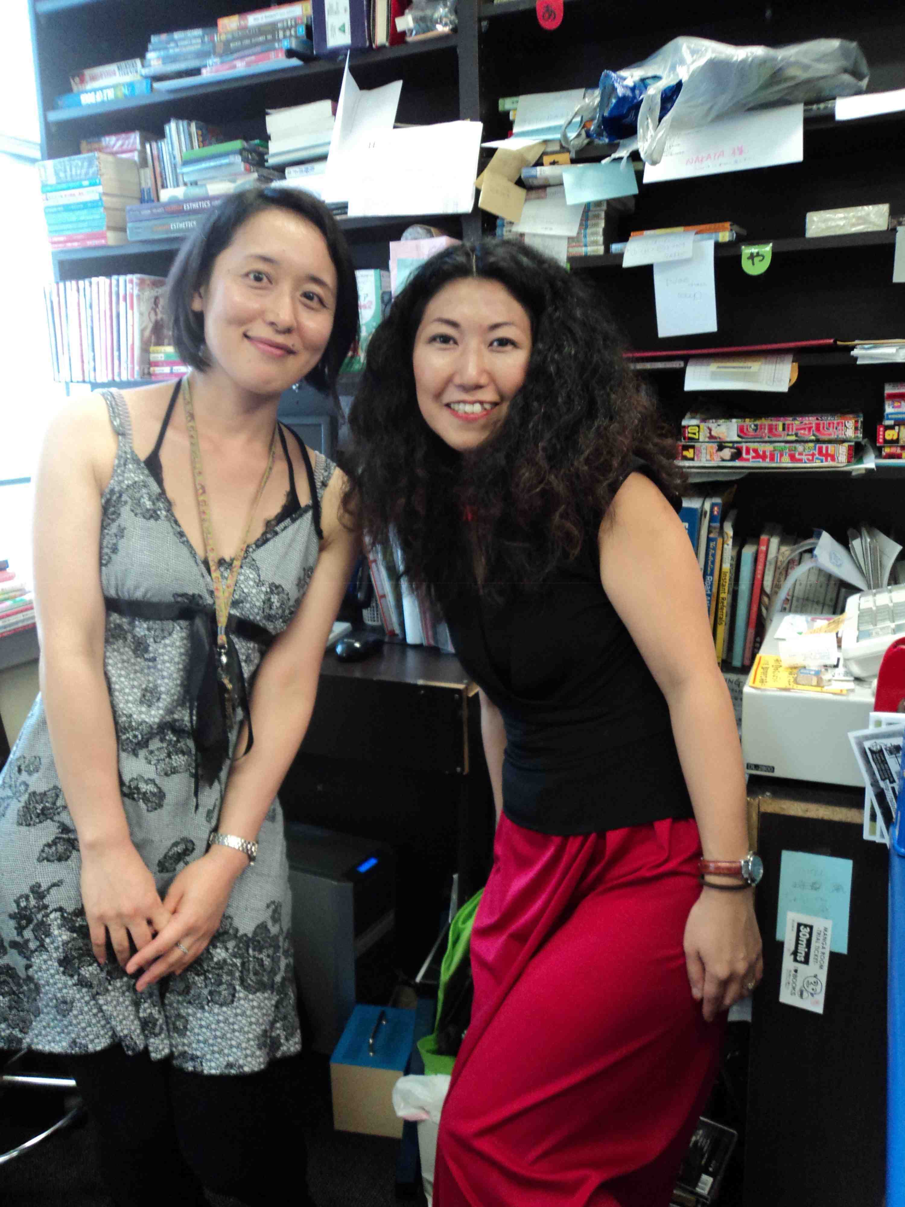
HONDARAKE Store’s fabulous owners Hisae and Tomoko. (Photo by Louise Graber)
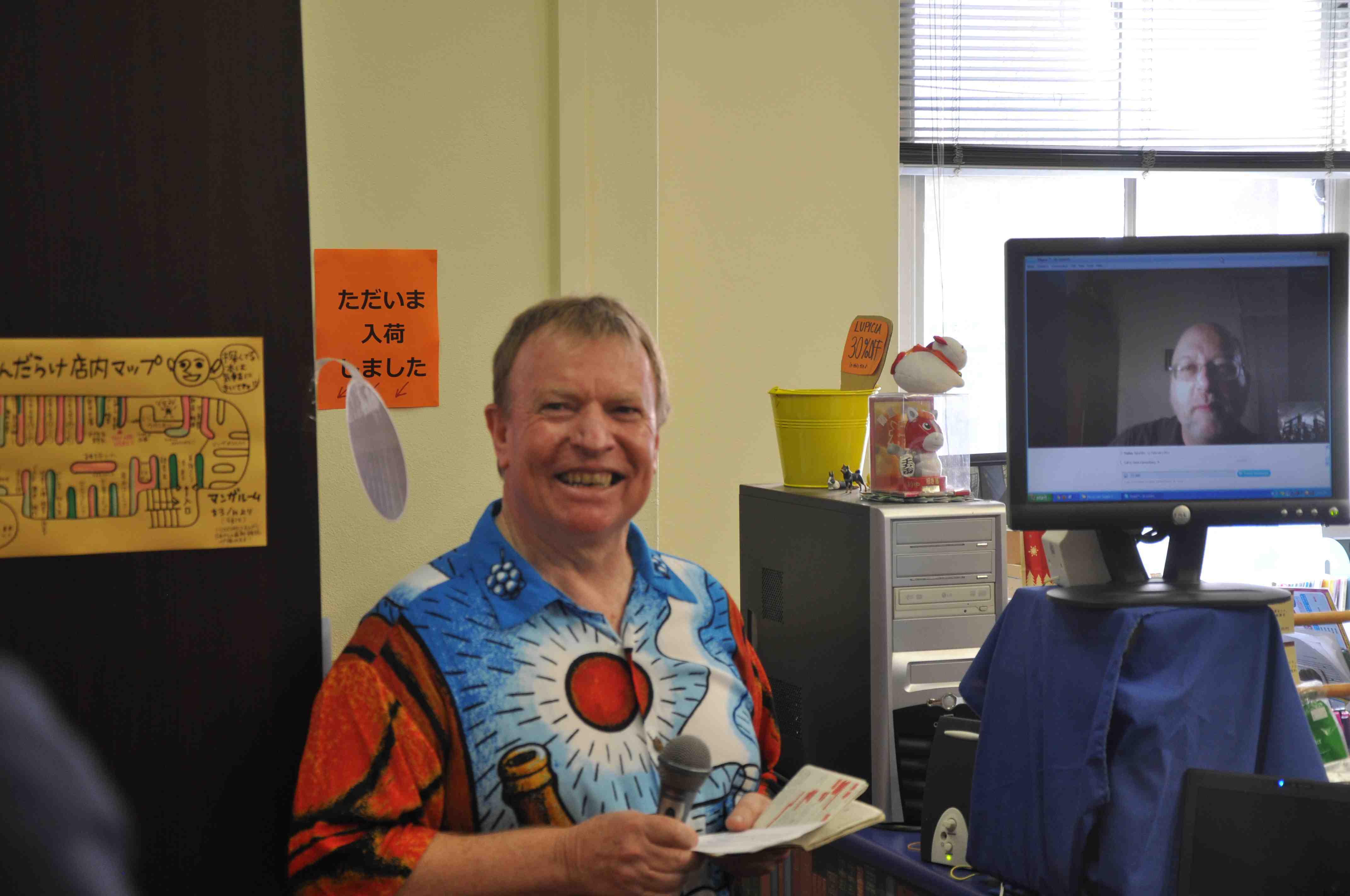
Dr. Michael Hill (a.k.a. Doctor Comics) in foreground enjoying Dr. Gene Kannenberg, Jr. (onscreen) who launched my comic and entertained with his witty matching of comics and beverages…in a live cross from New York. (Photo by Andrew Hawkins)
The book was launched by my colleague Gene Kannenberg, Jr. via Skype from the U.S.A. Noted comics historian, Kannenberg is director of ComicsResearch.org. former Chair of the International Comic Arts Festival…and the Comic Art & Comics Area of the Popular Culture Association…and author of 500 Essential Graphic Novels. He made a humorous speech and participated in a game of pairing comics with beer. What a great game! His matching including the work of creators Will Eisner, Lynda Barry, Hergé, Jack Kirby and Joost Swarte. Gene got a big response when he suggested black coffee with Steve Ditko…and Duff beer with Matt Groening, and an even bigger response when he brought his cat, Mr. Pickles, onscreen. Thank you Gene for the live TV launch! Thanks to my agent Andrew Hawkins for organising the event and store owners Hisae and Tomoko for hosting! Were you there? Send me your feedback, either about being at the launch or from reading this blog post. I would love to hear.
The limited edition numbered and signed book comes with an original print on the front cover (see photo above)…a numbered bookmark and printed bag (see photo of package below).
Hairstyles, postcards and masks about with Richard Black and Louise Graber amused in the aisle. (Photo by Harrison Hill)
Both the art book/comic and the postcards involved printmaking as an image-making technique. I employed the Japanese technique of woodblock printmaking in my first animation film around 20 years ago. I have continued to use Japanese influenced printmaking techniques ever since. I have been involved in the scholarly and research aspects of visual communication, more so than in production. This artist’s book and the accompanying exhibition marks a more focused return to the ‘making’ of images and visual projects.