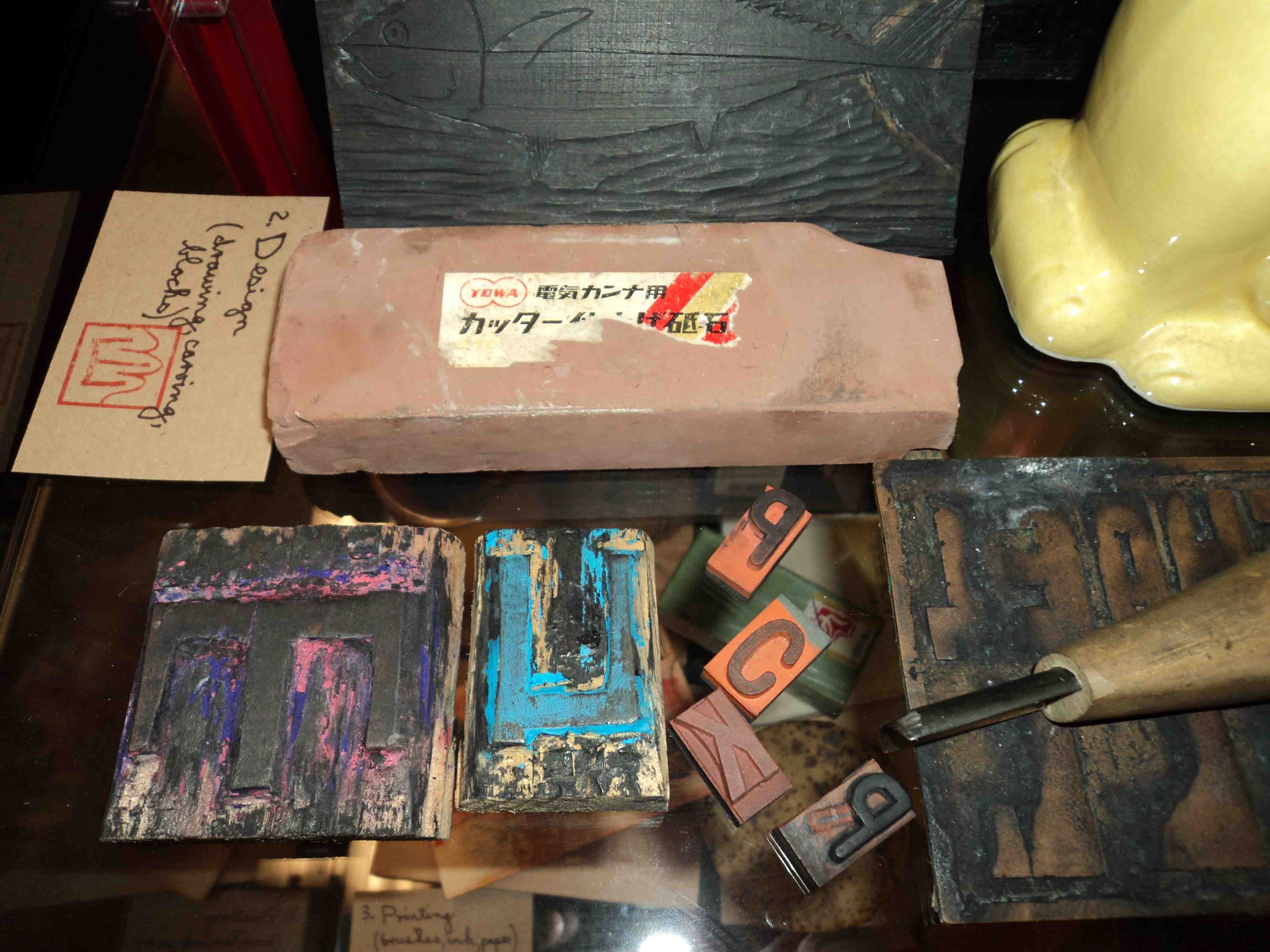
Design and production of Issue #1 of my artist book/comic…Blotting Paper: The Recollected Graphical Impressions Of Doctor Comics…involved a range of graphic techniques. These included drawing, handwriting, collage, photography, typography and printmaking. Selected production items were displayed at the launch with a description of my working method.
The first stage of the process is getting an idea. This may come from reading and research, travel, visits to galleries to look at art and objects and make sketches. One sketch book in the photo below shows a collaged image of a fictitious Japanese monster Shitake Man. Some sake also proved useful at this preliminary stage.
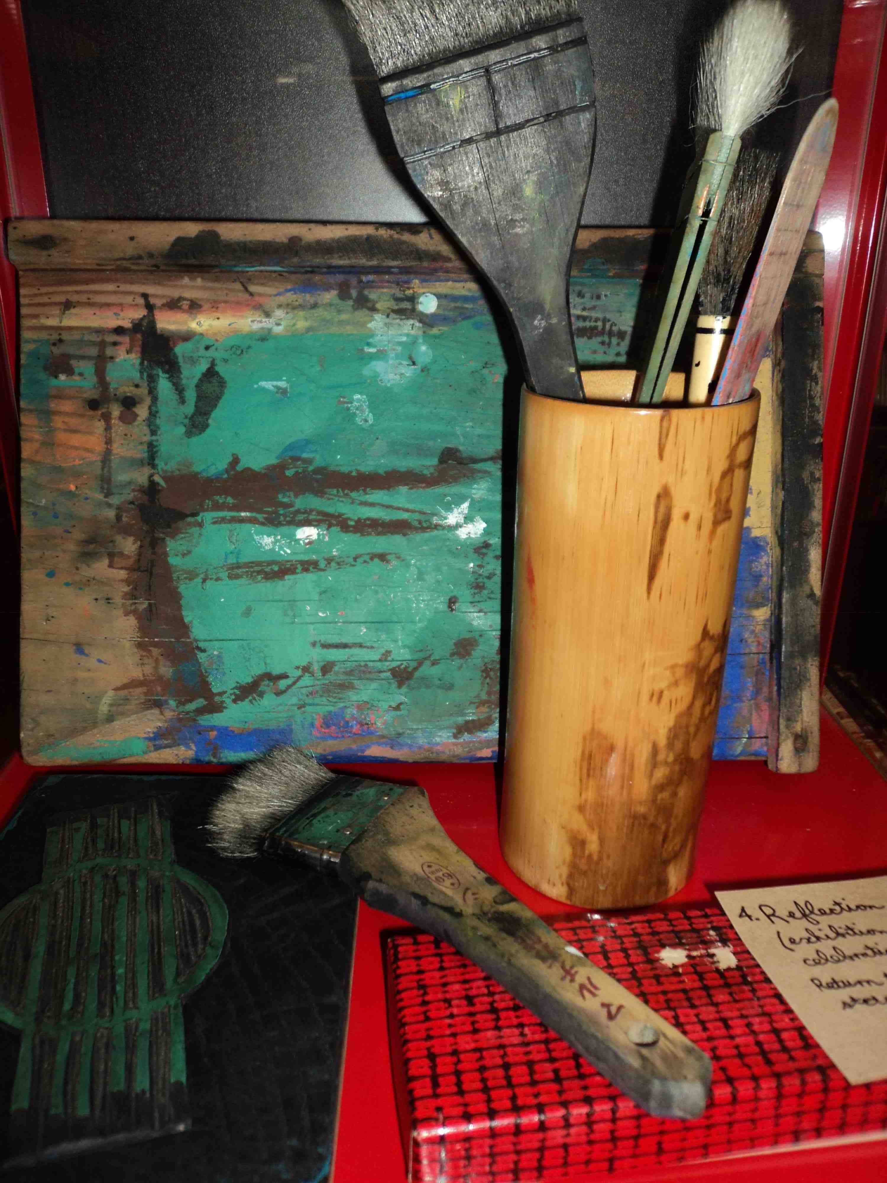
Where printmaking is involved the third stage brings out brushes, ink and paper for the printing part of the project. A baren is piece of dried bamboo that has been stretched over a board. It is used to ensure that the paper makes good contact with the inked block. The pressure applied can be varied to produce the degree of intensity of the ink. The autumn postcard print in the photo above has been constructed from 5 layers of print.
Copies of my artist book/comic…Blotting Paper: The Recollected Graphical Impressions Of Doctor Comics …are available exclusively from the launch venue Hondarake: Full Of Books till 31 May 2012. The store is located at Level 1, 465 Kent Street Sydney phone: 02 9261 5225 online shop: http://fullofbooks.com.au
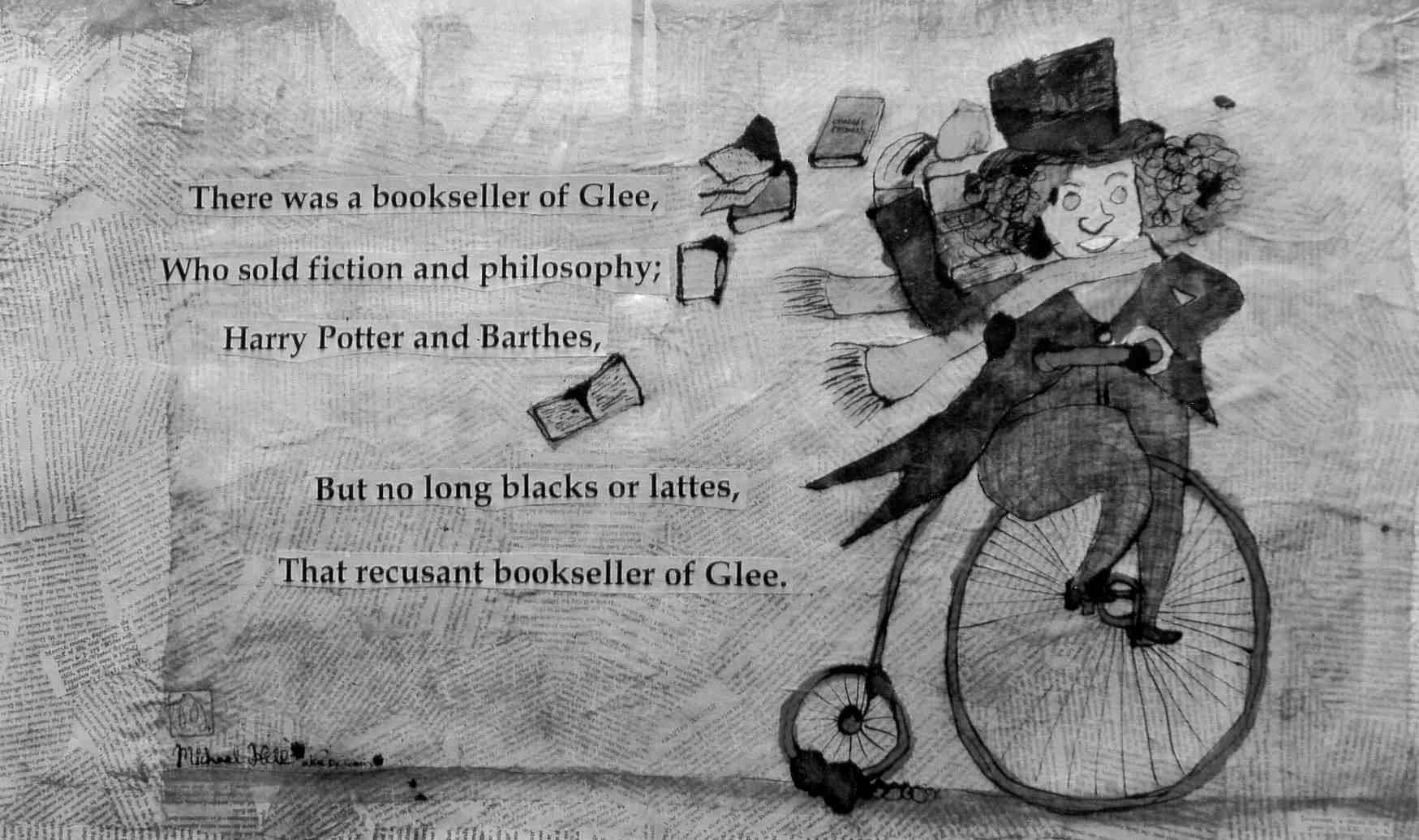
There are books, cats, fish and the occasional bicycle that appear in my comic…the one which I am currently in the process of creating. The title is BLOTTING PAPER. The principal character, Doctor Comics, is an alias of mine…an avid reader and collector of comics. He has two pet talking cats who also read comics, preferably graphic novels, and who regularly eat fish…sometimes these two activities are combined…despite the good doctor’s distaste of stains on his comics fish is a favourite dish of the Doctor’s, too,…but not whilst reading comics! The first chapter refers to books and comics, including graphic novels, both cats and one fish. The location, Glee, is a fantasy label for Glebe, the suburb of Sydney in which I live. It is a bookish suburb near the academic precinct…Sydney University, the University of Notre Dame and the University of Technology, where I work. Being tertiary education territory it has several bookshops, cafes, restaurants and pubs…and is within walking distance of the Sydney Fish Market…which is of special interest to the Doctor Comics character and his cats. I go there often, myself but leave the cats at home. The Bookseller of Glee (below) is a portrait of Roger Mackell, the proprietor of one such bookshop, Gleebooks…and a good friend of mine. Doctor Comics shops at and occasionally writes reviews of graphic novels for this bookstore. The proprietor refuses to sell coffee and cakes! With the emerging trend of cafes in bookshops, I wonder how long he will manage to hold out?
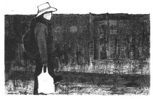
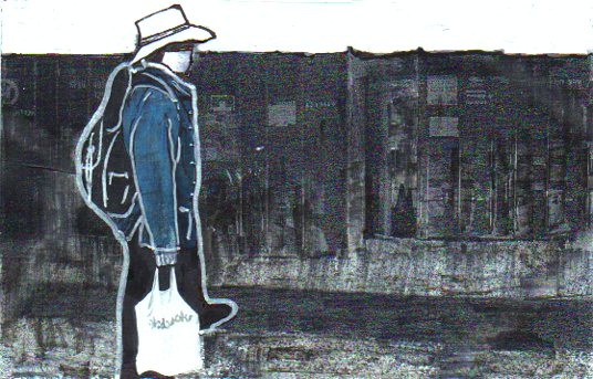
In addition to drawing, cartooning and printmaking, photography is being incorporated as a graphic tool. Below are two photographs from the Sydney Fish Market that have been graphically manipulated and merged…one of stacks of shipping containers…the other of me shopping with a bag of fish that I have purchased. The photographs were subjected to a graphic treatment then collaged together…to show Doctor Comics returning from his shopping expedition. He is carrying a bag of fish and wearing a backpack which is full of books and comics .
Despite the intention and the progress made…it is now looking likely that the first issue of my comic won’t be published this year after all. It is nearing completion, however, and I feel certain that I shall have something to show in early 2012. In the meantime there are these blogged progress reports. The shape of the comic continues to move in an “artist book” direction. It retains some semblances of an art comic, and an Australian one at that, despite some Japanese influences. The figure in the overlaid drawings below, is the older Doctor Comics character, doing some printmaking in his studio. It goes on!
There has also been some script editing. This has resulted in both extensions and deletions. I found that I needed more space to convey some sequences which weren’t working…and other parts were either too difficult or time-consuming for me to draw!
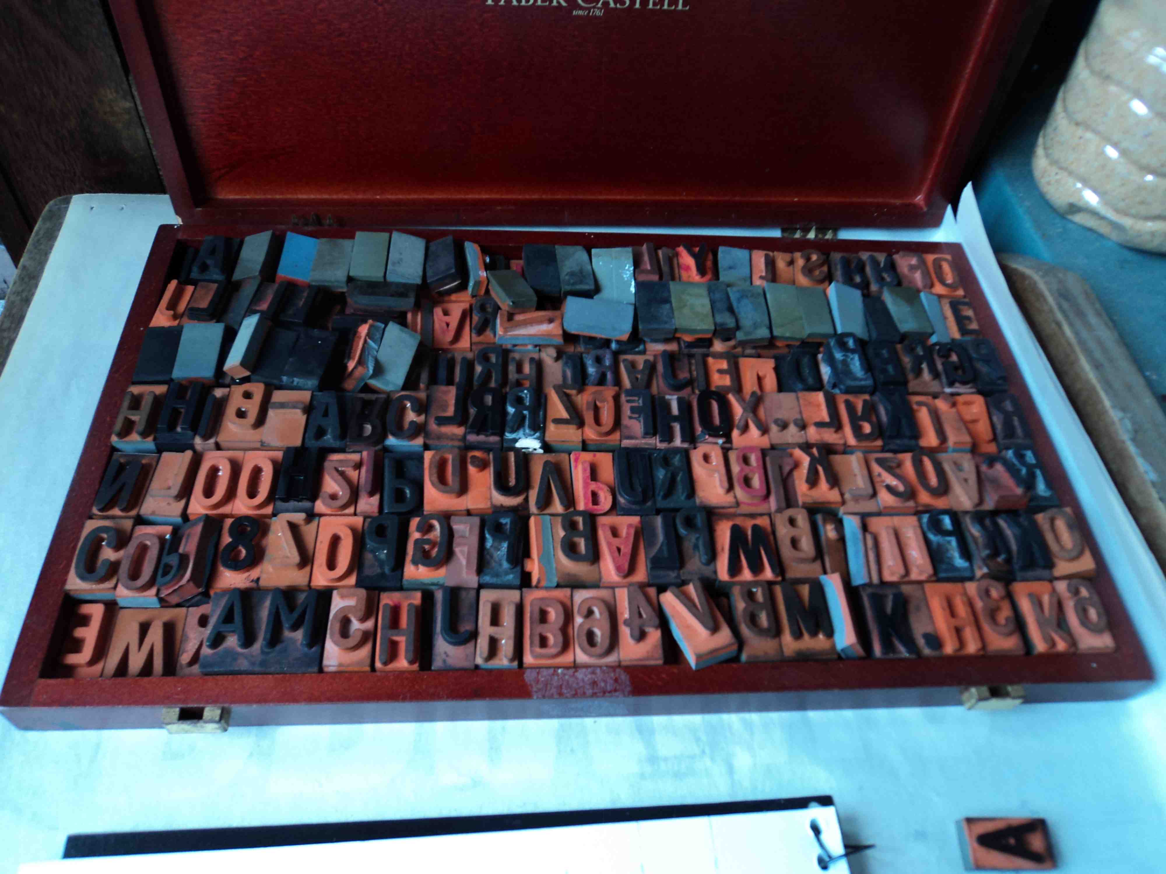
My box of uppercase rubber type. (Photo by Louise Graber)
The type in rubber-stamped, printed form prior to editing, cutting and pasting.
The other interesting development has been the photographic aspect of the project. Initially employed as a reference device for locations, objects and figures, photography has now become more prominent. Some pages are starting to look a little like sequences from a Mexican foto-novela or picto grafia comic. This was not my original intention. There remains, however, the anticipated drawn and printed elements along with the traditional rubber-stamped text (see the photos above). I hope to confirm the completion of the first issue and announce its publication date, shortly…but I won’t hold my breath, Michael.
This is the first post documenting the production and progress of my own creative comics project. After studying and researching comics for the past few years…and reading them since I was seven…I have now decided to have a go at making my own. I have more experience of researching comics than producing them. In fact I gained a Ph.D. for my research into comics. That is where I picked up the “Doctor Comics” tag. Then I decided to write some blog posts on the topic…and that led to the decision to create my own comic. The title of my comic is Blotting Paper: The Recollected Graphical Impressions Of Doctor Comics. My research into comics art is now being followed by the creation of it…in a self-reflective approach. I like the juxtaposition of research and production although it may prove difficult to balance. We will see. Please let me know what you think of my efforts. I expect that my comic will be partly autobiographical and partly fictive. It will include comics art related events from my academic career…and my attempts to carry the comics flag in art and design tertiary education. There will be anecdotes relating to my Doctor Comics’s adventures and to my own longstanding interest in comics art studies.
Following a few false starts the first chapter has been written, the design roughed out and the artwork constructed. My experience in printmaking was employed in the generation of some of the graphic work. Techniques included woodblock, linocut and Japanese sosaku hanga techniques along with the use of rubber stamps and seals. Printmaking has also shaped the title of the comic, namely Blotting Paper. It suggests the sometimes messy outcome of shaping words and images in ink on paper…and the latter’s absorption and rejection of it. It is a process where things can get messy at times…but I enjoy the appearance of inkblots and stains and attempts to resolve graphic issues arising from it. Drawing, photography, typography, collage and handwriting have all been utilised as image-making techniques. My intention is to construct a free form, creative comic in an artist’s book format. I really enjoy the process of printmaking…including its potential to produce variations on a theme e.g. unexpected blots, streaks and stains. I would also like to acknowledge of how I first learned it. That was at Sydney College of the Arts whilst working in the Film and Video department of the Design School. I was approached by a fellow academic from the Art School who wanted to learn animation. So we arranged a swap deal. If I taught her basic animation techniques she would introduce me to the art of printmaking. That sounded interesting and it worked like a charm. I fell under the printmaking spell. In fact, I’m still under it!
I am how much more time it takes to create a comic than to read or review one…but I am enjoying the creative and technical challenges. I now expect I shall be spending more time creating and less time critiquing comics art in the future. I have since altered the order of emphasis in my social media profile…from ‘critiquing and creating’ to ‘creating and critiquing!’
Accompanying the Doctor Comics character in the comic are his cats, Busch and Cohl. They not only live with him and keep him company but they also read his comics and critique them! Being talking cats they also give him feedback, advising him in a critical manner, of his skills, shortcomings and selections. These comics reading cats are a seeming contrast to him…although their characters are still being designed. One possible design is the Red Cat above. Future posts will document the graphic resolution of this matter.
Well that’s the third post on my blog…three weeks since the last one…smaller in size…and the first one dealing with my own developing creative project. I think I’m starting to get the hang of it. Thanks for the feedback I have received…I welcome any comments about my blog and my comics project. Here’s to comics art, Michael.