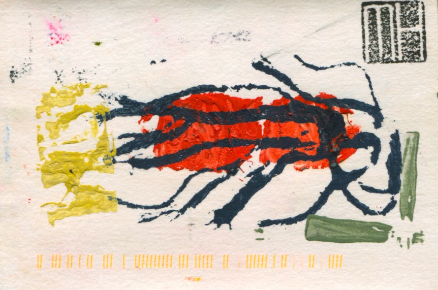
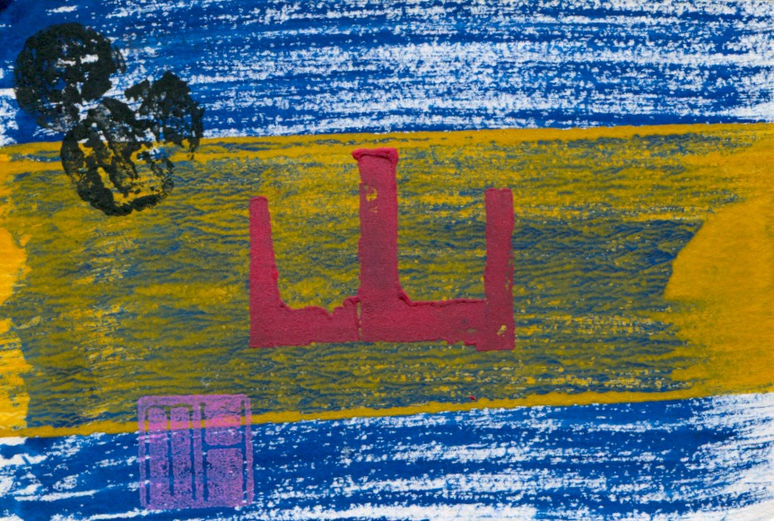
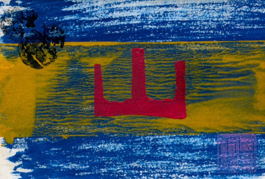
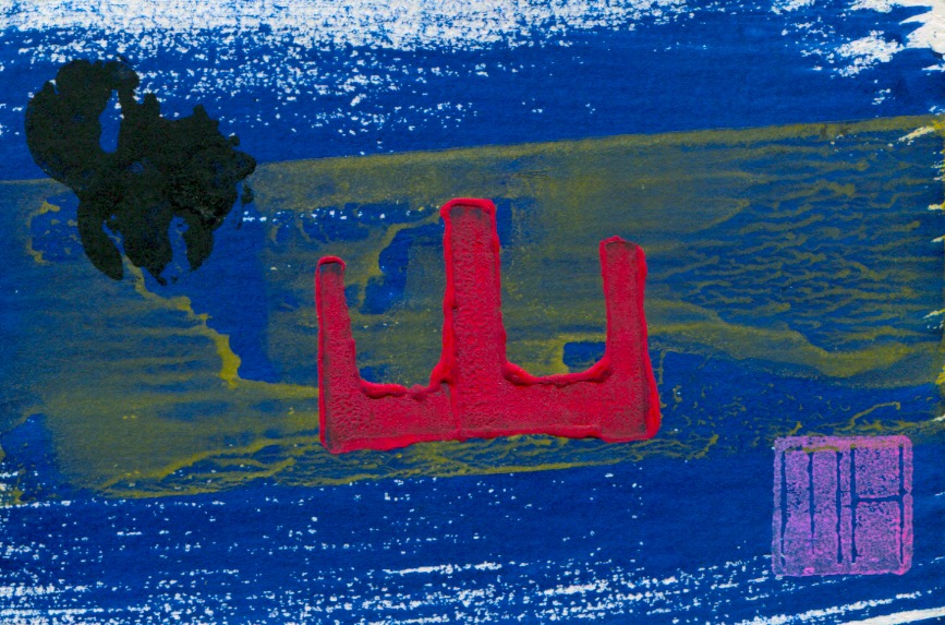
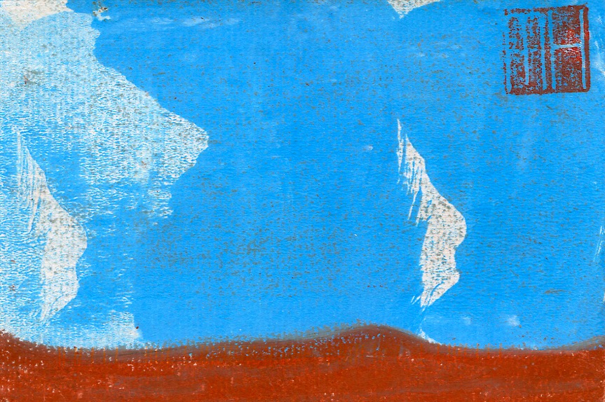
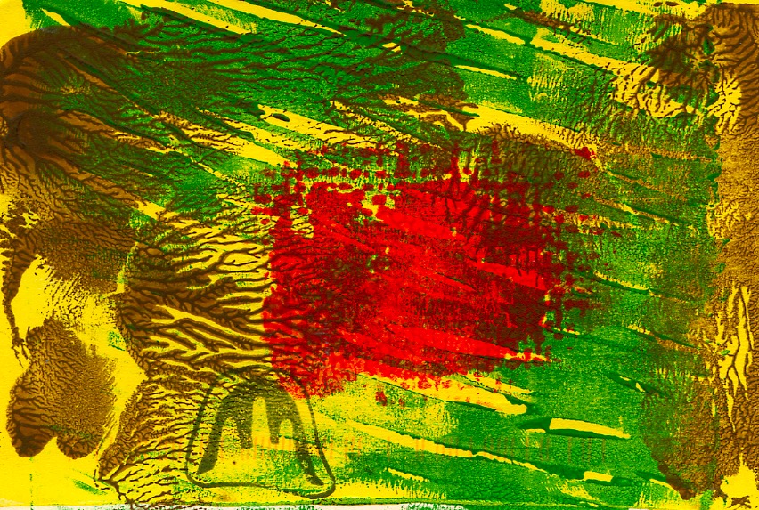
This post continues the profiling of production of my hand-made art postcards in limited editions… featuring more examples from the Abstract series…and as previously stated each postcard is an original…a monotype, similar in design but not an exact duplicate of any other card.
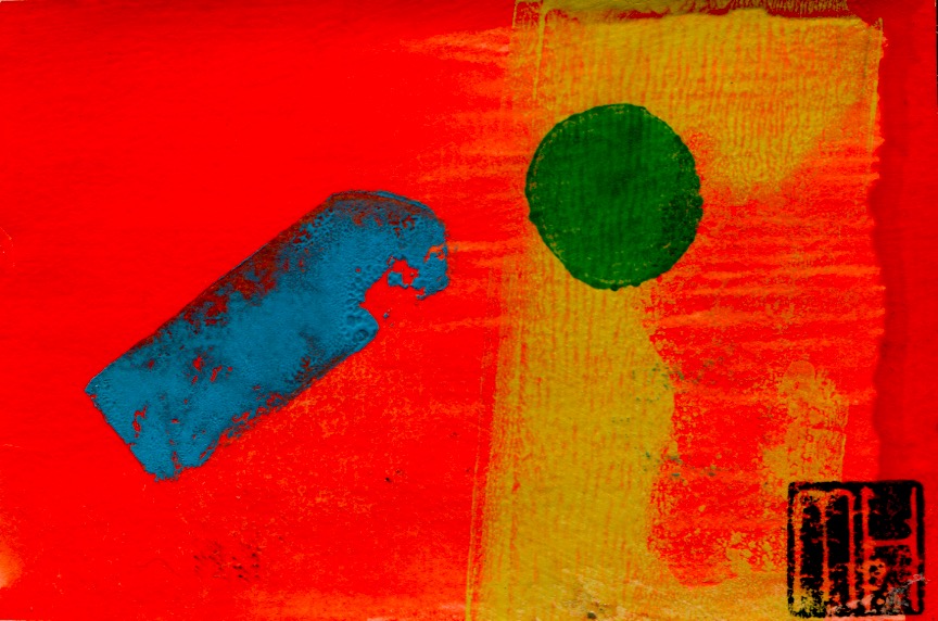
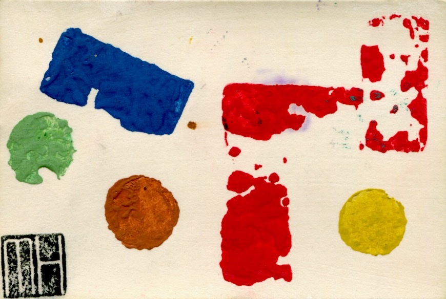
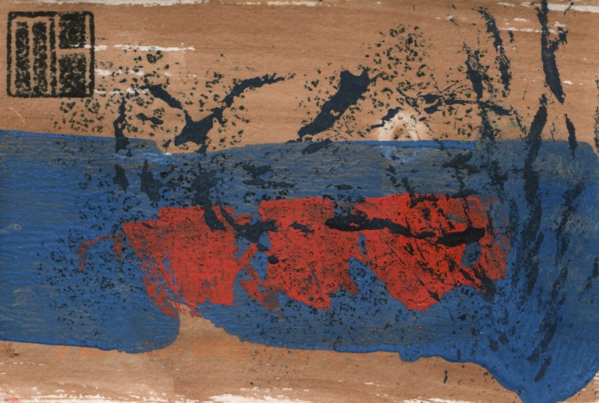
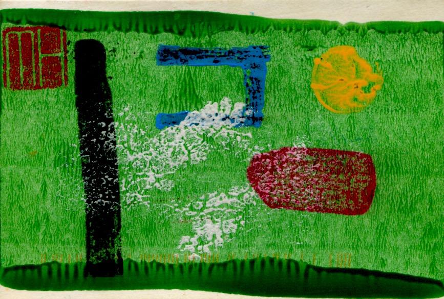
Cards in an edition are all original prints…similar in design but with no exact duplicates…as can be seen in the following four examples from the Abstract No-14 series. These cards were all made in the same batch…during the same printmaking session…however, variations in colour, texture and positioning of compositional elements can be detected.
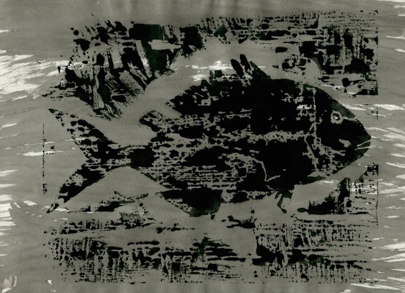
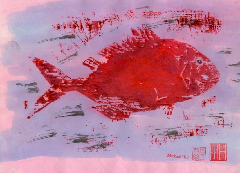
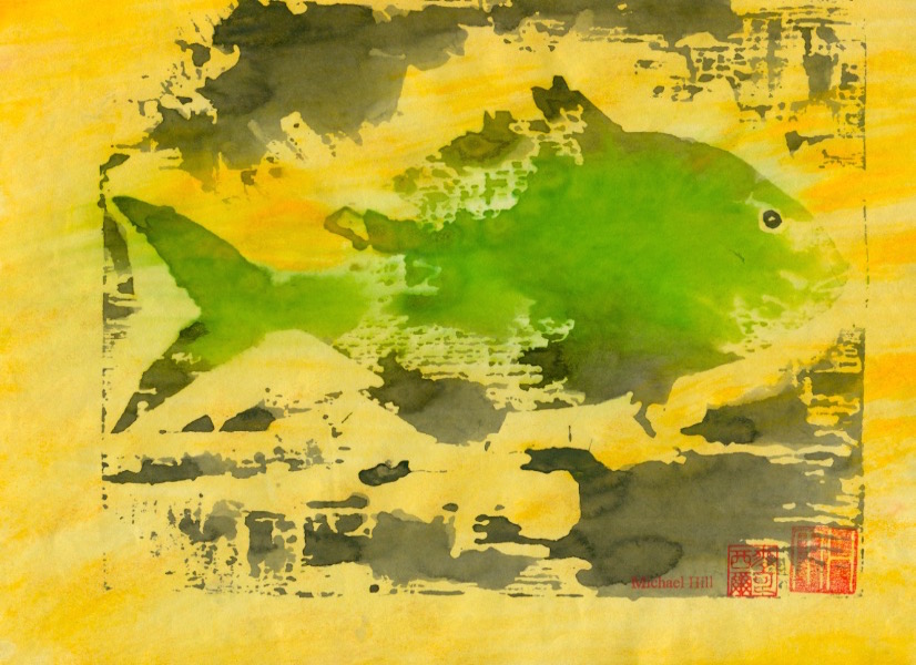
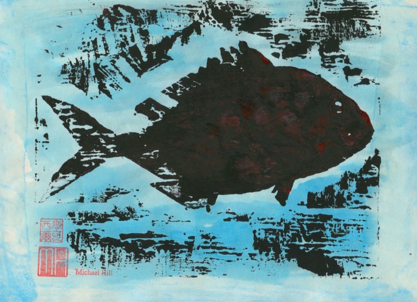
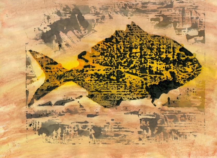
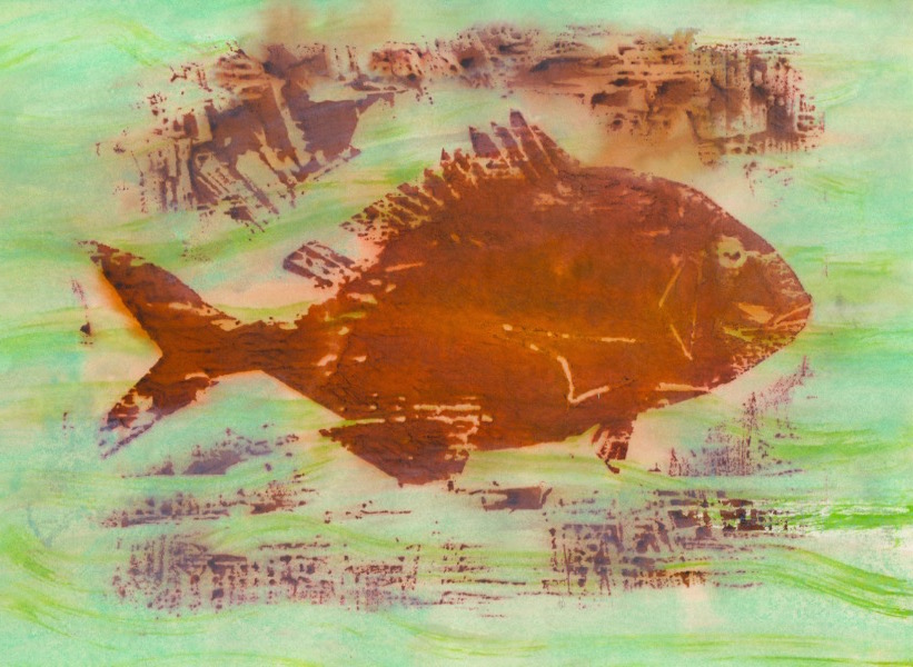
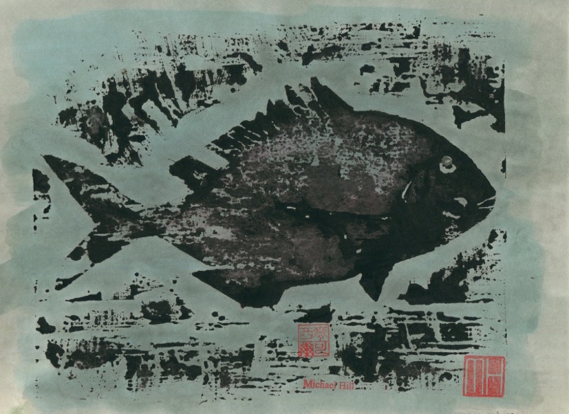
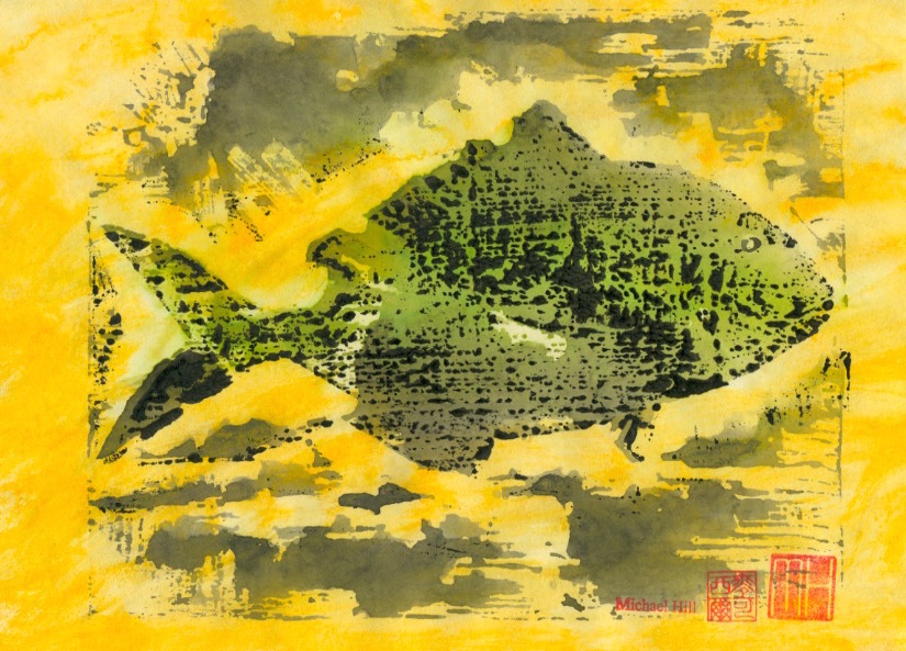
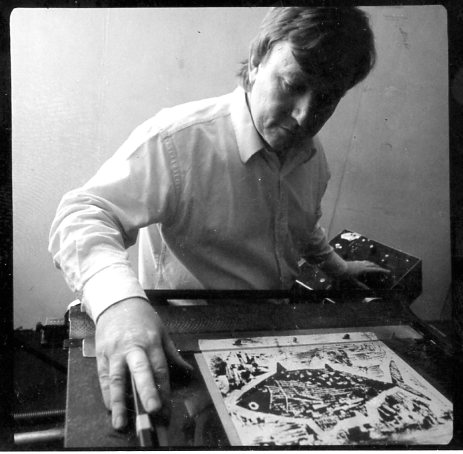
This series of posts will profile a collection of creative prints that I have made, beginning with a series of fish. I used the woodblock printmaking method with variations in inking to make monoprints so that the prints produced could also be used in animation sequences. Six species of fish were featured, the first of which is the Japanese Tai or sea bream. I was very attracted to the idea of working in both animation and printmaking at the time but found it difficult to sustain both in the available time and ultimately had to choose between the two. I found the solution in combining both mediums. Animation’s enormous need for artwork could be more speedily met by using the printmaking medium. I was doubly happy but have since settled on making comics which falls in the space located somewhere in-between and requires a lot less artwork.
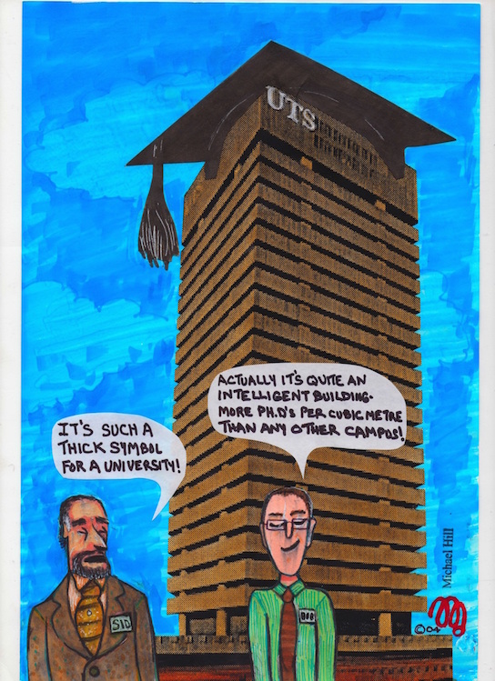
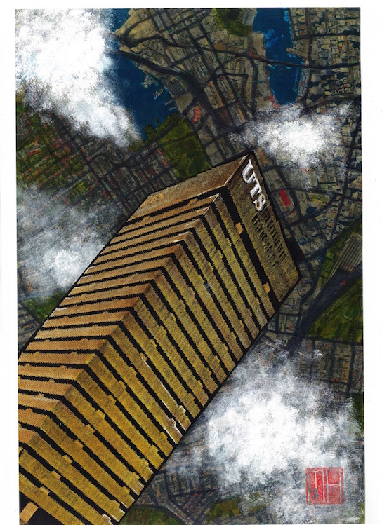
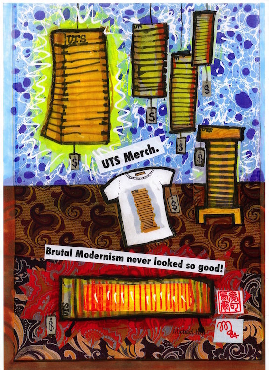
This post features the second instalment of cartoons I created during my academic tenure at the University of Technology, Sydney…and that were published in its magazine U:. These examples focus on the University’s Tower Building on Broadway near Railway Square. Labelled an example of “brutal modernism” despite its designer’s denial of it being that style…it is a monolithic stack of 27 storeys in concrete and glass… somewhat softened by the arrival of the newly constructed vertical garden clad Central Park building opposite. It was fun playing around with it as a satirical subject in these cartoons.
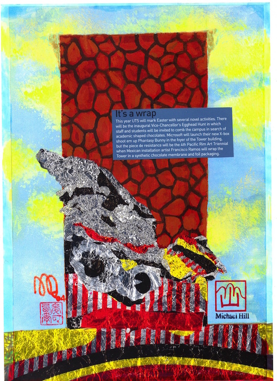
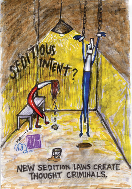
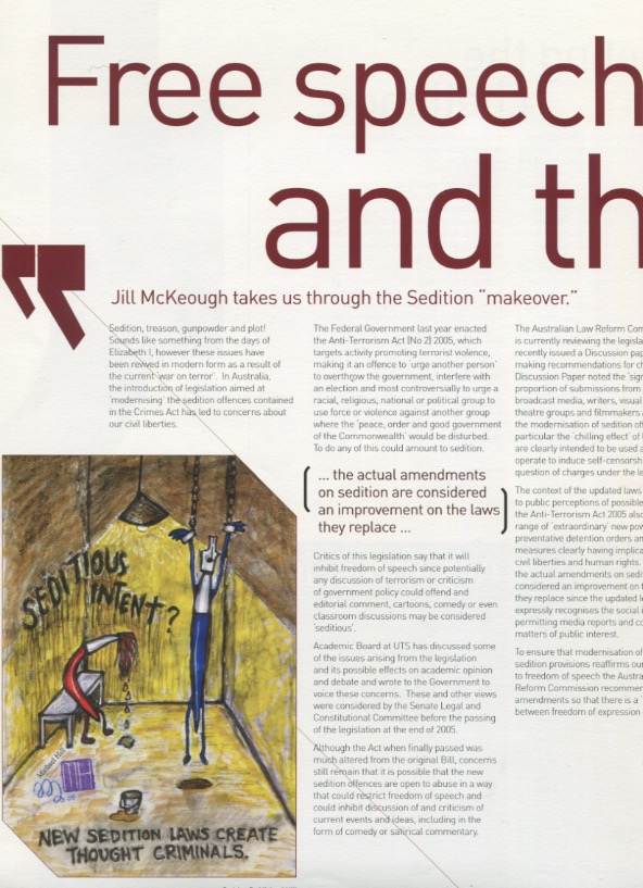
Fictitious merchandise in a non-existent shop in the foyer!…the Information Desk reported some enquiries as to the shop’s location after publication of this cartoon.
Originally I proposed using Nokia University of Technology but the sign on the tower would read NUTS! The University said “NO WAY!” to that…but the Virgin ad was O.K.!
I did an alternate version of the building relaxing on a banana lounge on Bondi Beach reading a novel…but the Vice Chancellor thought it was “A bit silly!” He preferred this one.
As always, my thanks for the excellent advice, assistance and cartooning expertise from the wonderful COUNTDOWNMagazine cartoonist, Louise Graber. Other posts of my cartoon based material include:
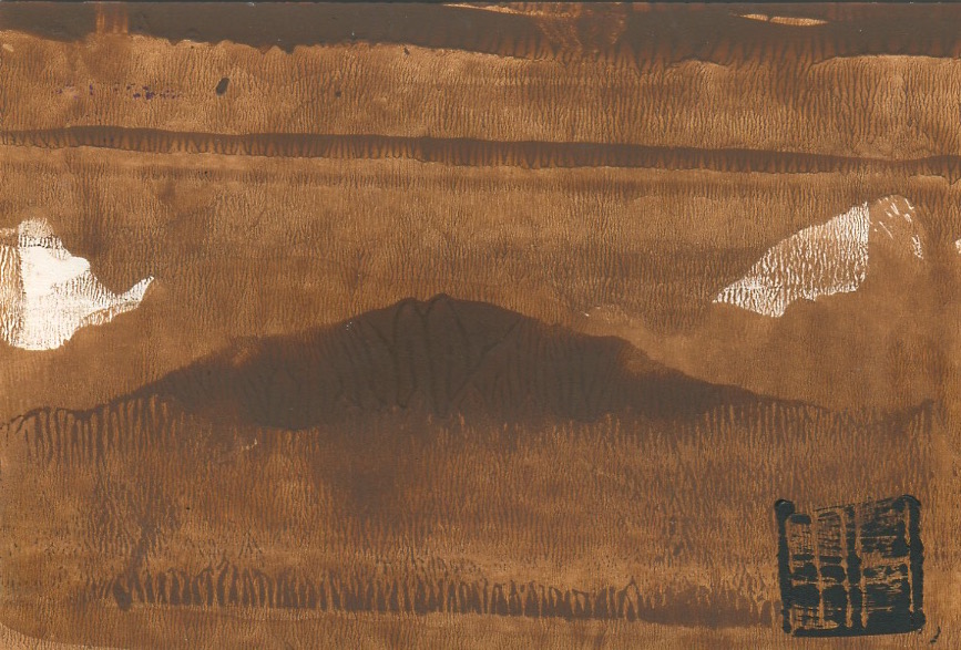
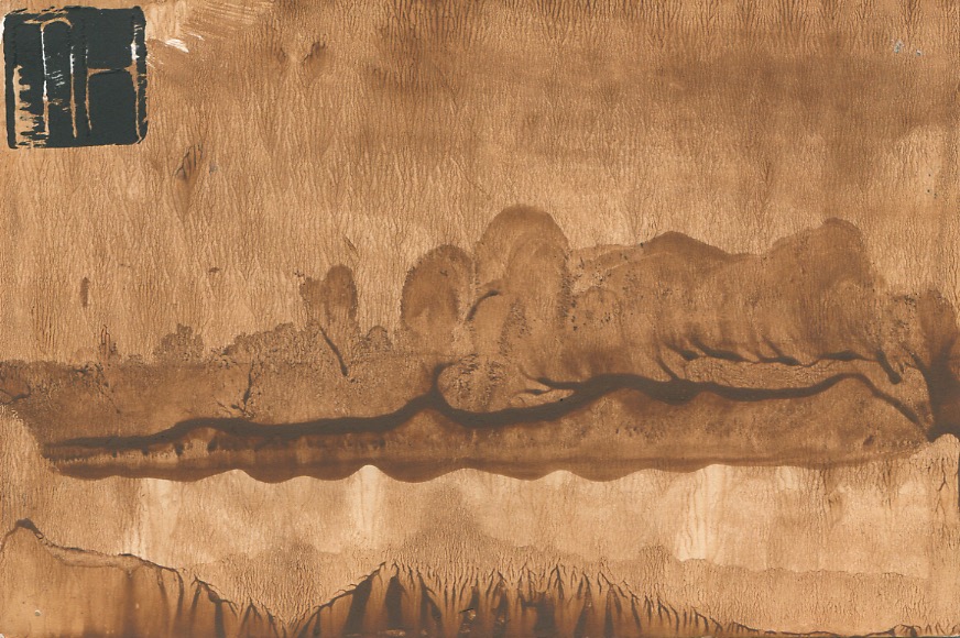
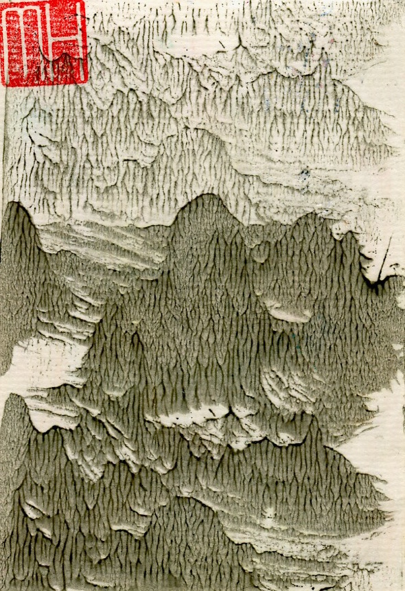
This post continues the profiling of the production of my handmade art postcards. These works were created from a combination of drawing and printmaking in small editions of 10 to 50. It must be stated that each of the cards is an original print, or monoprint…similar in design but with no exact duplicate. For example the three prints from the Landscape No. 2 edition below, whilst carrying the same title, number and technique, all bear some visual differences. My first postcard post was from the Abstract series…the postcards in this post are from the subsequent Landscape series. Some have abstract elements. With few exceptions these cards fall within the postcard size dimensions of 10cm x 15cm.
In the postcard art above I employed a restricted palette in comparison to the Landscape No.3 and No.4 cards which followed (see below in this post). These have a combination of textures that range from watery and weedy to grassy and sandy surfaces.
UPDATE MARCH 6, 2017: Below are are photos of my completed art postcards…bundled up for carting to the gallery and then spread out on a display table for sale.
Art postcards sorted and stacked for cartage to gallery. (Photo by Dr. Michael Hill)
Those cards spread across a table in the gallery for sale. (Photo by Dr. Michael Hill)
I can’t repeat often enough how much I enjoy the process of design and production of my art postcards!
In this series of posts I profile a collection of my published cartoons. They currently total 30 in number. I am starting with those I contributed to U: magazine whilst working at the University of Technology, Sydney. These CARTOONS posts will help me to grow an online gallery of my single panel satirical work.
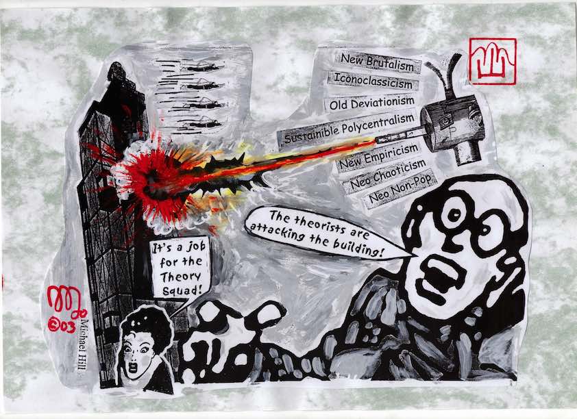
The “theorists” cartoon was put together hurriedly one afternoon. An academic design theory journal was being delayed at the printers awaiting a cover illustration which had failed to arrive. I received a panic phone call from the Faculty office along the “could I possibly please be of assistance” lines. I grabbed some images from old comics which I had in my office…invented some names for theories…and quickly collaged these elements together…all in an afternoon…and they published it!…on the cover!
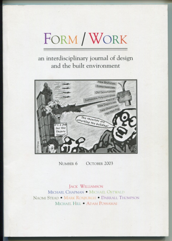
How the cartoon looked on the cover of the journal.
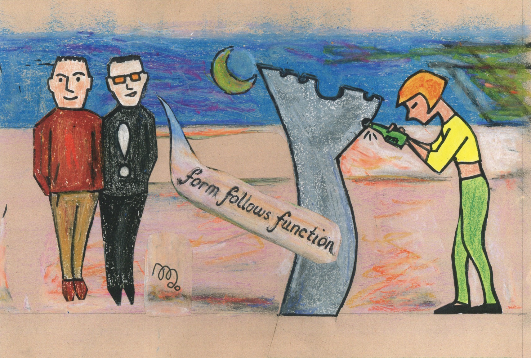
Form follows function was based on an incident at an end-of-semester design student party. This was held on the roof of the Design Faculty building. There was a semi-abstract modernist sculpture that resembled a large scale bottle opener mounted on the roof. I saw a less than sober female student tentatively approach it with a capped bottle of beer. After a short struggle she managed to open it despite the marked difference in scale between it and the bottle. It is quite amazing what Industrial Design students can do. Then I heard this comment from one of the two onlooking Industrial Design students: “Form follows function.” Yes, I really did hear that comment and observe that action…and salute that theory…and subsequently designed this cartoon!
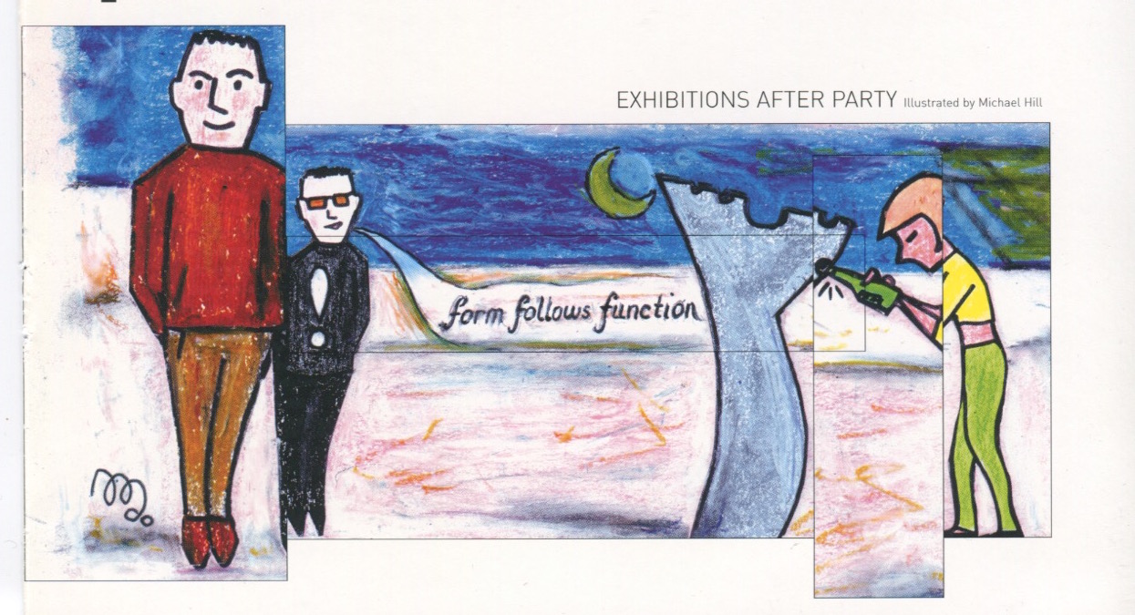
And this is how the cartoon appeared in the magazine…the art director just couldn’t resist that trendy layout technique of chopping it into segments…and altering the colour, texture and proportions!
My thanks for the excellent cartooning assistance from the brilliant COUNTDOWN Magazine cartoonist…Louise Graber. Her Pop Music illustrative work made her an amazing manager of short notice deadlines…with an acute fashionista’s eye drawing perfect pop portraits, Michael.
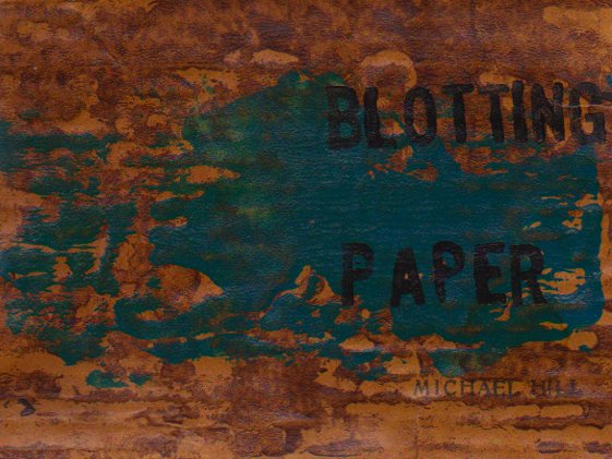
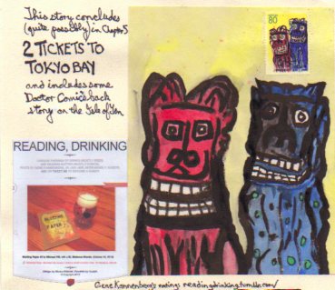
This is the next report documenting production of my artist book/comic…and ultimately graphic novel…Blotting Paper: The Recollected Graphical Impressions Of Doctor Comics. Creation and production of the forthcoming issue 2 Tickets to Tokyo Bay has begun. It deals with the continued adventures of the cats Busch and Cohl and their canine acquaintance Barks. Set mostly in Japan it also has some scenes in Germany. It follows these characters in funny animal cartoon style. It also includes further recollections from the archives of my alias, Doctor Comics. These refer to his visits to Japan and research of manga, his favorite form of comics.
The characters Barks and Busch travel from Germany to Japan by sea, arriving in Tokyo Bay. Their passage by sea is cheaper than flight buts not without some difficulty and discomfort in cramped quarters below deck.
Disembarkation in Tokyo leads to some fun and frolicking and access to a wider range of food. They visit a manga fair and then go to Kitchen Town where they eat cake.
Printmaking has been employed in the design with techniques including woodblock, linocut, rubber, bakelite and wooden stamps. There is also drawing, collage, calligraphy and handwriting plus more cartooning. The intention is to produce a comic in an artist book type format…and to have it ready for self-publication around the end of this year.
This is the third report documenting production of the fifth and concluding chapter of my artist book/comic Blotting Paper: The Recollected Graphical Impressions Of Doctor Comics. Production of the new issue 2 Tickets to Tokyo Bayis continuing with images currently being created along with some previously made works recorded during my travels in Japan and Germany. The script has first been developed in word form and accompanied by some conceptual colour coding. This was followed by a second draft consisting of roughly sketched visuals of the script with coloured pencils and associated descriptive comments or dialogue. There are examples of both of these development stages, below.
One scene in the script is a graphical recollection of my Doctor Comics alias. It reveals the design of one of his logo stamps/seals or chops that was roughed out on a paper napkin in a Sydney restaurant with guidance from a member of the Japanese Consulate. Here is a scan of that design development along with attachments including a photo and a Japanese photo booth print sticker.
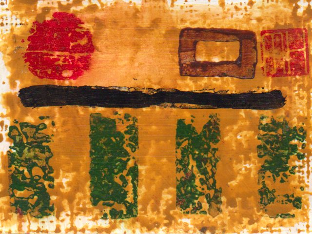
This post profiles another artistic medium that I have been printmaking in recent years. This is the design of limited edition art postcards. These are some of my earliest designs. More will be added in future posts. I hand-printed these postcards that were created from a combination of drawing and printmaking. I would make random, numbered editions of say 8, 19 or 33. A print run greater than 50 was rare. The total would be determined by the amount of blank cards, ink and time available for finishing. Once I completed a session it meant the end of that particular batch as I would not repeat the design. Cards in an edition are all original prints. These are called monoprints, so-called by being similar in design but with no exact duplicates in the batch.
The following three postcards show variations produced in the same edition. (1) the overlaid pink patch is in a different position on each card…and its shape and strength of colour vary. (2) the dragon stamp(the small curvy line) is not in the exact same position. It is on two cards but not the third. Its legs seem absent in two of the impressions. (3) the large black and yellow mass varies in colour and texture from card to card. (4) the Post Office franking machine marking is at the top, bottom or missing(only visible on reverse side of card). (5) my MH signature seal, whilst generally in the same position, is actually upside down on two of the cards…an bloody unbelievable, creative oversight! I’m sorry!
The drinking of beer, usually a bottle of stout, marked the end of an edition and celebration of completion. This was often late in the afternoon as I never seemed to print in the mornings or evenings. After a couple of years I supplemented this hand-made approach with digital printing, making copies from the scanned original. But then, lacking satisfaction…and missing the additional ink staining on my jeans, I abandoned that and returned to the hand-made printmaking process. Consequently, both my level of satisfaction and the print marks on my jeans improved, Michael.
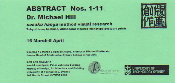
UPDATE OCTOBER 12, 2015: A selection of these art postcards have been displayed in exhibitions. The first in 2007 titled Abstract Nos. 1-11 at the DAB LAB Gallery, Faculty of Design, Architecture and Building of the University of Technology, Sydney.
Pop-Up Postcard Exhibition by Dr. Michael Hill: Abstract Nos.1-11, DAB LAB Gallery, UTS, 2007.
Detail: Pop-Up Postcard Exhibition by Dr. Michael Hill: Abstract Nos.1-11, DAB LAB Gallery, UTS, 2007.
Exhibition flyer designed by Dr. Michael Hill a.k.a. Doctor Comics.
Reverse of ABSTRACT exhibition flyer designed by Dr. Michael Hill a.k.a. Doctor Comics.
UPDATE NOVEMBER 6, 2015: At Hondarake Full of Books in 2012…the launch of my comic Blotting Paper was accompanied by a mini exhibition of my art postcards…33 in all from 32 different designs.
An exhibition of handmade art postcards…accompanying the launch of my artist book/comic Blotting Paper at Hondarake Bookshop, February 2012 (Photo by Louise Graber).
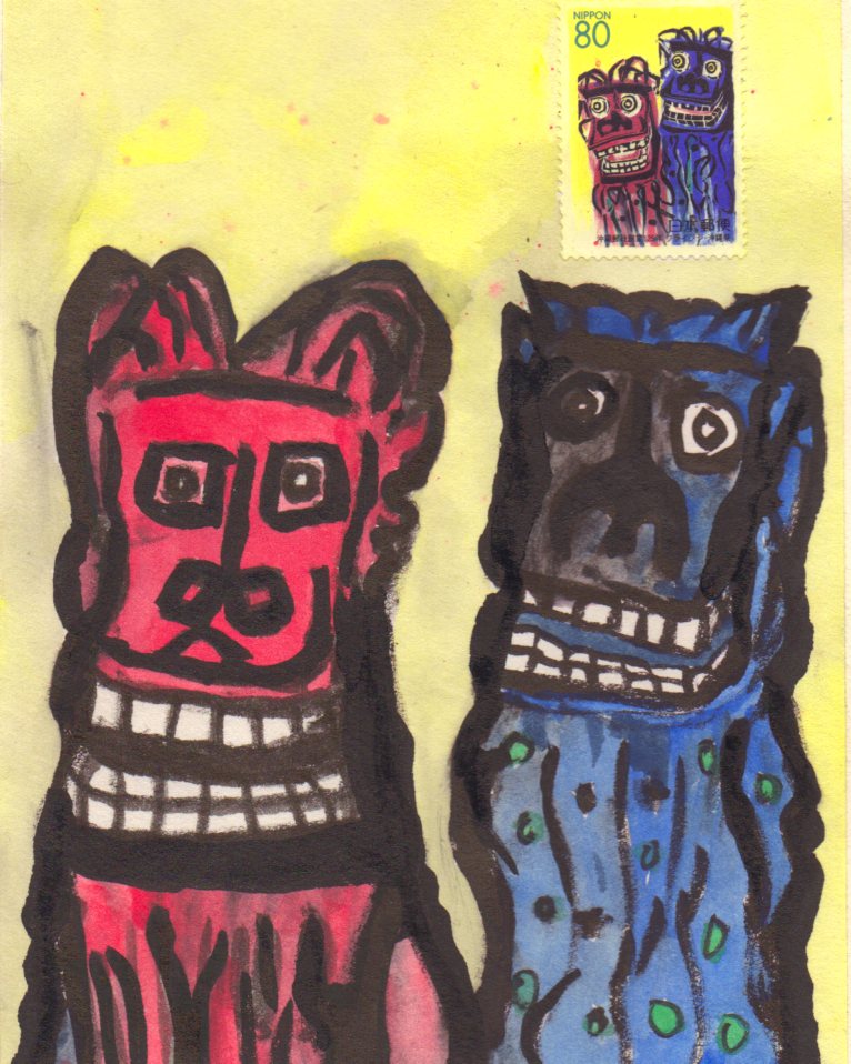
Fukushima Kids 2013 Auction, Japan: 10 of my art postcards…each print a monoprint and thus unique…were contributed to this cause and event. The reverse side was signed and dated with my artist’s stamp. These postcards were made on machine made cardboard following the Japanese sosaku hanga method of printmaking.
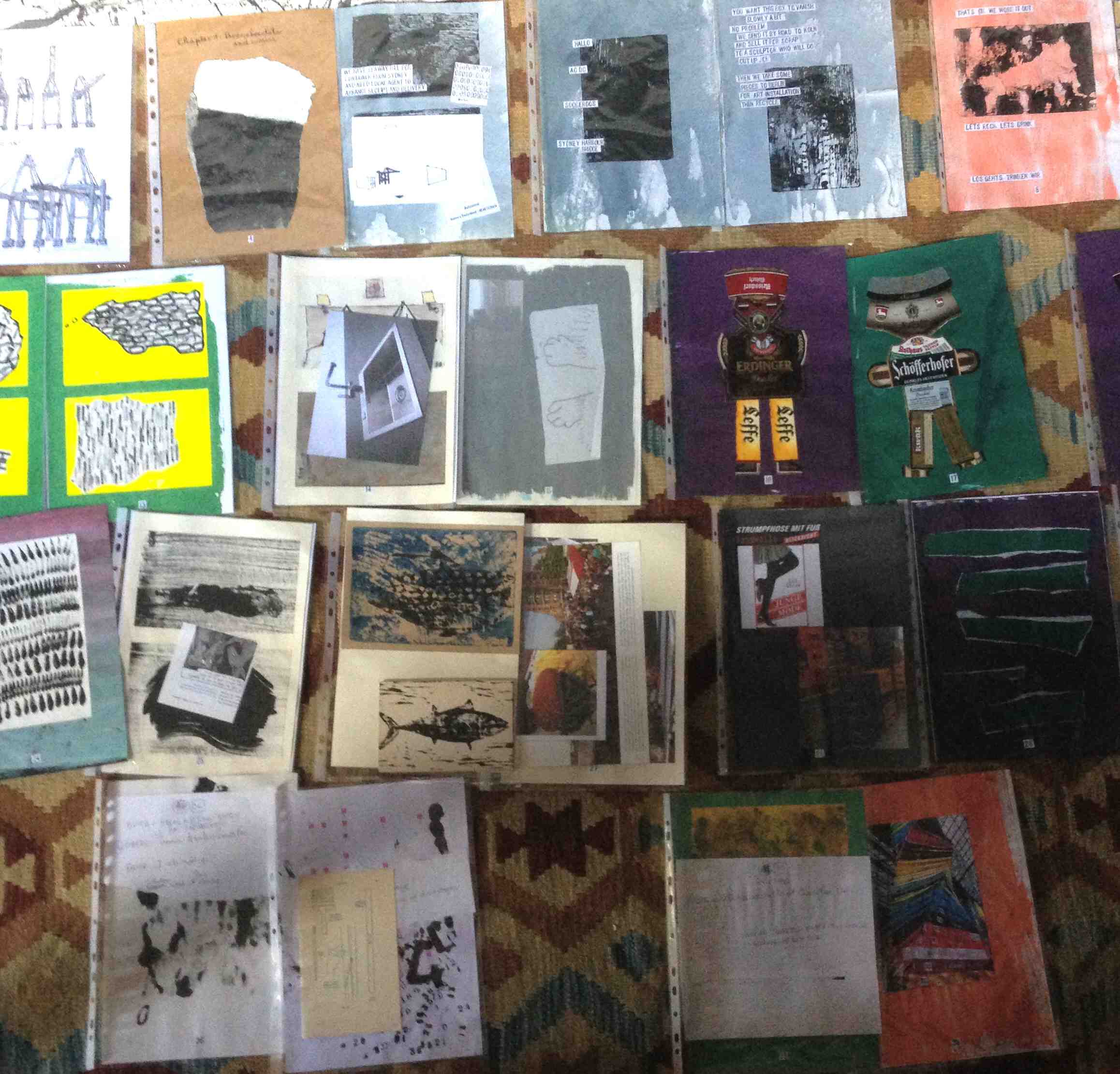
I have still not completed this issue of my comic but I am getting there! Completion of the fourth issue of my artist book/comic…and ultimately, graphic novel…Blotting Paper: The Recollected Graphical Impressions Of Doctor Comics is near. The printing and publishing process of those pages will follow. This includes the sequential stages of the pages being printed, collated, trimmed, covered and bound. As with the first three issues the fourth one has a total of 40 pages plus end-papers and covers. For this issue the covers will feature a wraparound print that includes the title. Being an artist book there will be a limited edition of 30. Each book in this first edition will be numbered and signed by the artist.
The addition of some spot colour plus a few paragraphs of handwriting is needed. It may also receive a bit of a toning touch-up and a little overprinting. I have spread out the pages in sequence on the floor of the studio. This reveals some sense of the overall flow of the comic. There might be the odd alteration to the sequencing in the final edit. I try to feel a sense of rhythm from reading and turning the pages.
UPDATE 6 JULY 2015: COMPLETION OF ISSUE #4! Although it took a little longer than expected I have now completed production of the fourth issue of my comic! The pages have been printed, collated, trimmed, bound and covered with title labels. Copies have been mailed to my supportive, personal readers. A possible launch is being looked at in Tokyo in October.
After running past the planned deadline and being slightly over budget I decided to finish in D.I.Y mode. This resulted in a somewhat hand-crafted look.
Now it’s on to the likely final issue…although reprints of previously published chapters are also a possibility…as is the eventual merging of all chapters into graphic novel form…I wish!…and can’t stop thinking about that possibility. Looking ahead, the tentatively titled 2 Tickets to Tokyo Bay Chapter 5 will be set in Germany and Japan. It depicts the continued activities of Doctor Comics’ cats and their new canine companion Barks in “funny animal” comics style. It may also contain further comics related recollections from Doctor Comics’ past, particularly his research of manga. Below is the ad for Chapter 5 on the back page of Issue 4.
I am beginning this post with a progress report. Issue 4 of my artist book/comic Blotting Paper: The Recollected Graphical Impressions Of Doctor Comics is not yet complete! I still need about another month to finish this issue. I do think that this is the penultimate report though… and further more,…due to its increasing length, I think I shall now start referring to it as a graphic novel.
The cats go to Germany with Doctor Comics’s big stash of comics related books, mementos and research materials. They meet a canine character who kindly assists them in arranging their affairs. Beer is drunk, comics are consumed and a plan devised.
The black cat, Cohl, sorts through Doc’s research materials. He reflects on some of his deeds including one that involved Belgian comics. Cohl also begins to emulate Doc’s art practice. This involves making sketches, playing with art materials and doing some drawing and printmaking. The other cat, Busch, who is not black, enjoys German beer, fish and fun. Both cats and their canine companion find enjoyment from the eating of chocolate.
More developments and an update on progress will be posted on this blog in around a month’s time. After I bring this chapter to completion we move to Japan, the setting for the next chapter.
More visual developments and an update on progress will be posted when I near completion. See you in Japan, so to speak…the setting of the next chapter, Michael.
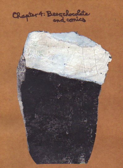
Here is the next report, first one of the year, documenting production progress of my artist book/comic/graphic novel…Blotting Paper: The Recollected Graphical Impressions Of Doctor Comics…Chapter 4-Beer, Chocolate and Comics. The story continues with both cats arriving in Hamburg in a shipping container on a freighter…and ends with them, seemingly accompanied by a newly acquired canine friend on another freighter bound for Tokyo Bay! However did that come about? Well, Japan is the setting for the subsequent chapter…as long as this scenario is not altered in the coming weeks.
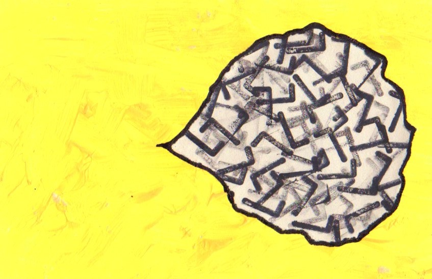
I am continuing my graphic experiments with ink and paint on paper that is printed then torn and drawn upon…and sometimes collaged, to create documents, scenes and settings as well as thought and voice balloons for the characters.
The following quick sketches were made on my previous travels in Germany. They were kept in notebooks till it seemed they had some relevance and resonance for this project…and now I am finding ways of working them into this chapter.
More visual developments and an update on progress will be posted on this blog in three or four weeks time…as I continue to close in on completion of the comic.
UPDATE 20 JANUARY 2015: In response to a query in the comments…(see below)…I have added examples of how I intend using the abstract landscapes as backgrounds…or graphic expressions.
More visual developments and an update on progress should be posted on this blog around the end of the month…as I near completion of the comic…and, as always, your feedback on my blog is most welcome.