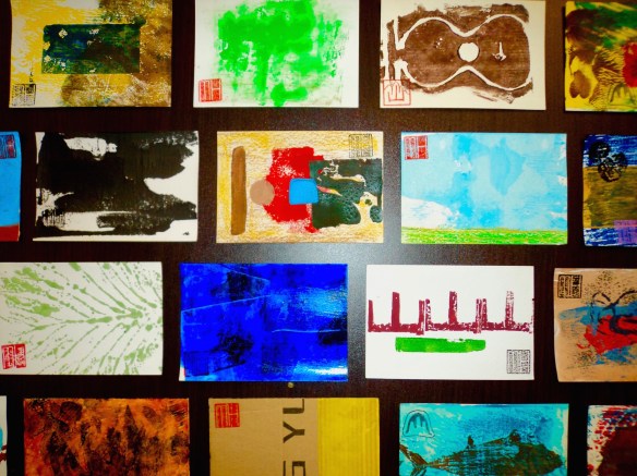
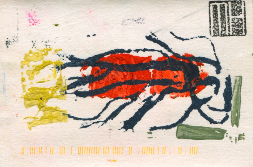
Continuing the profiling of my art postcards…here are some recent examples of on various themes. These cards are hand-printed, created from a combination of drawing and printmaking in low print run editions. Once I finished a session it meant the end of that particular batch. I would not repeat the design or reprint it. Cards in an edition are all original prints…similar in design but classified as mono prints as there are no exact duplicates. They fall within the standard postcard size dimensions of 10cm x 15cm or a near approximate. More information about this project can be found on the four previous POSTCARD posts…see the links below at the bottom of this post.
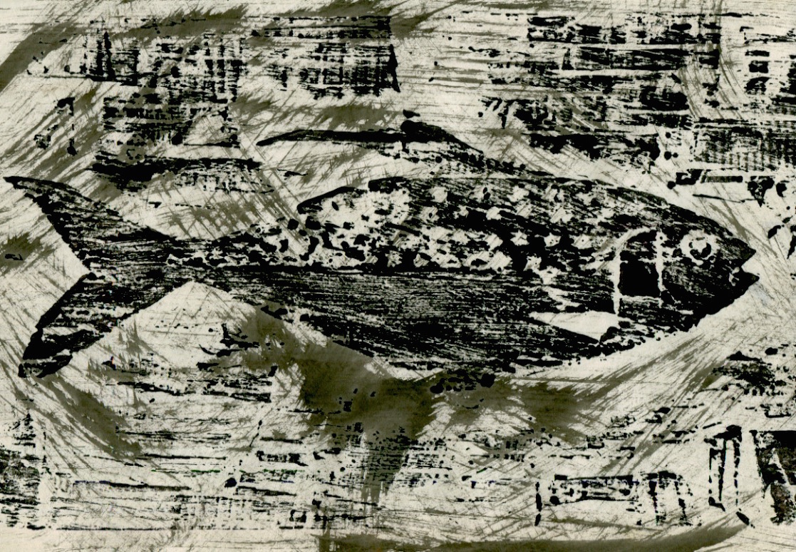
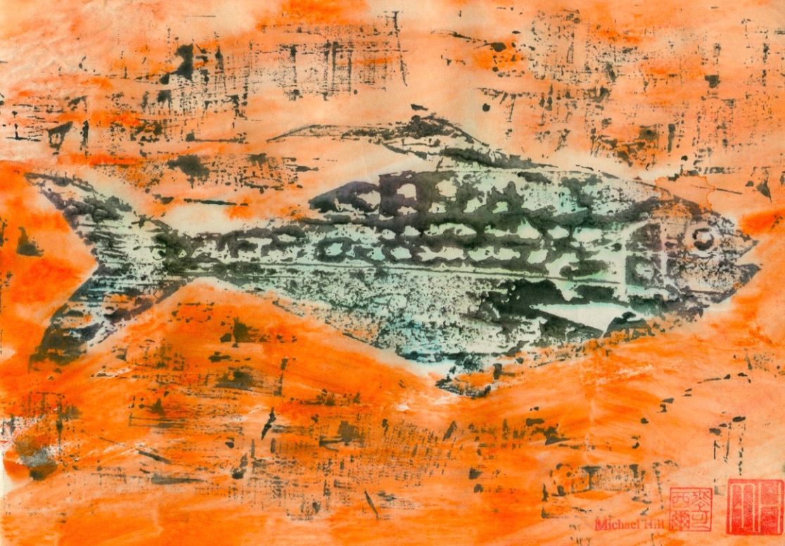
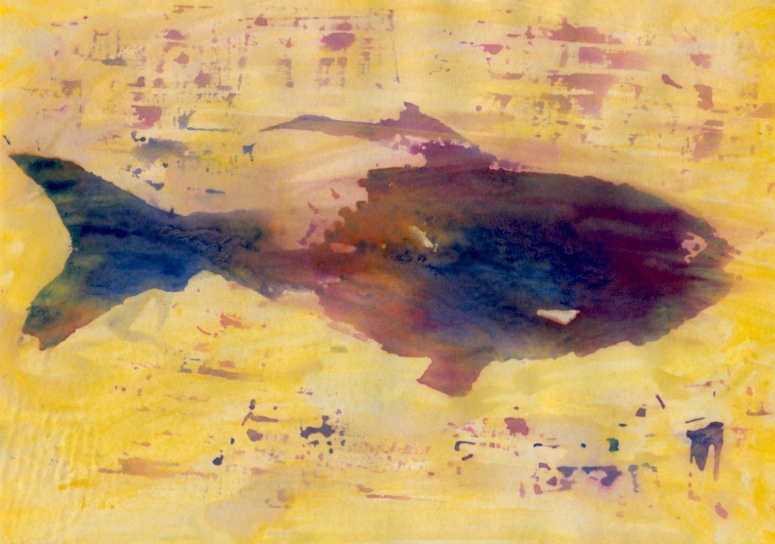
This is the third post based on the fish prints I made using woodblock printmaking techniques…for the experimental animated film Toxic Fish. The fish in this sequence is the Kohada or Gizzard Shad. Its static shape on the woodblock contrasts with the flooding of coloured toxins around it.
Making overlay textural effect inking of a sequence of prints on the floor of the studio…for inclusion as frames in the animation. (Photo by Louise Graber).
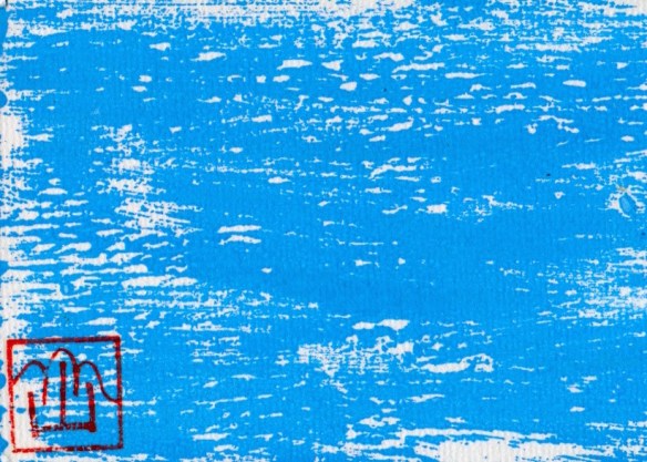
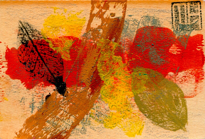
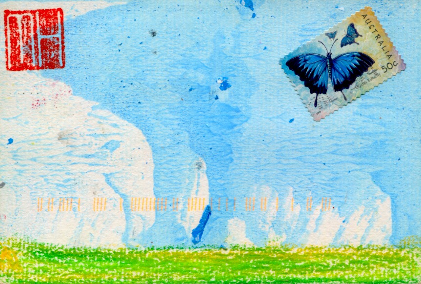
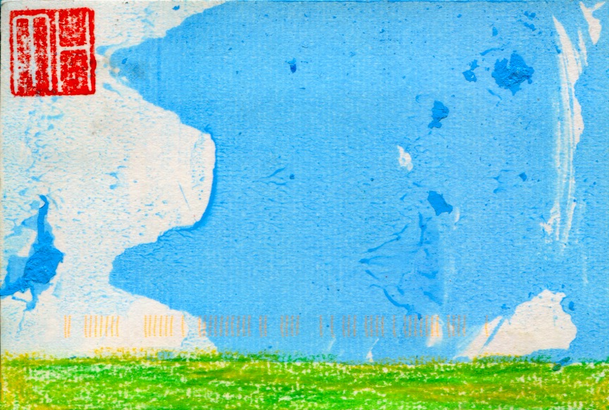
Continuing the profiling of my art postcards here are some early ones from the years 2007-2009 on the theme of The Seasons. These cards were hand-printed, created from a combination of drawing and printmaking in low print run editions. Once I finished a session it was the end of that particular batch and I would discontinue using the design. Cards in an edition are all original prints, named monoprints, i.e. the cards look similar in design and together form a series with no exact duplicates, but variations…thus the label of monoprints. The cards fall within the standard postcard size dimensions of 10cm x 15cm. The horizontal band of vertical orange print marks visible on some cards come courtesy of Australia Post…my cards were stamped on the surface with a code as part of the postal process. Consequently I began to post my cards in an envelope. More information about this project is contained on the three previous POSTCARD posts (see the links below).
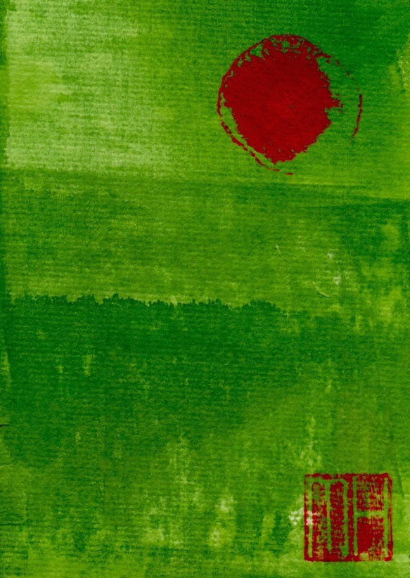
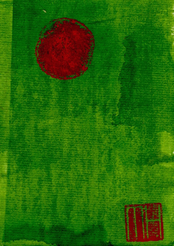
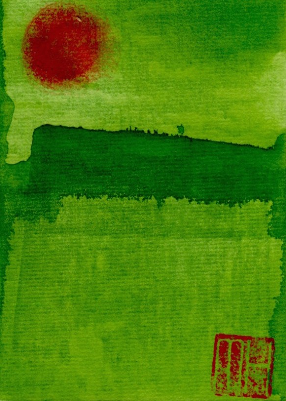
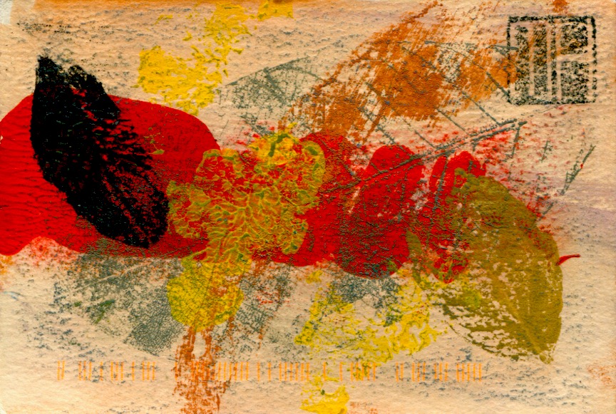
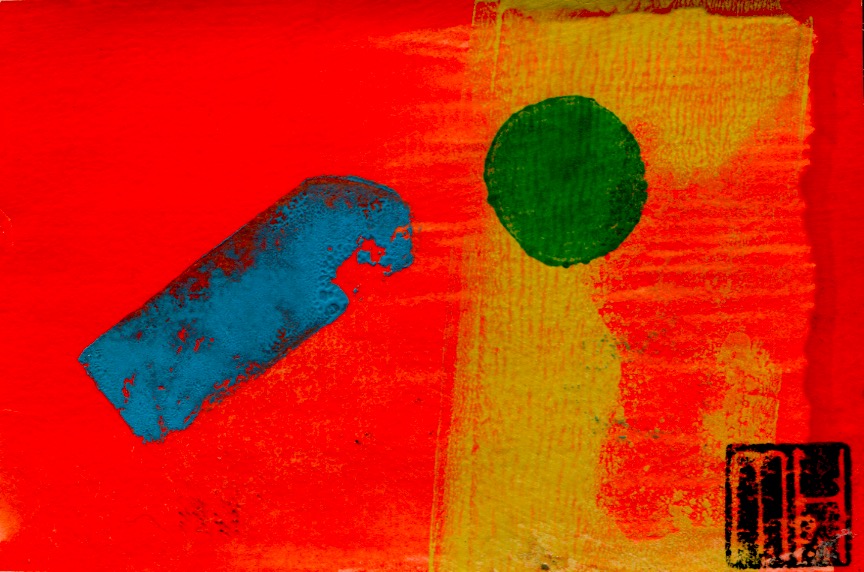
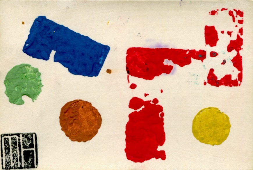
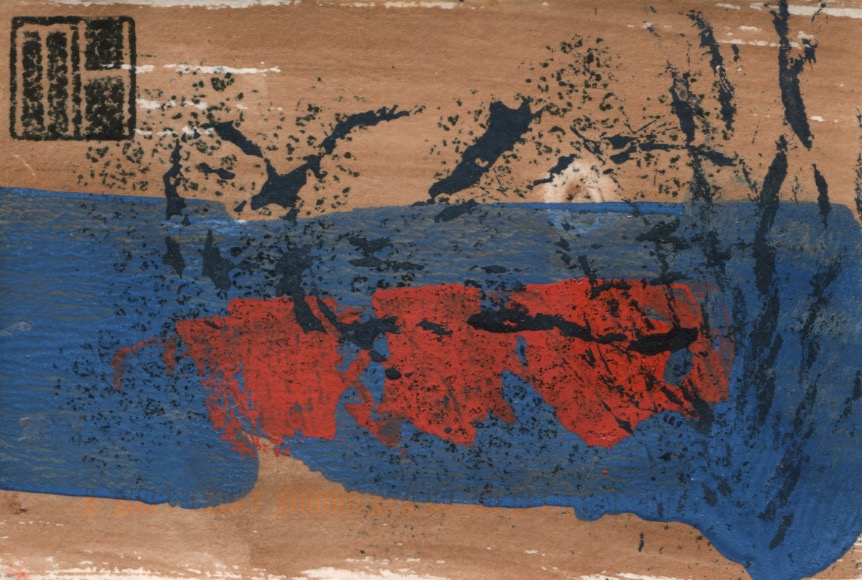
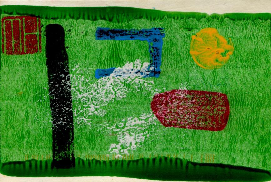
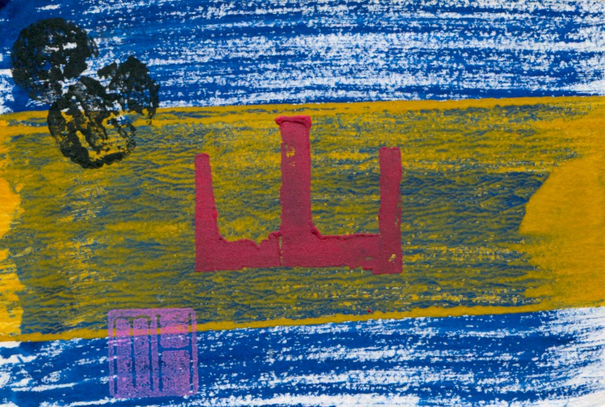
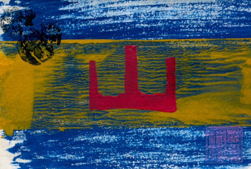
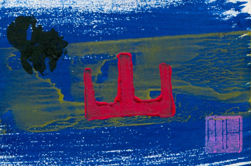
This post continues the profiling of production of my hand-made art postcards in limited editions… featuring more examples from the Abstract series…and as previously stated each postcard is an original…a monotype, similar in design but not an exact duplicate of any other card.
Cards in an edition are all original prints…similar in design but with no exact duplicates…as can be seen in the following four examples from the Abstract No-14 series. These cards were all made in the same batch…during the same printmaking session…however, variations in colour, texture and positioning of compositional elements can be detected.
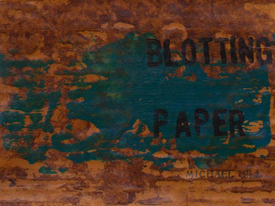
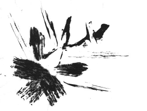
This post continues reportage of the production of my artist book/comic Blotting Paper: The Recollected Graphical Impressions Of Doctor Comics. It describes the use of printmaking in the image-making process, including the creation of landscapes of subconscious terrain.
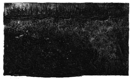
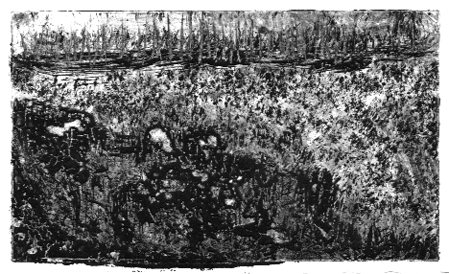
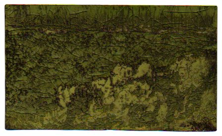
Doctor Comics finds himself in a shadowy landscape during an intense dream experience. I have tried to express the inky and murky feel of this etheric place he traverses. To achieve this I made a series of monochromatic monoprints.
This landscape can be seen more clearly as more light is added to each successive image. Despite the extra light he still finds it hard to trace his way through.
These prints were made using an etching process. It was a novel method of printmaking that involved exposure of the design to a light sensitive plate. This process marked the lines on a gelatin coated metal plate. The plate was then rubbed with a stiff brush under running water to carve the lines. This process is known as solar plate etching.
A deliberate ‘blotting’ effect was obtained from pressing a saturated inked block onto highly absorbent blank paper. This was for a scene from the second issue. After printing, the paper was peeled off the block carefully to avoid tearing. This was due to the combination of the wet inked areas and the paper’s soft, tissue texture.
Tails and fins of a cooked fish were inked and printed for some of the images used in Chapter 1. This approach was inspired by the Japanese sosaku hanga printmaking method. That involves inkable flat objects employed as ‘blocks’ as an alternative to woodblocks. The resultant graphic effect is shown in the print above. Photos of the image-making process involved in making that print are below.
Another unused print, above, from the first issue is a possible inclusion as a postcard insert in this issue. It was constructed from a combination of woodblock and object prints. I know I seem to be pushing the printmaking cart here but it has really got me going. I would love to hear of your experiences of printmaking, if you have done that, Michael.