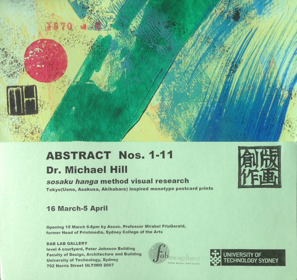
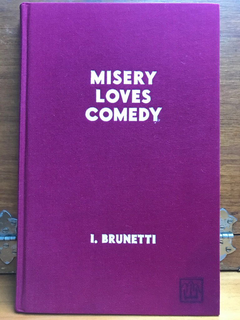
UPDATE 27 APR 2024: This previously published post from my older and now deleted series ON THE COFFEE TABLE, has been updated, extended and transferred to the new FROM MY LIBRARY series as the seventh posting. It documents items from my library and research collection and comes with a tip of the Doctor Comics hat to Hergé and his comics art creation Tintin. I have collected an edition of the complete set of the albums plus a copy of the Tintin magazine Le Journal Des Jeunes De 7 A 77 Ans. I have also read some related scholarly works, viewed the complete Adventures of TINTIN DVD set, written and published a bande dessinée franco-belge exhibition review (see below), and, as added interest and amusement, acquired some items of clothing and accessories associated with the character.

Most of my collection of assorted Tintin material (Art direction and photography-© 2013 Louise Graber).

Tintin magazine, No. 467, October 1957.

The Benoît Peeters study of Tintin and Hergé.

Michael Farr’s Tintin companion book.
The Adventures of Tintin albums, as the French call them, totalling 24 in all including the unfinished final one, were executed in the attractive ligne clair or clear line drawing style that was developed by Hergé and his colleague and collaborator Edgar Pierre Jacobs. Growing up in Australia, I missed the opportunity to read these as a child. Instead a pair of kind aunties bought me comics by the Americans Carl Barks and Hank Ketcham which I read and enjoyed. I didn’t discover Tintin till my adolescence when the English translations had been published and I began to see the odd volume of them in libraries. They were in fact the first comics that I found in libraries. Amazing, but that was back in the Sixties! Librarians generally did not approve of acquiring comics but somehow seemed to make an exception in their acquisition of Tintin. They didn’t disclose that they were actually comics but rather some form of European illustrated albums. I suspected the fact that they came in hardcover editions and not the soft, pamphlet form of North American comics, made them seem more like books and appropriate for library purchase and collection. And they were popular! Some of my fellow college students tended to monopolise the borrowing of them to the extent that it was generally difficult to find them on the shelves of the school library. Decades later, when my Doctor Comics persona kicked in, the collecting and reading all of the Tintin comics with their beautifully printed colour and drawing, their adventures in unfamiliar geography, the amusing babble from Captain Haddock and the entertainment provided by the surprising amount of slapstick, all combined to foster my appreciation of bande dessinée and the Ninth Art. That was consolidated and extended in the following years. I have presented some of my Tintin acquisitions in this post including a copy of that older published review that I wrote of a Tintin related art exhibition.
Volume 8 of the series.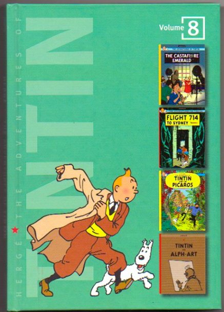
Harry Thompson’s Tintin profile book. 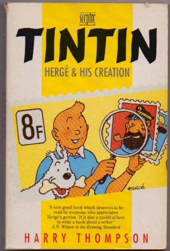
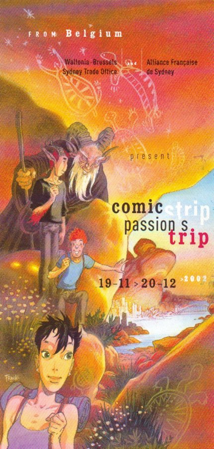
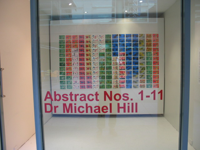
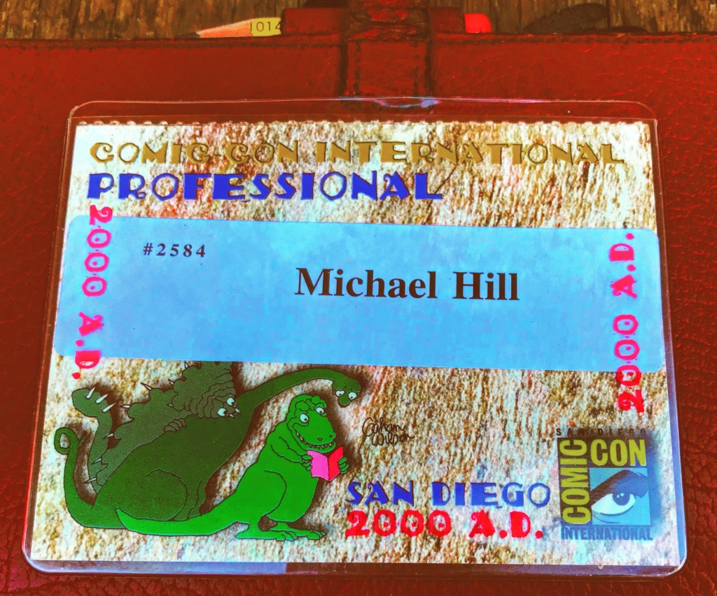
EXHIBITION REVIEW: Comic Strip, Passion’s Trip exhibition, Sydney, Alliance Francais de Sydney November 18-December 20, 2002, review by Dr. Michael Hill (a.k.a. Doctor Comics), first published in International Journal of Comic Art, Vol.5 No.1 Spring/Summer 2003
The “Tintin” Qantas Flight 714 finally touched down in Sydney in November 2002. Originally carrying Tintin and his associates to a scientific symposium in Sydney in the Herge Tintin comic Flight 714 to Sydney (1968) his party left the plane in Jakarta instead and went off on a private jet and another adventure. Now, 34 years later, Tintin, in the shape of a cargo of beer, chocolates and comics, three of Belgium’s significant export commodities, as well as members of the Royal family and an exhibition of French language Belgian comics titled Comic Strip, Passion’s Trip had arrived.
For a country that exports considerable quantities of comics (once listed as 65% of publication exports) and which refers to them as the Ninth Art and has a museum devoted to comics, it was no surprise that the exhibition was opened by members of the Belgian monarchy, Prince Philippe and Princess Mathilde, giving the exercise the Royal seal of approval (my invitations to both the exhibition opening and the following reception events are shown below). The exhibition formed part of an economic mission organised by the Wallonia-Brussels Sydney Trade Office. 300 different comics titles in French plus a further 70 in English were shipped to Sydney and put on sale in Dymocks, one of the city’s larger bookshops, creating a mini-venue for Euro comics to compete with the growing presence in the local retail market of Japanese manga and Hong Kong comics.
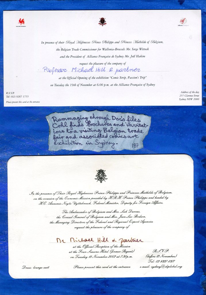
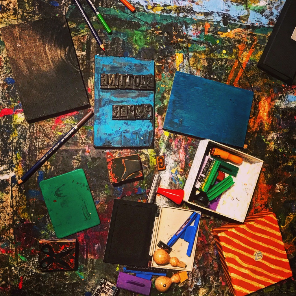
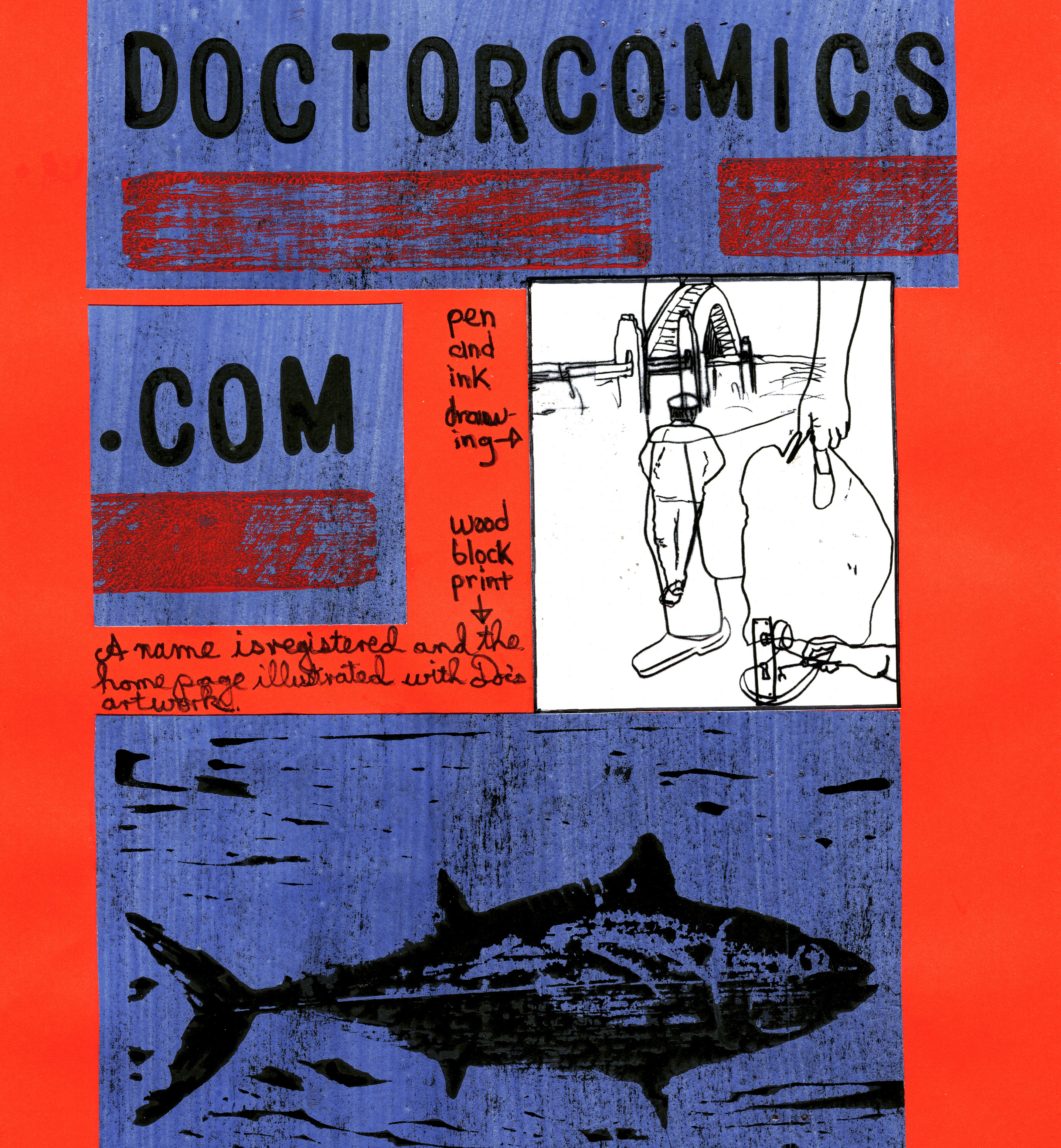
A page from my graphic novel BLOTTING PAPER: The Recollected Graphical Impressions of Doctor Comics showing the invitations to the events referred to in the above text.
The exhibition was staged at Alliance Francais de Sydney, a combination gallery, café and French language teaching centre. It was a noisey location next to a city bus stop. This became a bonus for waiting passengers as they could admire the window display of merchandise and old comics and the staged acrobatics of a large model by the Belgian cartoonist André Franquin of his character Marsupilami. The exhibition had undergone a serious design process by the curator Jean-Marie Derscheid and had a multi-strand focus: the exhibition of actual comic books, original comics art and rough process comics art, a display revealing the workings of the artist’s studio, a child’s bedroom decorated with comics art merchandise and videos, and a gigantic mock-up comic book album, 82cm (heigth) x 56 cm (width), beautifully bound and designed, contextualising Belgium comics and featuring brief biographies and examples of the work of 20 or so significant artists including: Didier Comes, André Franquin, Greg, Hergé, Hermann Huppen, Edgar Pierre Jacobs, Jijie, Lambil, Raymond Macherot, Morris, Peyo, Francois Schuiten, Jean-Claude Servais, Tibet, Maurice Tillieux, Tome and Janry, Will, and Yslaire. References were made to Spirou magazine and to two emergent schools of comics: the Brussels School and the Marcinelle School.
The bed in the child’s room had a printed Tintin doona cover and bed sheets, a Gaston Lagaffe reading lamp by the Belgian cartoonist André Franquin, a Marsupilami alarm clock, various posters and a cupboard containing Lucky Luke figurines. Interestingly there was not a Smurf in sight. The room also had a small television and VCR with a collection of Belgian animated cartoon series. Amusingly, by the end of the opening night, the child’s room was littered with empty beer bottles deposited by the noisey and appreciative crowd viewing the exhibition that gave the installation a bizarre visual association between beer and comics in the nursery. If only I had taken a photograph of that! In any case, my character Doctor Comics would have approved of the pairing of beer and comics, and likely even shouted his an old, jubilant cry “beer, chocolate and comics!” that I personally hold to be an excellent combination in which to indulge, reading comics whilst eating chocolate and drinking beer. The child’s room, the mock-up of the studio and the giant comic book brought to the exhibition some features not available in the normal process of reading comics.
Another section of the exhibition consisted of individual displays of the work of particular artists. These included examples of original artwork and a copies of comic albums that were accessible for visitors to read, some of which appeared quite soiled near the end of the exhibition let alone the opening night, and collaborative partnerships including Hermann, Geerts, Midam, Yslaire, Morris, Jacobs, Herge, Francois and Luc Schuiten, Francqu and Van Hamme, Dufaux and Marini, Lambil, Marc Bnoyninx, Tome and Janry, Constant and Vandamme.
Upstairs in a small seminar room there was a mock-up setting called ‘the artist’s studio.’ Large blow-up photographs on the walls showed the interiors of various comic book creators’ work spaces although these were not identified. A working drawing table had been set up with pencils and other equipment, again more of a generic than specific representation, and there was a video corner screening a documentary on one of the featured artists, Frank, at work on illustrations for his comic book The Source about Australia which had been specially commissioned for the exhibition and scheduled for release with it. His watercolour sketches of Australian animals were impressive. Even though he had never been to Australia prior to the exhibition (Frank come to Sydney for the opening) his story showed the desert and although his use of colour was accurate some of his conceptual content was neither sensitive nor politically correct. What he refers to as Ayers Rock, a giant natural rock formation is now known as Uluru, having had its ownership and management reverted to the control of the indigenous owners and consequently treated as a sacred place. In his comic Frank also freely plays with Aboriginal art and icons, a practice which local artists respect as the cultural domain and ownership of the indigenous people. Conscious of the lack of local knowledge perhaps, and in tongue-in-cheek fashion, the exhibition points to “our delightfully cliched images of Australia: kangaroos, boomerangs, mythical Aborigines and smouldering red deserts.” In any case this exhibition was about culture: the culture of a country where comics have been elevated to the level of art, are treasured and collected by libraries and museums; and also a culture where comic books are treated as consumables that may also be collected, handled, read, and integrated into everyday life. Praise to Belgium!