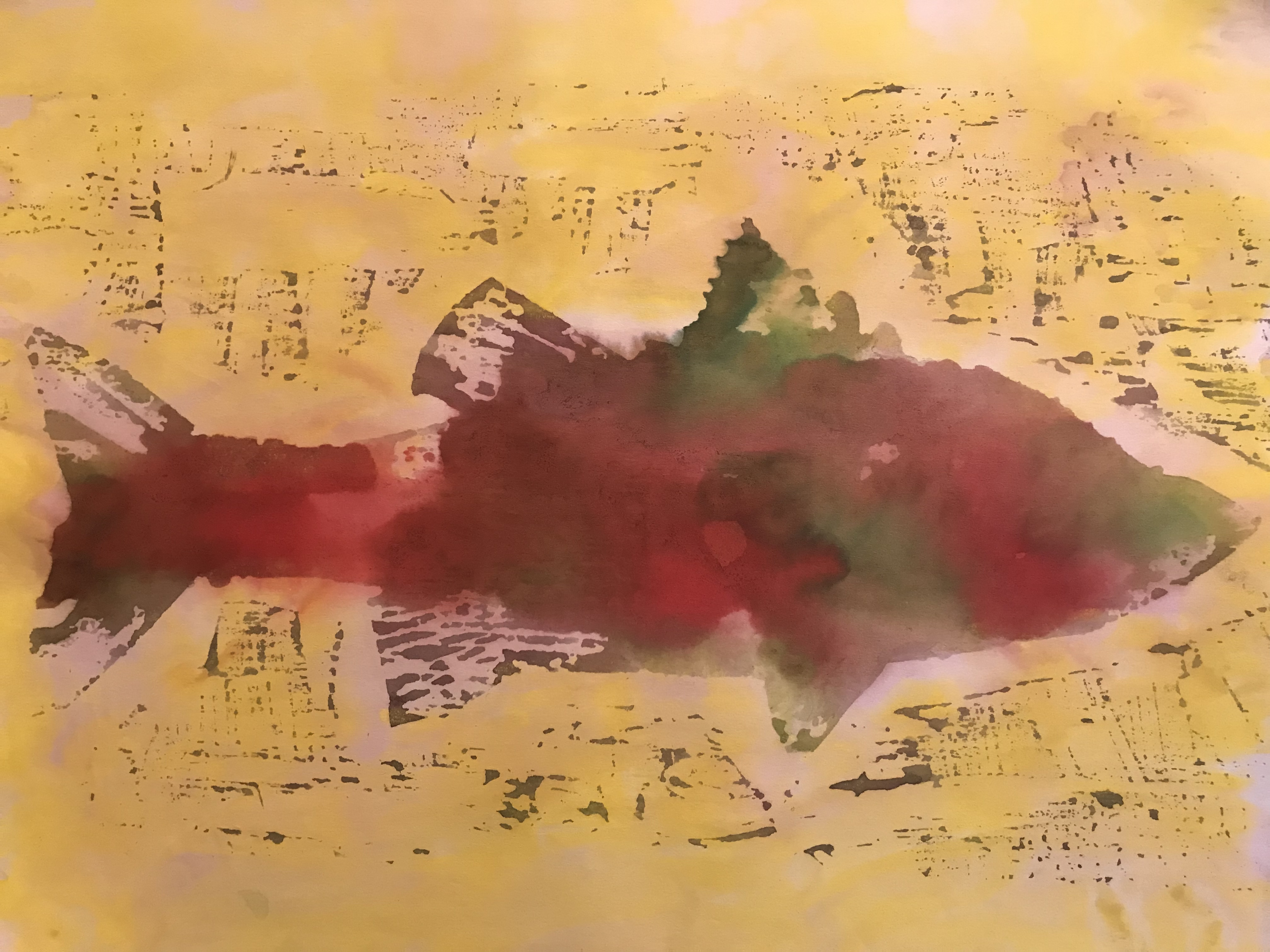
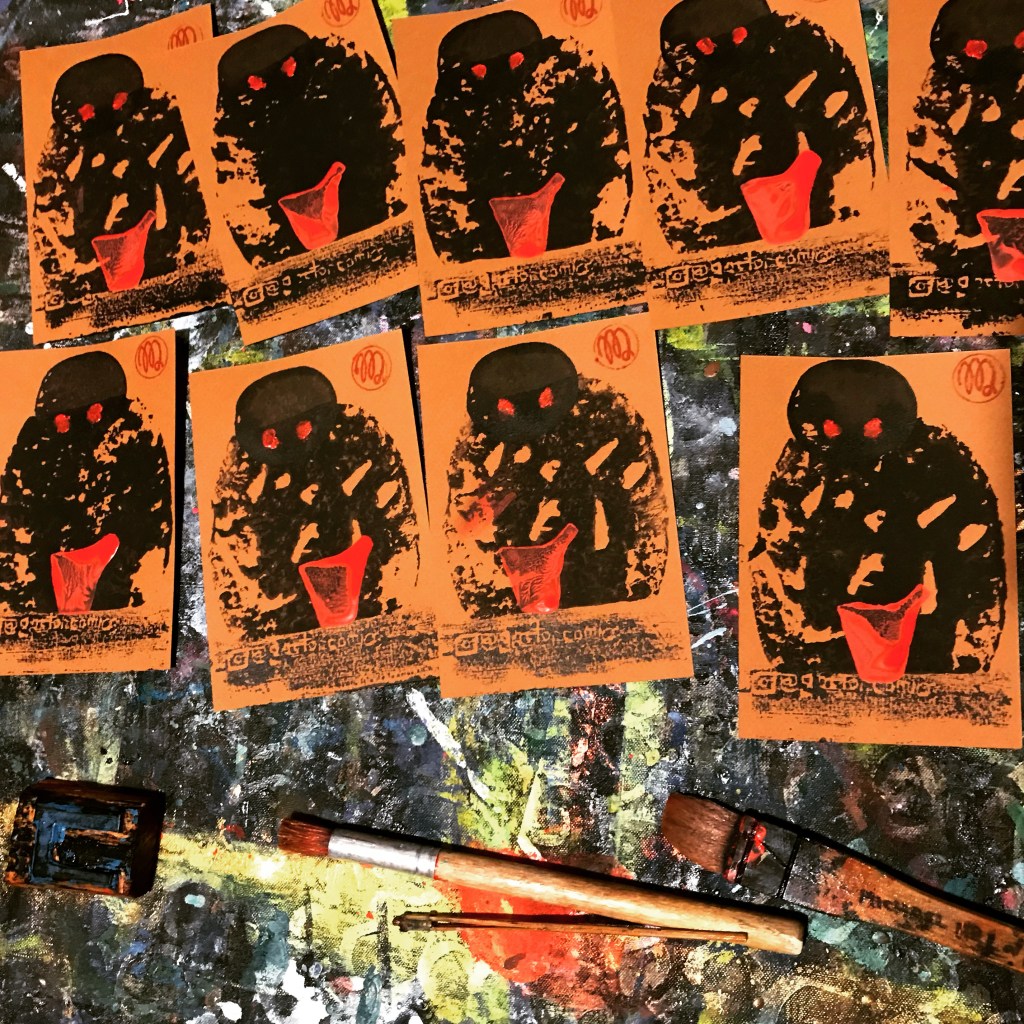
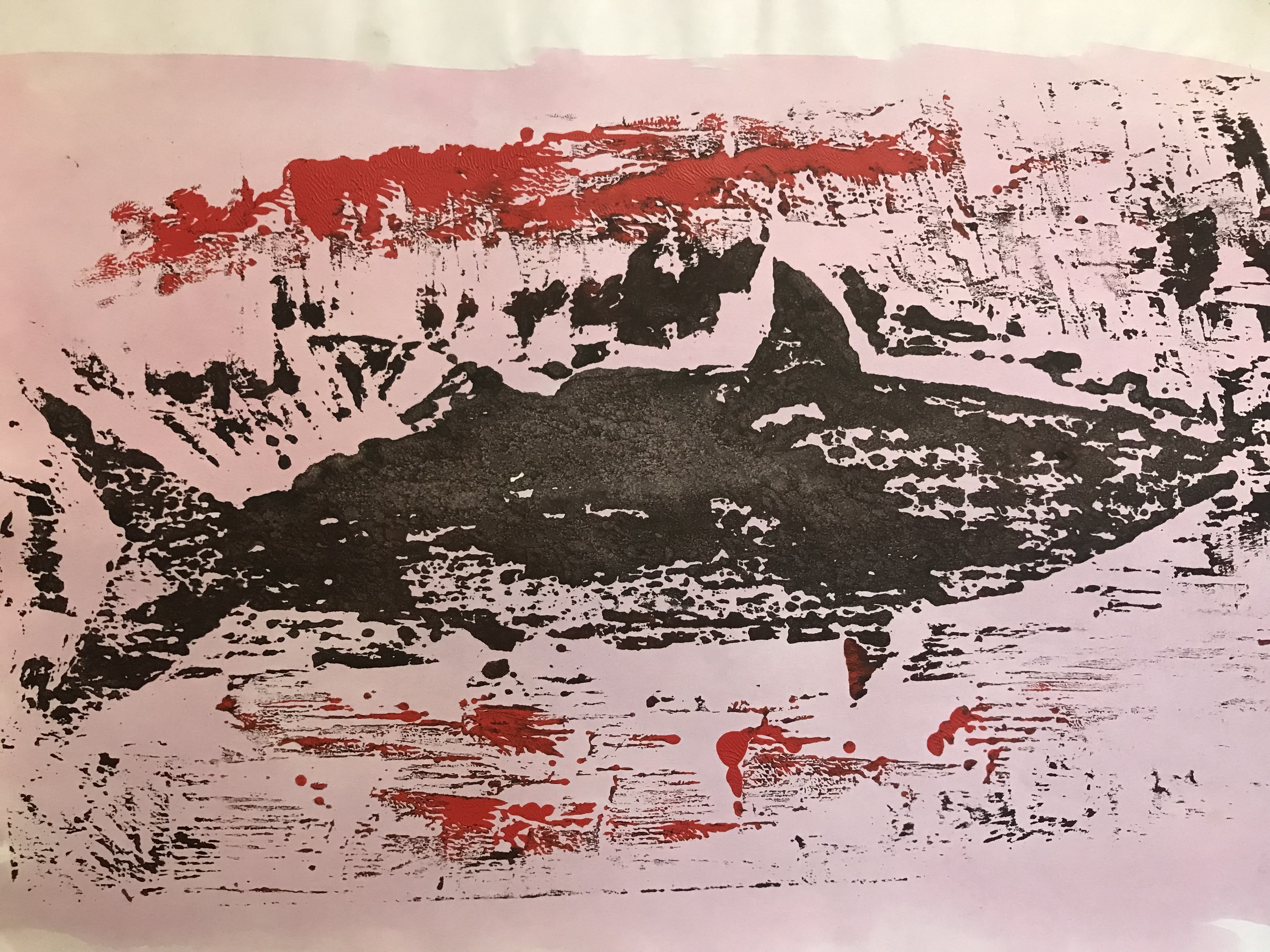
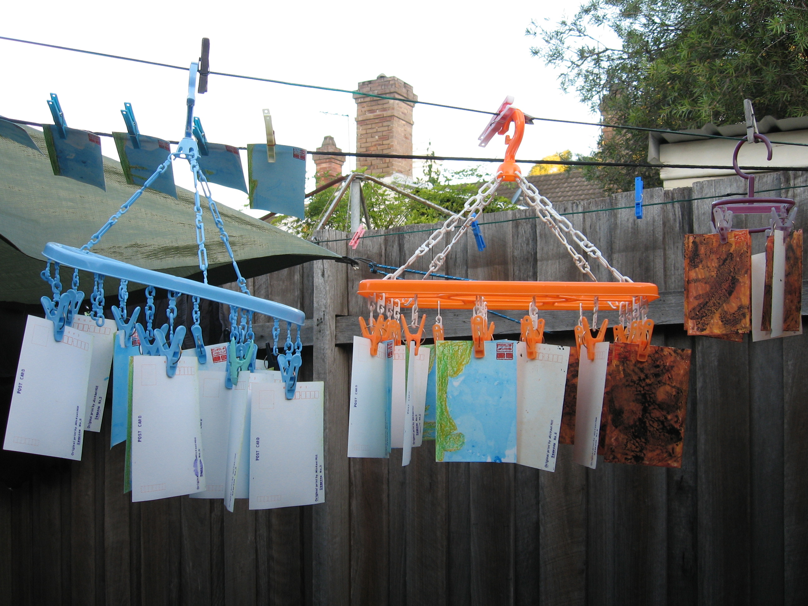
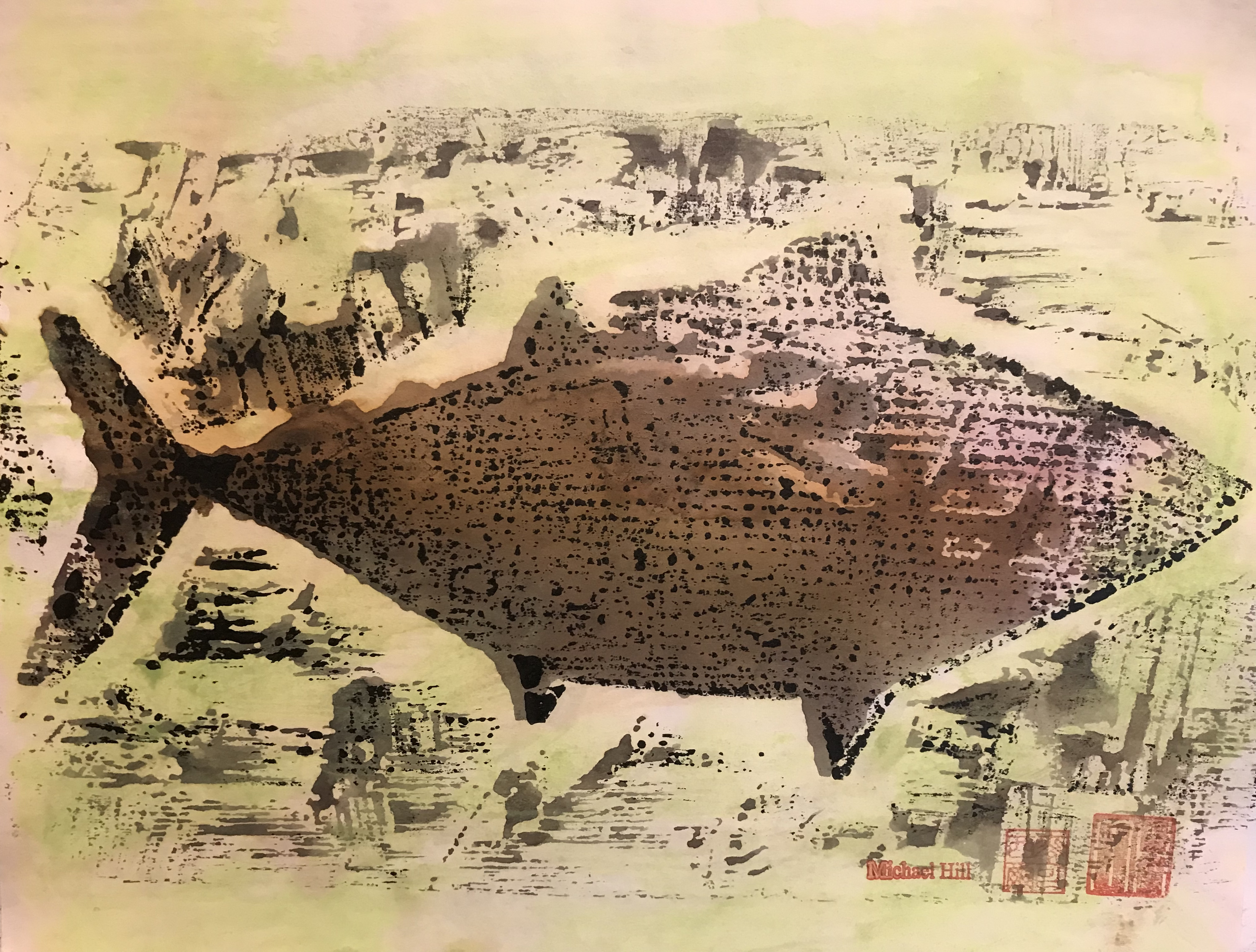
This is the final of six posts on the creation of experimental fish prints using woodblock printmaking techniques. These were exhibited as art prints. They were also used as animation frames in my experimental animated film Toxic Fish (see the photos below).The fish in this post is the kohada. It has a static shape on the woodblock and in the film frame. This contrasts with the surrounding coloured toxins from commercial pollution. These eventually poison the fish. Variations in the volume of ink applied to the block produced a range of similar but different outcomes. Once edited in sequence, these contributed to the creation of the illusion of movement. The associated movement of both fish and toxins frantically appear to twitch and jump all over the frame. The action looks frenetic. That effect is reinforced by the percussive soundtrack. The film was selected and screened at CINANIMA, the Animation Festival in Esphino, Portugal. It was also screened at the Art Gallery of NSW. Later it was shown at the Big Day Out rock festival in Sydney. There is a certificate and photo on a previous post: PRINTMAKING: Fish Four).
Sitting at the Oxberry animation film rostrum stand back in 1990. I was shooting my film, frame by frame, from the individual woodblock prints I had made. It took a really long time. I appear both happy and calm and pleased with the process despite the frantic impact that the film makes. I do listen to music while I work. I don’t recall what I was that day but it looks like I was enjoying it.
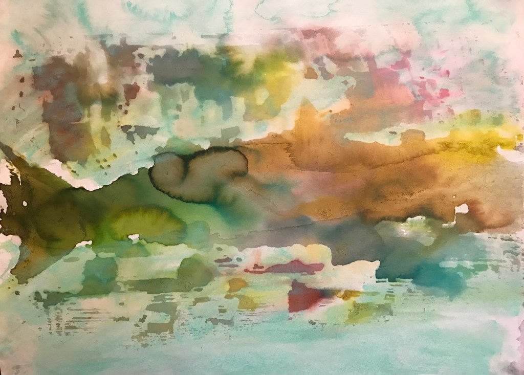
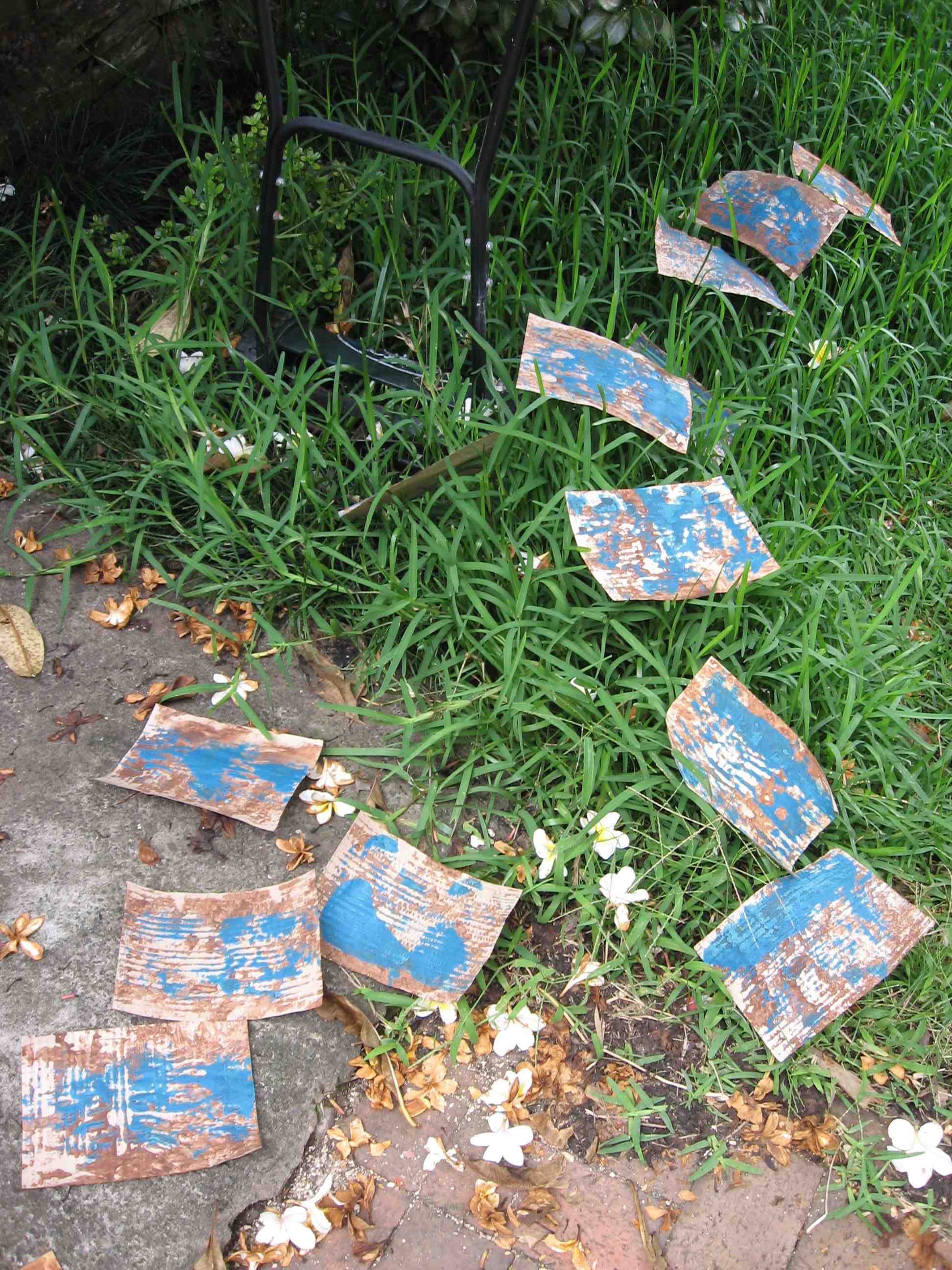
A later grouping of one species of the fish for art gallery exhibition. This composition had torn and collaged prints assembled in a school formation. It completed the process from design to printmaking to animation to film.
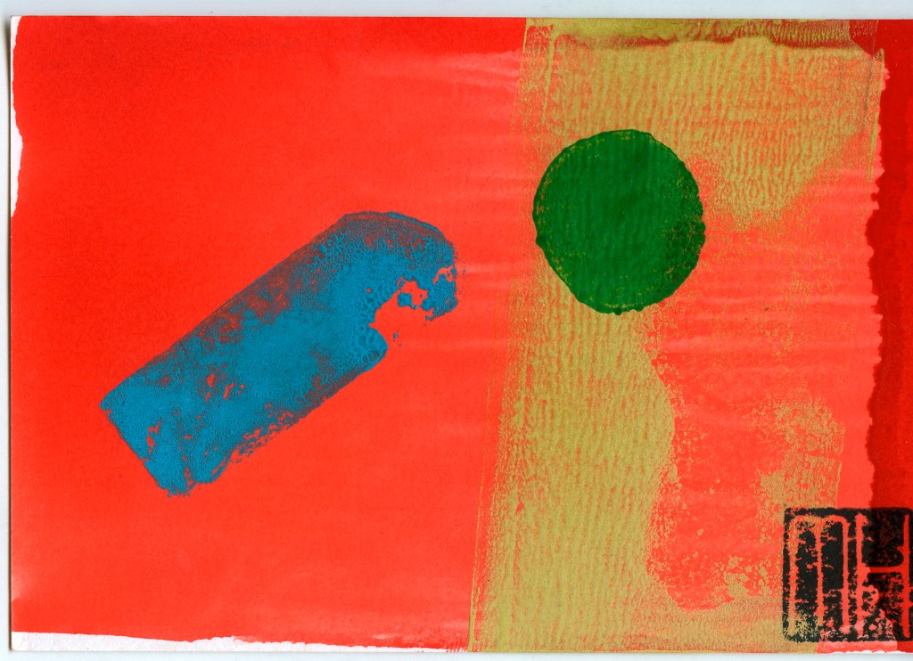
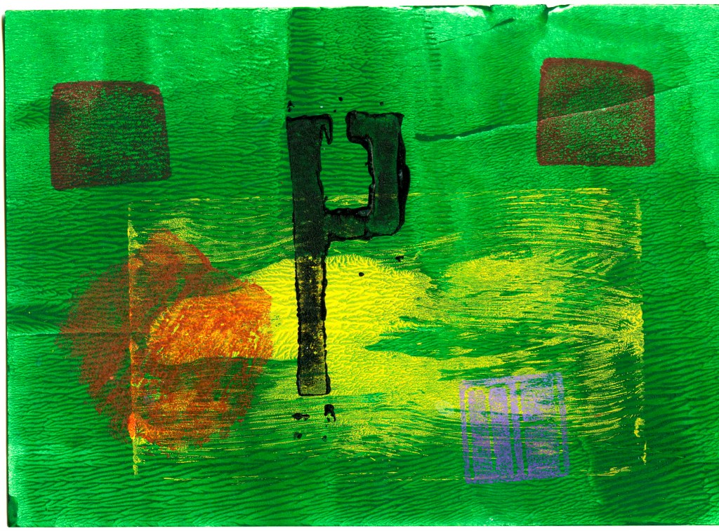
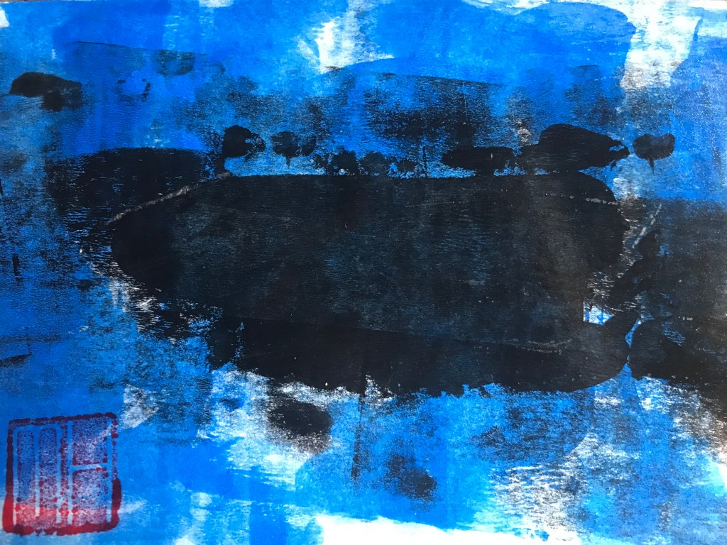
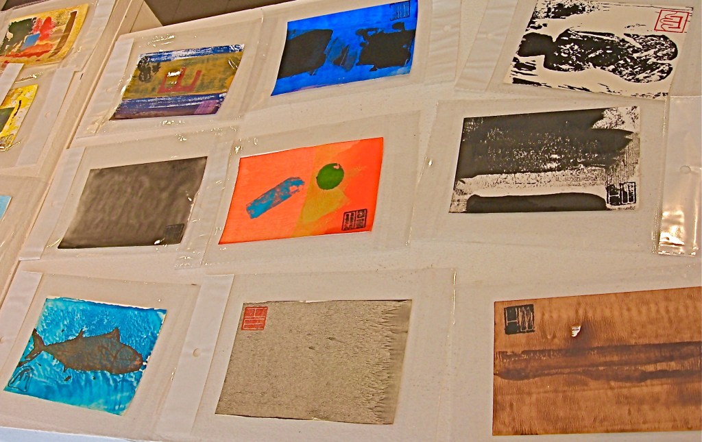
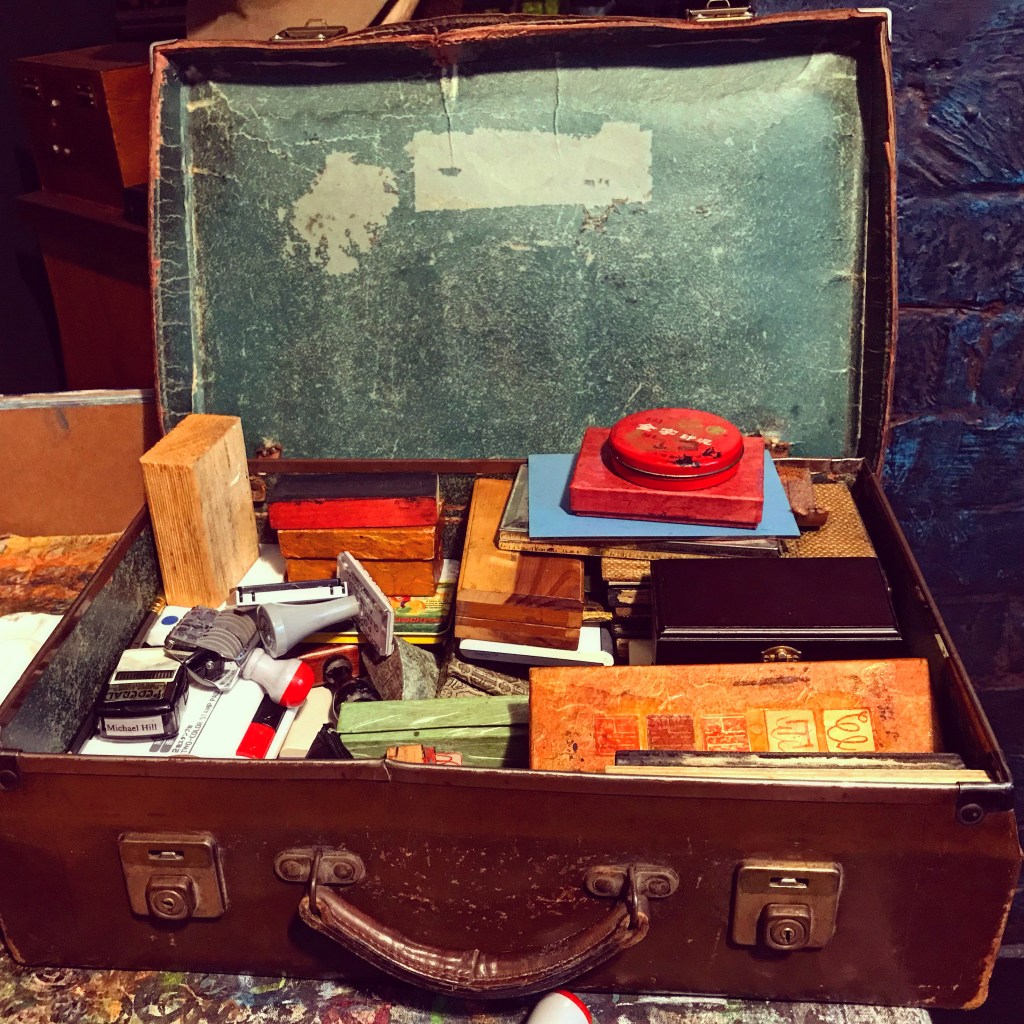
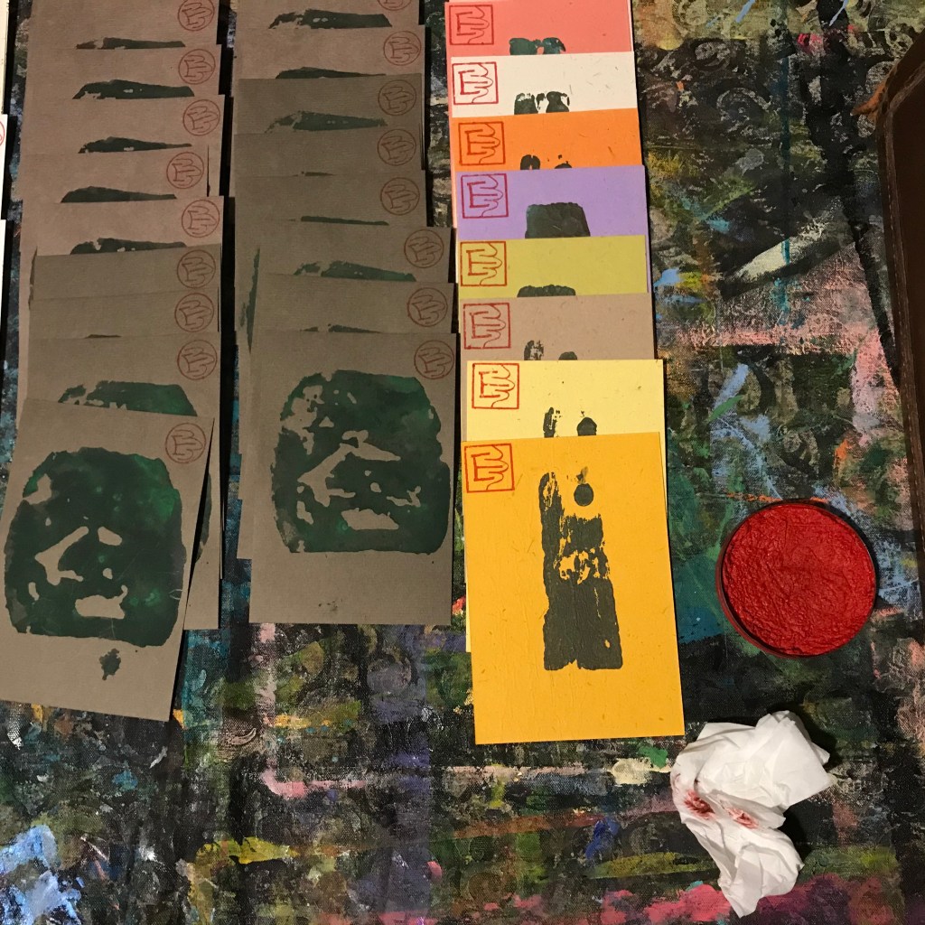
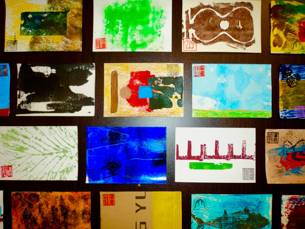
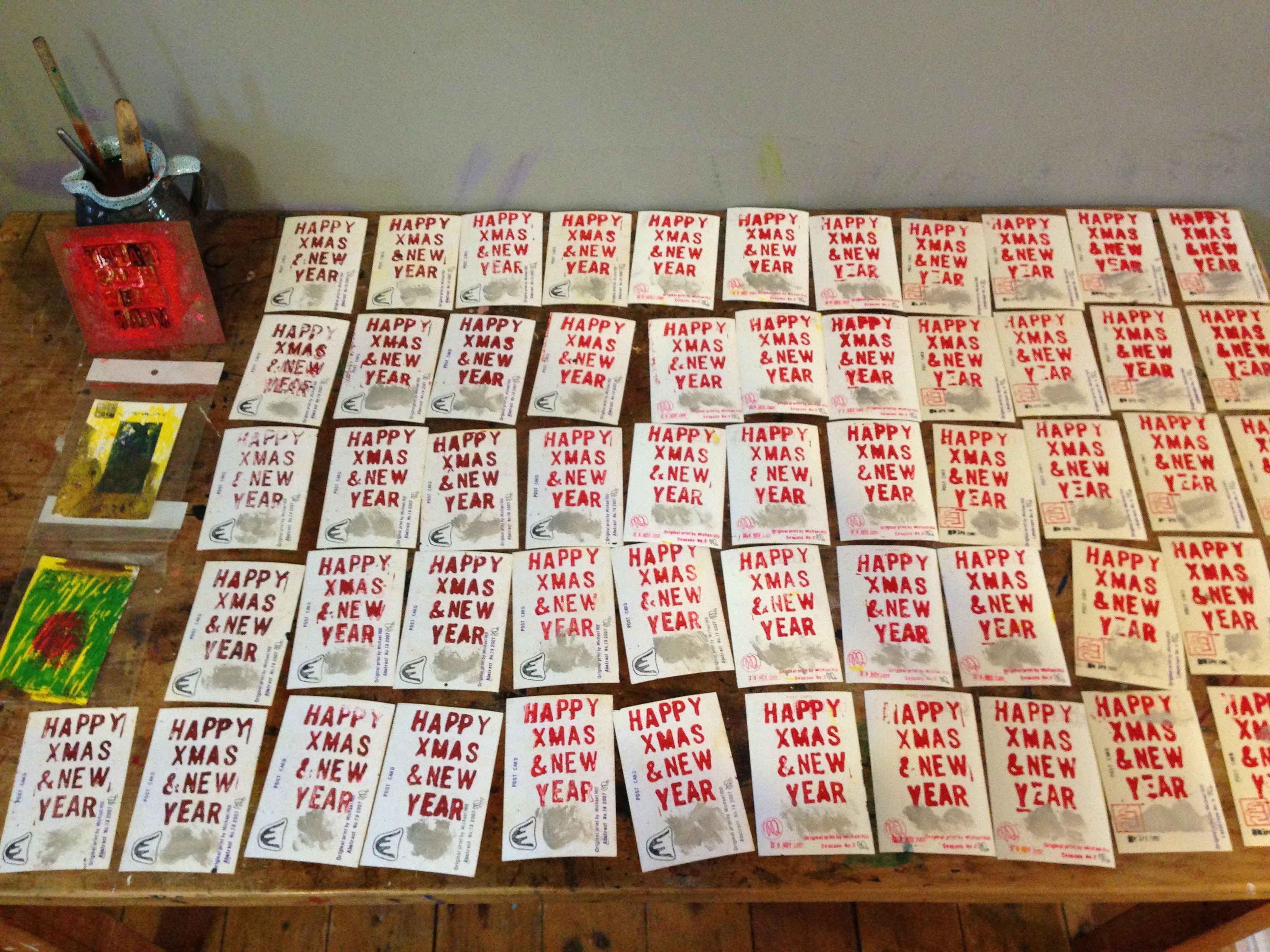
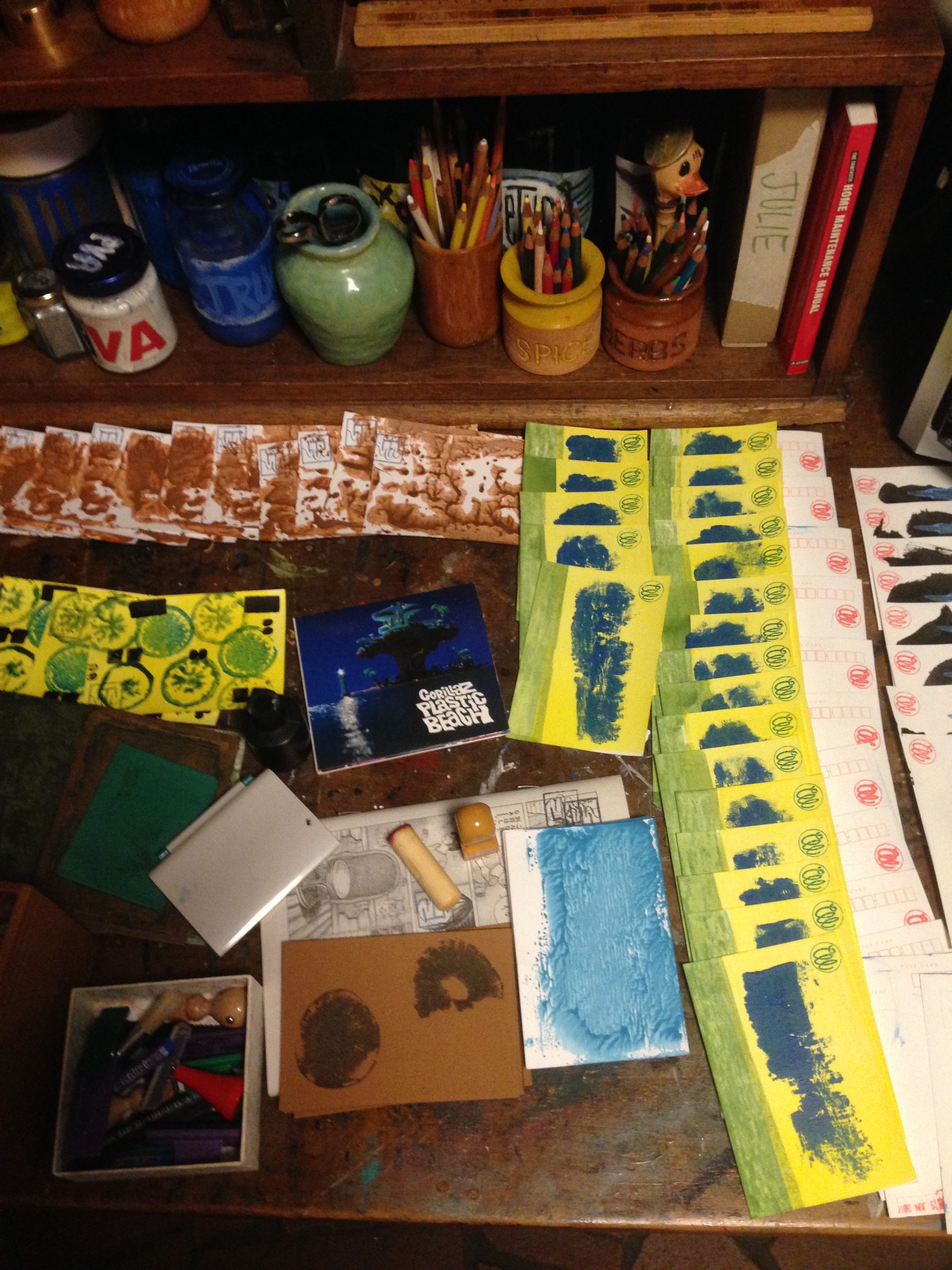
Continuing my POSTCARD ART blogs with another post profiling the design and production of my art postcards. I have been creating and printing these for more than a decade. This post looks back to cards I back when I started in 2006 and 2007. There are also cards from subsequent years. My art postcard project was inspired by a study trip to Japan. I looked at Modernist printmaking approaches that had taken place there. My cards were produced by hand in limited edition batches. Each card produced was unique…similar but not identical, part of a batch with an approximate match.
This is one of the earliest examples, from the series of Abstract Art Postcards made in 2007.
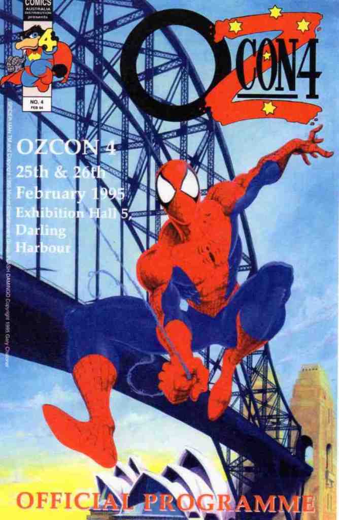
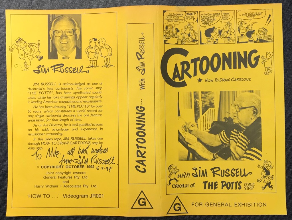
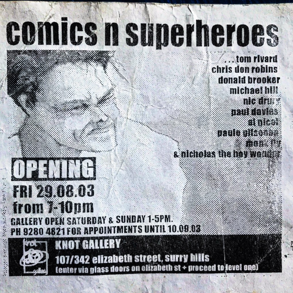
On my travels to comics art and animation events, galleries, museums and stores, I have endeavoured to study other creators’ works. Sometimes I have even managed to meet and chat with them. I met legendary Australian cartoonist Jim Russell at a comics event in Sydney in February 1994. What a comics art hero and really nice guy! We had a very good chat. There is also some mention of my role in education carrying the comics flag in Australia. This includes the staging of the first comics conference to be held in Australia,. This was the 2002 Sequential Art Studies Conference. It took place on April 19, 2002in Sydney at the University of Technology. To begin this post, a brief mention of another legendary creator and things anime and manga… when they started to impact on the local comics and animation scene in Australia.
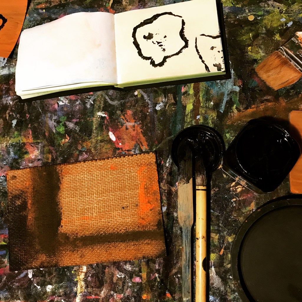
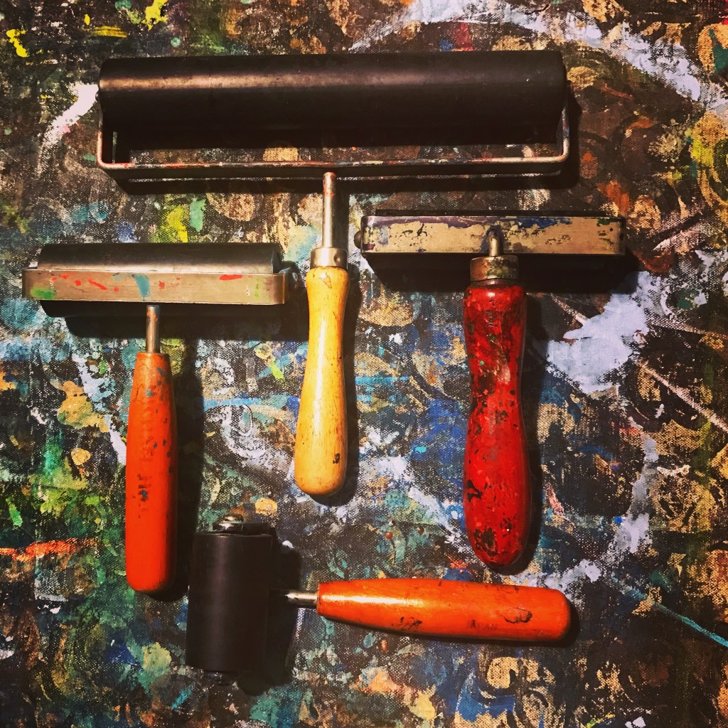
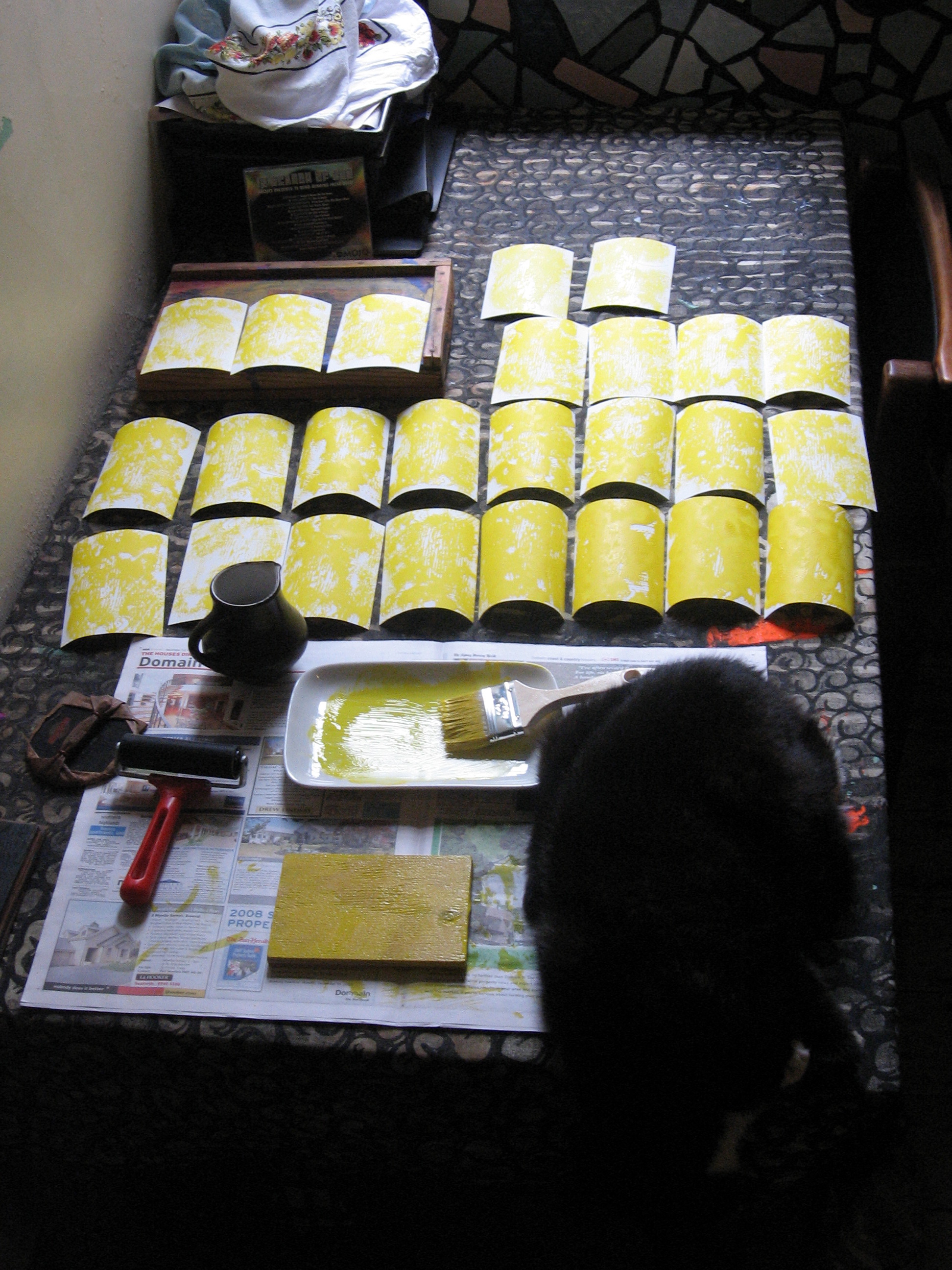
These graphic production stage series of posts were made over several years. They show selected, shots of the “making” stage and my methodology…whether for animation, comics, postcards, prints or paintings, in a small studio setting, with music playing in the background. I always work to music. Sometimes I include an image or thought about the music I was listening to in the studio that day. Some photos show the music equipment and/or the selected CD I was listening to at that session.
Welcome to another visit to my modest library collection of titles related to comics art…where I hone in on a small section of books on my shelves…select a book or two or three from that section…and take a closer look. As previously stated, the books are not shelved following standard library rules. They are stacked more by size than specific subject. They generally all have some connection with comics art…being either comics, collections of comics or histories and critiques of comics.
And a brief visit to the field of manga…from a British perspective this time…with a detailed publication…based on an exhibition of manga staged at the British Museum from 23 May to 26 August 2019…and I just happened to be in London that month. Oh joy! Cited as “the modern graphic art of storytelling” by the Museum’s Director Hartwig Fischer…in this exhibition catalogue of 350 pages where manga is both celebrated and studied.
The MANGA exhibition catalogue for the British Museum.
And to conclude this post there are two Ivan Brunetti books. Misery Loves Comedy: the dust jacket was missing from this book when I bought it…probably stolen according to the bookshop staff…but I bought it anyway. I wasn’t going to deprive myself of his brutal humour over a cover…and being a collection of his work it had three covers in it in any case!
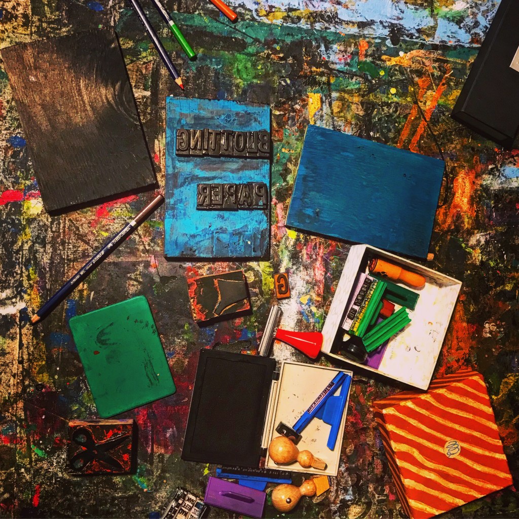
My RESEARCH posts form part of my graphic based material…that includes the fields of painting, printmaking and cartooning…including artwork for my comic and graphic novel BLOTTING PAPER: The Recollected Graphical Impressions of Doctor Comics…plus my scholarly research and study of the comics medium.
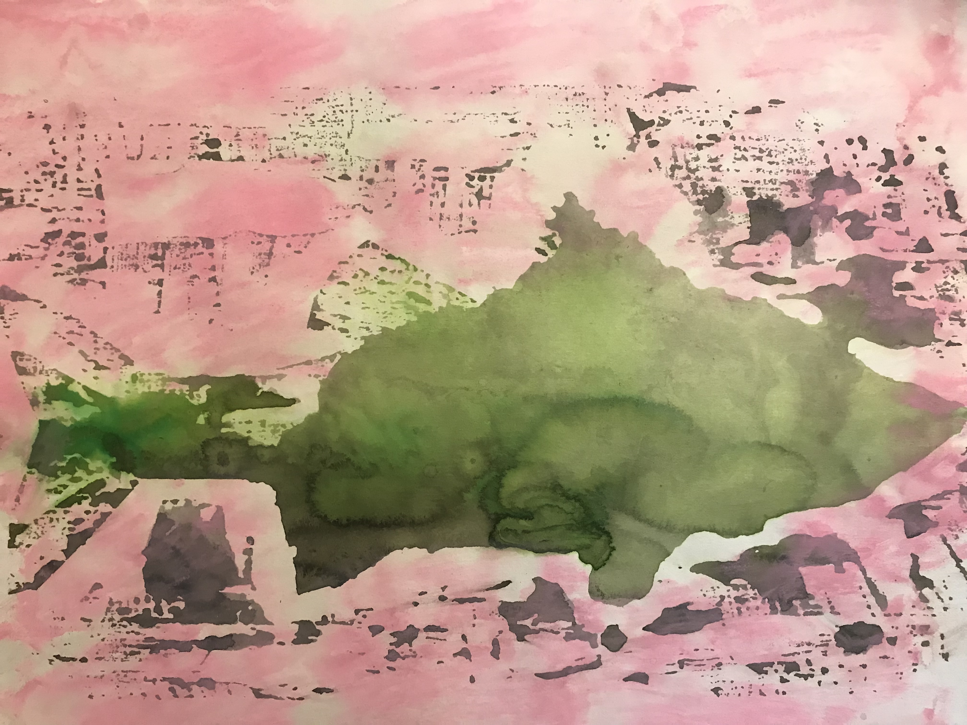
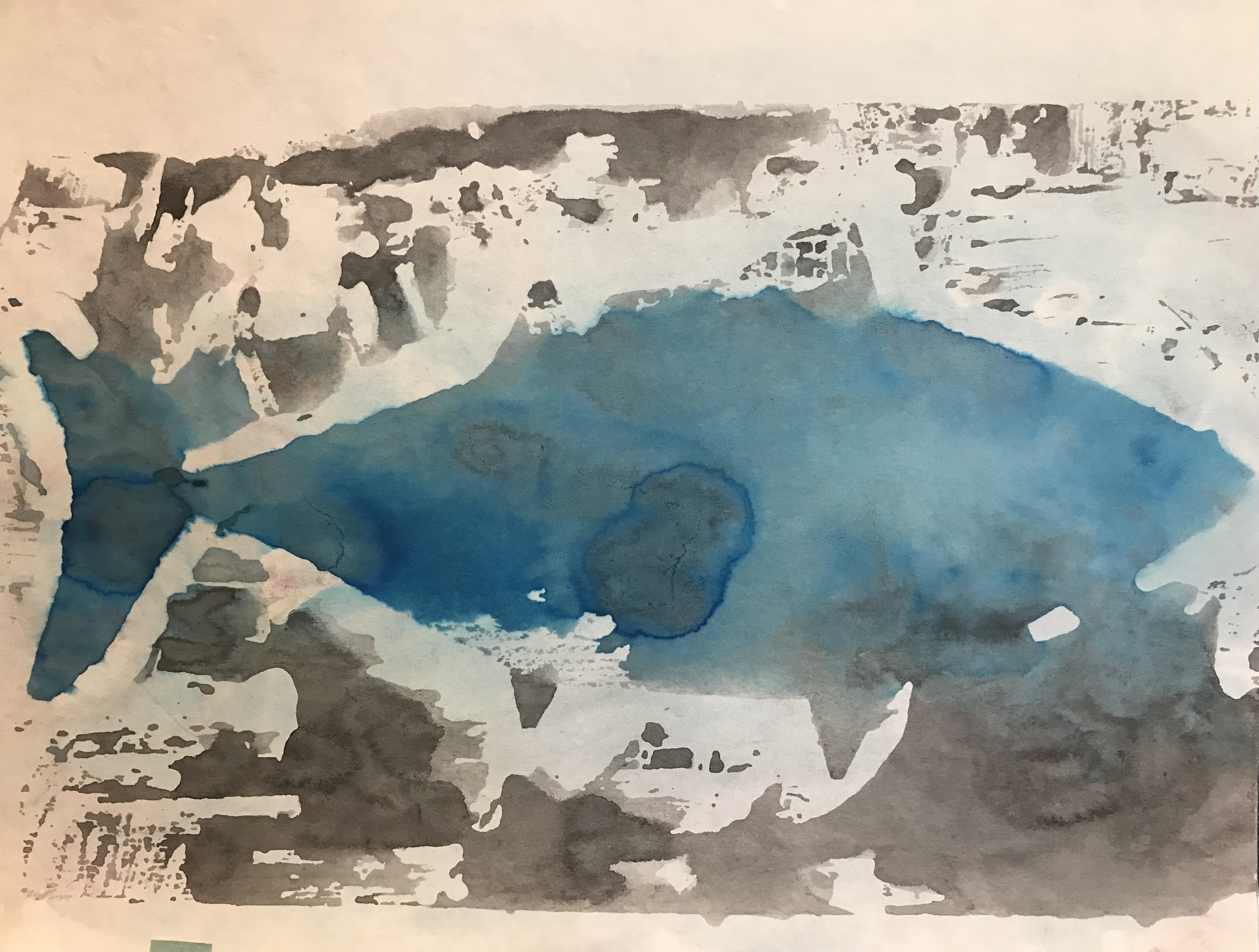
This is the fifth post documenting the production of the experimental prints that I made with woodblock printmaking techniques…for both gallery exhibition and also as frames in my experimental animated film Toxic Fish (see photos below).The fish in this sequence is the gizzard shad. It has static shape on the woodblock…this contrasts with the flooding of toxins from commercial pollution which are overlaid around it which eventually poison the fish. Variations in the volume of ink and the choice of hue produced a range of similar but different outcomes. When edited in sequence these contributed to the creation of the illusion of movement. The film was screened at CINANIMA, the Animation Festival in Esphino, Portugal…and at the Art Gallery of NSW in Sydney…and also at the Big Day Out rock festival. also in Sydney. (See certificate and photo on previous post: PRINTMAKING: Fish Four).
These and other examples of the art from the animation have been posted on the Doctor Comics website (doctorcomics.com) under the post heading PRINTMAKING: Fish 1, 2, 3 etc.
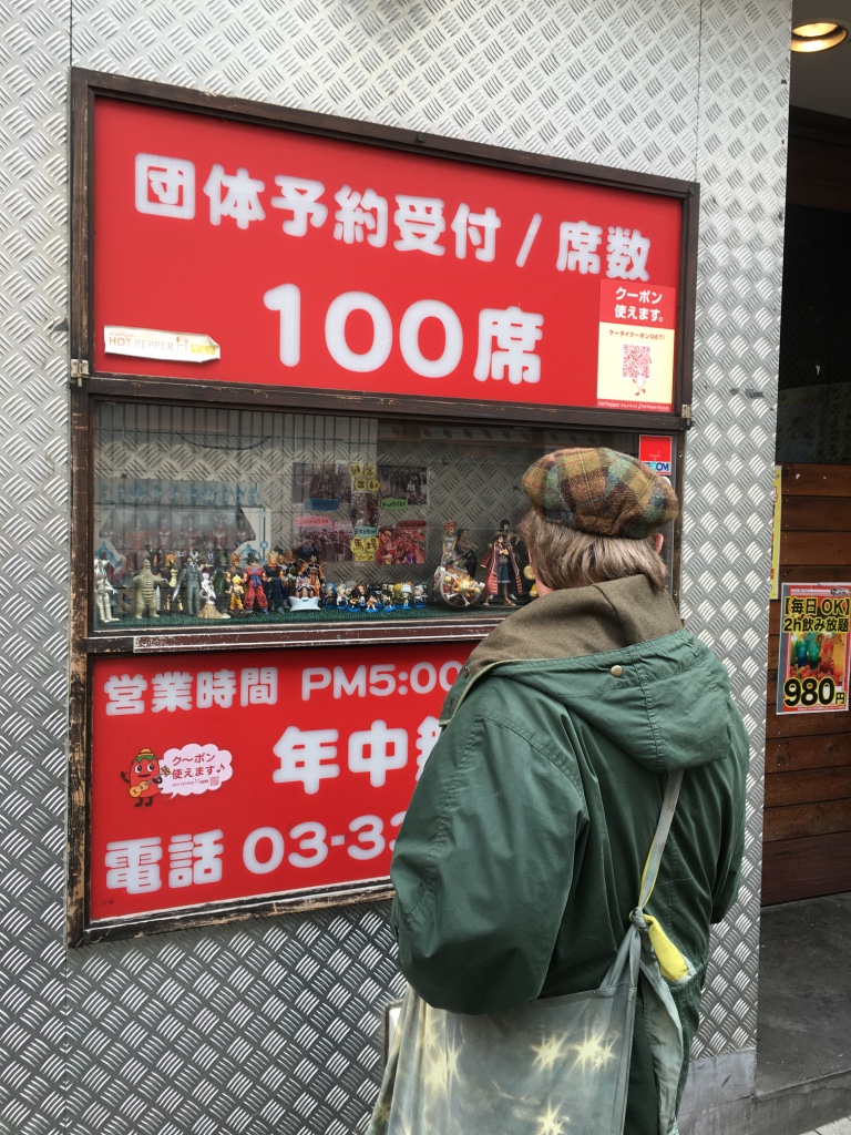
This post features one of my many visits to Japan to study and research anime, manga, comics and cartoons…not to mention fashion and food!
Doctor Comics in Japan, outside of Takadanobaba Station…under the railway tracks (see steel girder supporting a section of the tracks above the mural at top of photo). Here, near his former Tokyo Studio, is a memorial mural to the anime and manga artist, Osamu Tezuka, October 2016. (Photo by Louise Graber)
The ON MY TRAVELS… posts form part of my graphic based material. This includes painting, printmaking, cartooning and scrapbooking plus the odd bit of animation.
Here is another post profiling the design and production of my art postcards. I have been designing and printing these for a few years now…see links to some previous POSTCARD posts below. On this occasion I am looking back at assorted batches. These have been made back since commencement of design and production in 2006…some subsequent batches from the following years are included.
These production posts document the “making” stage, whether animation, comics, postcards, prints or paintings, in a small studio. I always work to music and some photos in my blog posts show the equipment and the CD…not these, unfortunately.
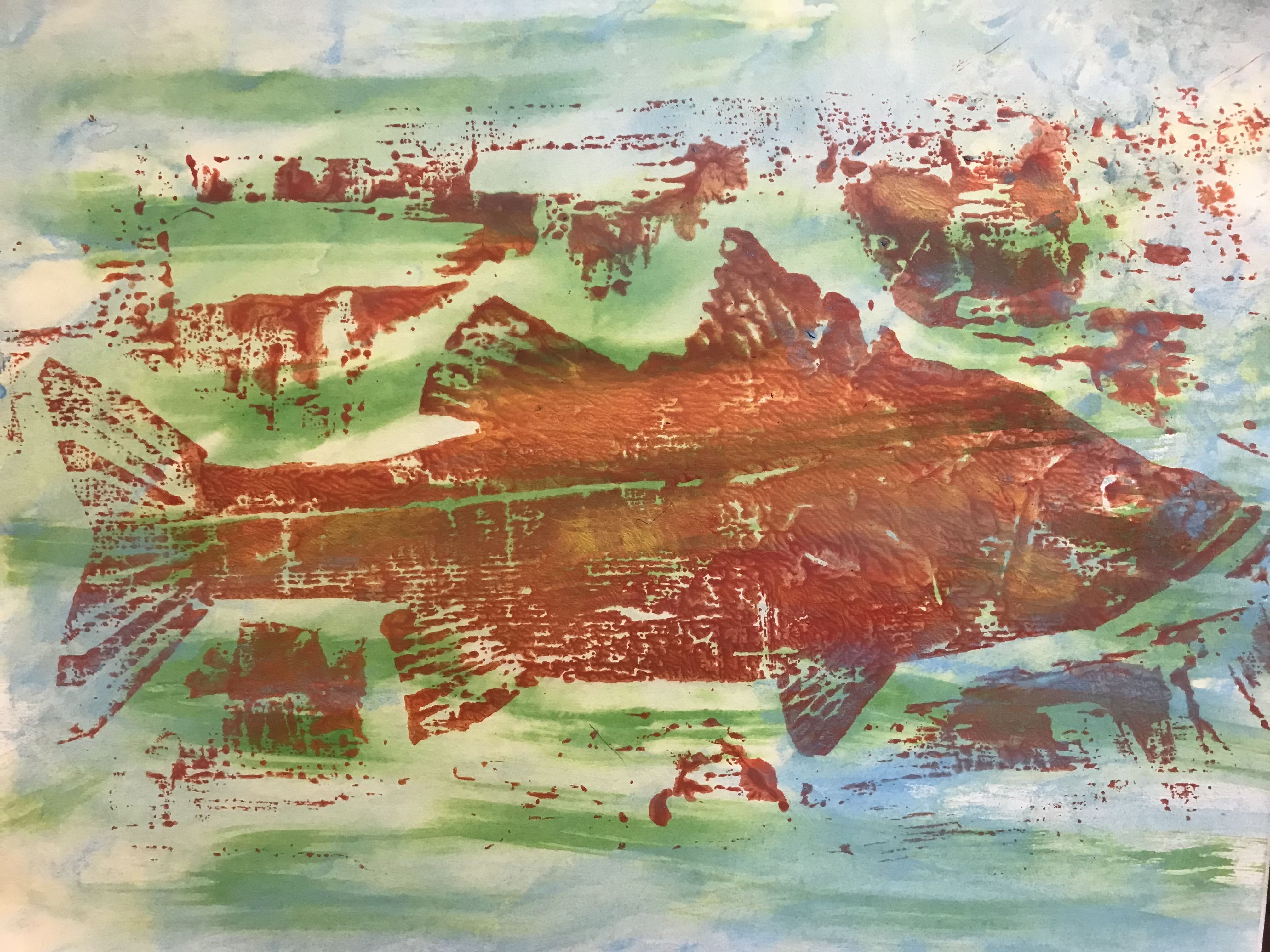
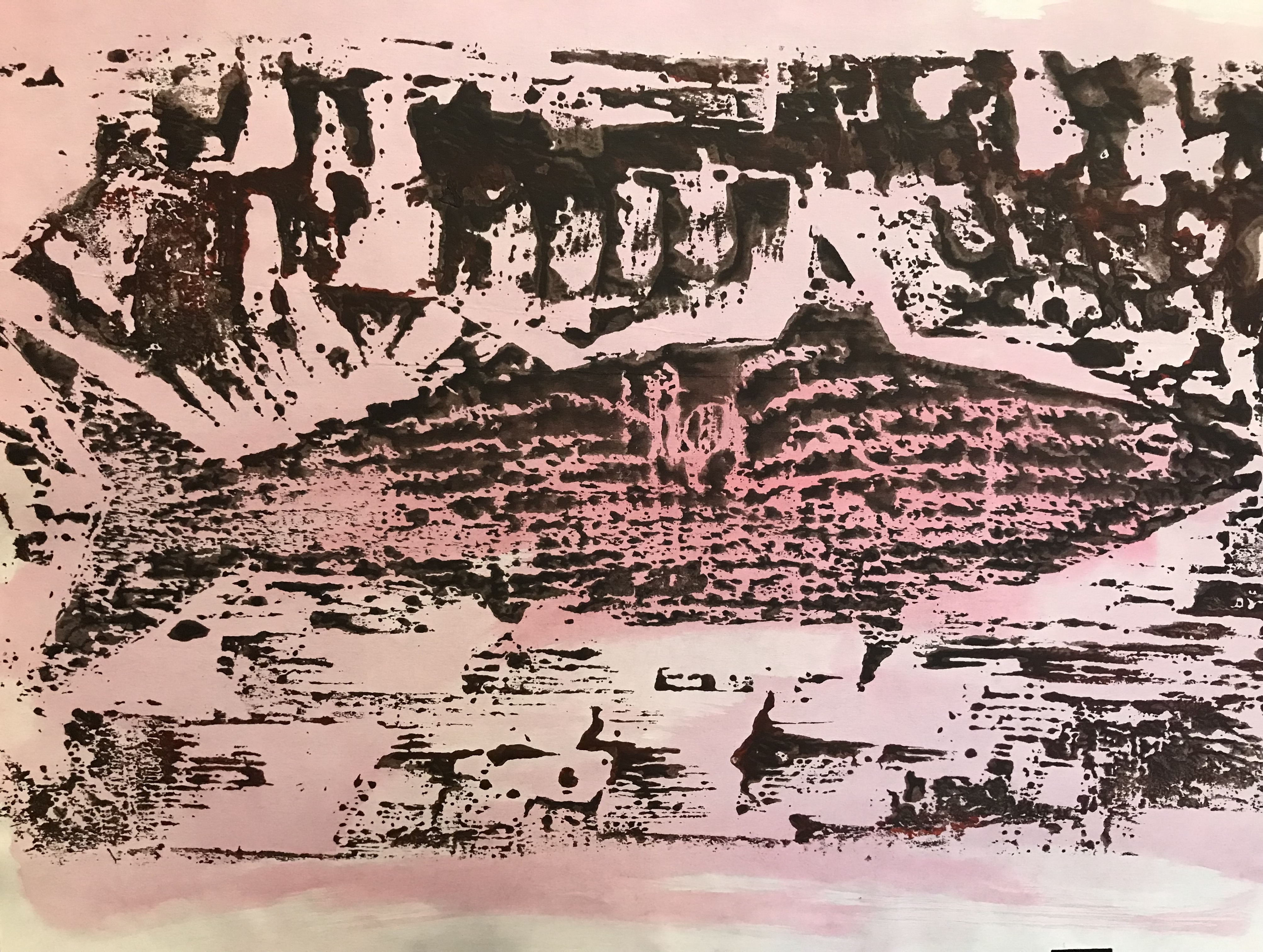
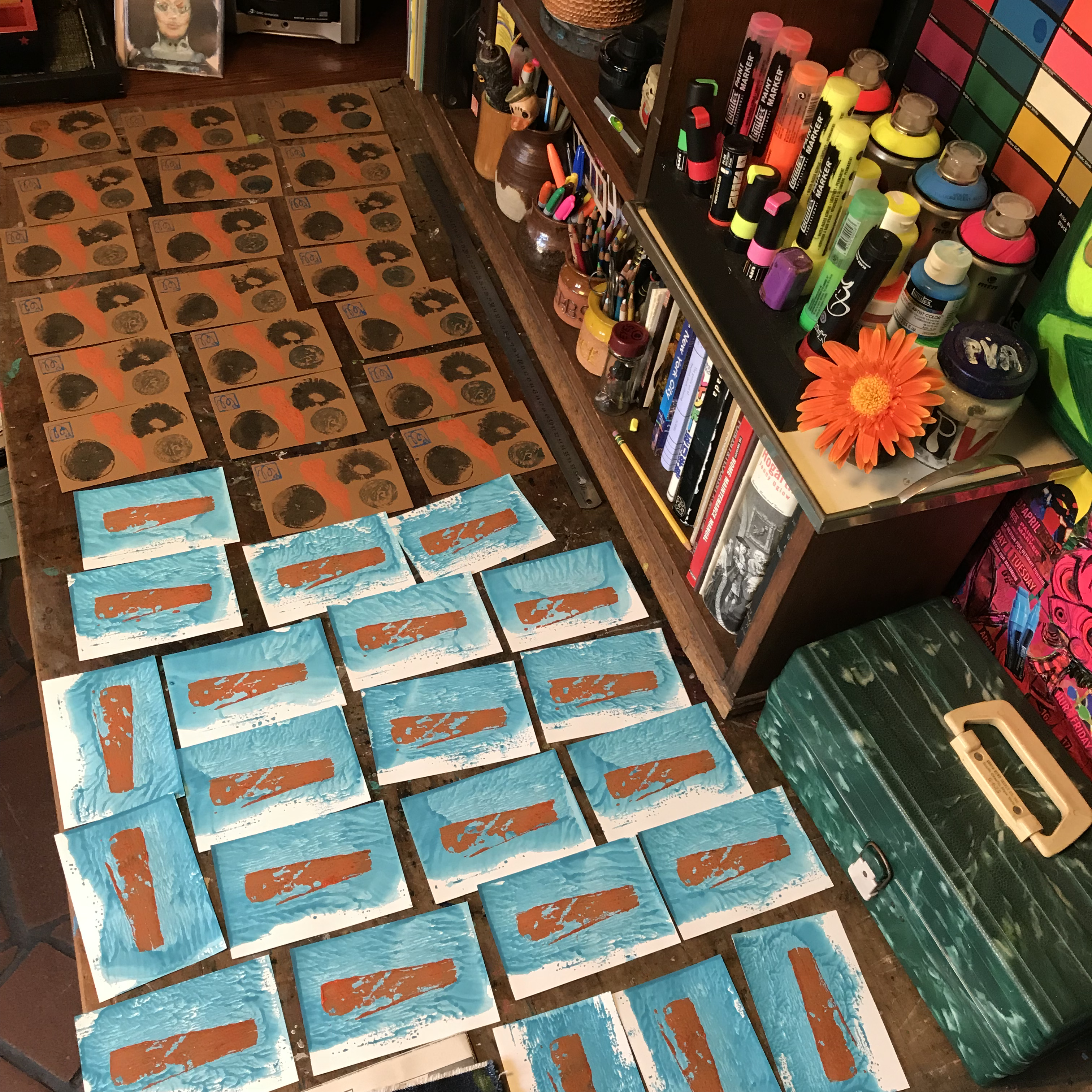
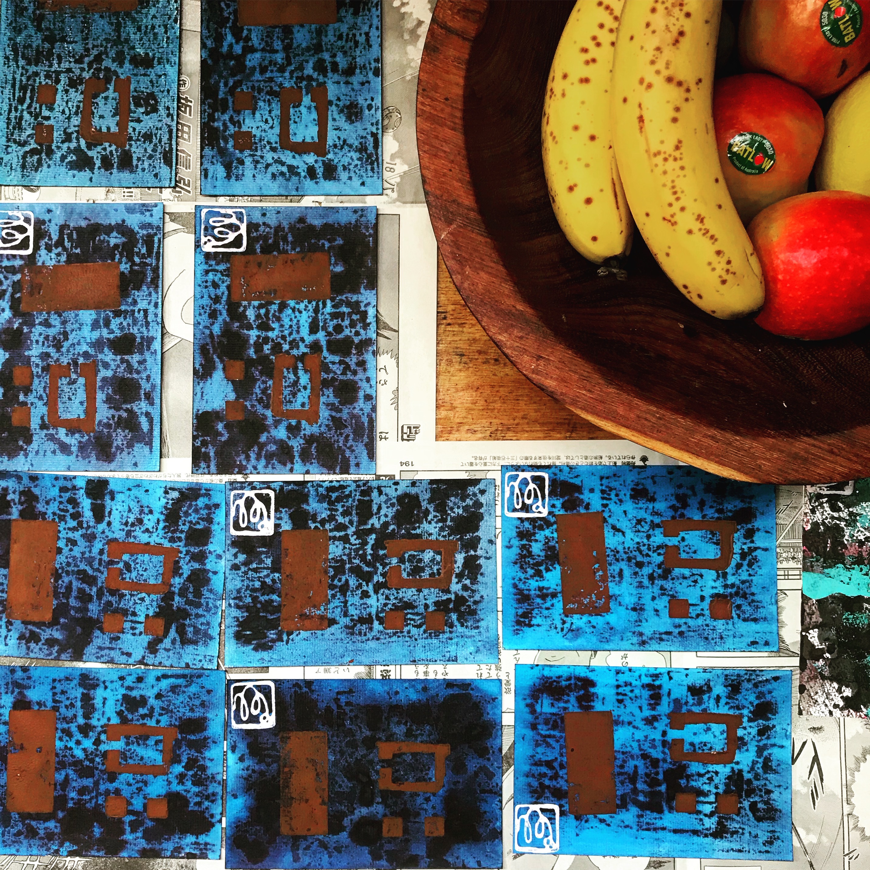
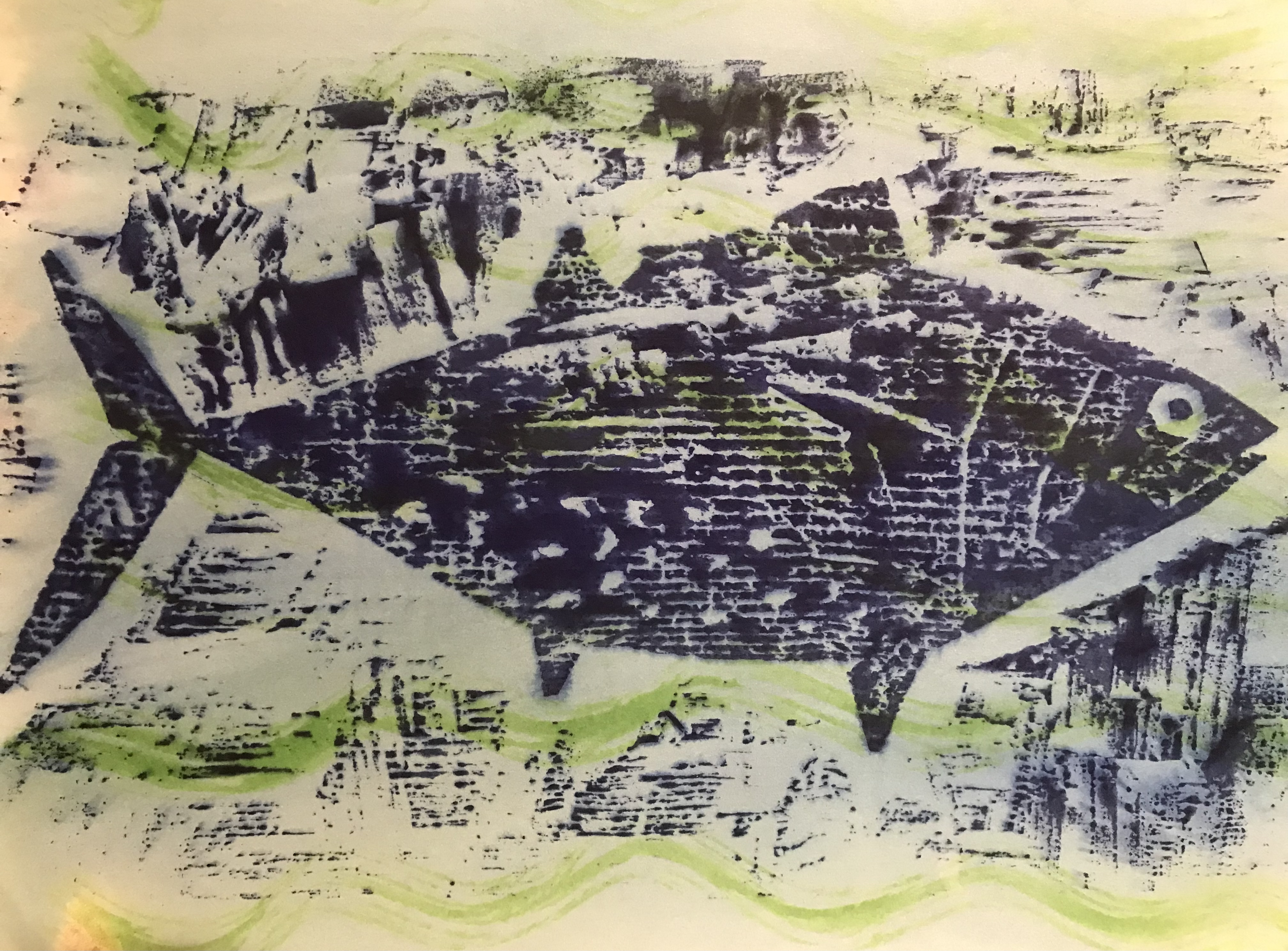
This is the fourth post documenting the production of my creative fish prints. I made these using woodblock printmaking techniques for use use in my experimental animated film Toxic Fish (see photos below).The fish represented in this sequence is the Kohada. Its static shape on the woodblock contrasts with the flooding of coloured toxins. These represent commercial pollution that is spread around the fish and eventually poisons it. There are variations in the volume of ink applied to the block and the choice of hue. These produced a range of similar outcomes when edited in sequence. This contributed to the creation of the illusion of movement. Film screenings: Animation Festival, Esphino, Portugal (see certificate at bottom of post),…Art Gallery of NSW and the Big Day Out rock festival.