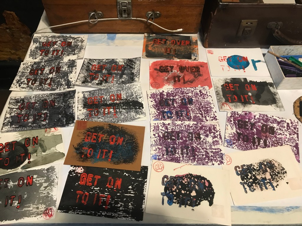
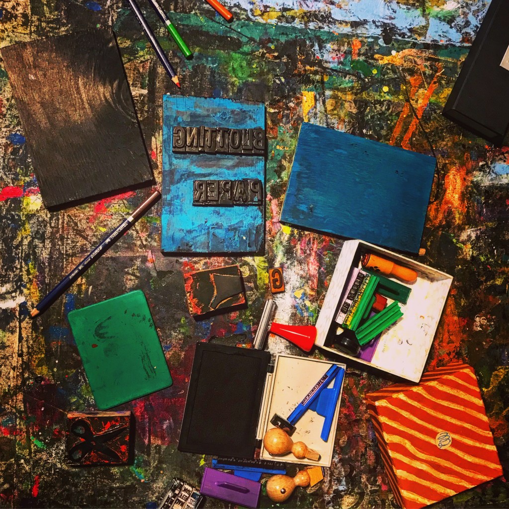
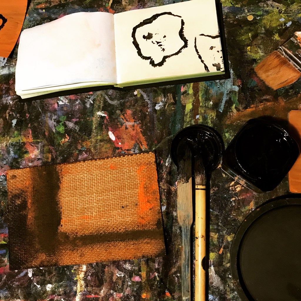
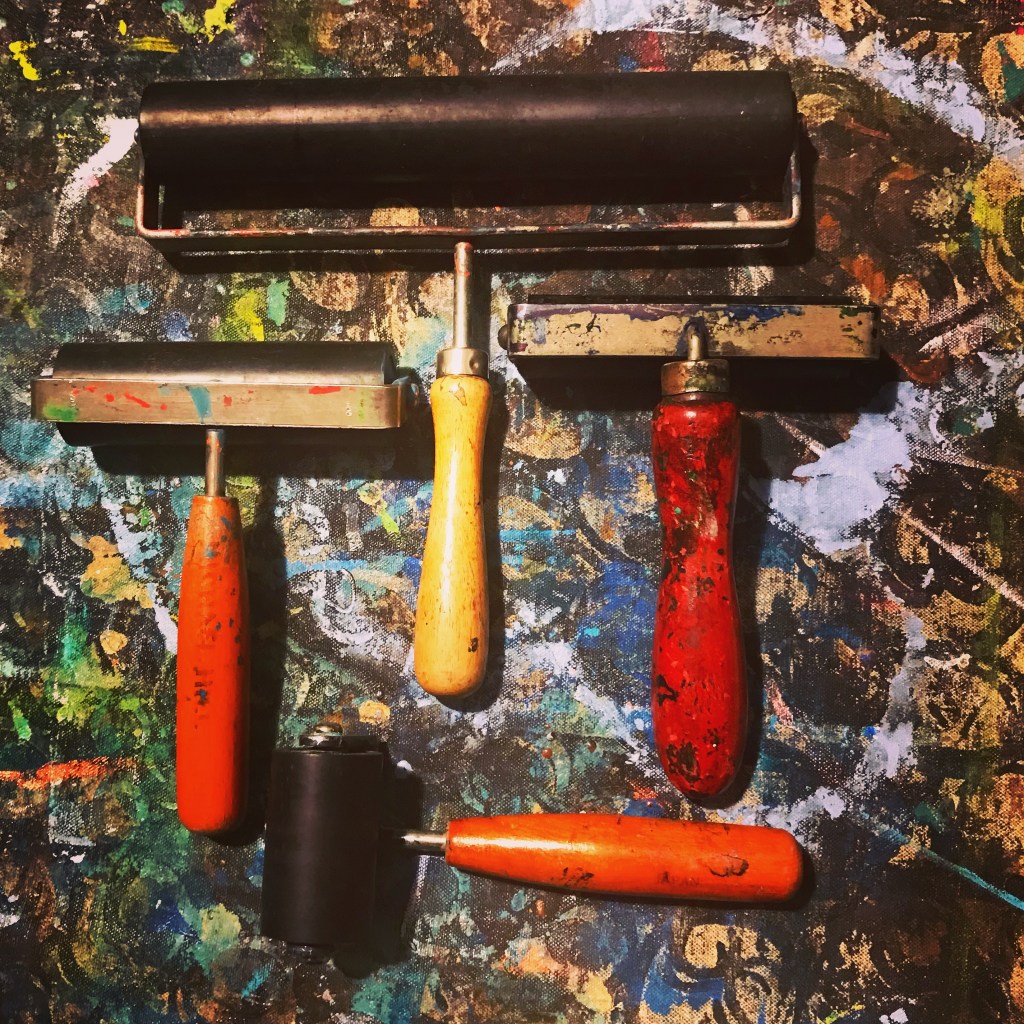
This post profiles recent experiments in my creation and design of some ideas for art postcards whilst working in my studio and employing drawing, painting and printmaking techniques with experimental and uncertain outcomes. I love working in the studio and particularly in the post card production process, especially as it involves printmaking. I do small runs of prints, usually less than 50, although each card may go through the run multiple times depending on the number of layers, as indicated in some of the photos below.
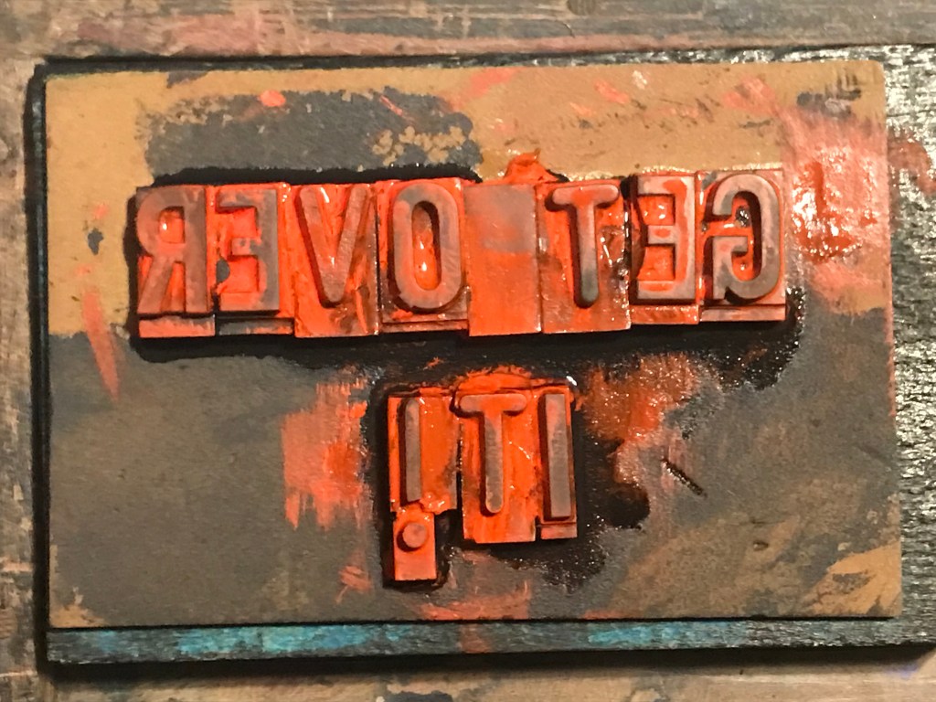
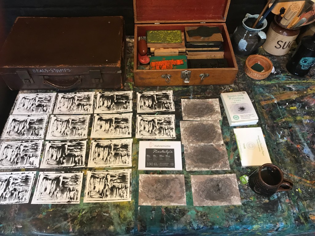
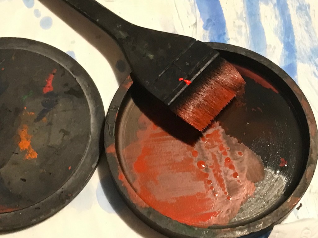
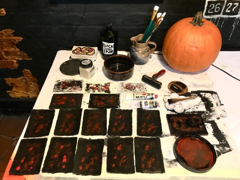
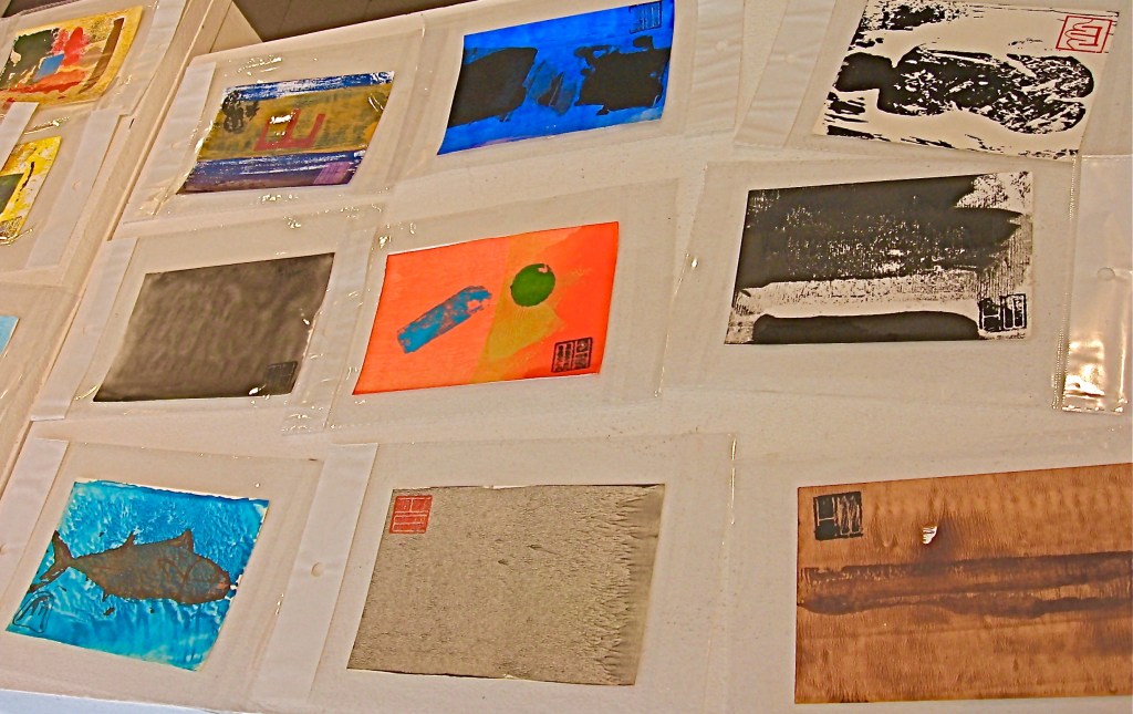
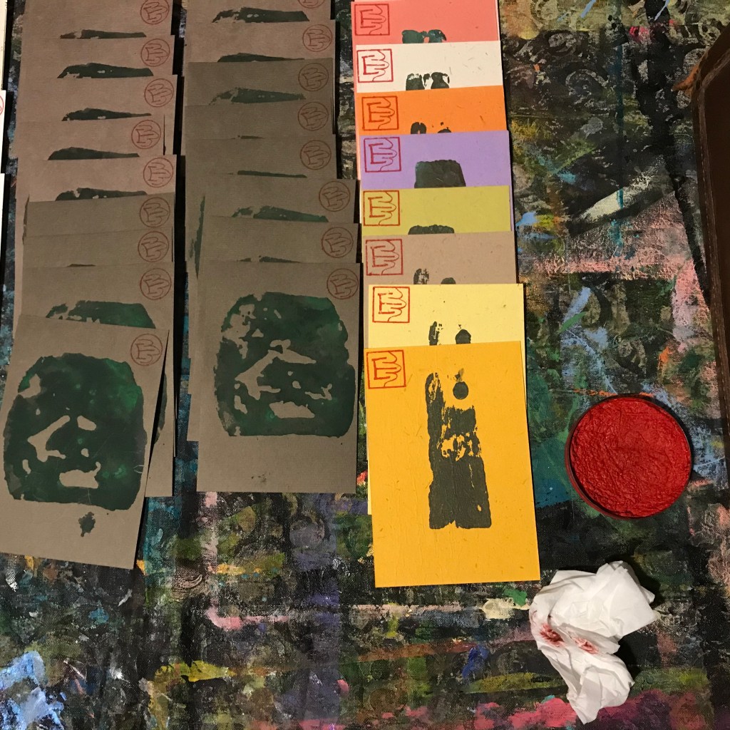
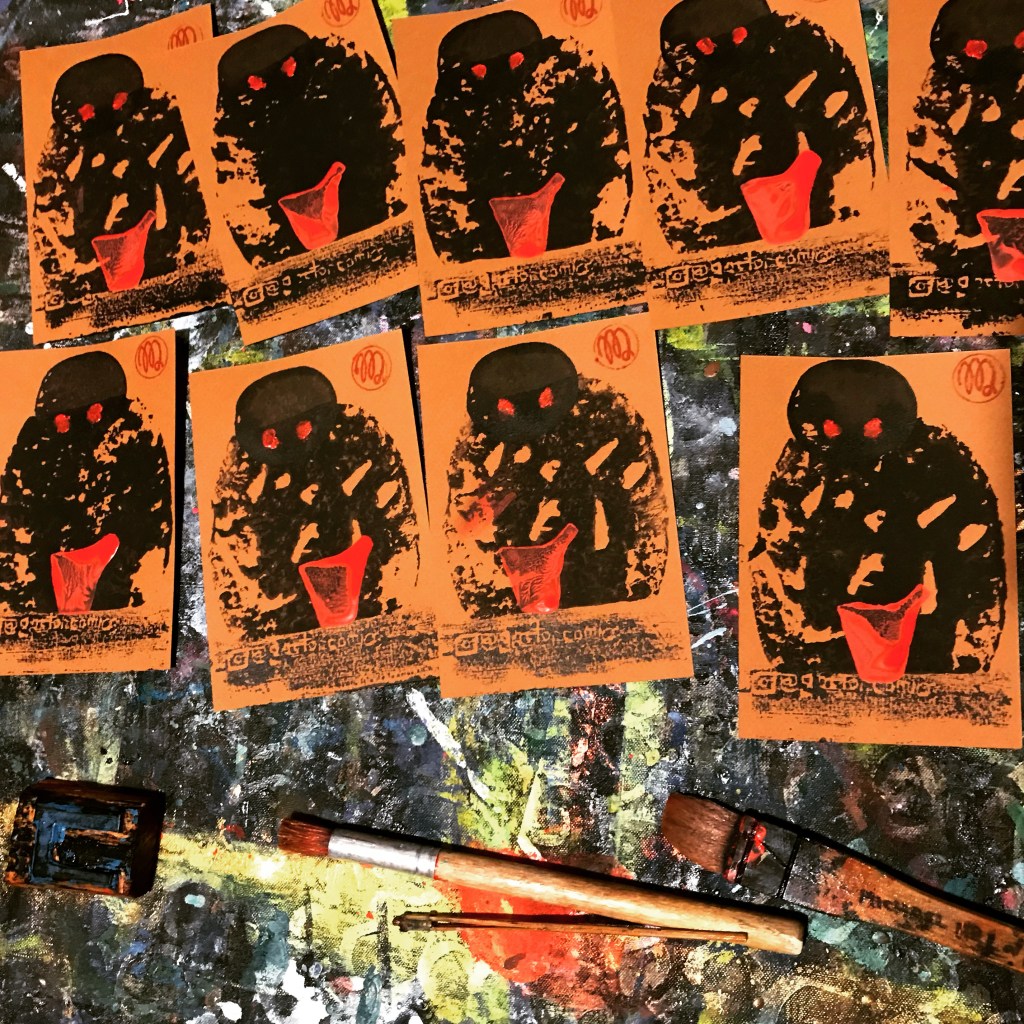
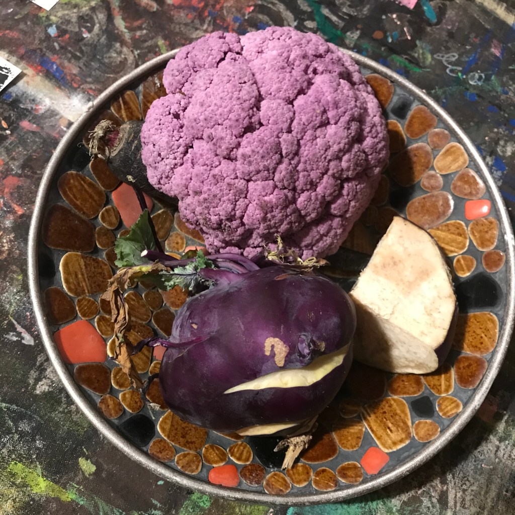
A rough sketch idea for the design of a postcard. This one remains at that draft stage.Type overlay for postcard that has already received a base layer(s). This one will be the top layer….perhaps?Two different designs with the one on the left having received its base layer whilst the one on the right has had two printed layers: base plus overcoat.Sumi ink dish being used as a paint pot with red ink and Hake brush.The black postcards in the foreground have had two print layers whilst the three cards alongside them have had three and the stack of post cards at the top left, having dried, have had four.The pumpkin just happened to visit the studio around Halloween time.A selection of different postcards most of which have had two runs through the printing process. Note also the addition of my artist stamp, at top left or bottom right, on some of the cards. As I have previously stated, making art postcards is one of my favourite artistic activities that I have been doing it for more than a decade. I also plan to do more posts on this topic.
(NOTE: Further additions and editing to this post are anticipated in the near future…including the completion of it!)
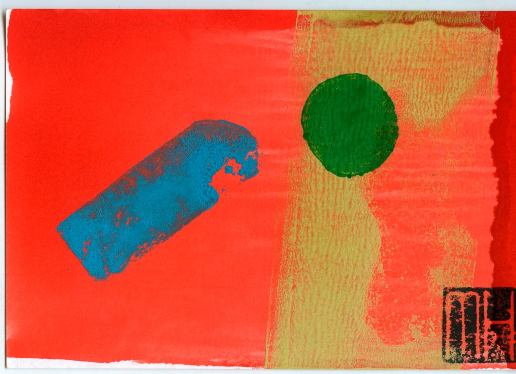
Continuing my POSTCARD ART blogs with another post profiling the design and production of my art postcards. I have been creating and printing these for more than a decade. This post looks back to cards I back when I started in 2006 and 2007. There are also cards from subsequent years. My art postcard project was inspired by a study trip to Japan. I looked at Modernist printmaking approaches that had taken place there. My cards were produced by hand in limited edition batches. Each card produced was unique…similar but not identical, part of a batch with an approximate match.
This is one of the earliest examples, from the series of Abstract Art Postcards made in 2007.
These graphic production stage series of posts were made over several years. They show selected, shots of the “making” stage and my methodology…whether for animation, comics, postcards, prints or paintings, in a small studio setting, with music playing in the background. I always work to music. Sometimes I include an image or thought about the music I was listening to in the studio that day. Some photos show the music equipment and/or the selected CD I was listening to at that session.
Although not initially included in my published posts I wish to add further details of my background story…how I arrived at my present moment celebrating and researching comics art…acquiring my DOCTOR COMICS moniker…detailing aspects of my teaching, research and passage from technical work into academia…and subsequent research, publishing and the writing and presenting of conference papers based on that research…as well as a series of supplementary creative projects.
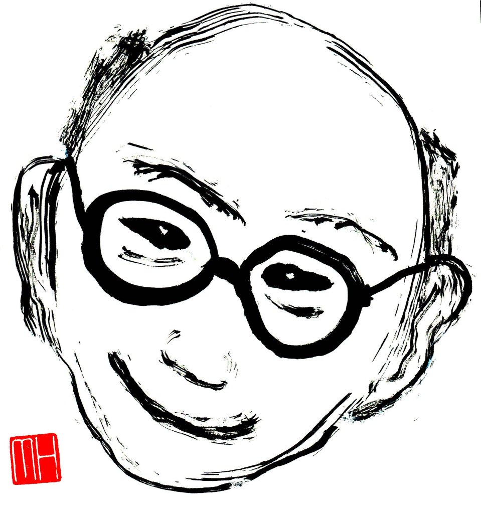
Doctor Michael Hill a.k.a. Doctor Comics (Photo by Alison Van Hees).
ACADEMIC QUALIFICATIONS
PROFILE: Subsequent to my artistic work in theatre and film, I have nearly 30 years tertiary experience in academia. This involved teaching, research, publication, course design, management and direction…plus consultation, working within the art and design and humanities disciplines…at both undergraduate and postgraduate levels and on both a local and international basis.
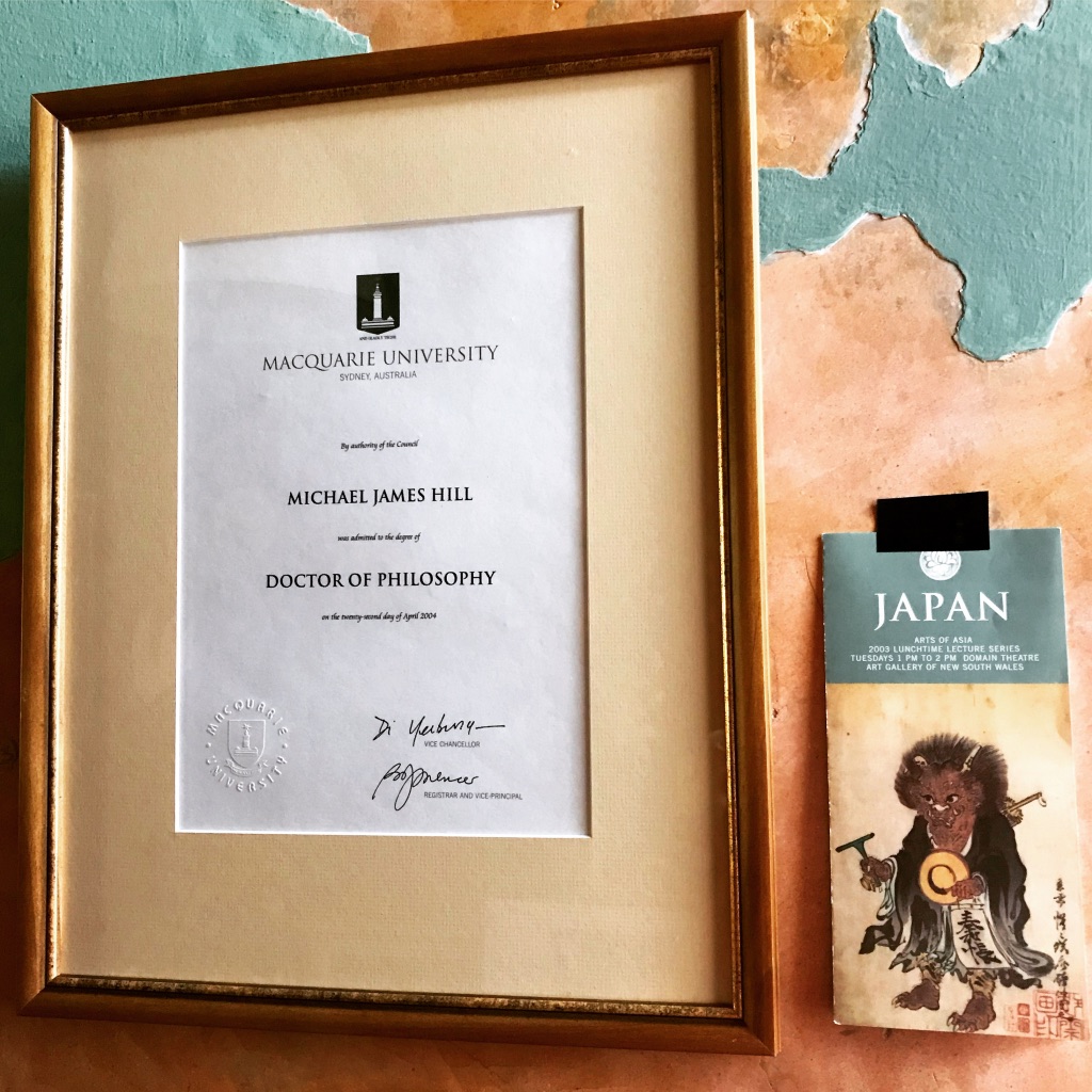
My Ph.D by virtue of the thesis:…A Study Of Contemporary Australian Alternative Comics 1992-2000 With Particular Reference To The Work Of Naylor, Smith, Danko And Ord…Division Of Society, Culture, Media And Philosophy, Macquarie University, 2003.
On completion of my Ph.D. at Macquarie University in Sydney I donated my collection of comics art research materials…including my collection of more than 500 comics…to the National Library of Australia, as the Michael Hill Collection of Australian Comics.
Master of Arts by virtue of the thesis…Slave To The Rhythm: Animation At The Service Of The Popular Music Industry…Faculty of Humanities And Social Sciences, University Of Technology, Sydney, 1995. Graduate Diploma in Media, Australian Film and Television School, 1986.
Certificate in Group Work, South Australian Institute of Technology.
ACADEMIC POSITIONS
Faculty of Design, Architecture and Building: University of Technology, Sydney…as Lecturer in Film and Video, Visual Communication Department, Faculty of Design
UNIVERSITY OF TECHNOLOGY, SYDNEY
Course Design and Management
Co-creator and first Director of the Master of Animation Course, spread across three Faculties of the university.
Director of Postgraduate Design
Director of Visual Communication Design Department
SYDNEY COLLEGE OF THE ARTS
Lecturer in Film and Video
Technical Officer in Art and Design
RESEARCH
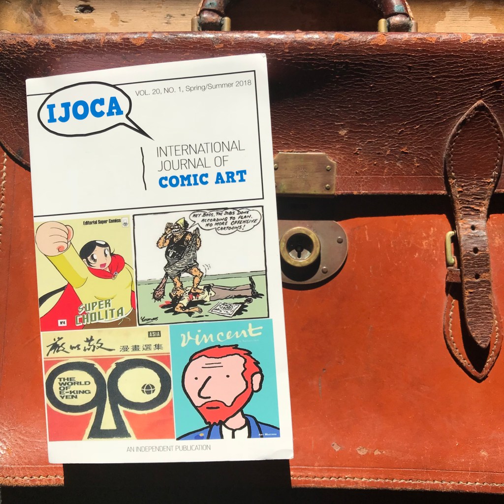
In the comics art area and previously in the fields of film, video and theatre. Australian representative on the International Editorial Board of the International Journal Of Comic Art, 2000 to present, 2025.
An issue of the International Journal Of Comic Art…I always carry the current issue in my brief case.
PUBLICATIONS
List of published articles on comics art. (NOTE: Work in progress: details to be added.)
PRESENTATIONS
Lectures, Tutorials and Panel Participation-multiple, local and international. (NOTE: Work in progress: details to be added.)
EXHIBITIONS
Participating in Group show on comics theme at KNOT GALLERY, Sydney.
(NOTE: Work in progress: details to be added.)
AWARDS
(NOTE: Work in progress: details to be added.)
CREATIVE WORKS
My design work, an animation storyboard, was selected for and exhibited at the International Design Exhibition in Osaka ’87.Professional involvement in Fashion Industry in the role of fashion video director…this was one of many I made for the fashion designer Katie Pye and others.A conceptual illustration of mine for the academic design journal FORM/WORK.
(NOTE: Work in progress: further details may be added.)
My cover illustration on design theory for an issue of the academic journal FORM/WORK.Poster for launch of first issue of my comic BLOTTING PAPER: The Recollected Graphical Impressions Of Doctor Comics… and exhibition of creative prints at Hondarake Bookshop in Sydney.My exhibition was launched by Gene Kannenberg, Jr. on a live cross from New York.
(NOTE: Work in progress: further details may be added.)
The bookshop launch took place under a canopy of torn wood-block prints…that I had made for my experimental animation Toxic Fish that was screened at the Art Gallery of NSW.
(NOTE: Work in progress: further details may be added.)
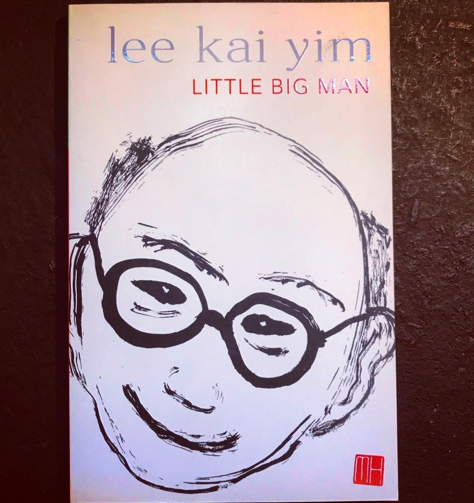
My calligraphic brush painting portrait of Professor Stephen Lee for the cover of his biography.My illustration on the cover of the book.
(NOTE: Work in progress: further details may be added.)
FILM
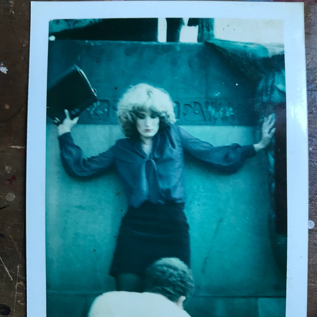
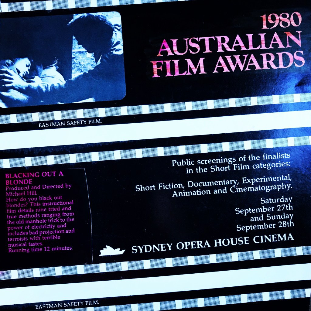
I have made a few independent art films…this is one of them, BLACKING OUT A BLONDE…screened at the Sydney Film Festival and the 1980 Australian Film Awards…that’s Jane Campion playing one of the many blondes in my film. She’s not too happy about the guy trying to kiss her on the knee…so she is going to whack him on the head with her bag!My film BLACKING OUT A BLONDE was screened at the Sydney Opera House..in competition for the 1980 Australian Film Awards!
(NOTE: Work in progress: further details may be added.)
IN THE STUDIO
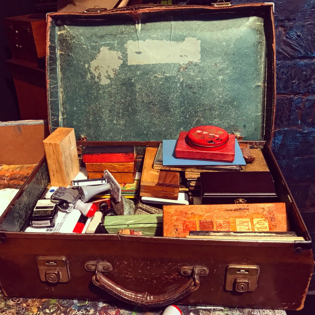
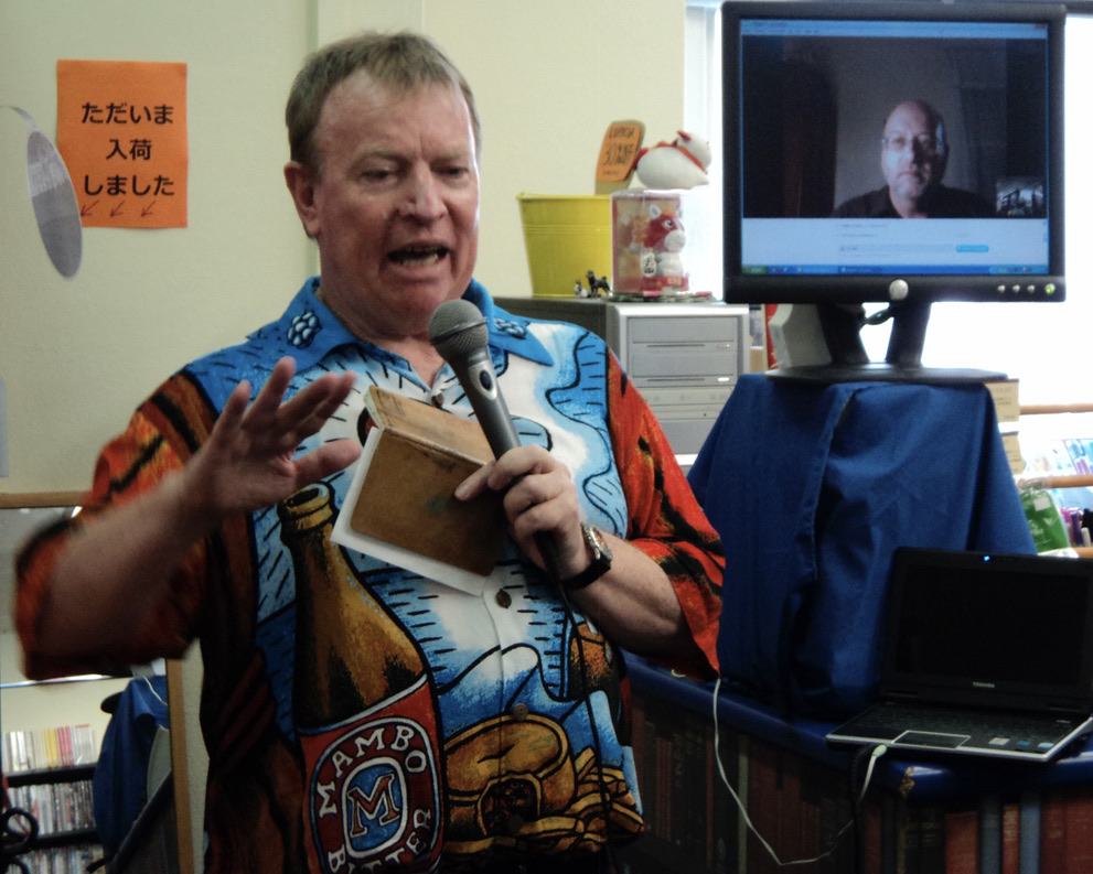
A postcard printmaking session in the small studio…
(NOTE: This is a work in progress: further images and details to be added.)
THEATRE
That’s me front and centre, kneeling and bowing to Romulus in a Sheridan Theatre production directed by Colin Ballantyne.
Initially, back in the day, I thought I was headed for a career in theatre. I enrolled in some drama classes in Adelaide at the Sheridan Theatre…but quickly realised that I would rather work in production than in acting and performance. Anyway those acting classes led to a walk-on part in the play ROMULUS THE GREAT…by Swiss playwright Friedrich Durrenmatt…(that is me down on my knee in the photo above…there is an umlaut in his name but I can’t quite work out how to insert it)…that was staged as part of the 1968? Adelaide Festival of Arts. After that I concentrated on writing and direction…directing and co-writing the play ENTH with Des Rutherford and subsequently both writing and directing the play BECOMING. These two productions received good reviews…that got me into NIDA, the National Institute of Dramatic Art, in the Production Course in Sydney. This led to jobs in professional theatre in Sydney. Then I headed off to London, as you do, thinking I would work in theatre in London…but at the time of my arrival there were around 12,000 stage workers unemployed…so I ended up seeking temporary work through a an employment agency…and ended up on an assembly line at the GEC factory in Wembley. This helped me pay my rent…anyway by the end of the week I was promoted to the head of the row…noting and filling in gaps in the assembly caused by lax workers…who were slow to respond to the passing unit on the conveyor belt or who has simply fallen asleep. Talking about sleep I had set my alarm for 4.30 a.m. to get from South Kensington to Wembley for the 6.00 a.m. start. Little did I know that within a month I would be working at Harrods selling refrigerators…and the walk from my home base in South Kensington to Harrods only took around 20 minutes! And I met a few famous actors who wanted to buy a fridge. Then I was transferred to the Toy Department for the busy Summer Sales season where I was much happier. And I met a few more famous actors who wanted to buy toys for boys and girls. But I didn’t stay there long. I had registered with an employment agency for temporary work. First stop was a betting shop where I was board boy…writing up the names of the horses for each race…and then the results and winning dividends. I was up and down all afternoon taking advantage of the white board with my felt tipped pen…doing the odd little doodle and drawing of cartoon horses with whipping jockeys. It was fun…but didn’t pay so well…not nearly as much as what settlers got…the ones who worked out payments for winning bets…this was way before computers. It turned out…that as I had the mathematical skills…I was able to change my job in the betting shop to that of a settler. Better pay! Hooray!
(NOTE: Work in progress: further details to be added.)
(APOLOGIES: The addition of further details to this and some other of my posts is on my TO DO list. I am slowly making progress with this and I thank you for your patience! Michael)