Continuing my blogging with another post profiling the design and production of my art postcards. This time I am showing the process stage…rather than the finished outcome that has been shown in preceding POSTCARD posts. Generally the postcards are given multiple layers of graphic treatment,…whether through painting or printmaking or a combination of the two. In this post I have displayed two examples of the first stage of printmaking,…and two with a second layer, from a series of cards of different editions over the years. These images have been taken from the design and printing of the base layer or layers of the image…prior to adding overlays, colour, embellishment and logos. The photos show the first, or first two layers of a printmaking run…establishing the base layer, or two base layers (one base layer plus one overlay). Within a print run the initial layer will be the first of more layers…perhaps two, three, four or more, that will follow.

Perhaps the most interesting aspect at this stage of the printmaking to discern…is the noting of differences in the design of the cards of the same edition. Although the completed print run of cards will carry the same title…no two cards will be exactly alike due to variations in the printed layers. This makes me a renegade printmaker. In my work there are no exact duplicates…and in that sense, all of the cards may technically referred to as monoprints i.e. not identical despite the whole batch carrying the same title. At the end of the print run following the addition of more layers…this difference will remain discernible, possibly even more so. All of the finished cards despite minor differences from each other, will share the same nomenclature and date of production.
(Art and Photo-©2018 Dr. Michael Hill a.k.a. Doctor Comics)

Here is another set of postcards following the design and printing of the base layer. The variation and difference in appearance of these cards, from the same batch and print run, is already discernible.
(Art and Photo-©2018 Dr. Michael Hill a.k.a. Doctor Comics)

This batch has had two passes across the print table…the base layer followed by a second coating or overlay…as can be seen in the photograph. The two layers of ink that can be perceived are a base layer in blue-black…and a second that has been overlaid with a bluish-purple tint. The ink-stained wooden block used for printing the layers is located at the bottom right of the photograph. In the printmaking process the block is inked and the blank cards laid face down on it…then pressed into/against the ink, then left, wet side up, to dry.
(Art and Photo-©2017 Dr. Michael Hill a.k.a. Doctor Comics)
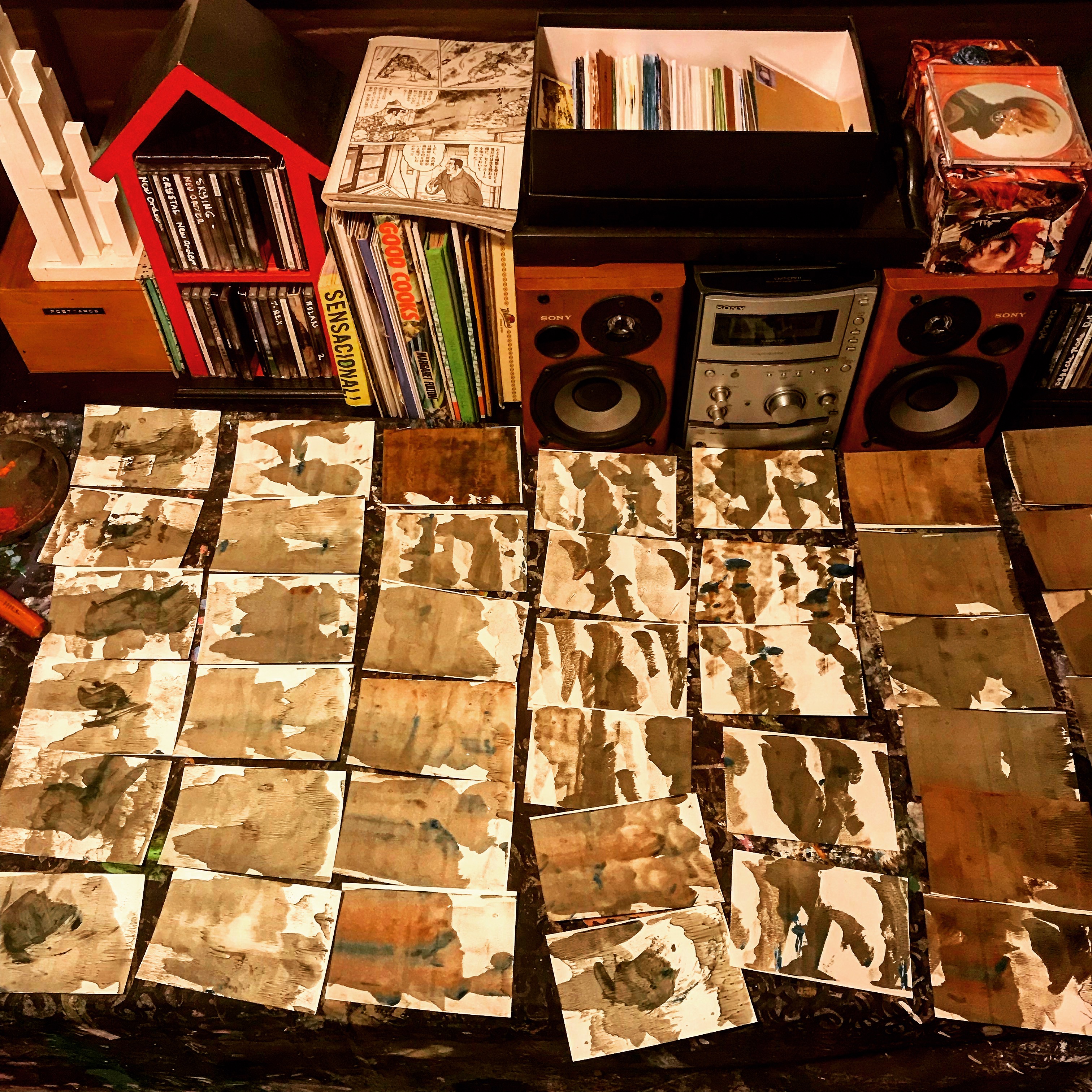
This batch displays a range in base layer design, almost as if it has been altered during the run. This can happen but in this case…there are three distinct base designs in play using a similar tone and hue of ink. That has resulted in three separate series of postcards. Note the musical accompaniment to the printmaking process, David Bowie’s LOW on this occasion. I like to stand right up close to the speakers. I find listening to music whilst working is both calming and inspiring.
(Art and Photo-©2016 Dr. Michael Hill a.k.a. Doctor Comics)

Finally, here is a set of printed postcards with a lot of variation in the base layer of the cards…both in terms of pattern shape and intensity. Despite their differences the cards in this set will be regarded as “a series”…and carry the same batch title.
(Art and Photo-©2015 Dr. Michael Hill a.k.a. Doctor Comics)
NOTE: These photos were taken over a period of several years…and document the establishment of a work methodology that I follow in my practice…with one or two subsequent improvements. I thought it would be interesting to show how my procedure developed. I am considering doing further posts on other aspects of the design, production and printing my art postcards.
(All text, photos and artwork-©2018 Dr. Michael Hill a.k.a. Doctor Comics).
