Tag: visual communication

BLOTTING PAPER The Comic: Production Report No.19

Art, Blotting Paper, Comics, Germania July 2, 2014

Job done! Production of the third issue of my artist book/comic Blotting Paper: The Recollected Graphical Impressions Of Doctor Comics was completed and the book launched in June at Comic-Salon Erlangen in Germany to which I had been invited by German design colleagues, Professors Markus Fischmann and Michael Mahlstedt of Visuelle Kommunikation, Design und Medien Department of Hochschule Hannover University of Applied Arts and Sciences where I did a visiting academic gig back in 2007. Comic-Salon is the largest comics convention in Germany with 25,000+ attendees. Oh joy!

COMIC SALON, Erlangen. (Photo-© 2014 Michael Hill).

16th INTERNATIONAL COMIC-SALON, Erlangen, Germany. (Photo-©2014  Dr. Michael Hill).

On the trading floor at COMIC SALON (Photo-© 2014 Michael Hill).

On the trading floor at COMIC-SALON (Photo-©2014  Dr. Michael Hill).

Launching Blotting Paper #3 at COMIC SALON. (Photo-© 2014 Hoschule Staff).

Launching Blotting Paper #3 at COMIC-SALON (L to R: Louise Graber, Prof. Michael Mahlstedt, Dr. Michael Hill, Prof. Markus Fischmann, Krisi). (Photo-©2014 Hoschule Faculty staff).

On display at COMIC SALON (Photo-© 2014 Michael Hill).

Pages on display at COMIC-SALON (Photo-©2014  Dr. Michael Hill).

For Sale at €15 per copy (Photo-© 2014 Michael Hill).

All 3 issues of the comic for sale at €15 per copy (Photo-© 2014  Dr. Michael Hill).

On the trading floor at COMIC SALON (Photo-© 2014 Michael Hill).

On the trading floor at COMIC-SALON (Photo-©2014  Dr. Michael Hill).

Donald Duck comics appeared to be very popular at COMIC SALON (Photo-© 2014 Michael Hill).

Donald Duck comics appeared to be very popular at COMIC SALON (Photo-©2014  Dr. Michael Hill).

Cosplay at COMIC SALON (Photo-© 2014 Michael Hill).

Cosplay at COMIC-SALON (Photo-©2014  Dr. Michael Hill).

BLOTTING PAPER The Comic: Production Report No.17

Art, Blotting Paper, Comics March 29, 2014

This is the first in a series of regular reports documenting the production of the third issue of my artist book/comic Blotting Paper: The Recollected Graphical Impressions Of Doctor Comics. It continues on from my previous posts on the first chapter/issue The Ingurgitator and the second chapter/issue A Blot On His Escutcheon. The new chapter, The Chthonian Turn: The Cats’ Revenge, deals with the cats’ reaction to the demise of Doctor Comics and that gentleman’s adventures in another dimension to which he has travelled. I hope to self-publish it before the end of the year.

Title page for Chapter 3 The Chthonian Turn–© 2013 Michael Hill

Title page for Chapter 3–© 2013 Michael Hill

As with the two previous issues printmaking is involved in the generation of images via woodblock, linocut, Japanese sosaku hanga technique, rubber stamps and wooden seals.  In addition other visual communication techniques such as drawing, painting, collage, cartooning and photography with the intention of producing a limited edition artist’s book kind of comic.

One of the spirits in the underground sky–© 2013 Michael Hill

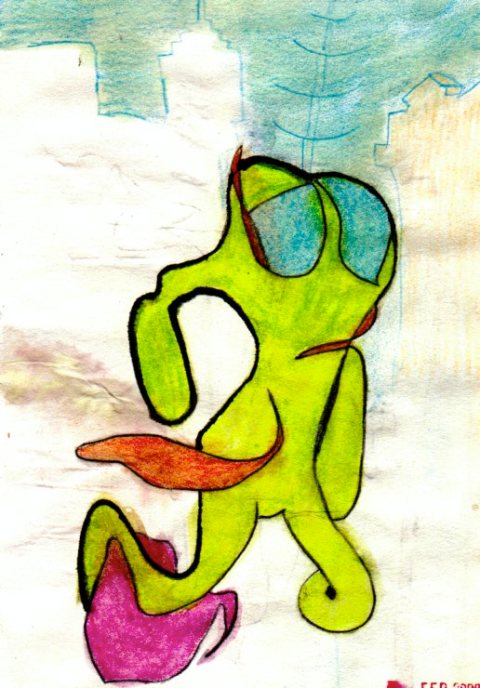
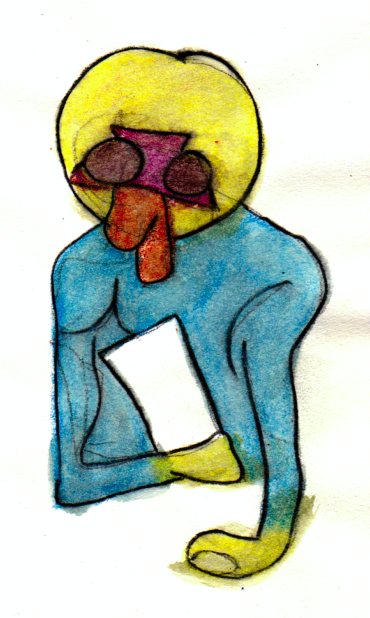
Design of one of the spirits in the underground sky–© 2013 Michael Hill

I also intend producing more colour pages in this issue following the use of sporadic spot colour in Issue #1 and the 8 full colour pages in Issue #2. The colour will assist in the graphic representation of both the real and imaginary worlds featured in the comic.

Another of the spirits in the underground sky–© 2013 Michael Hill

Design of another of the spirits–© 2013 Michael Hill

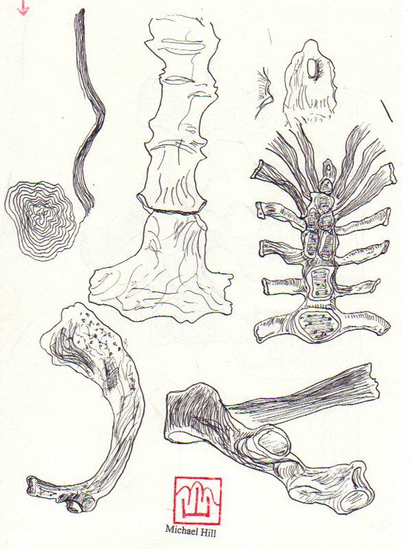
I am still sorting out the script, refining ideas, and developing others. There has been some unscripted image-making and printmaking activity with the intention of using this as a loose but parallel means of creating vaguely conceived and experimental visual content. Examples produced through this printmaking strategy are featured below.

Red face print #1–© 2013 Michael Hill

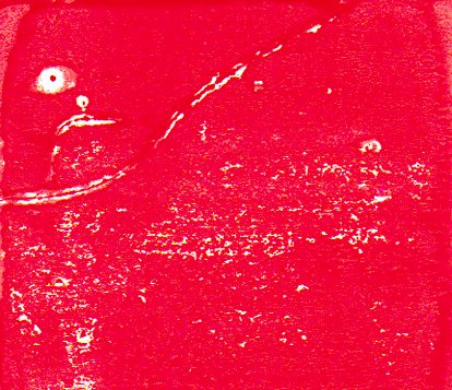
Visage of first red shade–©2013 Dr. Michael Hill

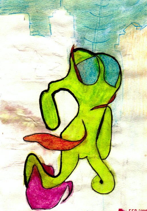
In the present chapter the cat characters deliberate over what to do following the sudden departure of Doctor Comics. Meanwhile the latter character continues his travels in the chthonian world confronting various vaporous forms and ghostly figures including a trio of red shades that roam there (see the three red shade illustrations). The raw state of these printmaking made images will most likely be subject to further graphic manipulation.

Red face print #2–© 2013 Michael Hill

Visage of second red shade–©2013 Dr. Michael Hill

Red face print #3–© 2013 Michael Hill

Visage of third red shade–©2013 Dr. Michael Hill

After a couple of weeks I started to get a move on once  the design and creation of the planned pages began to fall into place.

The production schedule is up!

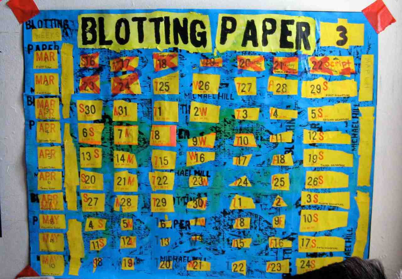
The production schedule for Issue #3 is up on the studio wall! (Photo ©2014 Dr. Michael Hill)

The intended dates for completion of the five 8-page signatures have been approximated and with a good run could be ready for binding as early as June.

The art table has been established.

The art table has been established… (Photo ©2014 Dr. Michael Hill)

Ink more so than paint appears to be the dominant graphic ingredient in the production with dip pens, drawing pens and brush calligraphy involved although some of the inking will be made onto previously painted paper.

...and particular tools selected.

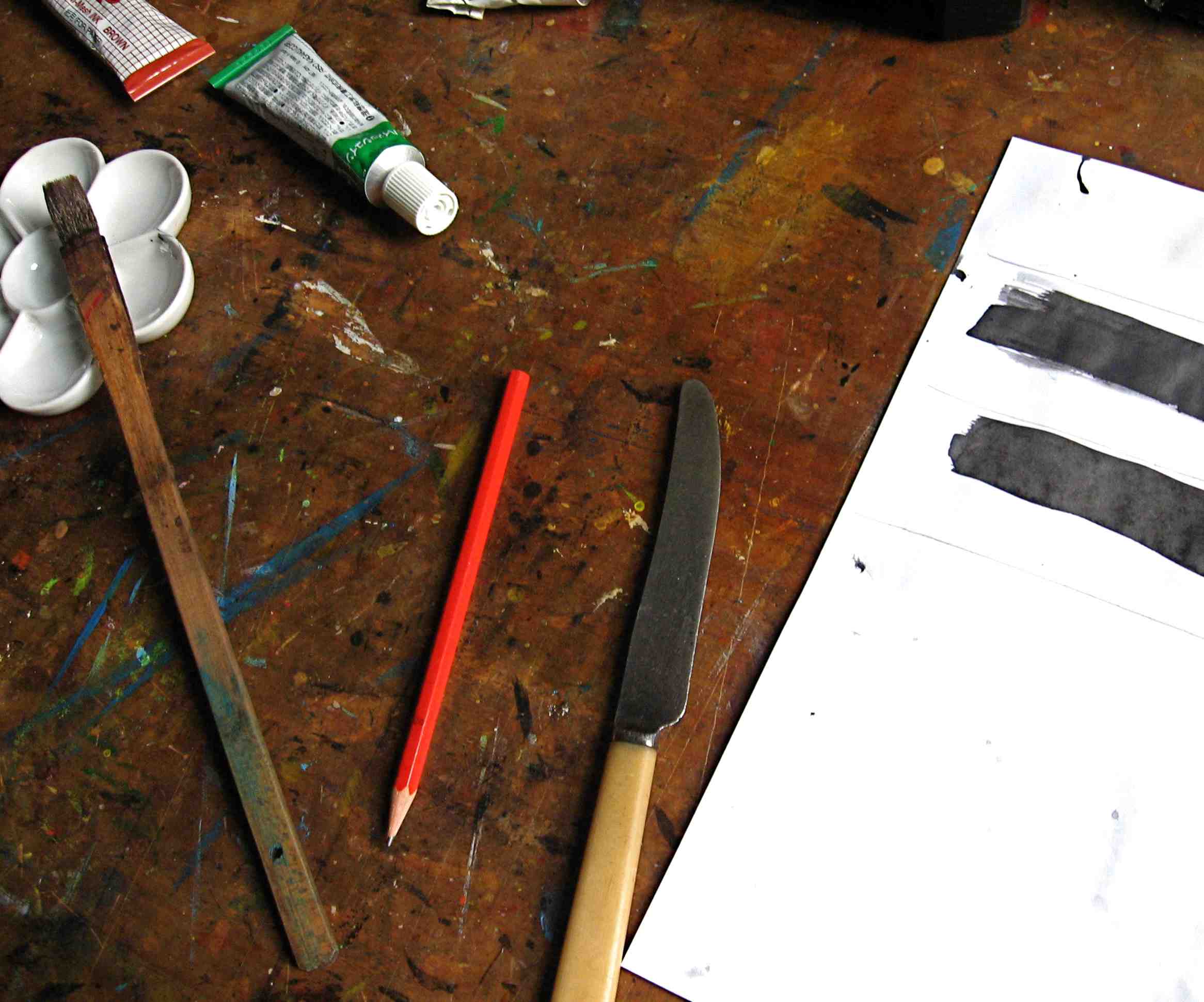
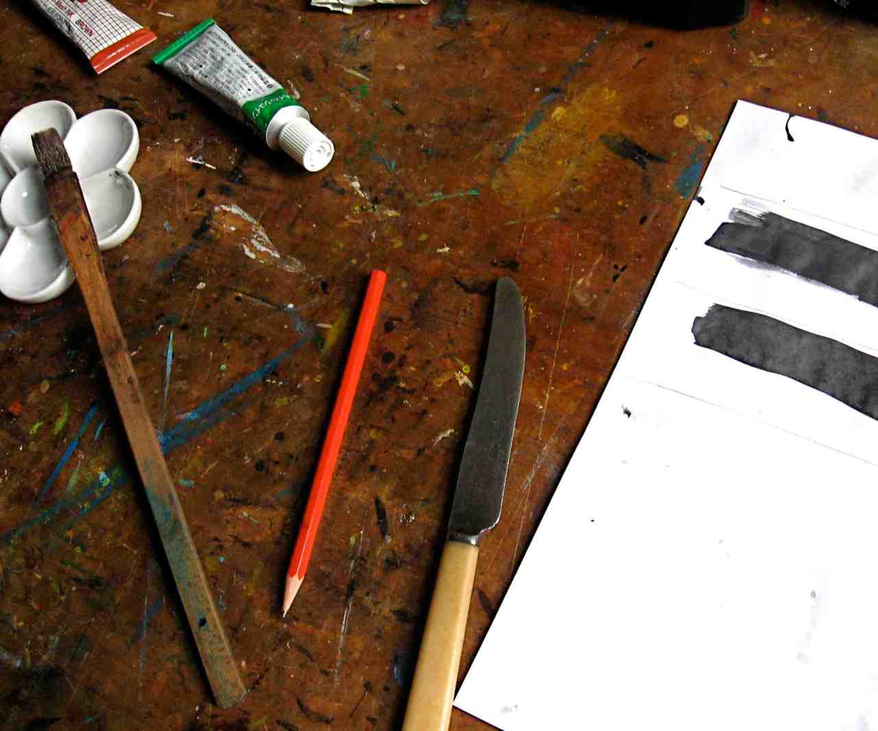
…and particular tools selected. (Photo ©2014 Dr. Michael Hill)

There are some pencils in there too, as well as the pens, with drawing and handwriting components plus my regular use of printmaking as a means of image generation.

Ink tests are underway...

Ink tests are underway… (Photo ©2014 Dr. Michael Hill)

The messy ink tests and mark making has begun.

...and drying on display.

…and on display whilst drying. (Photo ©2014 Dr. Michael Hill)

Having gotten deeper into production mode I am now approaching completion of the artwork having advanced from scripting to page layout, however, I am keeping things just a bit open in terms of the resolution of the story.

A spread of artwork on the studio floor.A spread of artwork on the studio floor. (Photo ©2014 Dr. Michael Hill)

I find the creation of the images, the entire image-making process, and the resultant generation of the artwork the most pleasurable part of the production process. Culling, selecting and editing the artwork is a tougher task.

A more detailed glimpse of the spread of artwork.A more detailed glimpse of the spread of artwork. (Photo ©2014 Dr. Michael Hill)

Printmaking has been employed to make more of the image-making this time around, more than photography but about the same proportion as drawing and, in terms of style, abstraction is making an impression.

Another more detailed glimpse of the spread of artwork.Another more detailed glimpse of the spread of artwork. (Photo ©2014 Dr. Michael Hill)

BLOTTING PAPER The Comic: Production Report No.8

Art, Blotting Paper, Comics, Japanning June 28, 2012

This is the first in a series of regular reports documenting the production process and progress of the second issue of my artist book/comic Blotting Paper: The Recollected Graphical Impressions Of Doctor Comics. In this blog the new series of reports continues on from the those posted during the construction and launch of the first chapter/issue The Ingurgitator (see linked blogged posts #1-14 below). The new chapter, A Blot on His Escutcheon, goes deeper into the establishment of the character of Doctor Comics, the environment in which he lives and some reflected moments from his life in comics. I am making progress with this and hope to have self-published it sometime next year. The book is based on my memories of a career in education in Sydney at an art college and design school, working within the disciplines of art and design in the specific areas of film, video, animation and visual communication. The subject of comics came up quite a bit, as a method of teaching storyboarding, as a word and image project and as a medium in its own right that included the study and research of it, presentation of lectures and conference papers, the staging of conferences, symposiums and exhibitions and the writing of a thesis. It has fictive passages as well as the auto-biographical elements. Printmaking is being employed again as an image-making medium including the Japanese sosaku hanga method, along with pen and ink drawing, collage and found materials.

Proposed title page for issue #2(Pen and ink drawing and collage-© 2012 Michael Hill)

I’m currently learning to draw bones by reading the osteology chapters in anatomy books and studying the illustrations really carefully. In Chapter 1 of the artist book/comic I used fish bones as an image and as a printmaking substrate for the sosaku hanga technique on the AFTER DINNER PRINT pages. In Chapter 2 there will be drawings of human bones of the hand and foot. I have had the opportunity to study some broken bones incurred in falls from bicycles. Speaking of cyclists I also make reference to the Bookseller of Glee character who was scheduled to appear in the first issue but ended up being edited out.

Bones of the hand and foot. (Pen and ink drawing-© 2012 Michael Hill)

This bookseller rides a penny farthing type of bicycle and will play a part in this issue. I had my portrait of this gentleman in the Glebe Sesquicentenary Art Exhibition(see below) and then it was a finalist in the 2010 Bald Archy Prize: The Bookseller of Glee (mixed media-drawing, painting and collage on paper):  It is a postmodern portrait of Roger Mackell, co-owner of Gleebooks (4 time Australian Bookseller of the Year), as a generous character gleefully disseminating books and promoting the joy of reading. The portrait caricatures the proprietor and his store’s contribution to the intellectual life of Glee Village, its nearby universities and community by virtue of its main street constructed from the writings of French literary critics and philosophers whose work the store made available in the 1980s. The populace is collaged from pages of Shakespeare, Dickens and Australian fiction.

The artist and his bookseller portrait on display. (Photo by Louise Graber)

More bones (pen and ink drawing-© 2012 Michael Hill)

More bones (pen and ink drawing-© 2012 Michael Hill)

And I have been drawing more bones.

Bones of the hand, heel and hips. (Pen and ink drawing-©2012 Michael Hill)

Archive of Australian Alternative Comics: MIND ROT

Archive of Australian Alternative Comics, Art, Comics November 18, 2011

Trawling through material from my back pages for content that will form part of my semi-autobiographical comic (Blotting Paper: The Recollected Graphical Impressions Of Doctor Comics) I came across this poster for an event that I conceived and organised at the University of Technology, Sydney back in 1998. I was a lecturer in Visual Communication in the Design Faculty at the time and endeavouring to incorporate comics based projects into the curriculum, both practically and theoretically. Comics is a perfect medium in which to practice techniques of visual communication design reliant as it is on the combination of words and images. First year undergraduate students undertaking Word and Image projects were generally enthusiatic about comics based applications. To increase the students’ understanding of the professional practice of making comics I decided to involve some practitioners.

Poster for the event designed by Neil Heymann.

With additional funding from the student group Stop Motion Sickness I invited Mandy Ord up from Canberra, Dillon Naylor from Melbourne and Glenn Smith from Sydney to show their work to visual communication design students and discuss how they went about making it. Mindful of the possibility of regional differences from the research I was doing into the Australian small press scene at the time it seemed interesting to have a speaker from three different cities. Each comics creator made a 45-60 minute presentation of their work followed by a Q&A session. Naylor profiled his comic about share-household shenanigans Pop Culture & 2 Minute Noodles, Ord her intensely inky, autobiographical tales of life in Canberra, Wilnot, and Smith his painstakingly linear drawn, slice-of-life The Sydney Morning Hell. Each guest also led a practical, sequential graphic workshop with a small group of students. Gerard Ashworth, also from Sydney, who attended the seminar helped out. The event was a small but significant moment in Australian comics history, especially in terms of the study of the medium within the ‘academy’.

The title? Attempted irony, perhaps? I think I was put in a defensive position by some of my academic design colleagues about claiming comics as a valid medium of visual communication back in those days, thirteen years ago. Photography was the then popular medium followed by graphic design and illustration whilst comics, animation and video were perceived as a lesser form. I was taking the study of comics very seriously and undertaking research into comics. I also saw this event as a stepping stone to the staging of a conference on comics for researchers and students of the form. The poster was a good piece of visual communication by then student Neil Heymann, now a New York based advertising designer. Teaching comics as practice was the hurdle then. A steeper jump followed with the notion of comics being considered as a medium of scholarly study and research.

Relevant to this post and also back in the 1990s a smaller number of design students enrolled at Sydney’s University of Technology that I was teaching were fortunate to attend two comics workshops taught by local creators Jason Paulos, Bodine Amerikah, Stuart Hale, Ant Larcombe, Sam Young and Xander Black. The events were organised by the students themselves. Working in the Visual Communication Design program at the time, the course from which one of the creators, Ant Larcombe, was a graduate, I was happy to act as both go-between and coordinator of this student initiative. The first workshop was Basick Inkstinct in 1996. This was followed up and developed the following year with the same tutors under the title Bio-Hazard. Both workshops enabled students to have contact with industry practitioners, creators and publishers of titles such as Hairbutt the Hippo, Cyberswine and Zero Assassin. This type of contact can make a valuable contribution to student training. It permitted students to see comics production as a valid form of visual communication within the graphic design field, a course that the majority of those who attended were enrolled.

The Bio-Hazard comics workshop poster. (Poster design by Xander Black)

The Basick Inkstinct comics workshop flyer. (Flyer design by Neil Heymann)

Both workshops were informally structured with the creators sitting at tables with the students demonstrating their skills on paper and engaging in studio banter with each other as they drew. Stuart Hale and Xander Black gave brief talks about comics making and the relative merits of local creators before the comics artists went through a practical session of scripting, thumbnails, page layout, rough and refined pencils, lettering and inking. The visiting creators were very generous with their time and the students appreciated this. These workshops preceded a more formal and official event that I subsequently organised, namely the Mind Rot Australian Comics Seminar & Workshop that I have blogged about previously in this series. That more formal workshop and accompanying symposium represented a further step in the process of formally recognising comics design within the academic curriculum as I was eventually able to offer comics based projects in the subjects Word and Image and Graphic Visualisation in that course and in the Master of Animation course that followed some years later.

This is the fourth in a series of posts called Archives of Australian Comics History that document moments in the recent history of Australian comics, particularly alternative comics and the Australian Small Press. I started researching this subject in the late 1990s and it eventually led to my PhD thesis: Ph.D. Macquarie University, Division of Society, Culture, Media and Philosophy,  A Study Of Contemporary Australian Alternative Comics 1992-2000 With Particular Reference To The Work Of Naylor, Smith, Danko And Ord, 2003. On completion of the research I donated the materials and comics I had collected to the National Library of Australia: Michael Hill Collection of Australian Comics.

BLOTTING PAPER The Comic: Production Report No.2

Art, Blotting Paper, Comics July 10, 2011

Title page for the first issue of my comic using rubber stamps and a linocut print to generate the type.-© 2011 Dr. Michael Hill

The above image is an impression of the reversed typographic design shown in Production Report No.1. As I am interested in experimental image-making I have moved the block during the printmaking to create a bit of blur. I have also used askew registration and mixed some of the fonts. The comic is based on experiences I have of a long career in education that involved teaching, research, design and consultation at an art college then a design school across the disciplines of film, video, animation and visual communication. The subject of comics often arose, first as a method of teaching storyboarding and visual sequencing and eventually as a medium in its own right following my practice and research. I eventually did my doctoral research in comics studies and gained my PhD in that field. Initially though, when the art school and the design school of Sydney College of the Arts were neighbours, I, by chance,  became involved in printmaking when I and a colleague temporarily swapped our classes- my graphics students with her printmaking students for a couple of sessions, and her students learning animation and video production with me. Later, I went along to experience the printmaking department myself and learned some studio techniques. I loved it! It touched me both as a technical medium and as a form of artistic expression. The result was that since that time printmaking became part of my artistic practice. In this project it has not only been used to generate the title page but also some visual expressions on several pages.

A little too much blur…perhaps I overdid it?… I shall keep it for awhile and have another look to see whether it survives or not. © 2011 Dr. Michael Hill

I experiment with the design and visual communication aspects of the work and modify the degree of graphical experimentation. I see both elements as essential considerations in constructing comics.

Experimental typography-© 2011 Dr. Michael Hill

The ‘graphical impressions’ are drawings or prints of graphic memories generated in ink from rubber, wood, lino and other surfaces (the title and subtitle are from rubber, my name from lino).  In addition to utilising printmaking as a method of image-making I am also doing some drawing with various tools ranging from traditional metal dip pens and pencils to felt-tipped pens and brushes and a selection of inks.

Title page for Chapter 1: The Ingurgitator. (Collage, sketch, assemblage- © 2011 Michael Hill)

Re progress on my artist book/comic Blotting Paper: The Recollected Graphical Impressions Of Doctor Comics I have encountered a few interruptions that have resulted in delays in production. There has been a good side to this, however, of the ‘working on other interesting projects’ type of interruptions kind. One project is on Anime and Manga research into particular works of Tezuka, Rintaro, Matsumoto and Miyazaki and the films Galaxy Express 999, The Dagger of Kamui, Laputa-Castle in the Sky, and The Girl Who Leapt Through Time. The other involves workshops in the sosaku hanga technique of creative Japanese printmaking. Both of these activities will form part of a Japanese Cultural Festival in Suva in the South Pacific and both are subjects that I find quite stimulating. They may even provide some material for future chapters of my comic.

In terms of the production of my comic, however, I have managed to continue pulling bits and pieces of already completed work together and have modified other bits that I had considered to be completed. That’s the title page design(above) for the first chapter The Ingurgitator, as it currently stands. Originally produced in colour a black and white version may appear in the comic. It consists of a combination of image-making techniques including drawing, painting, inking, printmaking and collage. The original collage and sketch, below, were made during a trip to Shanghai to attend an Animation Expo in Hangzhou in 2007.

Original image and early draft of The Ingurgitator from my Shanghai sketchbook. (Collage, sketch, assemblage- © 2007 Michael Hill)